Good work, Isaac, and your scrupulous attention to proportions, values, and details is apparent. So glad this set you up for this week’s drawing, which was my main intention. And so glad you can also see and appreciate Degas’ seemingly infinite subtlety.
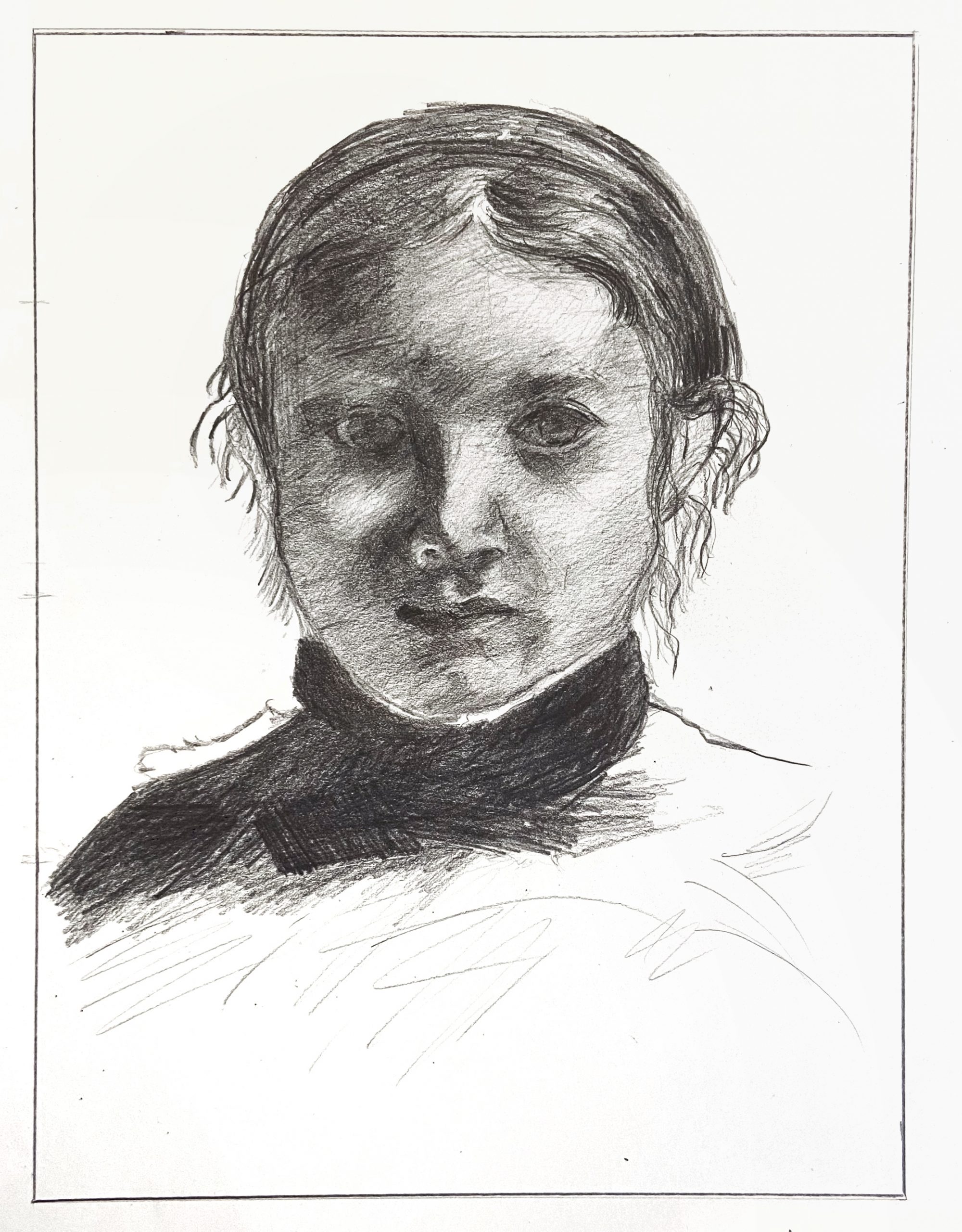
The two things that jump out at me are the texture of your hatching, which is coarser and grainier than the original, and a slight misalignment of the features with the silhouette of the head.
To solve the first issue you need a sharper point on your pencil and a much lighter, softer touch, holding the pencil loosely and far back and allowing the values to build up gradually. This can be followed by even finer marks to fill the white spaces between your strokes. To be clear, there’s nothing wrong with this kind of hatching the way it is—it’s just not as fine grain and high res as the original.
As for the misalignment, the space between the left contour and the features is just a bit too wide (just a bit) and the space between the features and the right profile is just a bit too narrow (again, just a bit, but taken together they pull the features to the right). Also, that contour between the face and the ear on our right is simpler and smoother–not so undulating.
You’ll notice we can see her left ear (on our right) but not her right, which tells us her head is slightly turned to her right. This has the effect of foreshortening that side of her face just a bit and making that side slightly narrower. It looks like you’re trying to center her features a little.
This is exacerbated by the eye on our right being a little too far to the right even in relation to the other features. Her tear duct should be directly above the outside edge of her nostril, but is slightly more to the right.
Great job accepting Degas’ lighting on the eye on our left—it all but disappears and you didn’t try to impose what you know or expect, but followed suit—great work.
Other small notes:
The reflected light on the nostril to our left is much too light, as is the reflected light on the cheek to our left, but to a lesser degree.
The modeling of the edge between shadow and light on the tip of her nose needs to be softer.
The white of her collar is jumping out in yours—it’s more of a light grey.
The values in her collar and shoulder are too dark.
Very good effort and noteworthy achievements here but still room for some refinement as outlined above.
I think this was a good attempt at the Degas portrait. One thing I’m noticing with the posted drawing is that the eyes appear to not be on the same level, but I wonder if that happened during the editing stage because the hard copy in front of me seems much more true to life. Other than that, the other things I’m noticing about this attempt is that I may have gone a little overboard on the value overall. It was difficult to match Degas’ value because the value differences in his drawing were extremely subtle and he seemed to add value with the same diagonal pencil strokes– something I tried to replicate. I think I captured the nose and forehead pretty well. One of the biggest challenges with this drawing was the hair, which surprised me. The good thing about hair is that it seems to be more forgiving than other facial features.
I enjoyed this project a lot. I think I’m in a much better position to try drawing my own portrait, and I have a really deep appreciation for Degas’ impeccable perceptions of value in his portrait.