 Very good, Anika, and well-composed. His drawing has a lighter, softer touch and his edges, even the eyelids, aren’t as hard or defined; a good thing to learn from. It looks like you’ve added lip color-note how his disappear into the surrounding area without such a defining contour
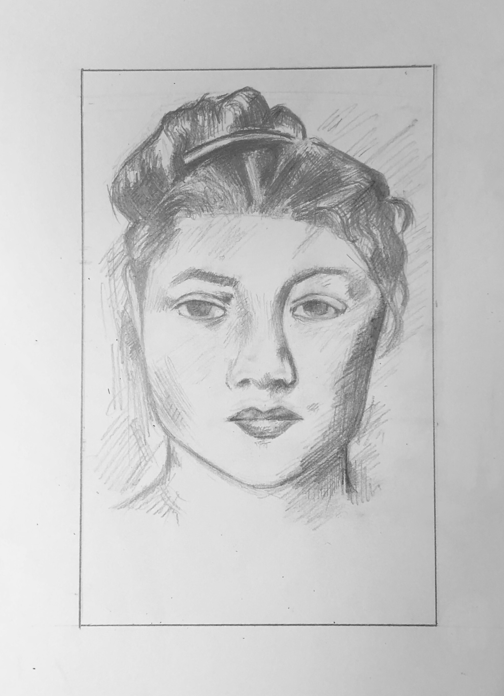
Also, the left side of her face (our left) should be slightly narrower, and the right side (our right) slightly wider.
Nevertheless, good work overall.
It was hard for me to choose a portrait to replicate, as all of the portraits exhibited different styles that I really wanted to emulate. However, I chose this one because I loved the soft depiction of the face. I struggled with the face structure a bit, and also with the texture of the hair. Ultimately, my final product turned out a couple shades too dark, but I am happy with how it turned out.
It’s funny that you say you struggled with the hair is this portrait, because that was one of the first things I noted to praise! I think you represented the variety of highlights and the volumes of the hair really well. I also think that the shadows that fall on the right cheek and neck of the figure are really well done and reflect where the light source is in the set up. Additionally the highlight in the center of the lips really make them seem pillowy and real. One thing that might be improved about this drawing is the consistency of the shading. If the light source is coming from the left side of the piece then maybe some of the shadows on that side would be rendered differently.