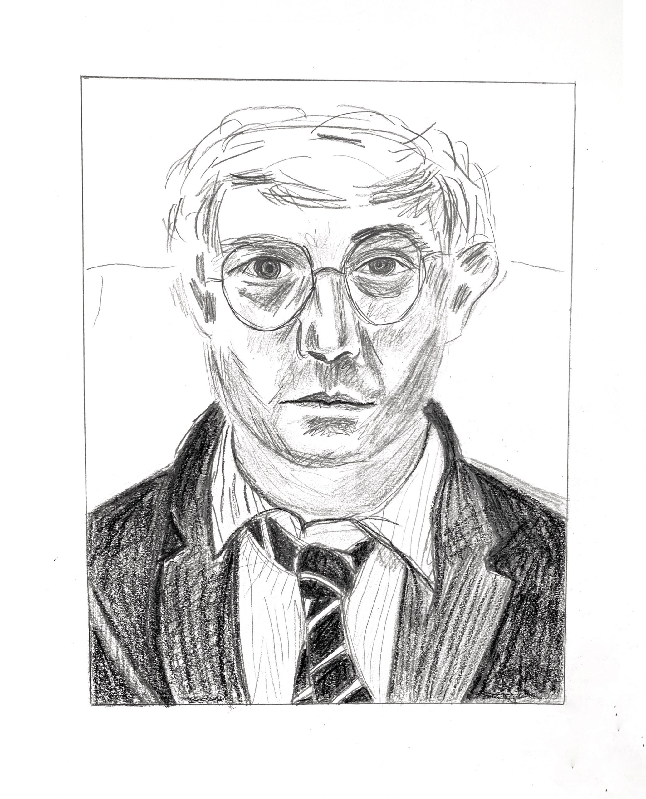
Good for you for going after this twice. The second one is definitely better, for the reasons you mention, but see my additional notes, below.
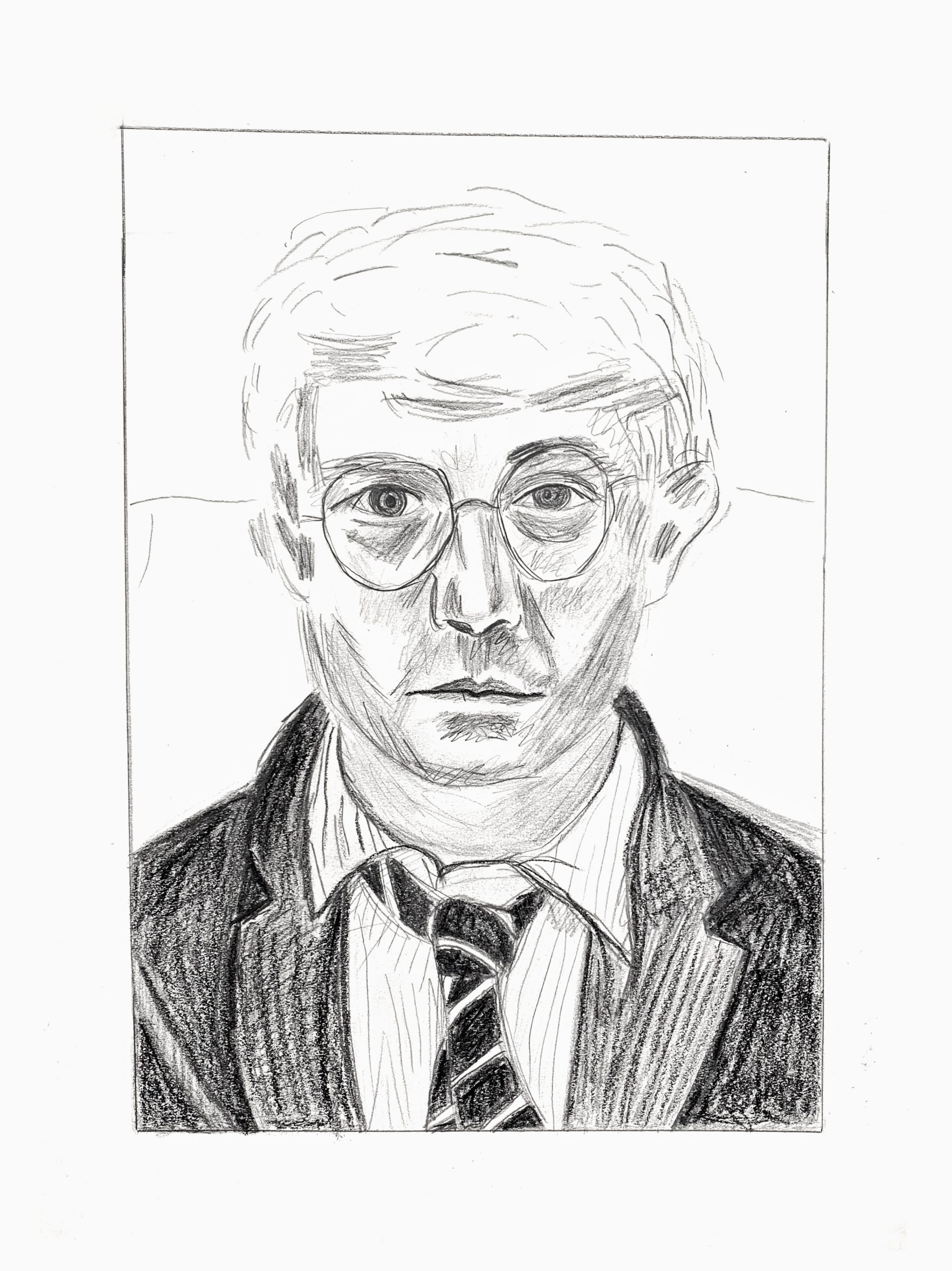
Good work, Olivia—this is unmistakably a David Hockney drawing with good composition, good configuration, and the lively, insouciant spirit of his mark-making—but these also appears a bit rushed, or at least not slowing down enough to take in more of the nuances. A few notes:
Great improvement to the proportion of the hair in the second version.
Both eyes are too large, but especially the eye on our left.
His glasses have a different shape and are more similar in shape.
The nose is a bit too long.
The comers of the mouth turn down slightly, not straight across. This is not just a matter of his expression–that slight curve connotes the volume of the lower face. By making it straight it flattens the head a bit.
The distance from mouth to bottom of chin needs to be greater.
His cheek on our right, below the frames is light grey, not white, achieved with a smudged tone. Same is true for the entire neck, which is entirely in shadow (also light grey–no whites). You seem to have trouble embracing the lighter greys, jumping from white to almost a middle grey. There’s a range of tones in between in the Hockney, and following his lead is a good way to get over this hump. These values are best obained by a pencil held loosely with repeated light hatching (and in this case, abetted by smudging under the hatching).
Lastly, you need a softer touch—your marks are harder and higher contrast.
The point here isn’t about exactitude but what you can learn from his drawing to expand your own understanding, sensitivity, and range, and there’s more there to glean from him.
I definitely struggled a bit with this one. As you can see from my first attempt, everything was going well until I reached the hair and somehow made it much too flat. I didn’t realize this until I was editing and uploading the picture, so I attempted to redo the hair. Editing just the top made a big difference, and I’m much happier with how it came out. Overall, I had a lot of fun playing with the different values and shading with both smudging and hatching. Hopefully, when I attempt to do my actual portrait, I won’t struggle as much with the proportions.
Hey!
1) I’m glad you had the patience to make a second attempt. Changing the hair did make a difference. The hair marks look very similar to the original. I also think you do a good job staying accurate to the original shape of the lips, the contours in the clothes, and the asymmetry in the eyes.
2) The right side of the face on the original seems darker to me. I think that there’s some white/light space on the right side of the face, around the lower part of the cheek, that should be darker. The lens/frame of the glasses on the right side also distorted. I bet this is due to adjusting the proportions.