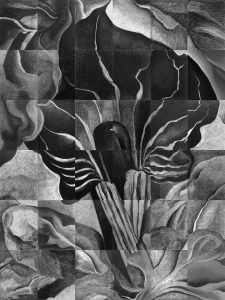
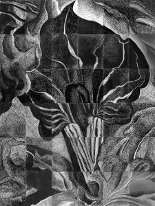
All 36 drawings together. Above is the high-resolution pencil version, and the one below is the pen rapid hatching version. Click them open and zoom in to see your pieces in context with their neighbors. The value and resolution differences between them is inevitable but makes the image interesting in a different way.
Note also the overall difference between the “complexion” of the pencil version and the ink version.
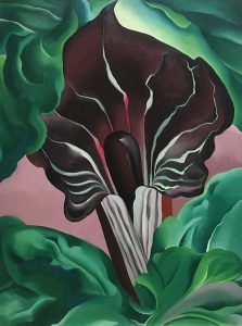
The image is a painting by Georgia O’Keeffe, called Jack-in-Pulpit, No.2, 1930, Oil on canvas, 40 x 30 inches
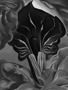
Here it is in black and white, which you worked from:
And the original, in color:


1) Beyond value matching, what was another lesson or purpose for this assignment?
I feel as if there is a further lesson at seeing line, proportion, shape, form, etc beyond the constraints of knowing what an image “is” or is “supposed to be.” As each piece started as independent of the whole, each drawing demands one to look at the flow of the form, the changed in gradation, and the formulation of tone for the piece as an object in itself. Such becomes important when each piece becomes part of a whole.
3) What did you find most challenging or surprising about value matching?
I found the most challenging part of value matching to translate what I was seeing on a screen, smooth and painted, into a drawing with the very different tools we were using. I occasionally found myself wondering whether my conception of “dark” or “light” translated into what the person with my adjacent piece would imagine those terms to mean, even though each piece is isolated. I found value matching especially difficult in the pen drawing as I feel that I had less control over how each value blended into the adjacent values and related to the values established by the grayscale painting.
5 and sorta 2) I preferred looking at and doing the pen version. For one, I did it second and was much happier with my work on the pen drawing than I was with my work on the pencil drawing. Drawing felt more practiced and methodical than frustrating by the time I got to the pen drawing and each stroke felt like I had much better control. Drawing the pen version felt like I was slowly building something while the pencil version felt like a tedious contour drawing with infinite lines. On a larger scale I like how our pen drawing seems more textured than the pencil and seems to catch the light at the top of the original better.
6) I realized the parts don’t resemble the whole at all. I completely believed I was drawing a piece of a Rorschach ink blot and not a flower. I wonder if I would’ve done a better job knowing the whole image? I also learned how much my brain can eliminate small imperfections once I zoom out and know what I’m looking at. I was surprised that the detail everyone put into each tile didn’t take away from the whole picture. I though that I would be focused on the details of each segment but the whole dominates more than any section.
3) What did you find most challenging or surprising about value matching?
The extent to which I needed to pay attention to detail surprised me about this assignment… I guess I had the idea that each value had no variation within itself, and that I wouldn’t need to pay attention to the tiny differences within, say, the darkest values or the lightest ones. I ended up really enjoying looking at the value pieces for so long, though, and having the values unfold before me. I kept noticing new details the longer I looked, which I didn’t realize would happen with a pure value drawing. I also think matching the true shades of the drawing was challenging. It was easier to match the values relative to one another, but getting the actual darkest and lightest values pinned down as they were in the original was quite a challenge.
5) Which technique did you prefer (either doing or looking at), and why?
While I preferred doing the pencil drawing and prefer looking at my individual pencil ones, I like the look of the group pen drawing more. I love seeing the scribbly quality and variation of lines, texture, and values in the pen. I think the pen forces more character to come out of the whole drawing. I preferred drawing with the pencil because I felt that I had much more control over the finished product and of each line, and that I could better match the values, gradations, and texture of the original. What I tend to think of the downfalls of each technique can be the pros for another viewer or if I think about a drawing as ‘good’ in a different way.
I think our version of this piece came out really well! I’m surprised by how well the pen version came out, I would’ve expected the pencil one to be much closer to the original but I think both come very close.
3) Something that was challenging about value matching was that it felt like a neverending process. I would constantly be going back to values I thought I had already finished to touch them up or darken/lighten them, and even then I’m sure I wasn’t close to exact. I still enjoyed the challenge of matching values, though, and think it will serve me well as an artist.
5)I really enjoyed the process of both pen and pencil, but I think I preferred using a pencil. The gradual process of adding value and resolution was rewarding as the piece came together overall. I felt much more in control with a pencil than with the pen, too.
5) Which technique did you prefer (either doing or looking at), and why?
I preferred the pencil technique because I could very gradually adjust it and chip away until I got it right. However, I almost like how the pen version came out better. All our values seem to match a lot more than in the pencil version. Maybe this is because we did them second, and so had honed the craft a little more. Or maybe since we all put in the same amount of time (30 mins) we got results that matched up better.
1) Beyond value matching, what was another lesson or purpose for this assignment?
I think an important lesson that I learned from this assignment was how meticulously we should “fill in” drawings. Up until now, we’ve mostly done a lot of contour work and outline work. I used to think of filling in outlines as “coloring,” but this assignment really taught me how deliberate and detail oriented this process actually is. It also taught me that, like making a contour drawing, a value drawing or “filled in” drawing is all about lines too. I guess drawing really is all about lines!
1) Beyond value matching, what was another lesson or purpose for this assignment?
I think beyond value matching this lesson helped me draw without attachment to the objects I was drawing. Like, drawing upside down, drawing something that my brain couldn’t identify meant that I could rely solely on my observations. This made the task of copying four paintings kind of tedious for me, nevertheless I know that it allowed me to draw much more realistically than I would have knowing that I was drawing a flower.
5) I preferred doing the pen drawing because I could be more free with my rendering without worrying about ruining hours of work. The pencil drawings surprised me because even after hours of working on them, my hatch-marks did not blend seamlessly. I kept rotating my mechanical pencil to use the sharp side, yet my lines stood out and I was unable achieve flat values. I guess I need to keep practicing. The pencil drawing was stressful. After completing the first one, and seeing many individual lines and differences in value from the original painting, I felt disheartened drawing my second pencil piece. Afterwards, the scribbling of the pen drawing allowed me to release my frustration.
2) I think you can clearly see that the group was able to use the pencil to create more accurate values. In the pen final version, I can see gaps in the values which is definitely expected. I personally thought it was much more challenging to create a consistent shade throughout my drawings with the pen and it seems that many others thought the same. However, as a whole, the pen version seems to have a consistent style to it, that is using this sort of hatching technique that really comes out in the full version. In contrast the pencil version has varying styles and techniques that cause slight differences to become much more noticeable. Overall even though the pen version didn’t capture the values as well as the other version, the consistency makes it just a little better in my opinion.
4) I think my biggest challenge during this assignment was getting the dark values with the pencil. After really pressing down with it, I found myself unable to achieve the really dark tones and subsequently altering each value in the drawing making them slightly lighter. In general, I think my drawings are slightly lighter than the rest, something I have always struggled with.
4) What did you find most challenging or surprising about the two techniques?
Something I was most surprised to find about the two techniques was the hardest part of the drawing. So far in this class we have had a number of assignments where we find the position of objects in space and draw them proportionately. However, the value matching for this assignment really caused trouble for me. I am still learning how to successfully vary my line weight and strokes (especially with pen) so to commit to drawing something with such a distinct emphasis on replication of shade was a little daunting. I ended up being pretty satisfied with the shapes in my drawings, as I think they reflect the originals well, but one thing I am seeing in the broader picture in my continued hesitancy in committing to the darker mid-tone values.
5) Which technique did you prefer (either doing or looking at), and why?
I really preferred the pencil technique. I think this may be derived from more practice with that tool in hand, but some of it also comes from the forgiving nature of the pencil. I felt that it was easier to soften and intensify the lines I needed with the pencil. With pen I kept finding that I was not producing the results I wanted. These shortcomings are especially clear when compared to the larger photo, with more accurate tiles beside my own.
1. I think that beyond value matching, this project challenged us to draw what was directly in front of us. When drawing a specific image, it is easy to get caught up in what I think the image looks like instead of what is depicted on the paper in front of me. When I didn’t have an image in my head beforehand of what I was drawing, I was forced to copy what was right in front of me.
5. I preferred using the ink because in a sense, it was more mindless than the pencil. I could just focus on the “scribbling” aspect of conveying certain values, while the pencil required more dense hatching to fully replicate the tones. I really enjoyed both techniques, but the ink was more peaceful.
1. Although this still goes along the lines of value matching, I definitely learned how to see really discrete nuances in value that I would not have noticed if this painting wasn’t abstract/as zoomed in. The really subtle changed in value is what helps build a three-dimensional look to the painting that most likely would not have translated if I were to attempt to draw the entire thing at once. When attempting my portrait, I will be sure to employ this new skill and perhaps zoom in so far that all I see is different values instead of eyes, a nose, etc. in order to craft a more accurate drawing.
4. I found most challenging, especially with the pen drawing, to trust the process. I found myself doubting how it would look, especially the lighter values, and doubting my ability to match and line the drawing up. However, I was pleasantly surprised that once zoomed out, the hatching actually looks quite beautiful and even if some rectangles don’t line up perfectly, the drawing as a whole looks great.
2) I prefer the pencil drawing as I think the values match and flow into one another better making the drawing feel unified. I think that the pen drawing feels far more disparate. I think that this is because the values that the pencil makes are lighter and thus the range of value is smaller. This means that despite people having different senses of value they will, by that virtue, have results that are closer to one another’s.
3) One of my drawings had a large range of values from light to very dark and it was very hard to keep all of them in proportion. This was made worse by how easy it is to overdo a value and then throw everything off when you make something that should not be your darkest or lightest value the darkest or lightest value, so everything is off the mark.
5) I enjoy creating and looking at the pencil drawing much more. There’s something about using a pencil that makes the art of drawing feel very smooth. It is also much easier to get the shade you want with a pencil. With a pen, the ink is uniform so the only way to differentiate to to make additional strokes to get rid of white space. I found this to be very frustrating because I never knew how much was enough and it seemed very messy. The pencil can create different shades based on how hard you press down on the paper. Therefore, it is easier to control and visualize. The pencil also makes really clean marks that makes the overall drawing look nice and realistic. It blends with other drawings much better than the ink drawings as well.
6) I thought it was very neat that everybody’s individual drawings can come together and make one big drawing… a realistic one too! The drawings generally look pretty fluid and especially when looking from further away, they look extremely similar from one another. One thing that I noticed is that some people’s definitions of dark were different from the others. Therefore, in areas where the drawing was supposed to be dark or light merging with another drawing of the same hue, they didn’t always match up. Another aspect of the drawing which I found interesting was the millimeter differences in where different people incorporated their value changes which didn’t always match up. Of course these would not be the same because it is impossible for everybody to measure up their drawings the same, but I almost saw some sort of beauty in the fact that the drawings were extremely close to matching up, but not exactly. The imperfections almost make it more perfect in a way.
3) I found it surprisingly challenging to just have the confidence and optimism that my values would begin looking correct as I added layers. Never having done pieces like this, it was difficult for me to imagine that the built layers of hatching would eventually lead to my intended values. I found it more difficult to try and match values with pen for these same reasons, plus the fact that the pen left a much darker mark and could not be erased. There was some comfort in not being able to revise and revise my pen drawings, but also some stress.
5) I preferred completing the pencil version. Although it took a lot longer, I ultimately felt I was able to more accurately capture the nuances in shade and to make my marks look less contour-y. I kept stressing over how dark the pen was and if I would be able to capture the same value scale, which was more difficult for me to do. I also just prefer how my pencil drawings came out as compared to my pen ones.
1) Beyond value matching, what was another lesson or purpose for this assignment?
4) What did you find most challenging or surprising about the two techniques?
1) For me, a significant piece of this assignment was finding proportion and flow of the section of the drawing. Replicating the piece was in part value matching and using the different tools to do so, but I also found myself practicing my sense of the drawing as a whole. These pieces had no anchor in familiar shapes or patterns, they were part of a larger unknown picture. Thus, I had to figure out what in the image I could anchor my rendering in, and find landmarks I could return to to check my progress. I tried to find specific places to check so that when I looked at it from a distance and compared my drawing to the original image, I could find where I needed to change things rather than just have a general sense that something is wrong.
4) Each of the techniques had its own challenges. The pencil drawing was difficult because the value range of the pencil is lighter than the image, so it took a long time to build up value. It was also a challenge to keep the pencil marks relatively uniform in length and direction so that the drawing looked somewhat cohesive. The pen drawing was difficult because of the time limit, but also for the opposite reason the pencil drawing was difficult: the pen has a very small value range. Thus, the hatching had to vary in density much more, rather than a pretty uniform hatching density with varied values