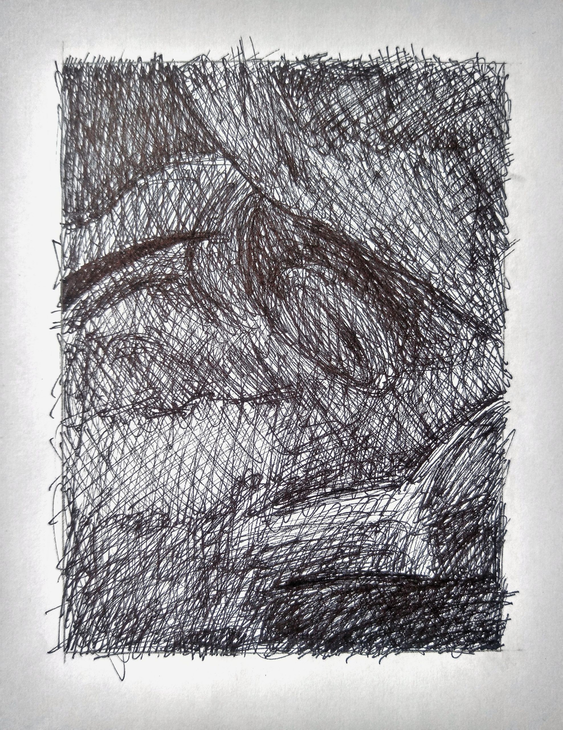
 Good, but darkest areas should be darker.
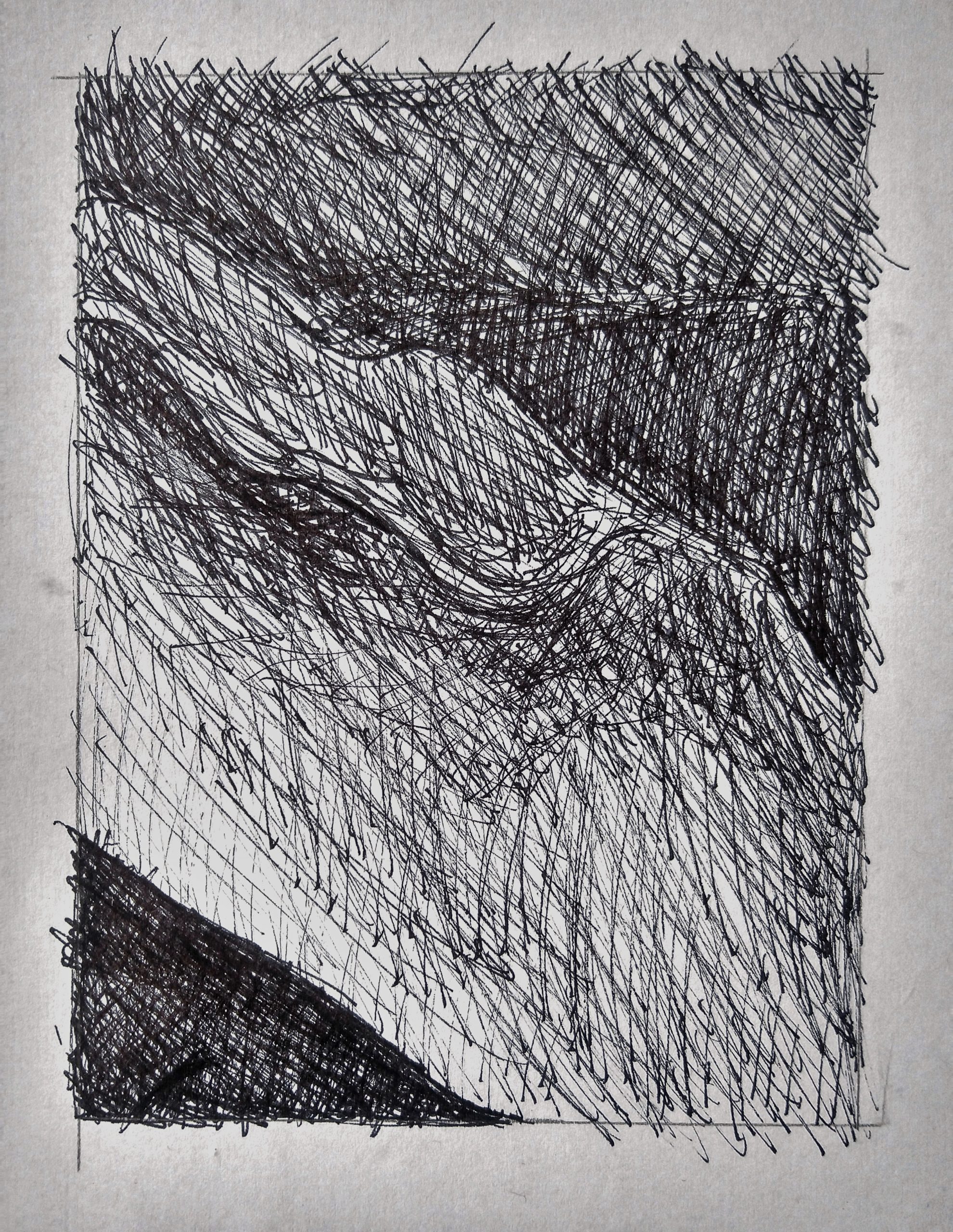
Good, but needs to be categorically darker. The lightest values in yours are comparable to the white of the paper but should be much darker. Even the very lightest value here doesn’t rival the white of the paper.
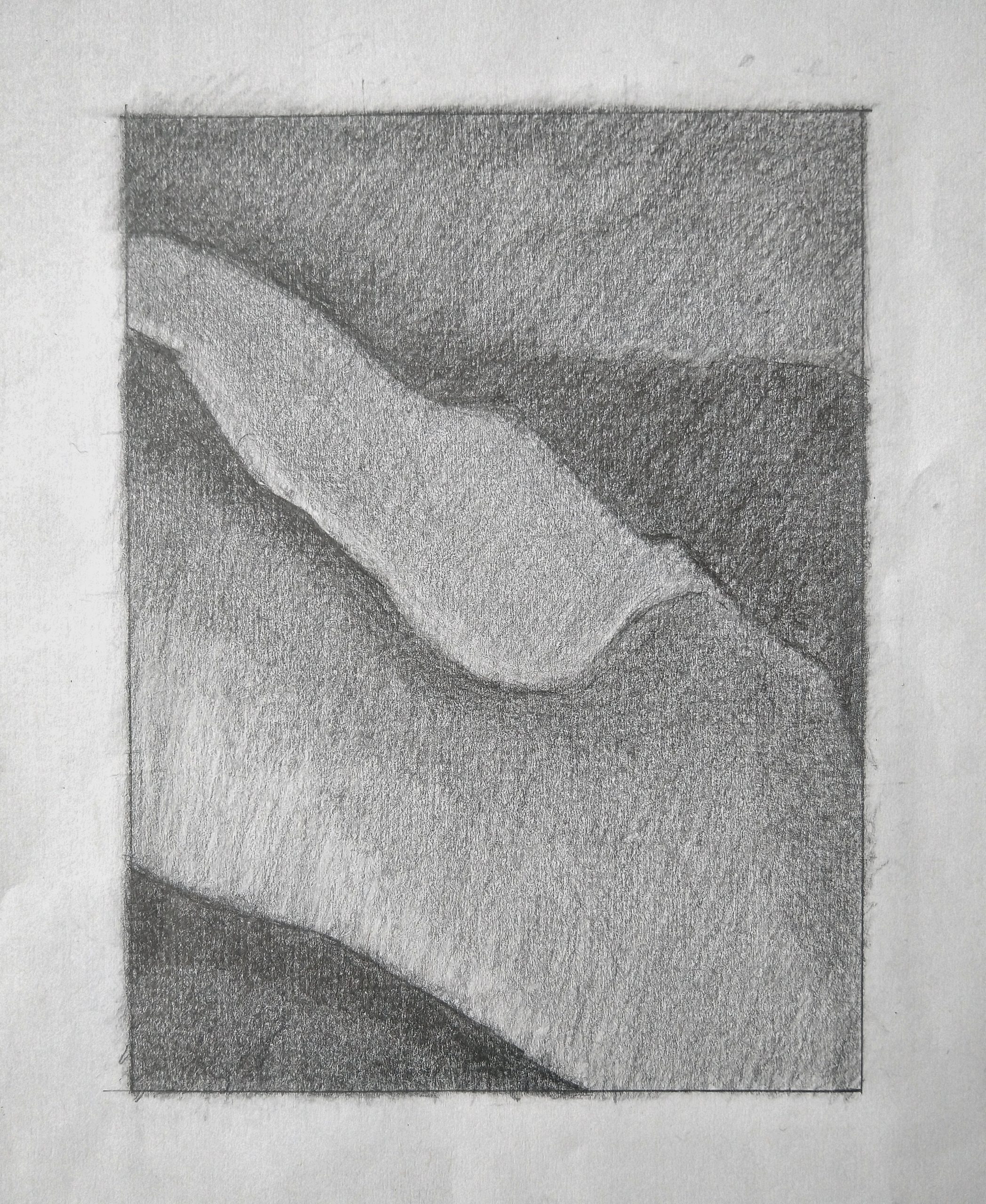
 Good job on the lower left. The triangular shape on the right upper half should be the same darkness or very close to that. You need more contrast along that “breaking wave” shape by sharpening the edge and darkening the value that borders it there. Very top shape is too light and needs more hatching in multiple directions.
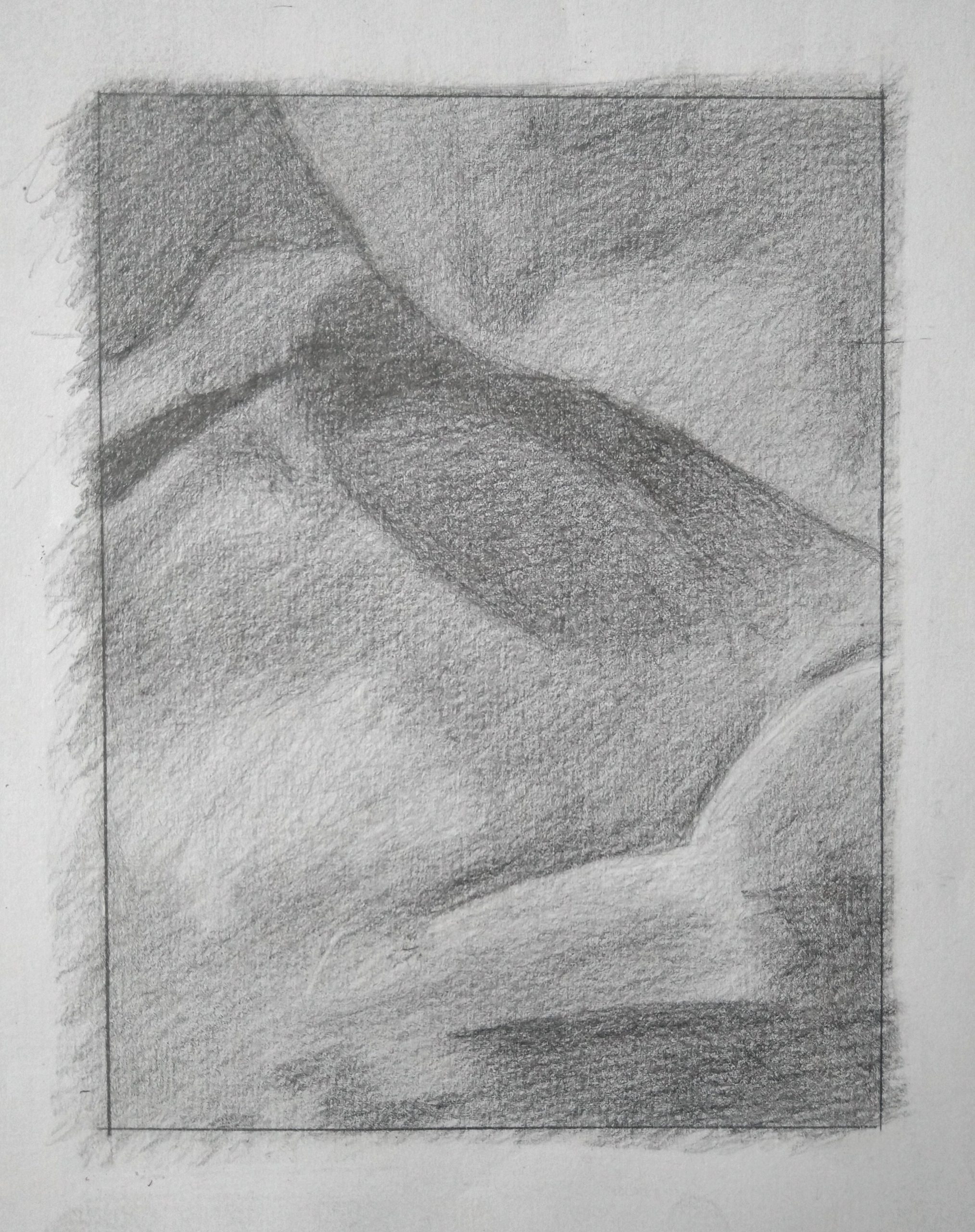
 Upper left corner is darker. There’s a dark shape like a leaf and a stem in the upper half that needs to be more unified. You’re breaking it up into too many sub-values and sub-shapes, when in the reference it’s more unified. There are differences in it but they never overtake it’s unity and simplicity as a shape.
I think I made this assignment a lot more stressful for myself than I needed to. I’ve never done value drawings like this and I was having a hard time imagining that as I added layers to the pencil drawings, the drawing would come together. I am somewhat satisfied with how the first one came out and really enjoyed, as the pencil drawings came closer to completion, noticing the little nuances in shade. I think I captured the nuances better in the first pencil drawing than the second. However, I had to stop myself with the pencil drawings because I spent 2.5 hours on each, still wasn’t completely happy with them (especially the second one), and had other things to do.
I was also plagued with self-doubt starting the pen drawings because I was worried that by placing those dark hatch marks too close together, I would lose nuances in shade. I did lose some nuances which was unfortunate, but by the second pen drawing (the one shown as the first) I was trying to just enjoy the process and not stress so much about the end product. I think my pen pieces would have benefited from more close and refined hatching.
This project was a bit stressful but it really made me realize a lot of the unwarranted self-doubt I have in my own abilities. Certainly many aspects of this project were fun and hopefully, in the future, I can enjoy the more relaxing aspects of value.
*On an editing note, I do feel like my pencil pieces are darker in real life but I was having trouble capturing that in editing on snapseed while still maintaining the gradients.