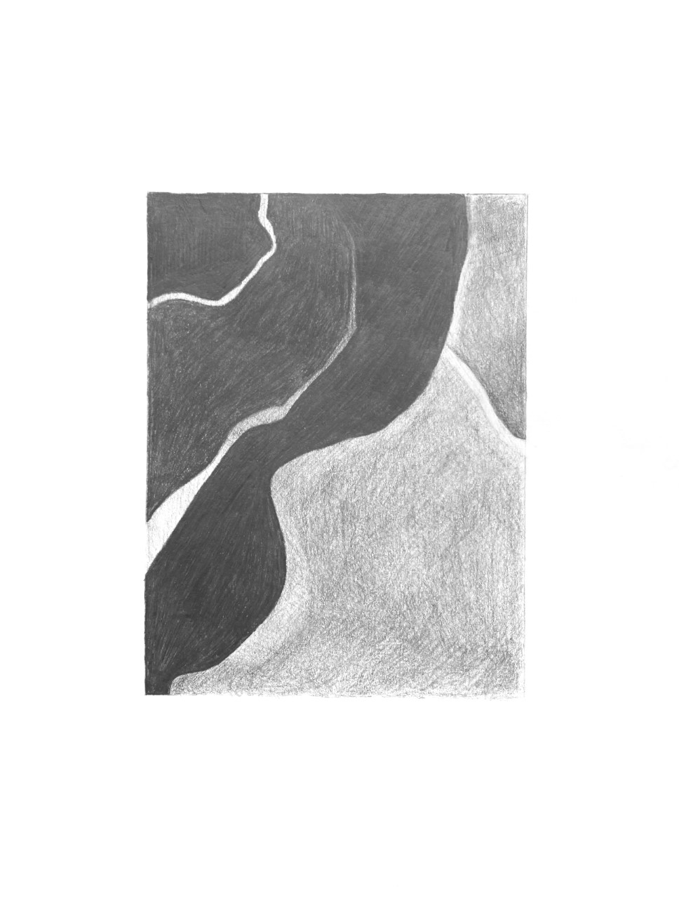
 Good, but the mid-tones in the right half should be altogether darker. Try hatching at a slightly different angle as well to avoid that mottled look. The upper right corner is significantly darker; although this might be glare–I notice the dark areas on the left also get lighter along the top, when they should be the same as the other darks on that side. The lower white stripe, especially as it approaches the left edge is also darker–not nearly the value of the paper as it is here.