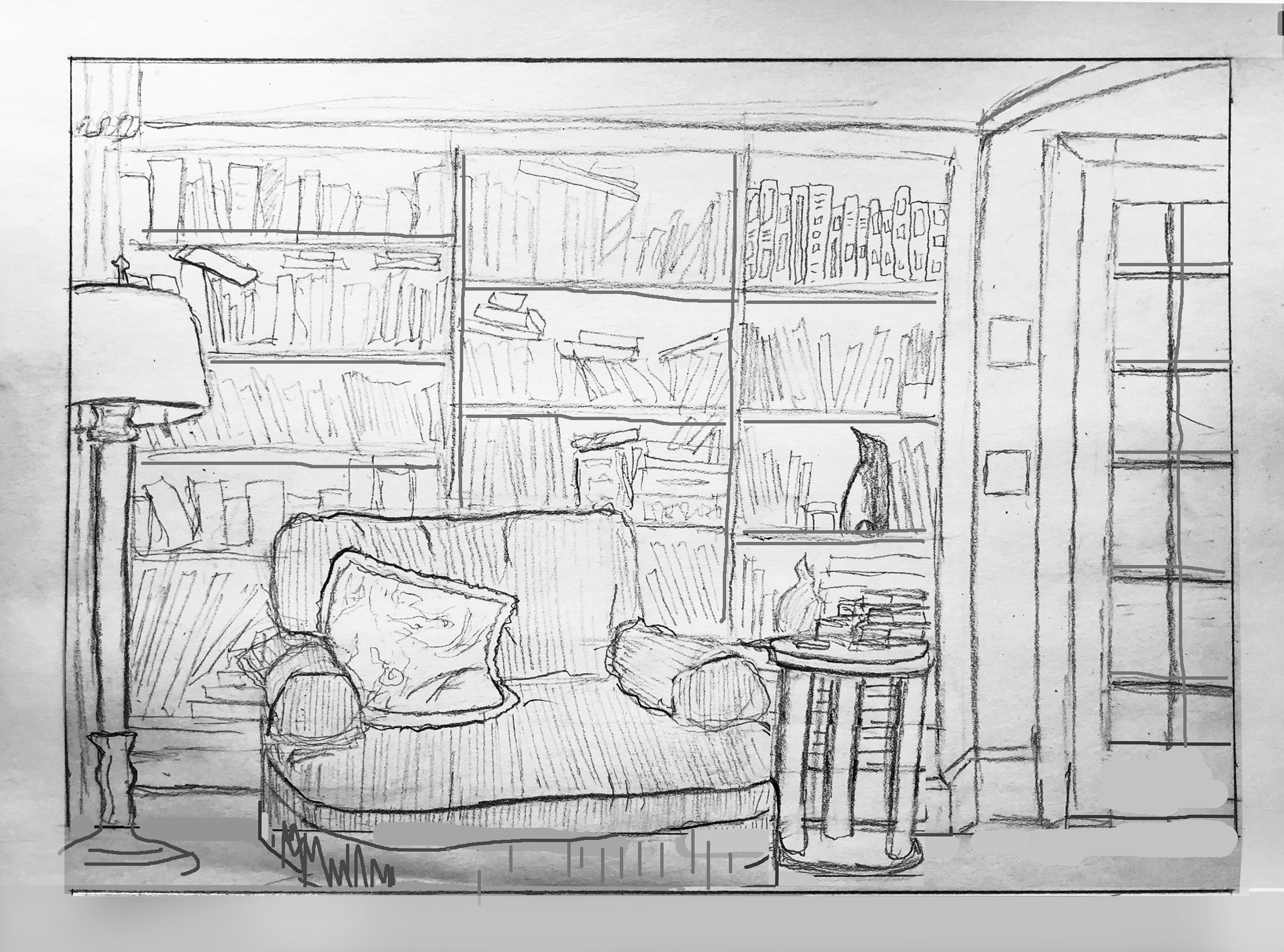
I’ve made some adjustments in Photoshop to show you how the following suggestions would look.
Notes:
Opening up the foreground just a bit more gives a better foundation for the furniture and bookcase and gives the viewer a visual “foothold” in the space.
Bookshelves aren’t paper thin–showing their dimension helps to divide and articulate the space, strengthen the character of the room, and make it more convincing. Likewise the mullions on the French door.
The base of the side table needs to be lower than the baseboard–otherwise it appears to be floating.
Making the base of the side table tangent to the bottom edge inhibits the perception of space; neither in nor out of the picture.
In yours, the bottom of the French door extends well beyond the bottom of the door opening. By correcting it it moves back in space, more unified with the plane of the bookcase.
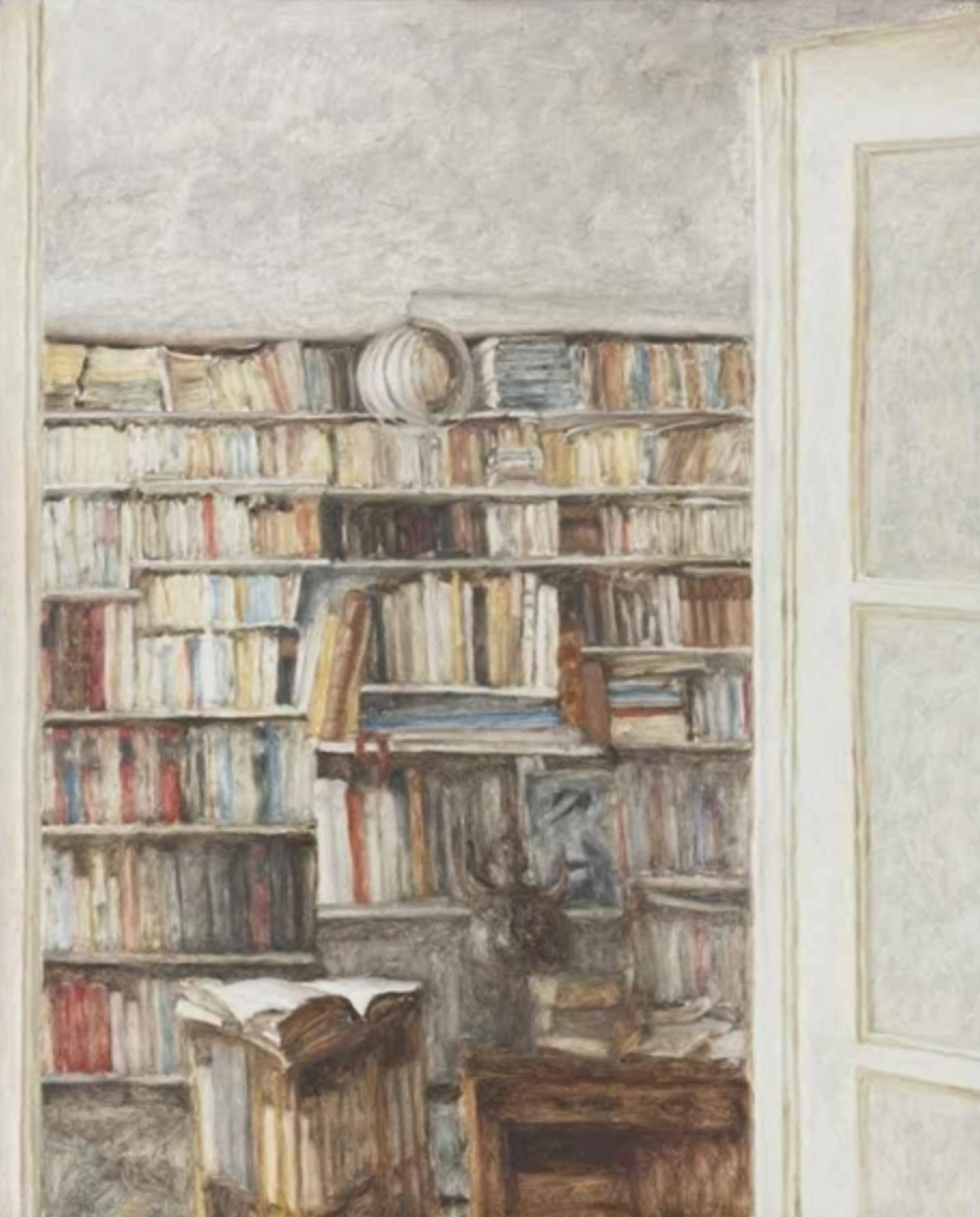 Avigdor Arikha, Books, 1977, Oil on canvas, 39.5 x 31.75 inches
A similar composition by Avigdor Arika (1929-2010). You’ll note he also crops out the floor, but he does it a little higher so that its more decisive and not teetering on a tipping point (i.e., is it in or is it out?). Note too the slight angle of the French door (which happens to be more in the foreground than yours) to urge the eye into the scene. You do this nicely with the top of the door frame in the upper right, but better had it been drawn without a bow in it–oh, unless it’s an arched door opening, in which case that could be more convincing as well.
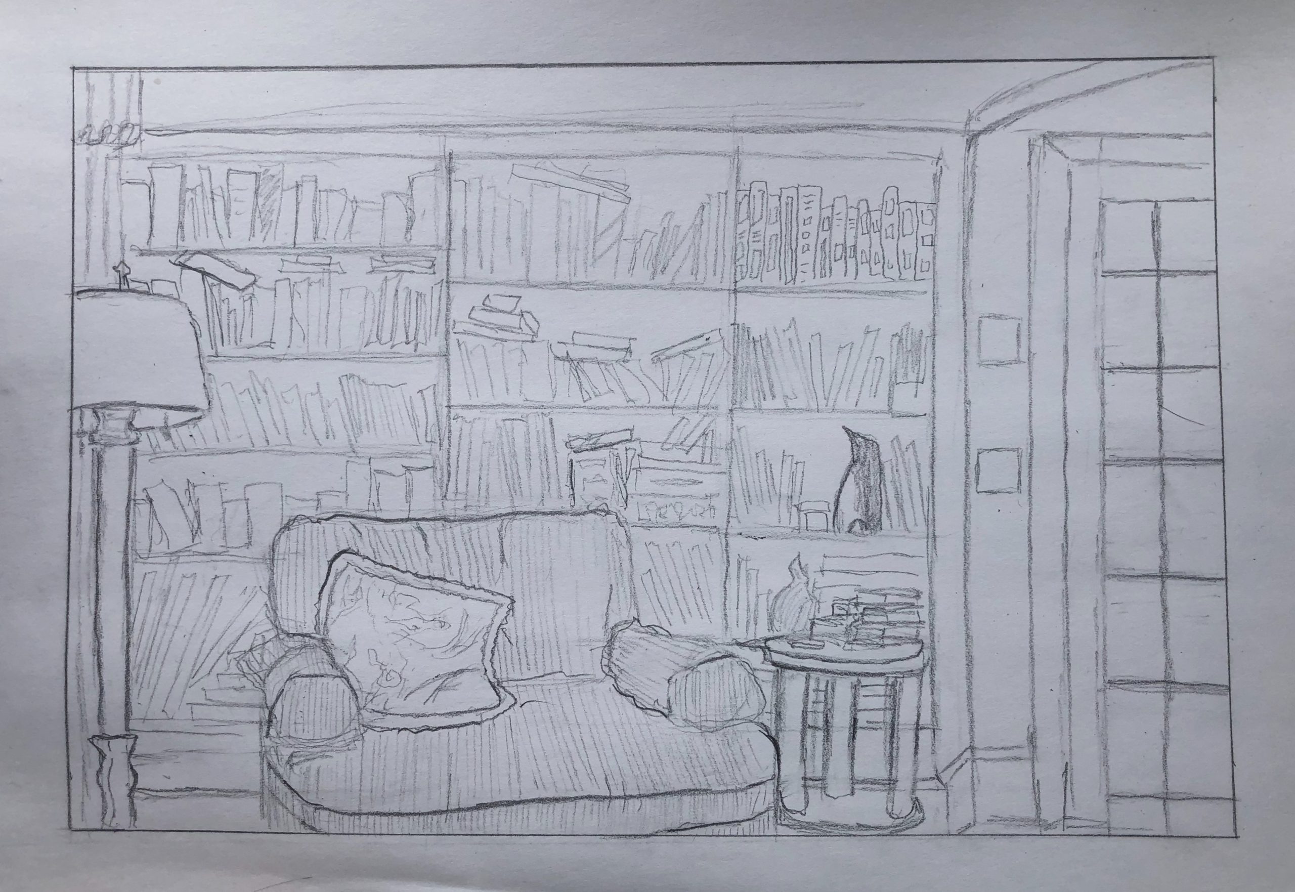
Choosing the spot that I wanted to draw was more difficult for me than I thought it was going to be. I wanted to showcase a place with lots of details, but I also knew that I didn’t want to overwhelm myself with the proportions and nuances of man made items. I ended up choosing this book case and door frame because it seemed to add just enough structure to allow myself to be comfortable, but it also provided lots of interesting details and angles which made the project fun. One this that I really ended up enjoying was the corduroy texture of the chair. It made it easy to indicate in which directions the chair was receding, and in what places there were wrinkles or bends.
I really feel like this drawing accomplishes the goal of telling a lot with a little. I can REALLY feel how squishy that couch is. I can see that you used the technique of making lines closer to you darker and those farther away lighter. I do think that this could be done a little more seamlessly, and some things that seemed to be equally far away had different line strength. Personally I found this harder myself with amore “sketchy” drawing, so I still think you did a pretty good job with that 🙂
I really liked how everything in your drawing seemed used but not neglected. Looking at your picture I felt that the use of the object was being portrayed more than the object which was refreshing take on the still life we’ve done in the past involving cups that would never be drank out of and vases that’d never have flowers. I really liked the lamp on the left side of your drawing. The lamp shade is a little bit crooked and the whole object is leaning slightly into the picture as if the light has just been pulled. The slightly off legs of the lamp give the lamp a sense of movement. I second everything Grace and Professor said about the books and the couch. I feel like a lot of what we’ve drawn is art that is awaiting a viewer and this drawing was more like a set awaiting an actor, which I found a lot more interesting.
Love this composition, Grace, especially “framing” the bookcase with the lamp and the French door. The bottom edge is more problematic, however, as per my notes above. That space feels too pinched and awkwardly cropped.
I agree with Grace about the believability of the sofa, but its line weights should be a degree darker than the side table rather than visa versa. Likewise, the line weights in the book case are a bit too hesitant and understated. They’re the main subject, after all, and your graphic style starts to “mumble” when you get to that part, and even moreso as you go up.
You might have been getting bored or impatient as you went (it looks that way) but like actors, musicians, writers, and dancers–anyone, really–you can’t let it show.
Love how attentive you were to the unique contents of each shelf–that gentle kind of clutter adds a lot of warmth and domesticity to the drawing.
Your drawing reminds me of the work of one of my favorite painters, Avigdor Arikha (1929-2010), which I’ve added above.
A good drawing but it needs a little more TLC to realize its full potential.