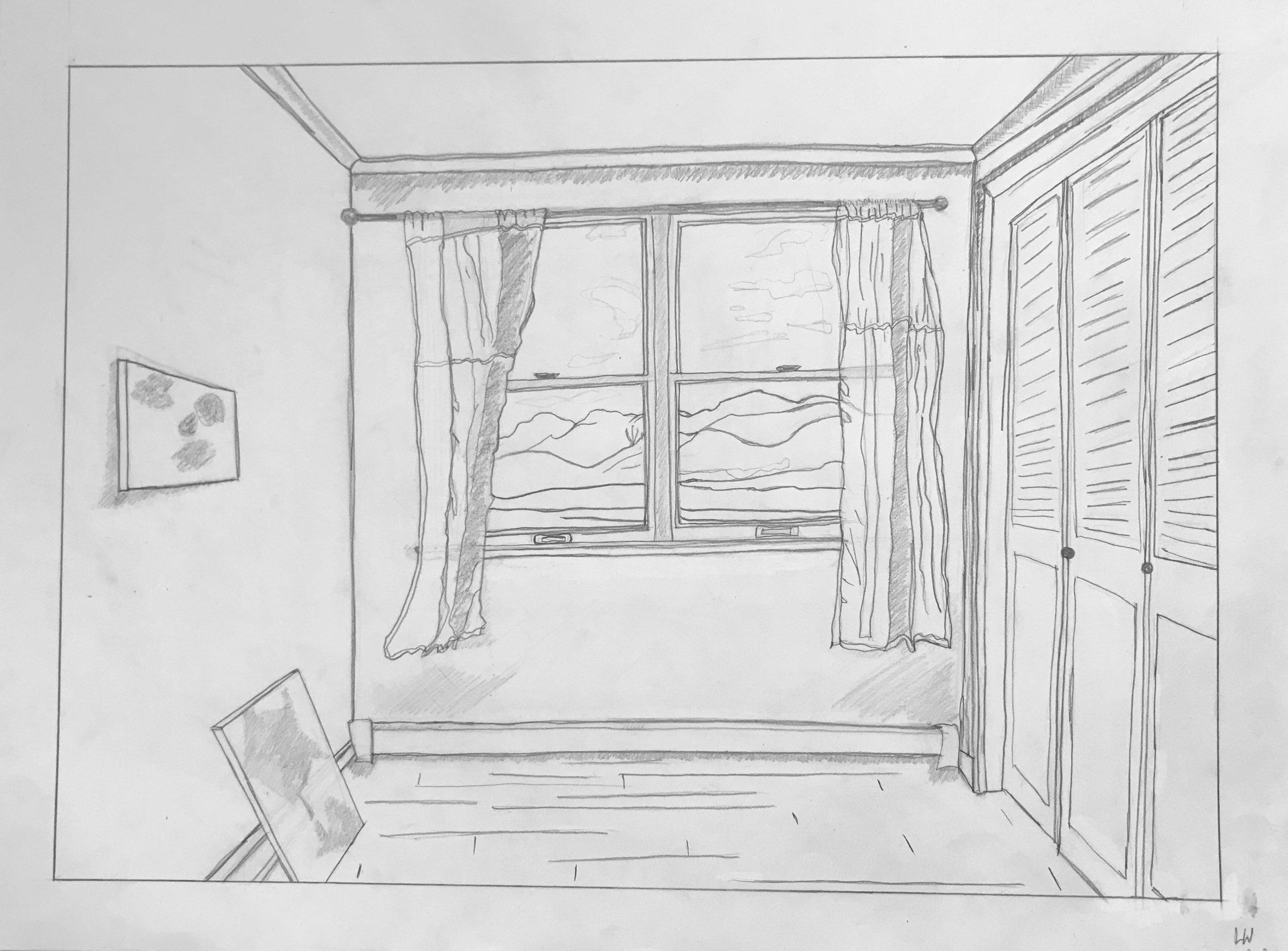
This is the view from my bedroom window. The area that I live in is defined by these mountains, and I feel that the nature around me is more important than any architecture or man-made structure in my town. I found this project a little challenging, mostly because I struggled with choosing an image to depict and a style to do it in. It made me think about what most defines my home to me, and how I could ever depict that. I wanted to try experimenting with value and more ‘expressive’ or scribbly styles, and looking back I think it would have been better if I had stuck with one distinct style. I enjoyed experimenting with different versions of the drawing, though, and liked spending time drawing my space.
I love how delicate this drawing is. The lines are thin and wavy in a lot of places; it makes it feel like there’s some movement and liveliness. I would have to say my favorite part of this piece is the curtains. I love that little detail on the right curtain where you can still see some of the muted line of the mountain through the fabric. I feel like the piece could benefit from some variety in line weight to really bring those curtains forward from the window or enhance its surroundings. However, I also really enjoy the softness of the drawing as it is so perhaps that is more of a stylistic choice.
I love the location you chose for the drawing. The openness in front of you and the mountains as the only sign of life in the background really speaks of our reality during these times. The curtains are very nicely incorporated into this drawing, and their asymmetry enhances your composition, however it does appear to be a bit barren on that left side making the drawing appear a bit weighted to the right. Maybe add some shading or increased line weight to the mountains if you want to highlight their importance to full detail. Overall, very well done on crafting an enjoyable piece to gaze at.
My apologies for the slow turnaround on this comment. Getting this week’s assignment out eclipsed my time for comments–just catching up.
Good to see your responses to the suggestions we talked about, but I might still wish the verticals and horizontals were more true–the better to frame and contrast lovely details like the curtains and the landscape. The room wants to be as neutral as possible (normative) to act as a foil to those other elements.
Stylistically the drawing falls between categories–too developed for a sketch but too under-developed for a finished drawing. It seems tentative, in other words. Shading begins to appear but doesn’t follow through; the windows and drapes are wonderfully detailed but the louvers on the closet doors are drawn impatiently.
Expressively, this casts a distinctive mood–you’ll recall I compared it to an Edward Hopper painting–but if I hadn’t read your comments I would think this was moving day. Maybe moving in but more of a feeling of moving out. It’s unusual to have a room without a stick of furniture, and my sense is the closets are empty behind those doors.
A painting on the wall but another one resting on the floor also suggest transience, especially in contrast to those timeless mountains (reminding me of a wonderful short story by Jorge Luis Borges, called “The God’s Script)–all of which is poetically beautiful to this viewer but I’m not sure that’s what you’re seeing or intending.
Above all, the drawing, though not bad, would benefit from much greater conviction in its mark-making and structure.
This is the view from my bedroom window. The area that I live in is defined by these mountains, and I feel that the nature around me is more important than any architecture or man-made structure in my town. I found this project a little challenging, mostly because I struggled with choosing an image to depict and a style to do it in. It made me think about what most defines my home to me, and how I could ever depict that. I wanted to try experimenting with value and more ‘expressive’ or scribbly styles, and looking back I think it would have been better if I had stuck with one distinct style. I enjoyed experimenting with different versions of the drawing, though, and liked spending time drawing my space.
I love how delicate this drawing is. The lines are thin and wavy in a lot of places; it makes it feel like there’s some movement and liveliness. I would have to say my favorite part of this piece is the curtains. I love that little detail on the right curtain where you can still see some of the muted line of the mountain through the fabric. I feel like the piece could benefit from some variety in line weight to really bring those curtains forward from the window or enhance its surroundings. However, I also really enjoy the softness of the drawing as it is so perhaps that is more of a stylistic choice.
I love the location you chose for the drawing. The openness in front of you and the mountains as the only sign of life in the background really speaks of our reality during these times. The curtains are very nicely incorporated into this drawing, and their asymmetry enhances your composition, however it does appear to be a bit barren on that left side making the drawing appear a bit weighted to the right. Maybe add some shading or increased line weight to the mountains if you want to highlight their importance to full detail. Overall, very well done on crafting an enjoyable piece to gaze at.
Hi Lily,
My apologies for the slow turnaround on this comment. Getting this week’s assignment out eclipsed my time for comments–just catching up.
Good to see your responses to the suggestions we talked about, but I might still wish the verticals and horizontals were more true–the better to frame and contrast lovely details like the curtains and the landscape. The room wants to be as neutral as possible (normative) to act as a foil to those other elements.
Stylistically the drawing falls between categories–too developed for a sketch but too under-developed for a finished drawing. It seems tentative, in other words. Shading begins to appear but doesn’t follow through; the windows and drapes are wonderfully detailed but the louvers on the closet doors are drawn impatiently.
Expressively, this casts a distinctive mood–you’ll recall I compared it to an Edward Hopper painting–but if I hadn’t read your comments I would think this was moving day. Maybe moving in but more of a feeling of moving out. It’s unusual to have a room without a stick of furniture, and my sense is the closets are empty behind those doors.
A painting on the wall but another one resting on the floor also suggest transience, especially in contrast to those timeless mountains (reminding me of a wonderful short story by Jorge Luis Borges, called “The God’s Script)–all of which is poetically beautiful to this viewer but I’m not sure that’s what you’re seeing or intending.
Above all, the drawing, though not bad, would benefit from much greater conviction in its mark-making and structure.