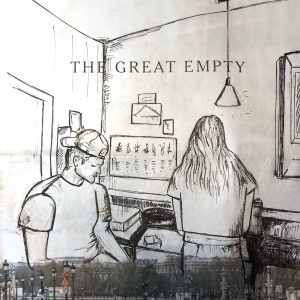
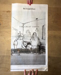
After looking at the powerpoint, I really liked the idea of drawing on a material besides a blank piece of paper. I thought that newspapers dictating current events would make an interesting backdrop for my smaller, current state. The newspaper I chose was from the Sunday Times, showing a blank street in Paris, and although Paris is not exactly relevant to me, the isolation and emptiness is extremely relatable to everyone. I felt that the open background gave me the space to draw my brother and sister washing and drying the dishes – a common chore, especially now that we are all home. The three of us have not been in a common space for this long in a long time, so it is an adjustment as we all try to find our space but also celebrate the time we have together. I used pen because I thought it would make the most striking marks on the newspaper – however, when editing, I found it a little difficult to show the exact gradient of the image as it was not white. I hope the two photos give a look of both the detail but also the complete image.
This is a really cool, creative drawing. It fits very naturally into the newspaper and also the theme you’re expressing here–emptiness and togetherness– is especially apparent with the juxtaposition of your drawing and the newspaper headline and photo. I also really love how you don’t overdo the shading with your pen. There are only a few very dark spots which make sense in the context of the composition as a whole, and your pen lines are nice and loose. I think the only thing that seems a little off is the line weight in a couple spots, for example your brother’s sleeves. His left shoulder seems somewhat distorted because of the line weight, and a couple lines on his shirt might be too dark. However, I really don’t think this takes anything away from the overall composition.
I think this might be my favorite. I really love how you chose to draw on this newspaper instead of a blank page. The composition is really great and even disappears and merges into the actual image on the newspaper. I also love the interpretation and juxtaposition of the “great empty” vs the busy kitchen. Although the streets may be empty, households are now full. My only suggestion is to play around with value more to define your siblings and the space past the door frame- I wonder what it would look like if the other room was filled in and could ground the piece a little more.
Good for you for approaching this so creatively and stepping up to the opportunity that our examples suggested. Also a great choice from the newspaper–not many pages are that blank. And good drawing as well.
I’m not as convinced, however, that this is the most effective image you could have chosen. Until I was told it was your brother and sister and that you were intending to contrast your newly crowded household with the wording (the great empty vs. a full house), I was looking for meaning elsewhere.
Not knowing they were brother and sister I assumed they were a young couple and things weren’t going all that well between them. They’re working side by side but seem to be oblivious to one another, her back to him and his eyes turned downward. I assumed “the great empty” referred to the great emptiness in their relationship.
It also took me a minute to register that they were doing dishes but what this has to do with Paris or your sense of place this week was lost on me. I wondered if that was you, for instance, but lacking any other clues drew a blank.
Formally, this composition also turns them into giants, either literally or figuratively, looming over the Paris skyline (purposefully kept low in that part of town, BTW, so as not to compete with the Eiffel Tower). His gaze downward seems to be fixed on something in the photo, down in the street….
Again, another red herring (meaningless clue).
In short, your intended meaning only makes sense if you cue the viewer into your intentions for the piece.
You’ve done a great job here for your first outing into this kind of image making, but the tension and the production of new meanings by playing an image against the existing image and the wording could be heightened quite a bit further.
Curious if you had other candidates for your image, or–having read this–if you do now. Let me know. I’ve got a suggestion but I want to hear yours first.
Formally, I think this might also work better if your drawing didn’t have so much closure. Partial imagery or areas that fade from view would let the ground (the newspaper) breathe through more, and suggest something closer to memory or a dream or a vision rather than one concrete image meeting another.
Mark
PS / Be sure on the Add Media page, in Blackboard, after your image appears in the queue, to scroll down on the right until you come to “Attachment Display Settings,” and activate the “Media File.” This will enable us to click on the image and make it larger, for a better look.
After looking at the powerpoint, I really liked the idea of drawing on a material besides a blank piece of paper. I thought that newspapers dictating current events would make an interesting backdrop for my smaller, current state. The newspaper I chose was from the Sunday Times, showing a blank street in Paris, and although Paris is not exactly relevant to me, the isolation and emptiness is extremely relatable to everyone. I felt that the open background gave me the space to draw my brother and sister washing and drying the dishes – a common chore, especially now that we are all home. The three of us have not been in a common space for this long in a long time, so it is an adjustment as we all try to find our space but also celebrate the time we have together. I used pen because I thought it would make the most striking marks on the newspaper – however, when editing, I found it a little difficult to show the exact gradient of the image as it was not white. I hope the two photos give a look of both the detail but also the complete image.
This is a really cool, creative drawing. It fits very naturally into the newspaper and also the theme you’re expressing here–emptiness and togetherness– is especially apparent with the juxtaposition of your drawing and the newspaper headline and photo. I also really love how you don’t overdo the shading with your pen. There are only a few very dark spots which make sense in the context of the composition as a whole, and your pen lines are nice and loose. I think the only thing that seems a little off is the line weight in a couple spots, for example your brother’s sleeves. His left shoulder seems somewhat distorted because of the line weight, and a couple lines on his shirt might be too dark. However, I really don’t think this takes anything away from the overall composition.
I think this might be my favorite. I really love how you chose to draw on this newspaper instead of a blank page. The composition is really great and even disappears and merges into the actual image on the newspaper. I also love the interpretation and juxtaposition of the “great empty” vs the busy kitchen. Although the streets may be empty, households are now full. My only suggestion is to play around with value more to define your siblings and the space past the door frame- I wonder what it would look like if the other room was filled in and could ground the piece a little more.
Hi Anika,
Good for you for approaching this so creatively and stepping up to the opportunity that our examples suggested. Also a great choice from the newspaper–not many pages are that blank. And good drawing as well.
I’m not as convinced, however, that this is the most effective image you could have chosen. Until I was told it was your brother and sister and that you were intending to contrast your newly crowded household with the wording (the great empty vs. a full house), I was looking for meaning elsewhere.
Not knowing they were brother and sister I assumed they were a young couple and things weren’t going all that well between them. They’re working side by side but seem to be oblivious to one another, her back to him and his eyes turned downward. I assumed “the great empty” referred to the great emptiness in their relationship.
It also took me a minute to register that they were doing dishes but what this has to do with Paris or your sense of place this week was lost on me. I wondered if that was you, for instance, but lacking any other clues drew a blank.
Formally, this composition also turns them into giants, either literally or figuratively, looming over the Paris skyline (purposefully kept low in that part of town, BTW, so as not to compete with the Eiffel Tower). His gaze downward seems to be fixed on something in the photo, down in the street….
Again, another red herring (meaningless clue).
In short, your intended meaning only makes sense if you cue the viewer into your intentions for the piece.
You’ve done a great job here for your first outing into this kind of image making, but the tension and the production of new meanings by playing an image against the existing image and the wording could be heightened quite a bit further.
Curious if you had other candidates for your image, or–having read this–if you do now. Let me know. I’ve got a suggestion but I want to hear yours first.
Formally, I think this might also work better if your drawing didn’t have so much closure. Partial imagery or areas that fade from view would let the ground (the newspaper) breathe through more, and suggest something closer to memory or a dream or a vision rather than one concrete image meeting another.
Mark
PS / Be sure on the Add Media page, in Blackboard, after your image appears in the queue, to scroll down on the right until you come to “Attachment Display Settings,” and activate the “Media File.” This will enable us to click on the image and make it larger, for a better look.