Photographer Meggan Gould’s photo series of white boards….
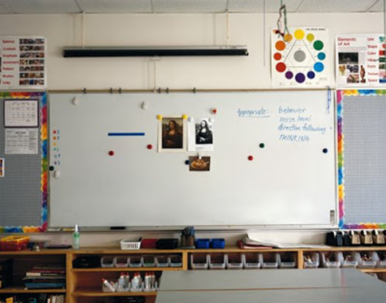
….computer desk tops….
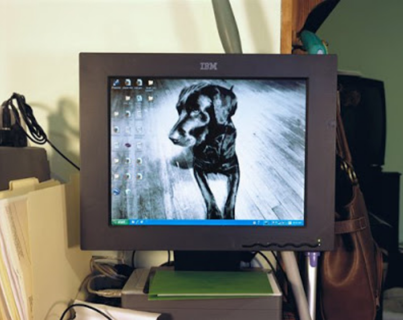
…and the finger marks on iPad screens, independent of any image on the screen.
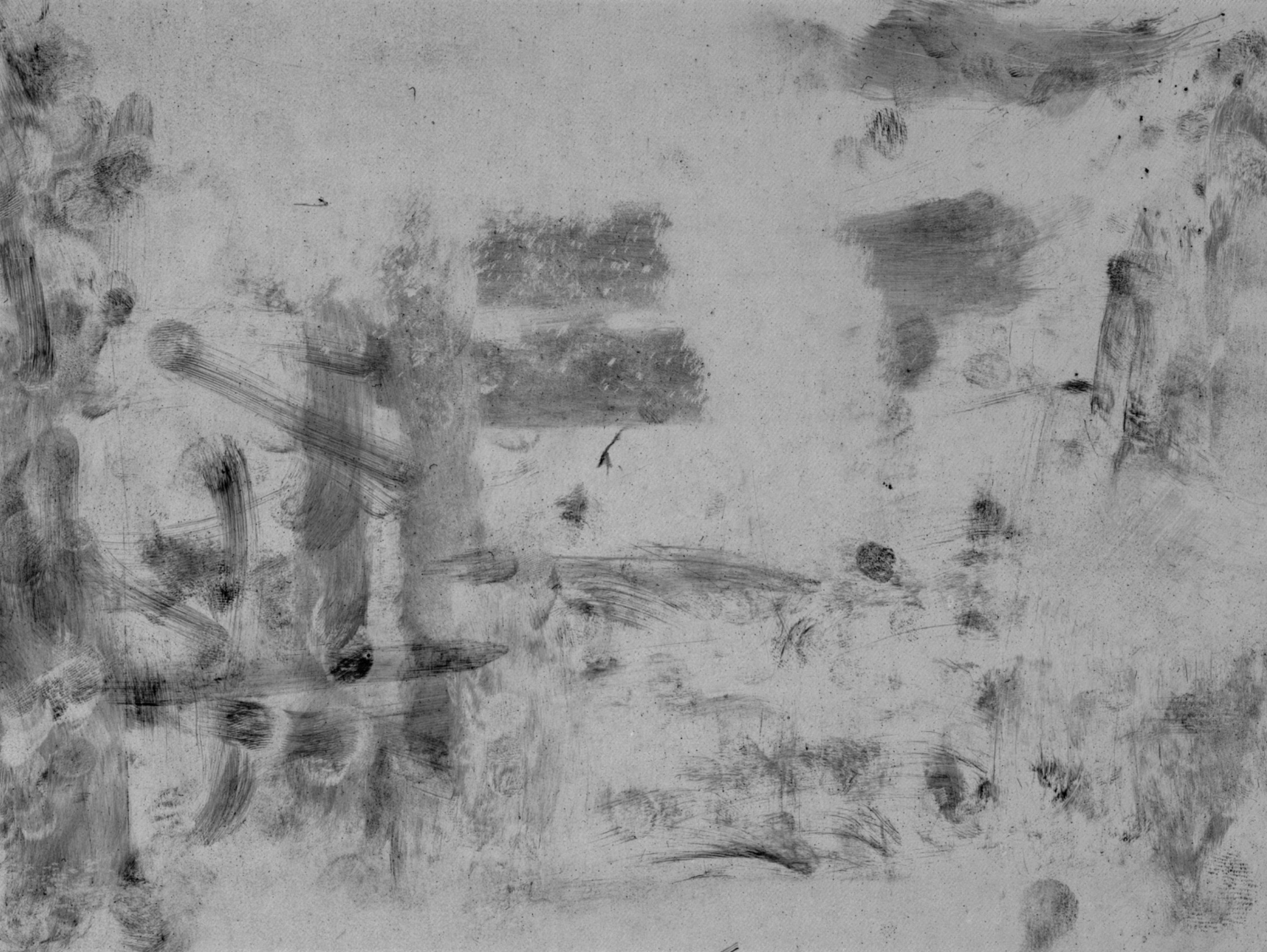
 Avigdor Arikha
 Roz Chast
Professor Mark Wethli – Spring 2020
Photographer Meggan Gould’s photo series of white boards….
….computer desk tops….
…and the finger marks on iPad screens, independent of any image on the screen.
Avigdor Arikha
Roz Chast
You must be logged in to post a comment.
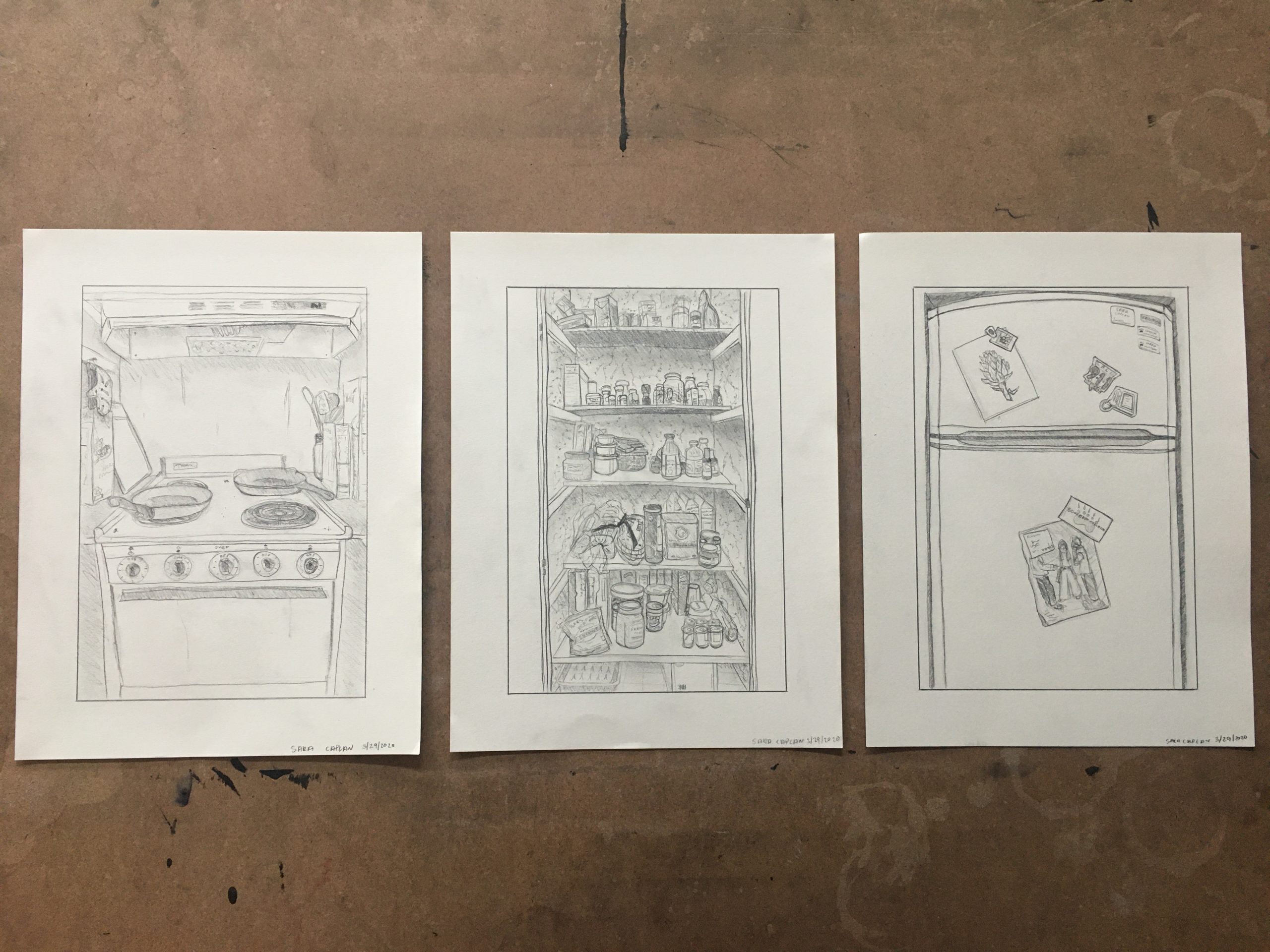
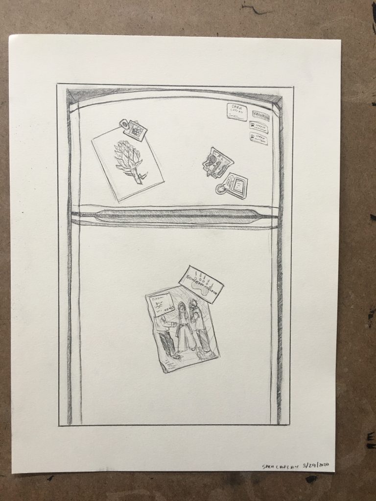
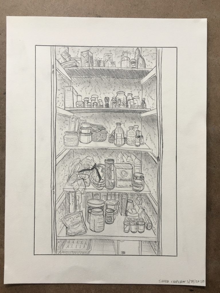
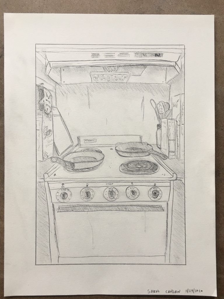
These days I spend most of my time in my kitchen and over the past few weeks I have grown to love the space. Despite the fact that my kitchen can only fit one person at a time, cooking and baking in this small space has brought me some joy in this hectic and heartbreaking time. So, I wanted to honor my tiny little minuscule kitchen with a triptych of its three major sections. (It was also fun getting to draw a tiny version of our articoke project.)
I am so happy to hear that your time in the kitchen has brought so much joy! I also have a tiny kitchen that I appreciate quite a lot. I really admire your use of shading to denote light and shadowed spaces and the wonderful attention to perspective that makes me feel as if I am looking at each scene from straight on and really taking part in the scene (ie. An effective composition!). I might suggest that you try increasing the contrast between your lightest and darkest lines to make the objects in the foreground pop even more! I feel like this was very successful in the inner refrigerator image and would love to see more of it, especially in the details of the stove. P.S. love the artichoke.
Sara! These are really fun. I think you communicate the vibe of your kitchen well. Even though it may be small, it has character, and that comes across in all of the little details you’ve included. The artichoke is a nice touch but so are all of the jars and cans in the second drawing. I think the third one may be my favorite, and in my opinion, the strongest. There’s a really effective use of contrast that helps balance out all of the tones. Where the fridge is too light, the closet is too dark, but the stove is just right. There’s a healthy amount of light spaces on the stove and the back wall which are balanced by darker areas on the stovetop and the surrounding cutlery. I think the perspective here is really strong. The lines aren’t straight, but I like that. It contributes to a sense of expression and urgency. It feels more honest to the energy of your kitchen. Your kitchen feels like an active space, and your drawing feels like an active drawing.
Great job, Sara, and good comments from Devon and Nat.
My first instinct looking at these would be to take any one of them (probably the pantry or the stove top) and draw the living shit out of them (a technical expression we use in the art field). In other words, all great, but once you’ve brought our attention in this close, even better if you reward it with even richer detail.
I might say these are the sketches for what promises to be an amazing longer term drawing (not suggesting that should have happened here—more of a complement that this is an idea “with legs”).
The refrigerator door reminds me of a series of photos by Meggan Gould, who used to teach here, of people’s white boards, computer desk tops, and iPad screens, above. Like her, I like the way you’ve filled the drawing with the image, creating a closer identification between the drawing and its subject.
Painter Avigdor Arika does something like this as well (see above).
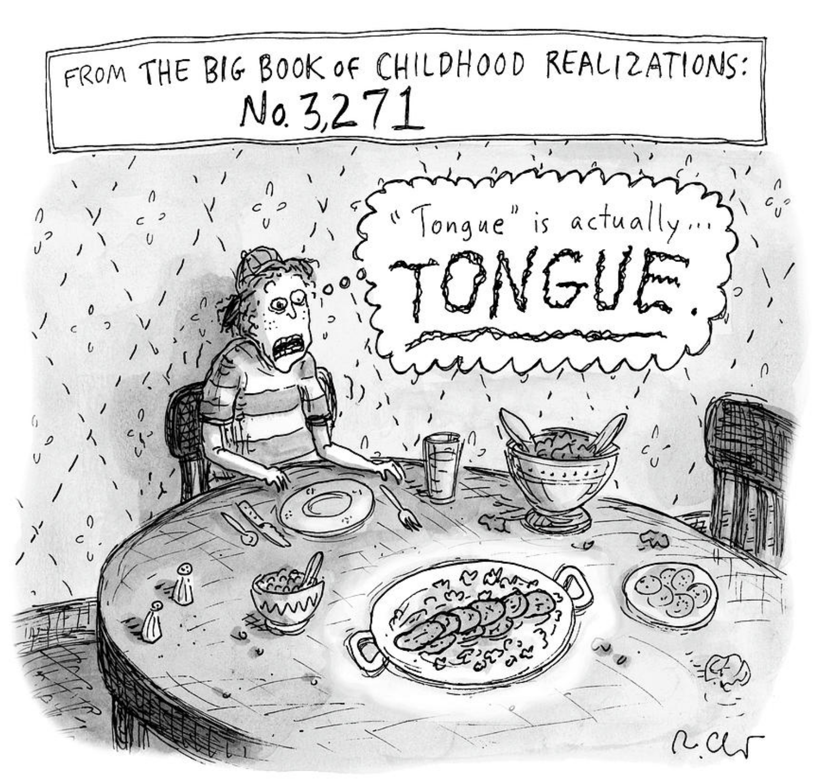
Like Nat, I like the slightly irregular and tremulous quality to your lines, which remind me of the work of one my favorite cartoonists (although The New Yorker, where her work often appears, is insistent upon calling them drawings, much to my delight), Roz Chast. It makes me wonder if these would be better in pen, or a wicked sharp pencil.
At the same time, while these gain a certain intimacy I feel cut off from the feeling of the space in general. I welcome that little bit of downward perspective on the stove, which begins to let in a little bit of context (and air).
Nevertheless, a very sophisticated approach, not without a wry sense of humor—always welcome.