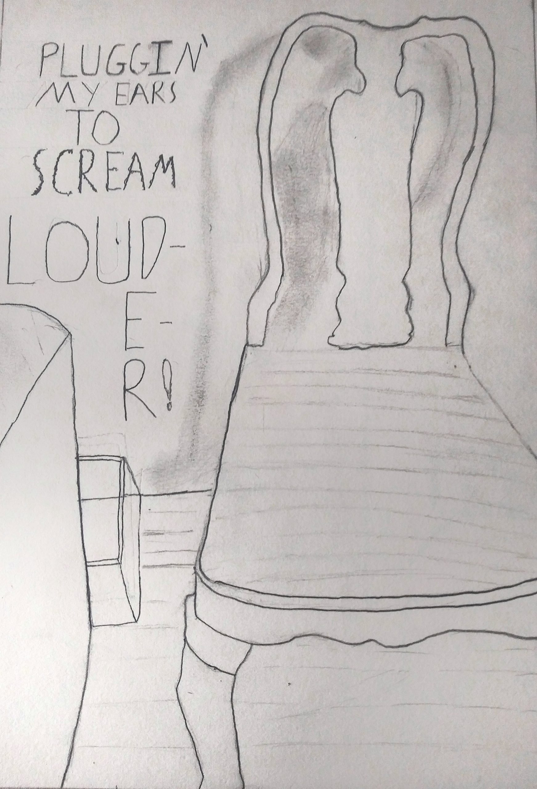
I reloaded this so that it could be opened larger with a click. Love that you included the text, which is like concrete poetry–poems whose graphic design contribute to their meaning, such as the word “louder” too big to fit in its space, spilling over twice to a new line. The contrast between this sentiment and the apparent calm and domesticity of the chair is very powerful. Great drawing.
Raymond Pettipon, another artist who uses text and image very effectively:
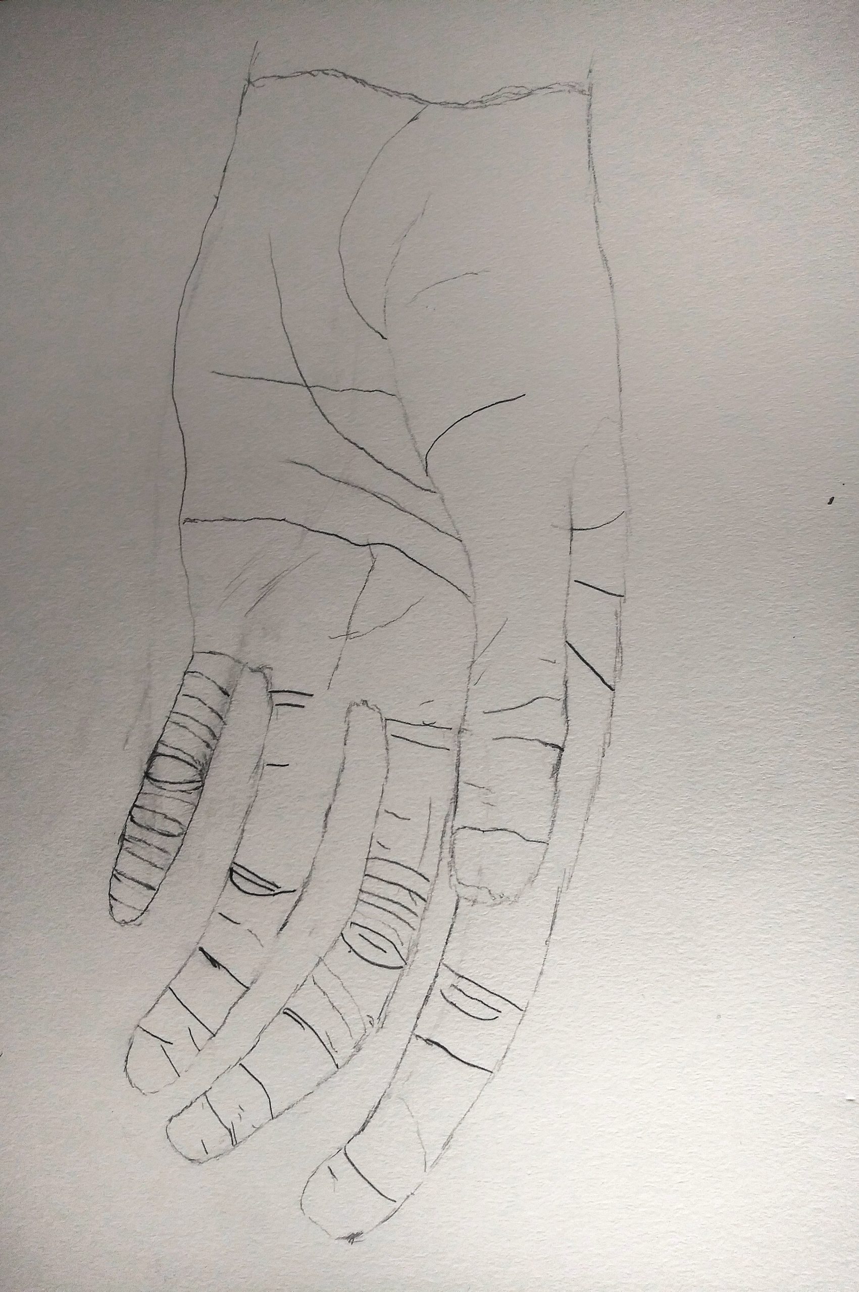
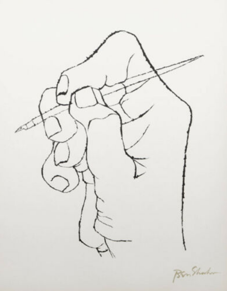
Very good drawing, but could be better still with a more forceful line quality. You’re being too circumspect, and your theory about the small finger doesn’t hold up. Better the thumb, to bring it closer. Some other examples:
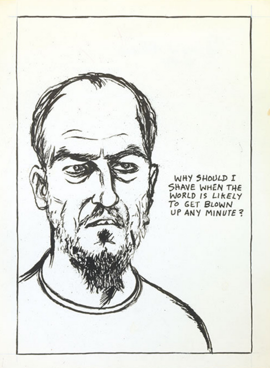
 Ben Shahn
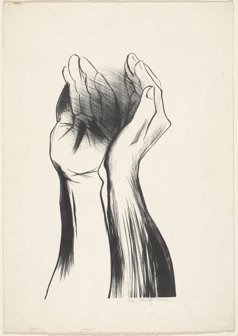
José Clemente Orozco
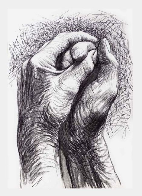
Henry Moore
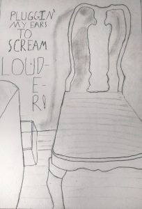
For the Drawing in place drawing I drew two pictures. The first was my left hand and the second was the chair next to the one I drew in. I picked my hand because I going home for meant spending a lot more time with myself. I also did a really bad job with the early drawing hand assignment and wanted to try again. For me, spending time with myself means becoming more aware of my strengths and weaknesses. I tried to use the same line weight for the actual lines on my hand and the contour lines to merge artistic practice and humanity. I’m not very confident in how it turned out, but I left my most ambitious attempt to do this on my pinkie and tried to reduce it across the page. For the chair I asked myself what place am I drawing and drew that place. I wrote some words cause the wall looked empty.
One thing I really like about your chair drawing is the shadow that is cast on the back wall. This seems to give the drawing much more dimension, and it reflects the actual shape of the chair really well I think. Although it totally seems like the chair and the shadow have completely different personalities. The chair is more structured and solid, while the shadow is borderless and seems to hint at where the light in the room is. One thing that I think could improve in the line quality in some areas. On the right side of the chair some of the lines look a little sketchy and could be solidified.I really like the way your hand drawing has been composed. The wrist coming from the top of the page is very interesting, and considering that this is a self-portrait of your own hand it’s unexpected! I think in this drawing there could be stronger more consistent line quality there as well.
I really like the use of text in this piece. I too think that it is really clever how “louder” gets too big for the line. I also get the impression that the drawing is quaking in a way from loudness because of how shakily geometric it is for lack of a better descriptor. Good work. I agree that line quality in some areas could be improved, and bits of the drawing could also be cleaned up, but all easy fixes.
Grace