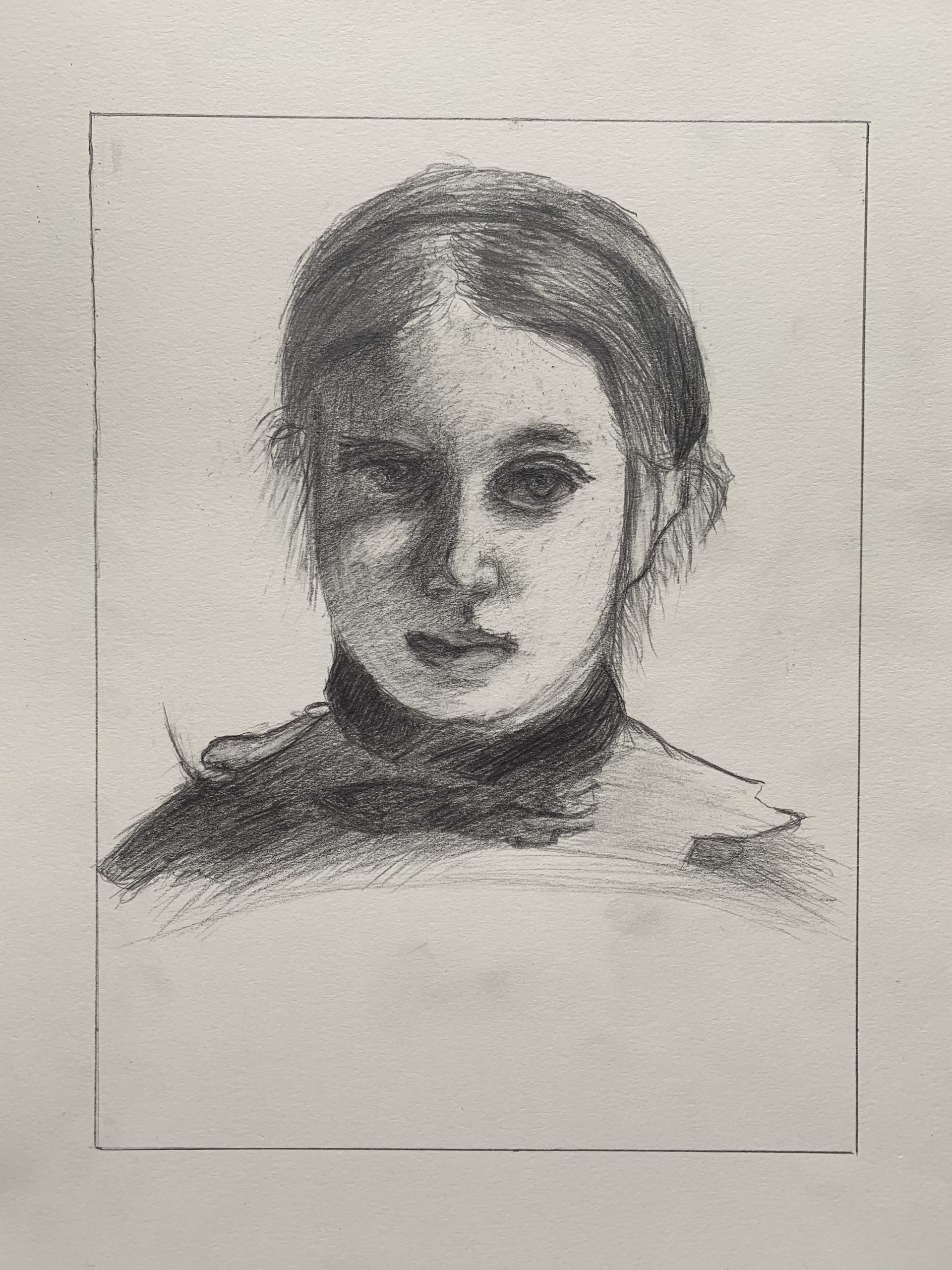
Beautiful drawing, Ian, and a very thorough exploration of the Degas. Curiously, like Ben’s treatment of the same image, your features are oversized. Also like his they’re nevertheless almost physiologically possible, but just a bit too large—those eyes could never fit in those sockets, but it’s a distortion that makes them very expressive. Also very well modeled.
One consequence is that that they take up more than their share of the face, so that the space between the nose and the ear, on our right, should be wider. This is also true because you made the head somewhat too narrow to begin with (the negative space on the left is too wide).
Great exploration of value and of Degas’ touch, including that reflected light on her upper lip. That tells me you were really looking. I commend you for not trying to show us more of the eye on the left than he did—it’s hidden in shadow. Allowing the “whites” of the eye to get the dark is a good example of overcoming a major preconception.
The light on her cheek on our left is a little too light; the shadow on the nostril on our right a little too dark; and the highlight on her lower lip a little too dark, but small matters—nicely done.
Good job on the hair as well, although you’ll notice the lines representing hair disappear in the highlight on his. Don’t be so dogged in reporting all the strands. Note how few of those lines he actually includes.
Good work–
I am pleased with my final drawing but I’m not certain that I captured all of the subtleties of the Degas original. I struggled with some of the facial shading which is clearly vital to the image as I feel that Degas really captured the personality of his subject with his use of shading. I enjoyed the assignment and its focus on accuracy but I also realized the challenge of such an intricate image. I first tried to get the proportions accurate by capturing the actual distances between the major facial features like the hairline, nose, and lips. I then tried to focus on the shading, as this was the more challenging aspect of the drawing. I struggled the most with making sure you couldn’t see the individual pencil strokes and creating a consistent texture and shading aesthetic.
I think you did a really good with this drawing, especially capturing the values on the left side of the face. The lips and the left side of the nose are shaded really well and capture the subtleties of Degas’ original. You also did a really good job with the eyebrows, which are very subtle since they’re actually pretty small. I think one issue with this version is that a few features appear to be slightly out of place or proportion. For example, the right eye seems to large (maybe because it’s emphasized by your shading) and the part in the subject’s hair seems too far to the left. I also think some of the hair around the ears could be refined a little more.