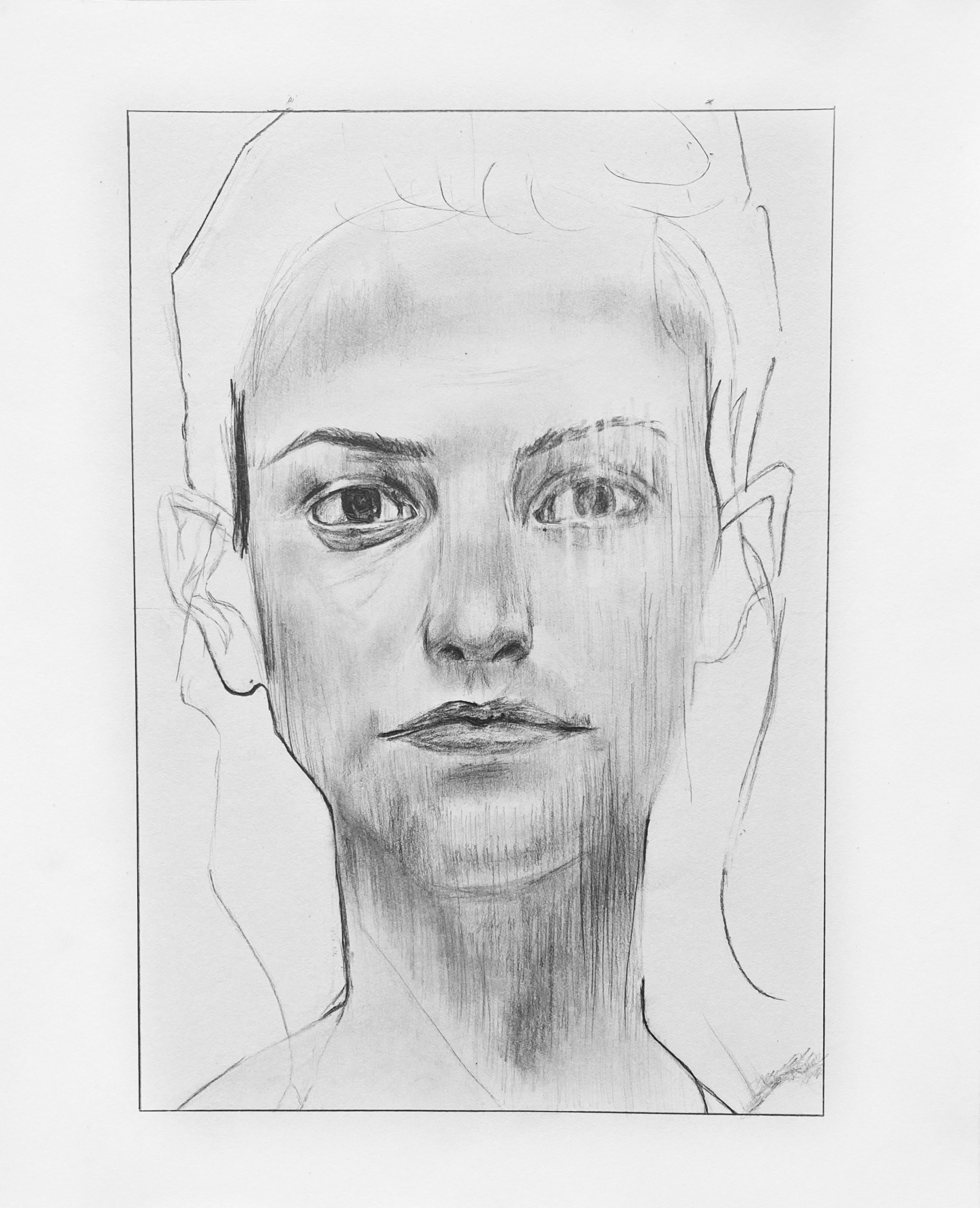
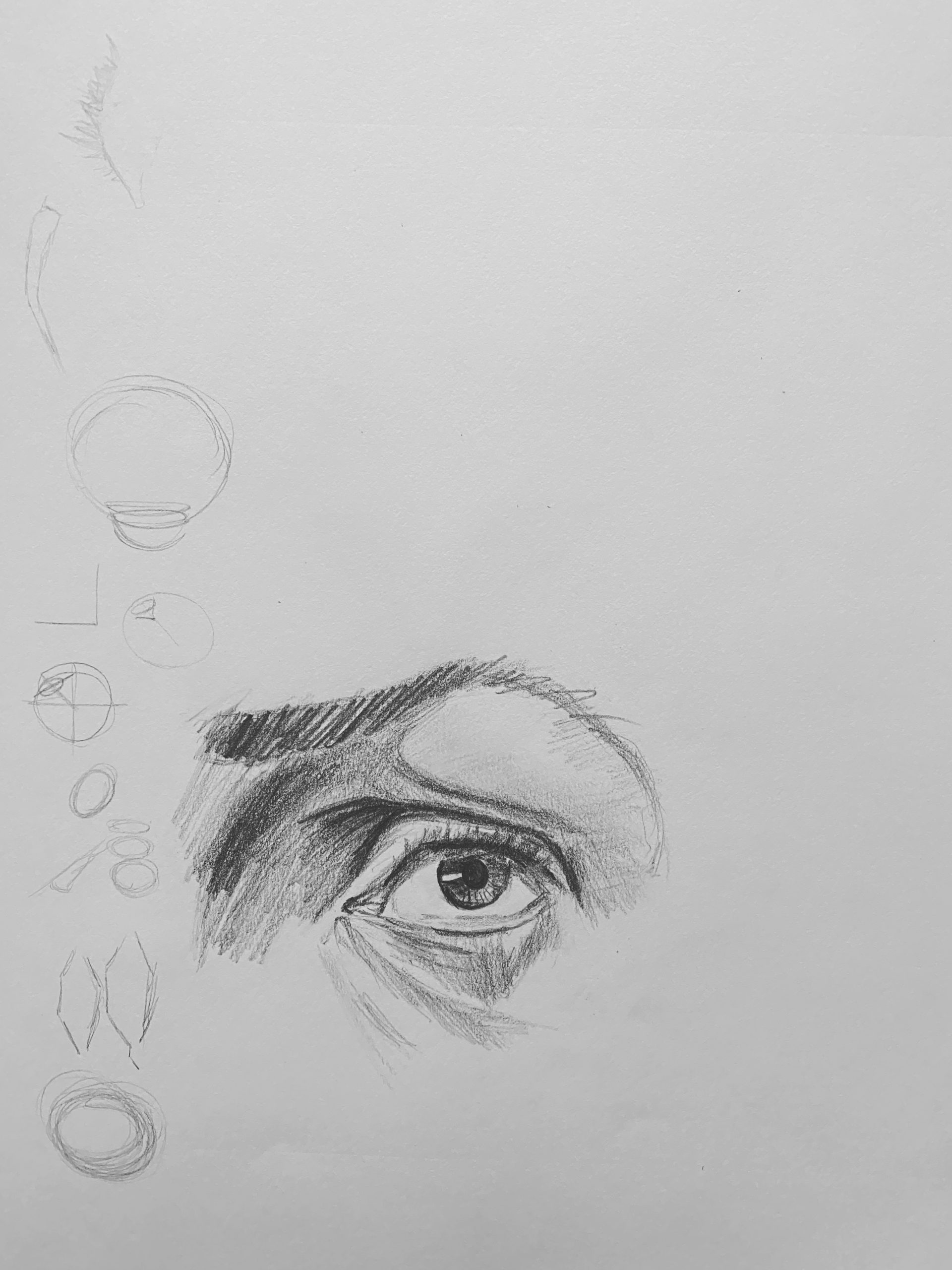
Excellent work, Aadhya. A very sensitive, confident, and subtle rendition of the original. Just a few notes:
The whites of her eyes on the left (our left) are not that light. They’re noticeably shaded in the original, along with every value in the eye socket, making that eye more mysterious.
Her upper lid on that eye is also a bit wider, lowered, and more relaxed–yours looks a bit startled.
The base of the nose should be a bit wider (look for it to be the width between the tear ducts, as it is in the original), and the modeling a bit softer.
The upper lip is fuller and more softly drawn (less sharply defined edges).
Great job–
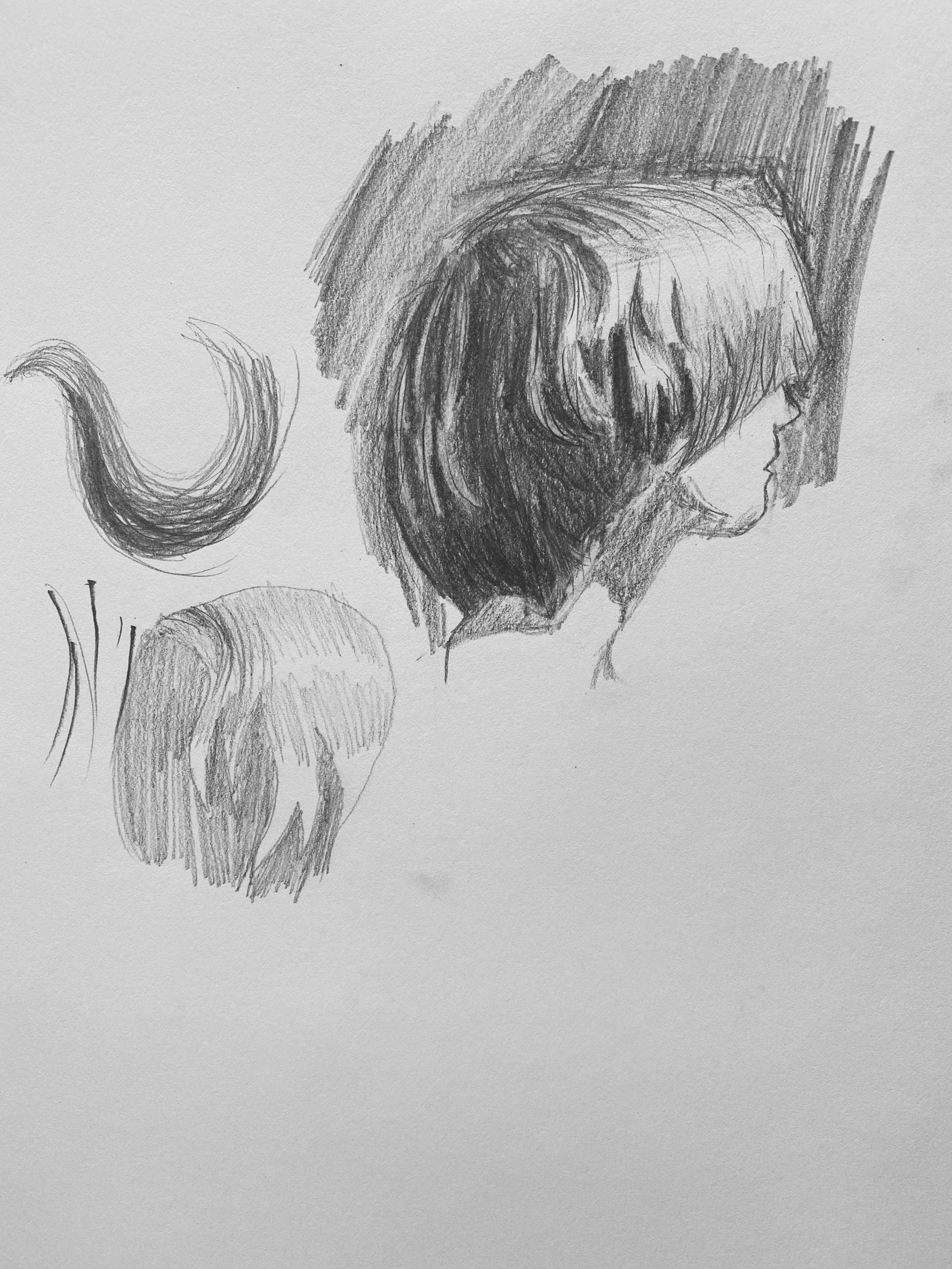
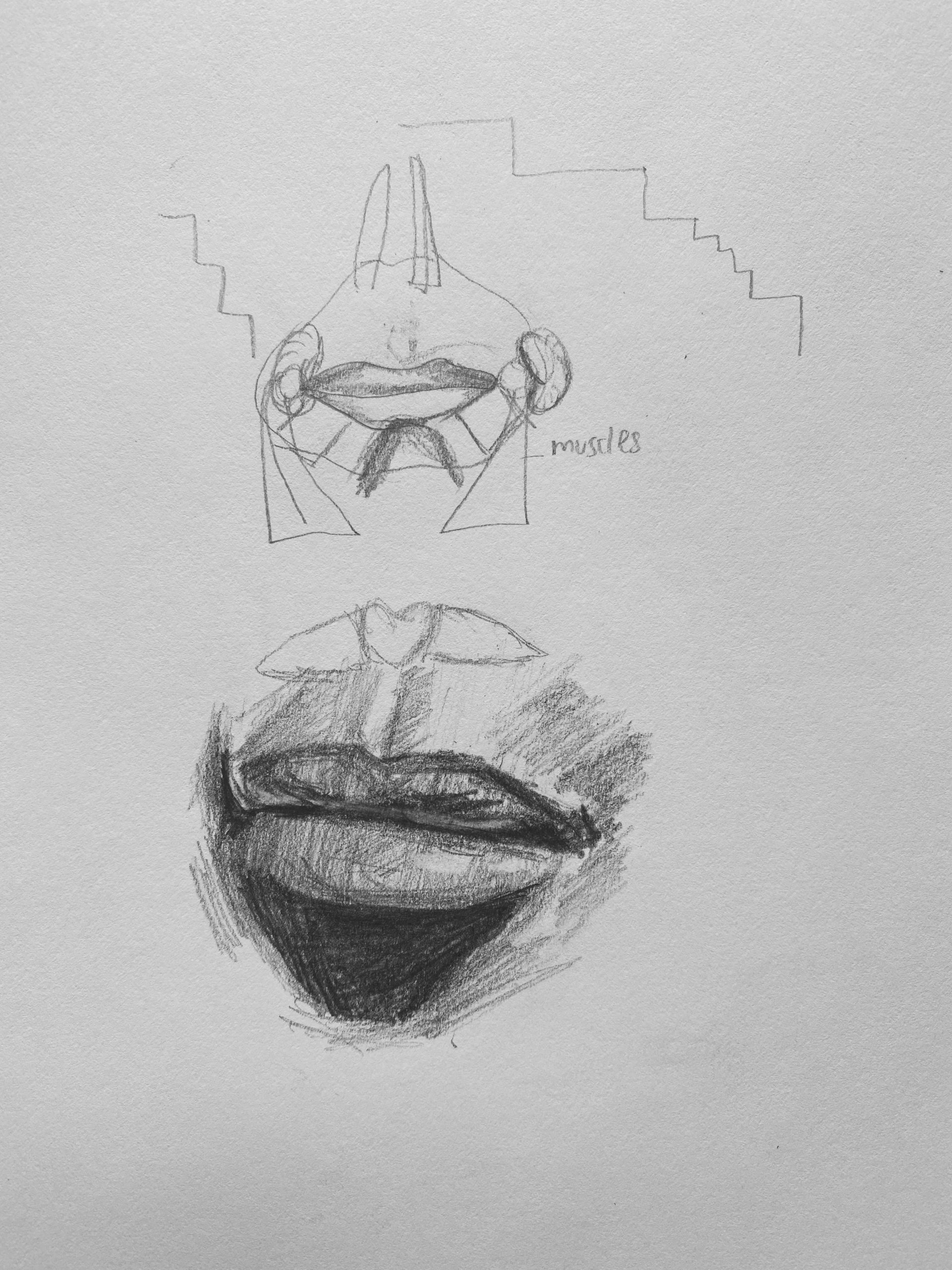
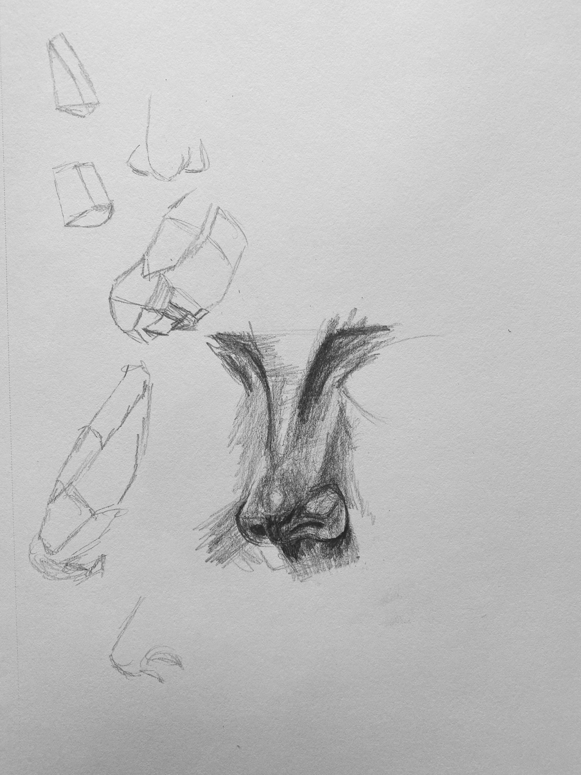
These studies are very good. Nice to see–
I enjoyed this assignment, but it reminded me how much I still have to learn…
I think my sighting has improved a lot since the beginning of the semester, but my shading needs work. Turning the paper and reference image upside down was a game changer for me during this assignment. I was able to work much faster and more accurately after doing so.
I love the original piece by Hanna Craig, but I think my piece looks overworked and messy, though my sighting is good. I failed to capture the glowing nature of Craig’s work. I think this is because my darkest values are not dark enough, making my mid tones and darks are hard to differentiate.On her left eye I tried to mimic Craig’s use of an eraser to make vertical beams of light across the face, but I think my lines look forced whereas the original is subtle, barely there. I wonder what type of eraser he used. The unfinished nature of the piece made it difficult to avoid a patchy shading look … I don’t know how Craig did it. What advice do you guys have?
I enjoyed the Proko videos. He fits a lot of information into short videos so I might watch them again later. I enjoyed doing the small studies because they were low stakes compared to the finished work we submit for class every week. Its instant gratification to do mini sketches.
I picked the same portrait so I completely understand the struggle in capturing the “glow” and the subtlety of the original. I do have a bit of trouble differentiating some of your mid-tones (e.g. I think the shading just below her cheekbones could be a little darker) but I think you’re being a little hard on your shading. You may have gone a little harder than Hanna did in the area to the right of the chin, but I think that’s one of my favorite parts of this portrait. I think you emulated the style of the rougher hatch marks over the more smudged undertones, especially on the cheeks and around the chin.
For her left eye I might recommend going in and just shading a bit at the parts you erased. The light gaps in value that create that striped look are not completely white in the original but instead are a little more subtly lighter than the surrounding darker stripes. Those light lines on the eye should actually be a little darker than the highlight on the cheek below. I think filling in those stripes lightly could help achieve some of the subtlety you’re looking for.
Overall I think you did a fantastic job on this portrait, especially your vertical hatching and sighting.