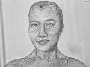
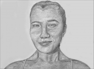
(MW) Had to see this without the cast shadow on the left (which I assume is not part of the piece)….
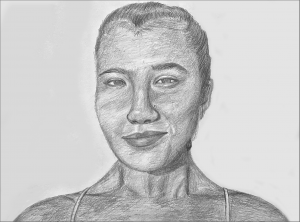
…and lightened the white just a touch while I was at it. In the process I had to remove the signature at the upper right, which I think allows the space to breathe more and behave as light.
Click to enlarge the top one and them flip through them to see the difference.


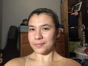
This was definitely a difficult drawing! Besides having trouble finding consistent space and time for it, I struggled to get my proportions correct and consistent. I found that part especially difficult since I was drawing myself, and I can tell when my face looks familiar and when it doesn’t. I definitely warped the shading a bit so that my face looks more turned toward the viewer instead of the more dramatic angle my face is turned in the photo. My nose is also too long and thin. I can see that I inadvertently made my neck too long and the shading on my neck is too dark, making me look thinner than I am. Same with the shaidng on my face-I am definitely not as thin as the shading on my face makes me look. I may lighten the face shading to show that I have a fuller face. I think the general shape of my eyes and lips are pretty good, and I tried really hard to get my cheekbones-eyes-eybrows to be good because I suspect those are some of the features that make me look the most distinctive. So, although I did make a bunch of mistakes, the fact that I paid a lot of attention to my cheekbones, eyes, and lips make it so that you can still tell it is me. I never realized how crazy my hairline is, and that was definitely hard to replicate! I still think I made my hairline too high.