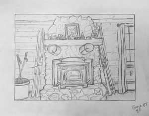
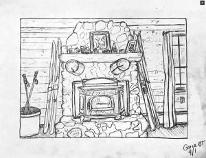
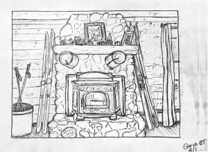
First, use Details/Structure, Highlights, and Selective (in Snapseed) to increase the contrast and strengthen the reproduction:
And in the drawing itself…
1. Use a barrier sheet to avoid smudges.
2. Make horizontal lines horizontal and the few vertical lines vertical. This would create a more uniform visual pressure across the whole composition, the better to examine the compartmentalized “evidence” in this tableau of faux rustification (to pick up on your take).
3. I suggest cropping it on the right (as I’ve done in my version, just FYI) so that the fireplace is centered. A composition that’s almost symmetrical but not quite feels like a misfire (just as a point of view that’s almost parallel to the picture plane but not quite also misses the mark). By squaring up and balancing the image our attention moves more easily to the real subject–your graphic interpretation of all those great textures and visual anecdotes.
Cropping the window also reduces the eye’s temptation to slip out the window–you want to keep our attention indoors with all these visual clues.


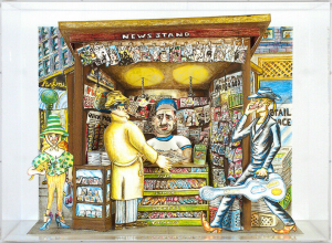
 Red Grooms
No, this is not what most houses in Maine look like, just my parents’ tacky cabin near Sunday River where I am currently quarantining myself. And no I didn’t set those skis up, this place actually looks like this. I chose to draw this location 1. because it is the view from the couch where I often find myself these days, and 2. because I think it perfectly captures the “phoniness” of this “cabin”: old fashioned skies next to a stone fireplaces, but directly next to a big old outlet, not to mention the “1999” and “Let it Snow.” Definitely not how the frontier people lived. I really enjoyed making a more “sketchy” drawing, and I think that style really captured the organized chaos of this room.
One thing I really love about this drawing is all the texture you have put in. The varying sizes of all the stones on the fireplace and all of the knots and lines in the wood walls in background make for so many interesting details. I also think you did a good job of showing how the fireplace sticks out from the wall and is more 3d. Your lines darken at the point where the fireplace meets the wall making it jump forward into the foreground. Also the details with the metal grating are wonderful. One thing that that I think you could improve on would be the line quality you have for the longer more dense lines in this drawing. You have lines that waver and fade in density as they go on and with some more definition it may create a clearer picture.
Good choice, Grace, and nicely done. Love all the textures.
Most of my comments are next to the images, above, but I agree with Grace about the importance of texture and volume in this drawing (which is what brought Red Grooms’ work to mind, added in above, with a composition similar to yours). I also have some thoughts about the formal characteristics of the drawing that you’ll find up there as well.
As for your doubts about the authenticity of the place, you need to turn the parody up even higher to make your point, maybe something closer to caricature (like Grooms). When it comes to ski lodges and country homes, Americans love their frontier past (or so they think) but they also like their wide screen TVs, and nothing says America like the two together–so I understand your skepticism.
It’s a good drawing whose intent could be a bit sharper with better attention to how it fills the rectangle.
I really liked the details in the curtain and how you can just see out of the window. This really stood out to me because the fire place is placed slightly to the left and the details in the window uses that slightly large space really well. The quirkiness of the space is captured by the details you choose to add on the mantle alone. Putting a toy car next to picture frames shows that what’s in the room is in a showcased part of the room is what is personally valuable. I also find it funny that their appears to be a candle above the fire place. It’s in those little details like the messages inscribed on the stone that the singularity of this place stands out. I second everything Grace and Professor wrote about the would paneling and the rocks and also liked what you did with the floor.