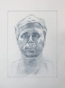
Good work, Ryan, especially in your composition, overall proportions (good schematic), attention to planes, and mark-making (hatching).
This model has close set eyes, which you’ve located correctly, but made more apparent by enlarging the eyes slightly and turning the irises inward a bit, making him look cross-eyed. When you draw irises, pay even more attention to the white of the eyes.
You’ve also widened his face just a bit–still anatomically plausible but perhaps his stockier cousin. The space between the eye socket on our right and his sideburn is noticeably too wide.
The tip of the nose needs more attention. You’ve shifted into a pre-conceptual symbol for the nostrils–a great lesson you could learn from this drawing.
Great job emulating his hatching, which underscore the planes almost like the chisel marks on a sculpture, but your values wander a bit. Your center forehead is too dark while the upper lip and underside of nose are too light.
Glad you picked up on the darker values on the hair at the temples–a classic move to draw attention to the eyes.

For this assignment, I recreated the portrait crafted by Anonymous Artist #1. Although I had no idea who drew it, I really liked this portrait because of the careful line hatching method which was used to create it. I thought it was very interesting how minimal shading created such a unique texture and display. Overall, I was happy with the outcome of my drawing. Obviously its difficult to completely emulate the drawing of another artist as ids the case with my work, but I think the lines really work together to create an interesting and realistic piece. The strokes of the lines and amount of detail was incredibly difficult to recreate and I think I could’ve fared better with a sharper pencil at points and some more firm marks, but I really enjoyed this assignment and my results.
Hi Ryan,
Great job on the portrait this week! This was surely a tough task given all of the fine tunes hatching and I admire your willingness to create an attentive master copy of it. I think you did especially well with the placement and direction of the hatching, following the original artist’s pattern of strokes. The hair is particularly nicely shadowed and you did a good job of leaving untouched positive space on the temples. I feel that you could return to observe the hatching on the forehead and make the line where the shadow stops a bit less harsh, noting the value gradient and nuances in angle where it hits the forehead alongside the face. I’d also take a deeper look at the anatomy of the eyes, noting the shape and that they are set further back into the face and are smaller in proportion to the nose.
Hi Ryan, I love the portrait you chose this week. It’s so interesting to me. I think you did a great job on it, given how unique and probably challenging this fish-eye style is to achieve. I think your observation of facial features and how they’re spaced in the original could be an area of improvement. They eyes are a bit too big and I don’t think you got all of the proportions quite right. That said, you emulated the artists line/hatching style very well. I agree with what Devon said about how impressive your ability is to dedicate to the neat hatching style.