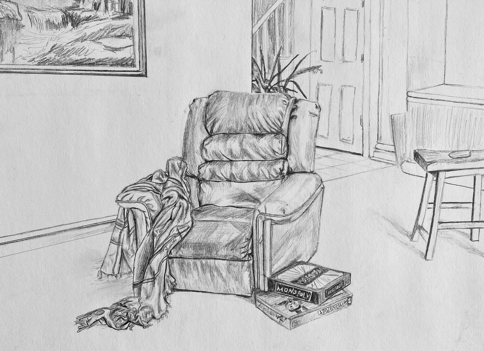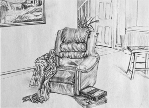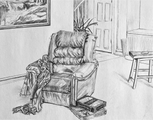
Excellent work (see my comments) but your perspectives are off. Most noticeable is the painting on the wall, the bottom edge of which should be converging on a common vanishing point with the baseboard and the short end of the countertop. But the recliner is also slightly askew. It would look more like this:
Note how that also has the games touching the edge of the frame, just like the stool, the painting, and all the background material. Not only does this complete the visual “theme” but makes stronger (better defined) negative spaces and ties the image to the rectangle. Your objects float a bit.
Finally, I’d also recommend cropping the left a bit. It goes on a bit without adding anything to the drawing (much like the space between the plant and the bed last week). Your sketch of the painting is just terrific. I didn’t want to lose any of it so I moved it down the wall–and in the process made a tighter connection (and better negative spaces) with the chair. Note how the cropping plus the more correct (and more dramatic) perspective anchors and opens the space to the viewer more.


edited:
My quarantine lifestyle is such that we have movie nights basically every night. My mother, younger brother, grandma, and I have been watching movies in our living room, which currently has only one piece of furniture: a recliner. My family stopped using our living room and it’s become more of a play room for my brother with basically no furniture, but because we are all at home, with little to do, we’re using the living room for the first time ever. The recliner is reserved for my grandmother, while the rest of us get pillows and blankets and lay on the floor. Also, we recently played monopoly (I won) and I thought the 2 boxes of Monopoly by the foot of the chair, especially the one that is upside down symbolizes the inevitable recession the world economy is heading into, yet I am escaping reality by distracting myself (watching movies and playing board games). It’s relaxing, but at the same time wasting time is more difficult than getting things done because of the constant worry for the future and regret of the past.
I wanted the chair and shawl to stand out while everything else remained underdeveloped. My favorite thing to draw was my grandmother’s shawl because it was very forgiving. I think the overworked shading on the chair indicates how too much of a good thing can be bad, just as too much entertainment is mind numbing. Overall, I am happy with this drawing; I think it captures my life right now. I want to move on and face reality, soon. This assignment has given me something meaningful to do by forcing me to reflect on my situation.
This is a very impressive drawing. I love the scene which you set up with the recliner taking center stage and everything else around it. Unsure if this was the exact plan, but aside from the recliner’s importance of the room, I think it does a great job of showing your grandmother’s importance and power within your family as well. The details on the chair are very nicely drawn and careful as well. I enjoy the monopoly metaphor as well. My family has played a few monopoly games as well and every time I go bankrupt, (I haven’t won yet) it makes me worry about society. Your composition is very appealing, I may have shifted the reclines the slightest bit left if I were you, but your positioning definitely still works. Line weight is excellent as well. Great work!
Hi Addhya,
With apologies for the delayed reply, this is an excellent drawing–especially your rendition of the upholstery which is very fine Love the other objects in the room and that glimpse of a stairway. I also commend the selective focus you’ve added through value–the chair is obviously of prime importance and the other focal points–the painting, the stool, and the background–take their appropriate places.
Wonderful short hand sketch for the scene in the painting, by the way–a drawing within a drawing, and just the right touch–neither too much nor too little detail.
You render objects beautifully–the thing you need to work on is composition, and attention to the shape, proportion, and rhythm of negative spaces in particular.
Fine work.
1. There are immense details in the leather of the chair which help create depth, the rounded quality of the cushions in the recliner. I also love the sliver of the painting show, which also has this “good messy” quality to it. It really contrasts the more subtle value changes in the chair. Awesome job on the shading!
2. However, I agree with Professor Wethli’s critiques about the composition. My only other suggestion would be to add some darker values in the right third of the paper. I understand using value to create atmosphere: things farther away are lighter. But, at the same time, I think the plant, which might be farther away, I’m not sure, in the hallway behind the chair has some darker values too. I think that this would be more cohesive since the value is much stronger on one half of the paper than another.