Author: rsupple
Portrait Practice
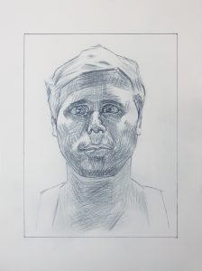
Good work, Ryan, especially in your composition, overall proportions (good schematic), attention to planes, and mark-making (hatching).
This model has close set eyes, which you’ve located correctly, but made more apparent by enlarging the eyes slightly and turning the irises inward a bit, making him look cross-eyed. When you draw irises, pay even more attention to the white of the eyes.
You’ve also widened his face just a bit–still anatomically plausible but perhaps his stockier cousin. The space between the eye socket on our right and his sideburn is noticeably too wide.
The tip of the nose needs more attention. You’ve shifted into a pre-conceptual symbol for the nostrils–a great lesson you could learn from this drawing.
Great job emulating his hatching, which underscore the planes almost like the chisel marks on a sculpture, but your values wander a bit. Your center forehead is too dark while the upper lip and underside of nose are too light.
Glad you picked up on the darker values on the hair at the temples–a classic move to draw attention to the eyes.
Ryan’s Designs
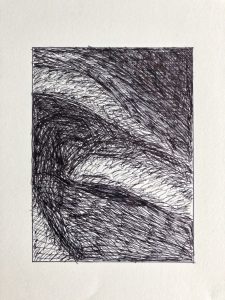
Fairly good, and a wonderful abstract drawing in and of itself, but except for your darkest areas (near black) all of your tones need to be darker by a few shades, especially in the upper half and that dark shape at the bottom that goes off the lower right corner. Even the lightest value, about a quarter up from the bottom and toward the right, should be darker.
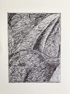
This is good so far, but there’s more value contrast in play–especially where that large curved shape in the lower half overlaps the shapes in the upper half. It also shades toward dark much more toward the right. Except for the lightest areas, all others could be darker.
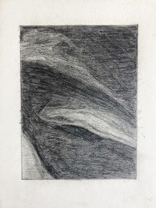
Better than the ink version in terms of value but it too should be categorically darker. Also, the texture of this drawing lacks the refinement we’re after. As shown in my demo, you need to combine strokes from all angles–these are dominantly left to right–as well as a more tempered and gentle stroke, to achieve a high resolution surface.
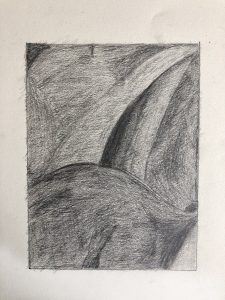 Better than the ink version but still under-developed. All values except for the darkest ones and the lightest ones should be darker. Note that the triangular shape on the lower right is the same value as most of the lower half, but separated from those similar values by the dark patch; its the dark patch that makes it look lighter due to simultaneous contrast, but you need to see past that by making wider comparisons.
Abandoned Courts
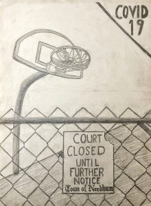
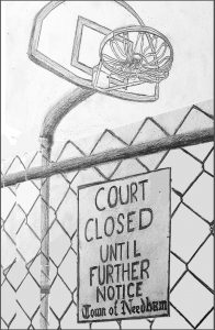
The odd thing in your perspective is that we’re looking up at the hoop but down on the court (and straight at the fence) simultaneously, which makes the experience of approaching the sign and feeling shut out less tangible. I’ve tried to recast the same elements in a perspective that might be closer to actual experience, all looking up and looming over the viewer, making things more out of reach (see below).
This also fills the space, eliminating the need for that “band-aid” solution with the COVID tag. There’s such a thing as telling your audience too much, and not leaving room for them to reach their own conclusion.
I cropped the top of the backboard to create two stronger negative spaces and to put some pressure on the image. Note too how it makes the fence feel much more insurmountable. It also brings more attention to the tied up net, which I agree is fantastic–so well done.
I also cropped it to create a stronger vertical, and adjusted the white balance so the drawing doesn’t look so old (on old paper).
Of course all of this can’t be worked out once the drawing is on the page, but that’s what thumbnails are for (as you’ll recall we did with the flower)–to sharpen the composition and refine your “message” by testing different alternatives before you dive in.
Ryan’s Dining Room
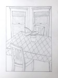
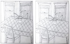
This is an almost great composition, save for the dreaded TANGENCIES along the top edge (i.e. space killers, because they glue the drawing to its frame). In a composition in which everything else but the potted plant is cropped or overlapped, I’d probably opt for cropping the top of the windows (on the left), which also throws more attention to the plant at the center.
But you could also open up the space a little (on the right side as well) for another good solution.


