 image 27
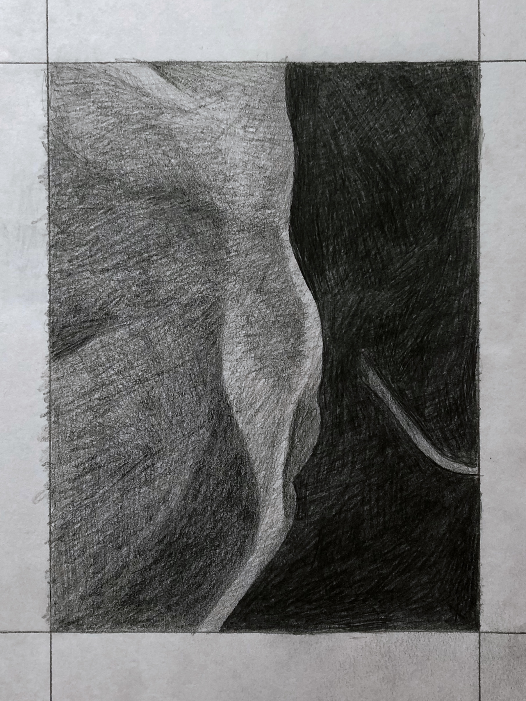
Team Value Drawing
Professor Mark Wethli – Spring 2020
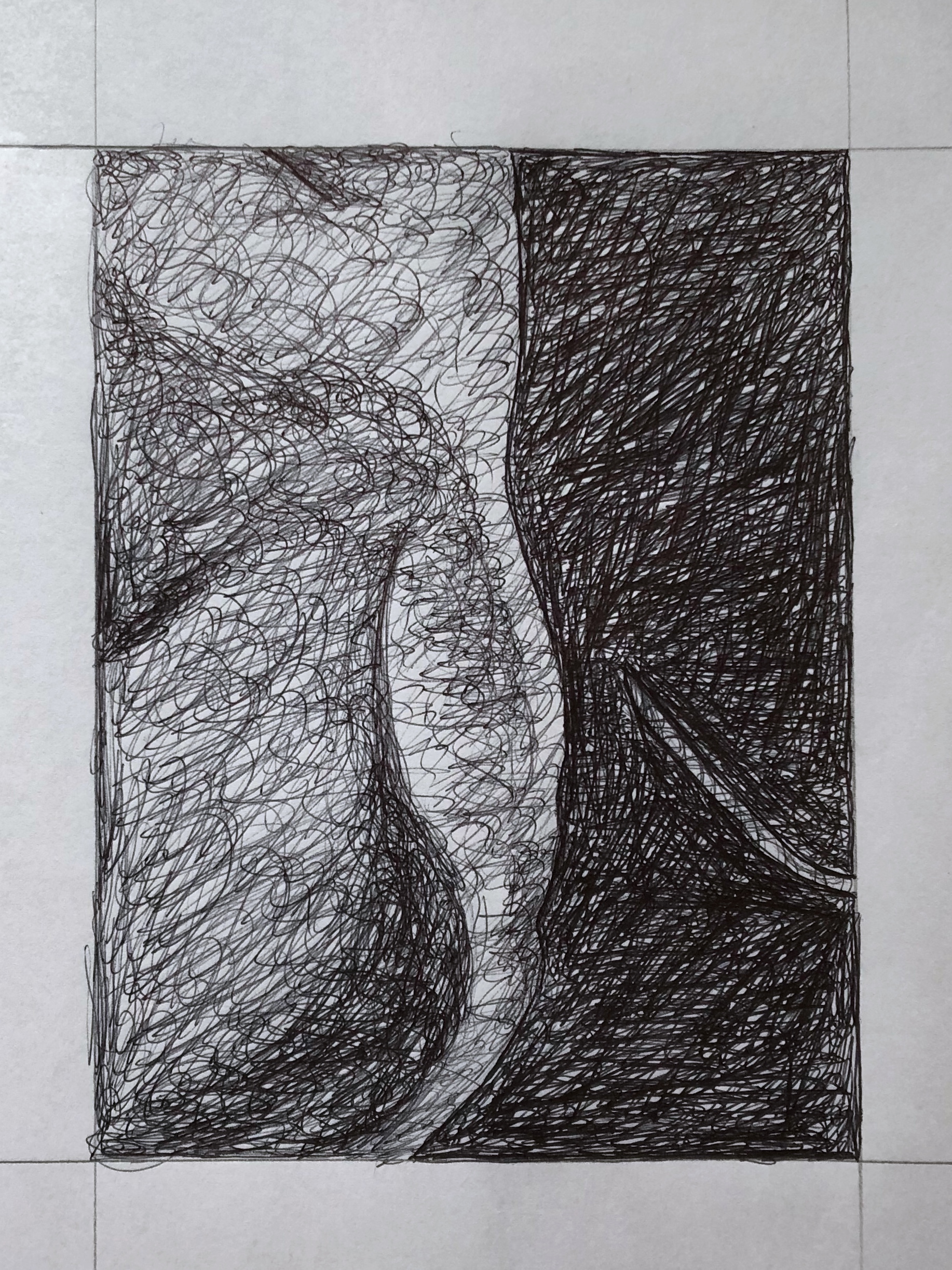
 Good value relationships but all values are altogether darker. The darkest spots, at the lower left and right should be nearly black. You’re exaggerating the differences in the lower right. Those forms are there but they’re almost imperceptibly different.
 Lower right is perfect but all of the other values should be much darker. The lightest shape in this one, in the lower left, is much darker than the white of the paper.
 Good, but darkest areas should be darker.
Good, but needs to be categorically darker. The lightest values in yours are comparable to the white of the paper but should be much darker. Even the very lightest value here doesn’t rival the white of the paper.
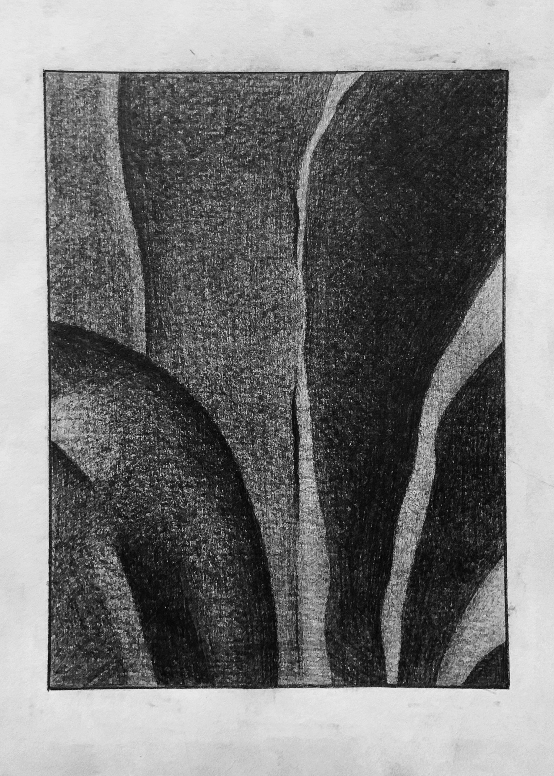
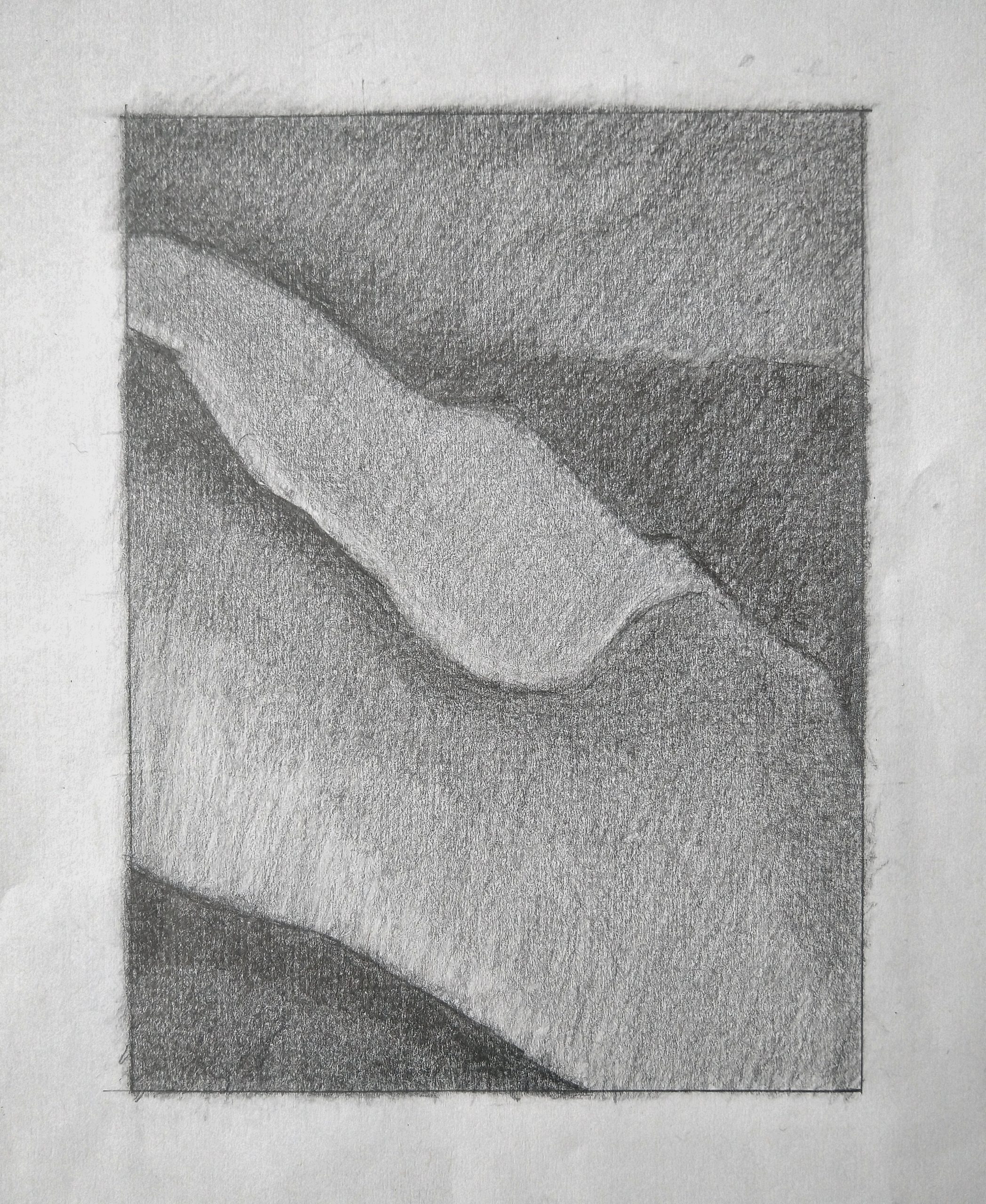
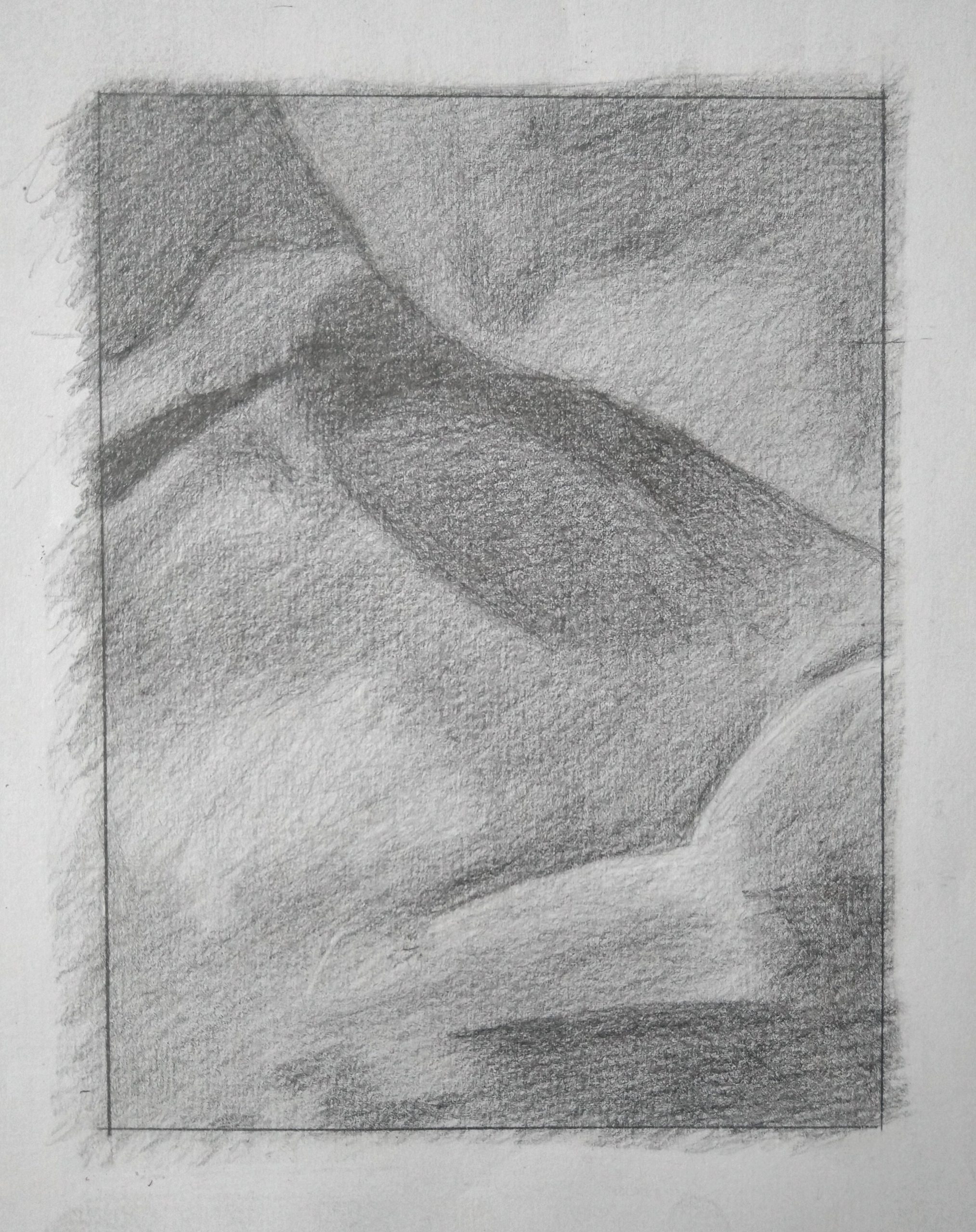
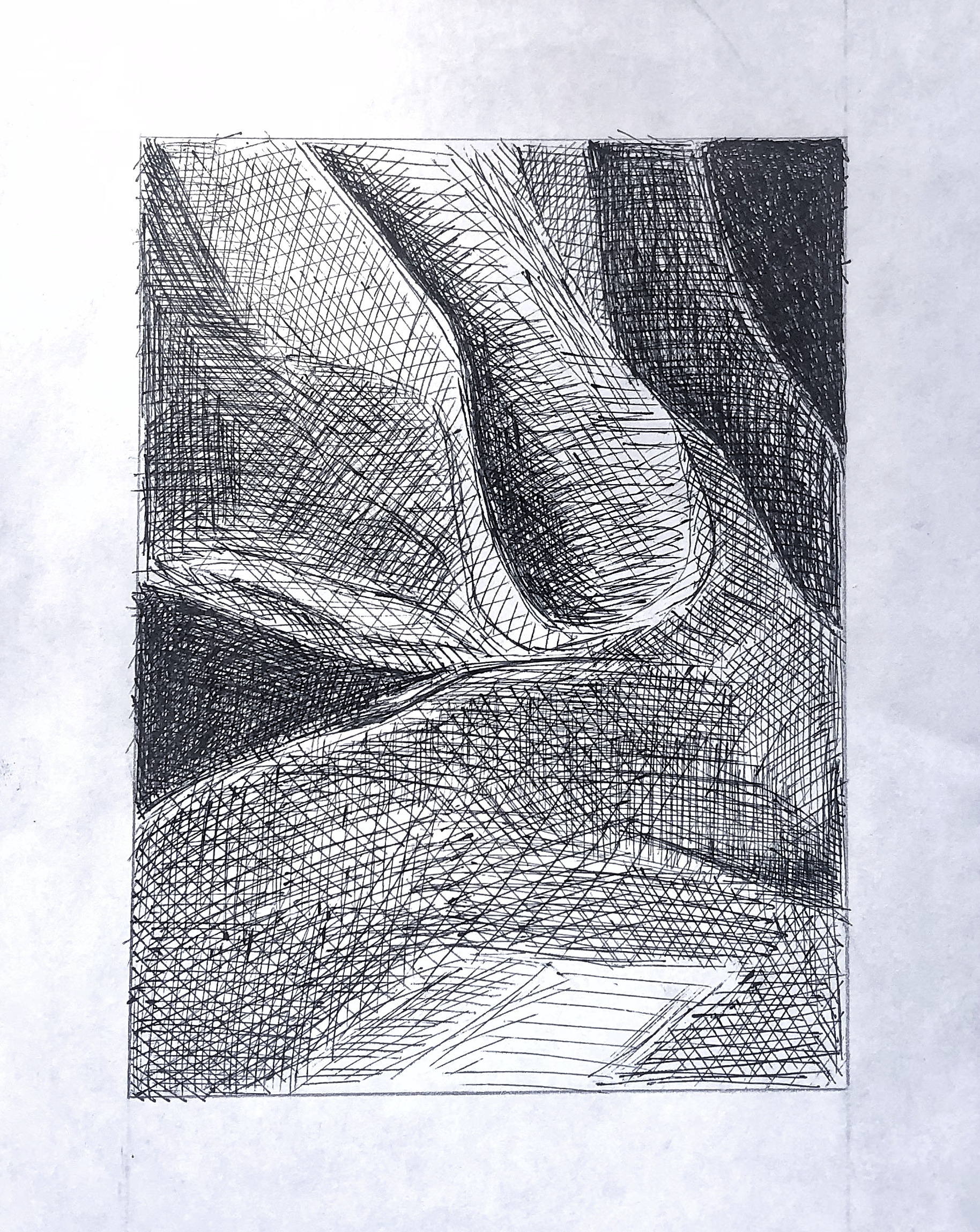
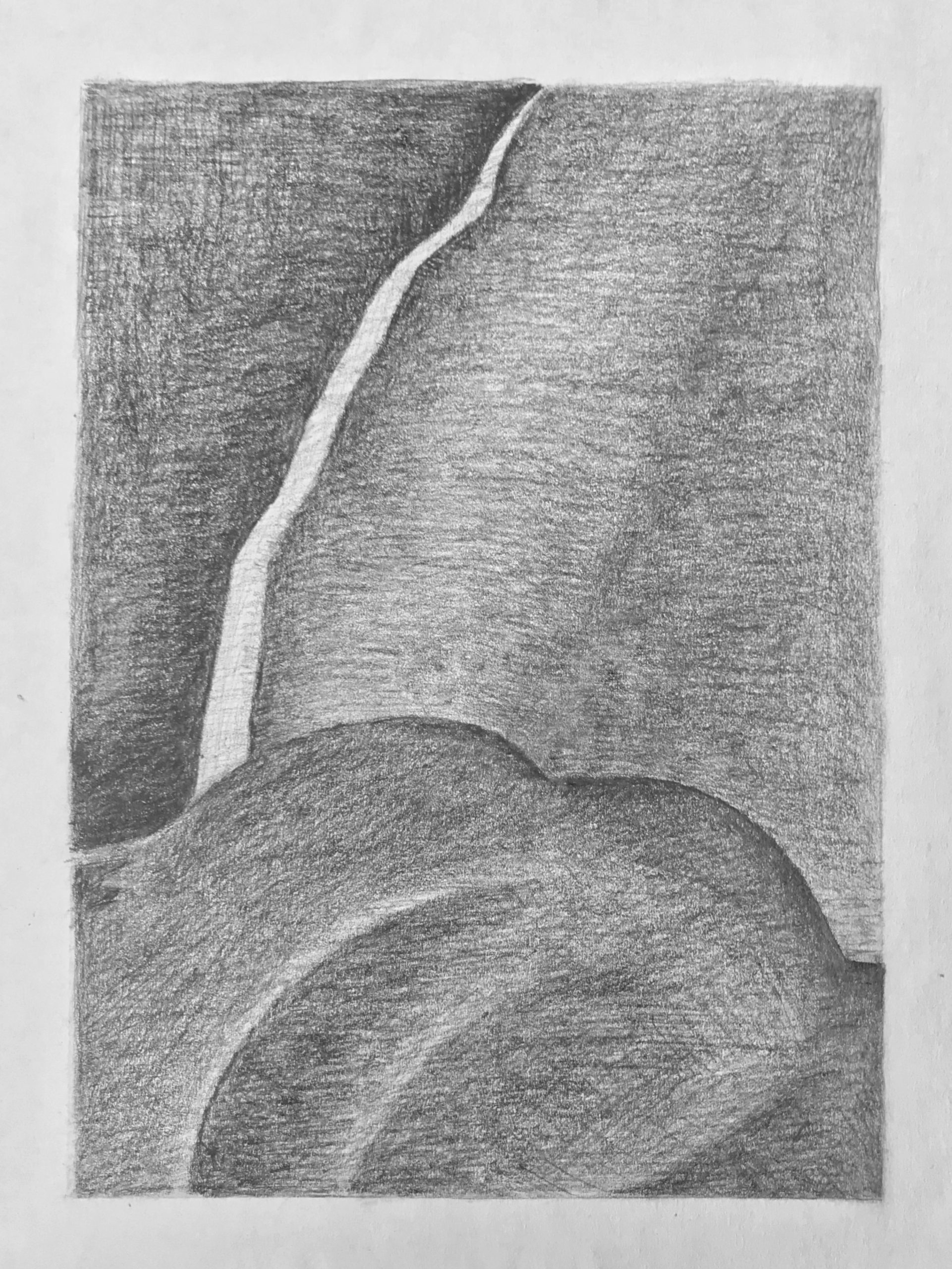
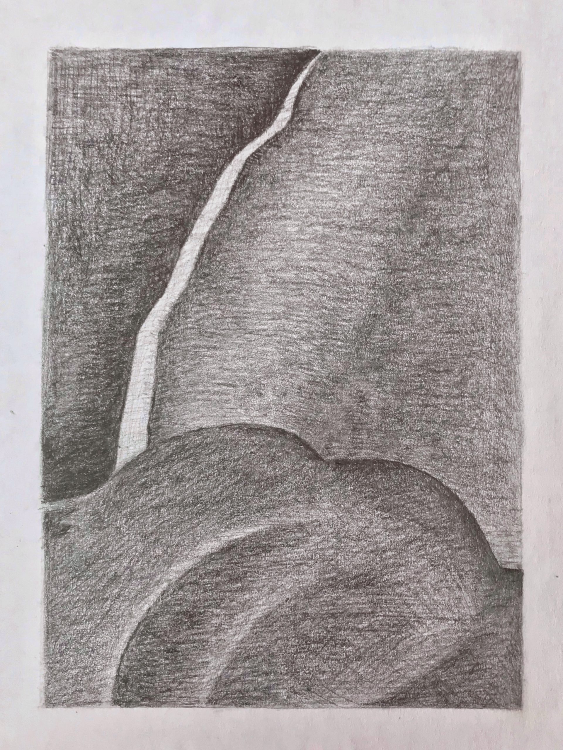
 Good job on the lower left. The triangular shape on the right upper half should be the same darkness or very close to that. You need more contrast along that “breaking wave” shape by sharpening the edge and darkening the value that borders it there. Very top shape is too light and needs more hatching in multiple directions.
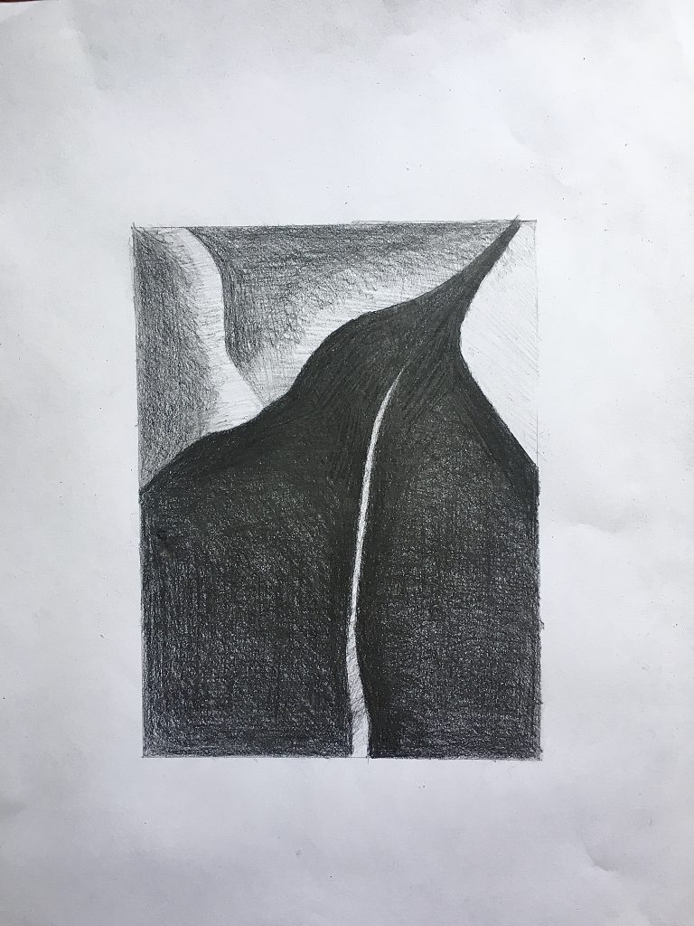
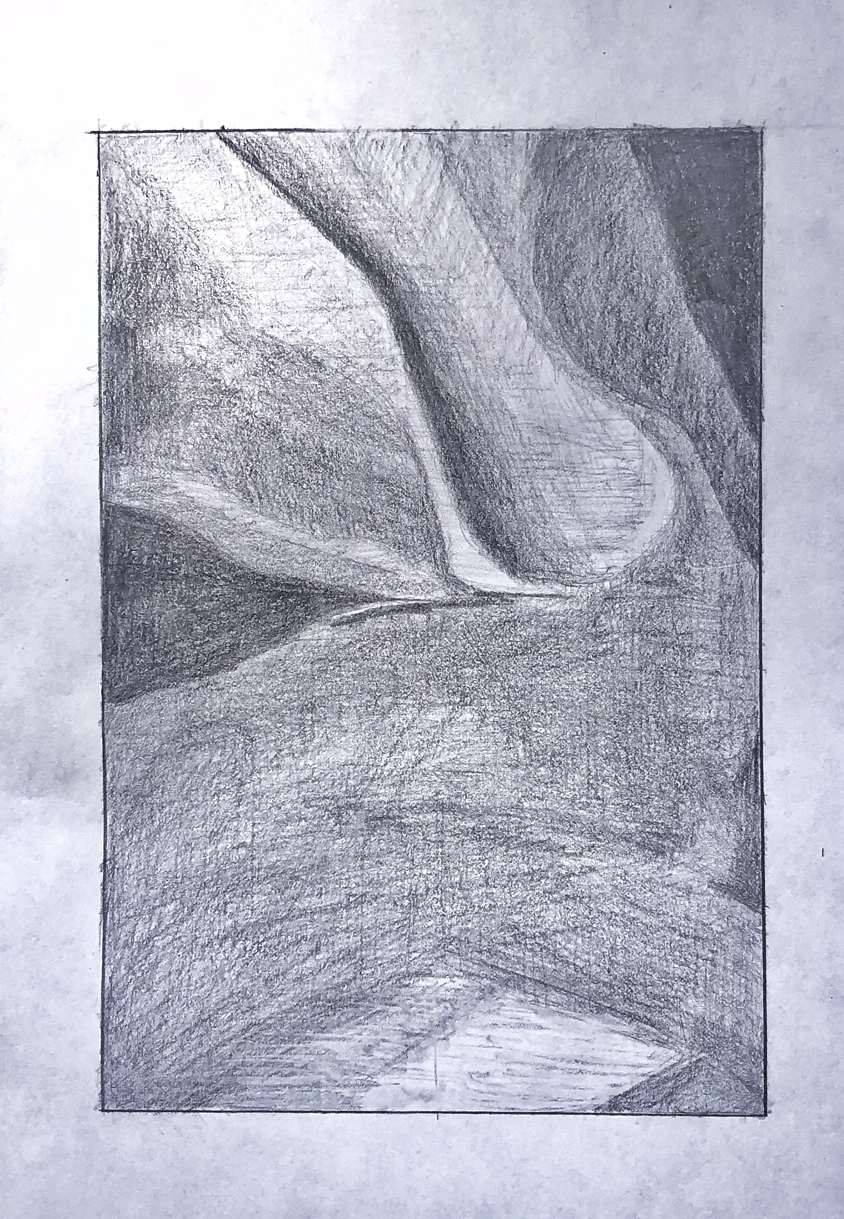
 Upper left corner is darker. There’s a dark shape like a leaf and a stem in the upper half that needs to be more unified. You’re breaking it up into too many sub-values and sub-shapes, when in the reference it’s more unified. There are differences in it but they never overtake it’s unity and simplicity as a shape.
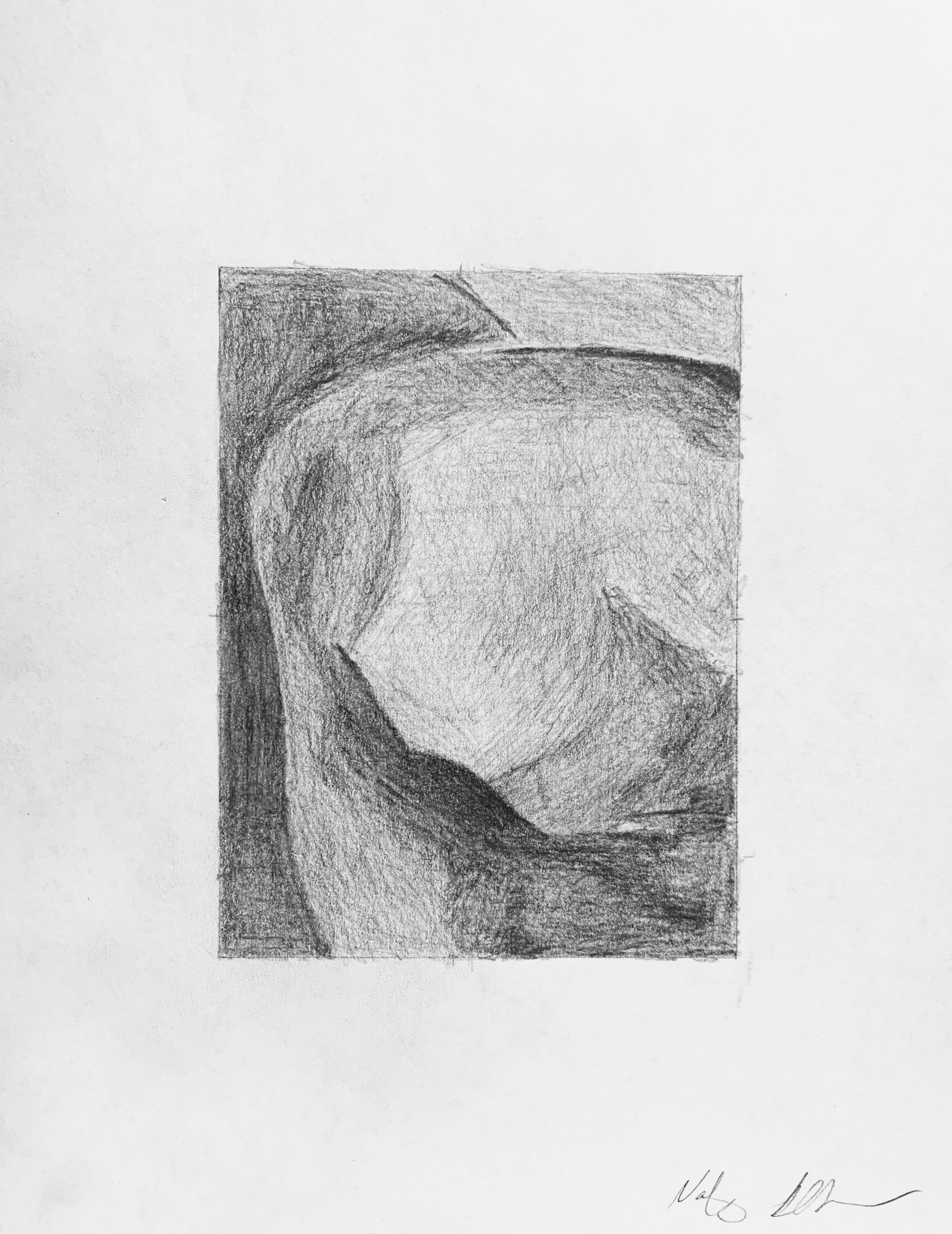
Very good
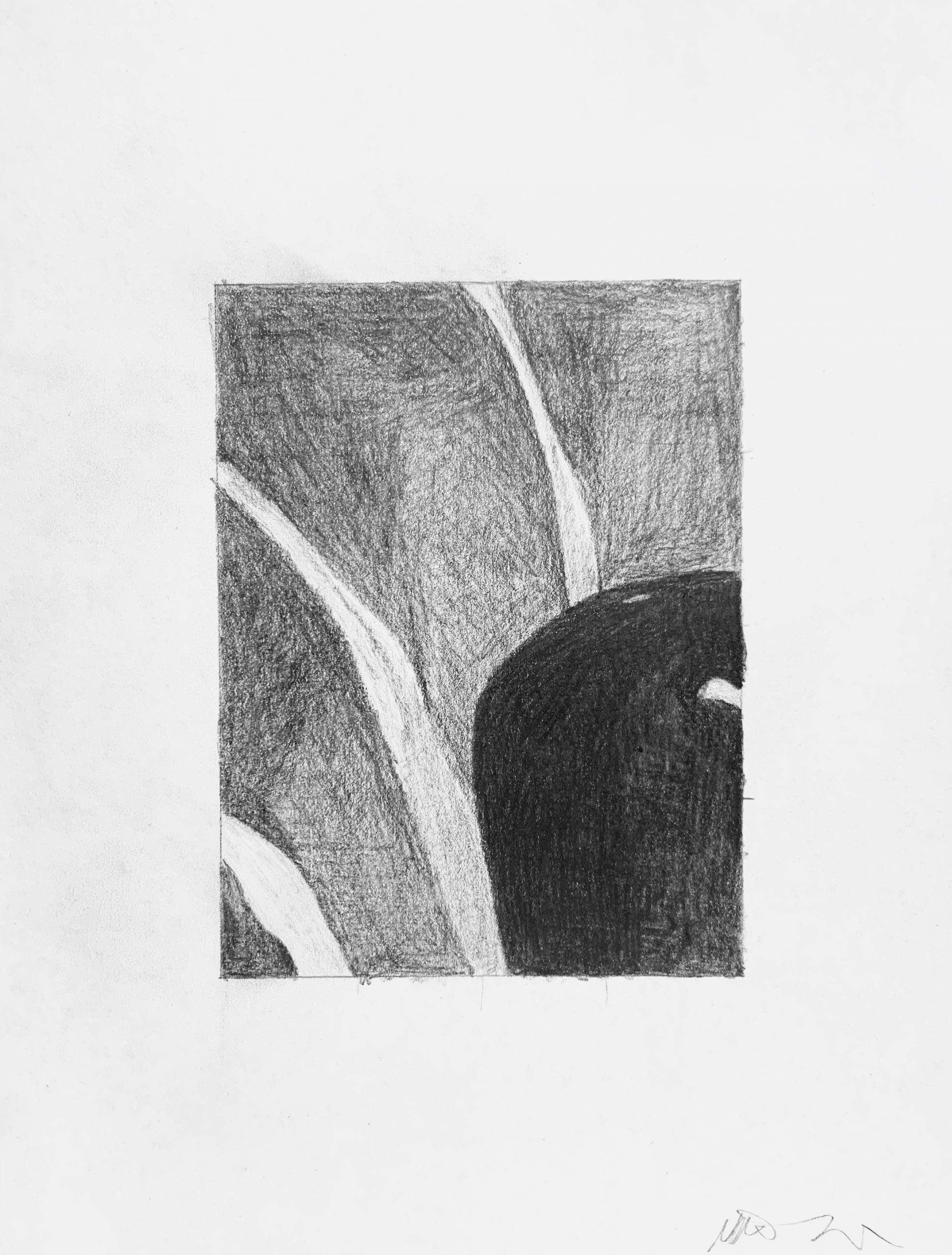
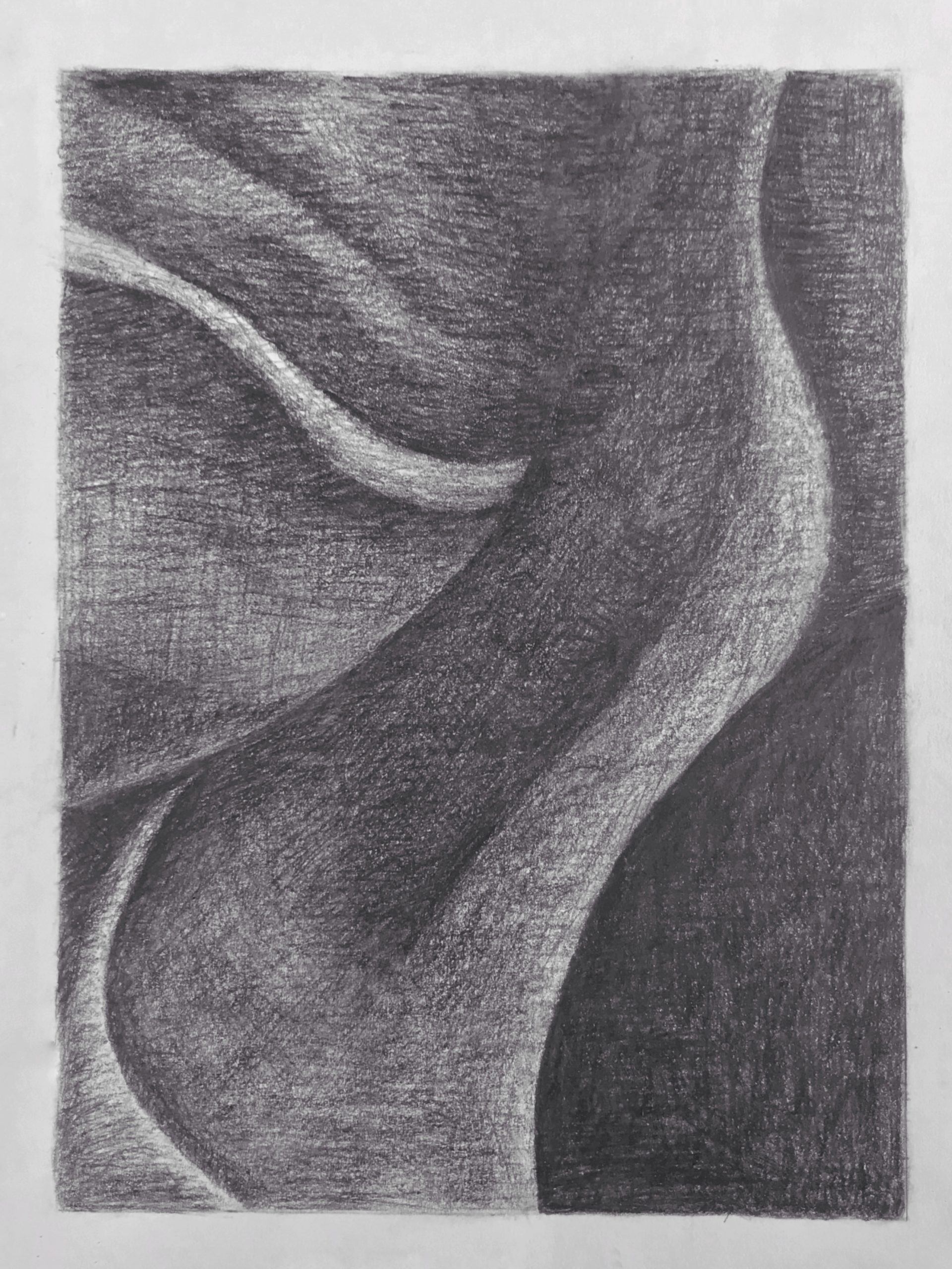
Very good but values in upper left corner and in the semi-circle shape should be darker.
Could be much darker overall. Even the lightest values are a shade darker and the darkest values near black
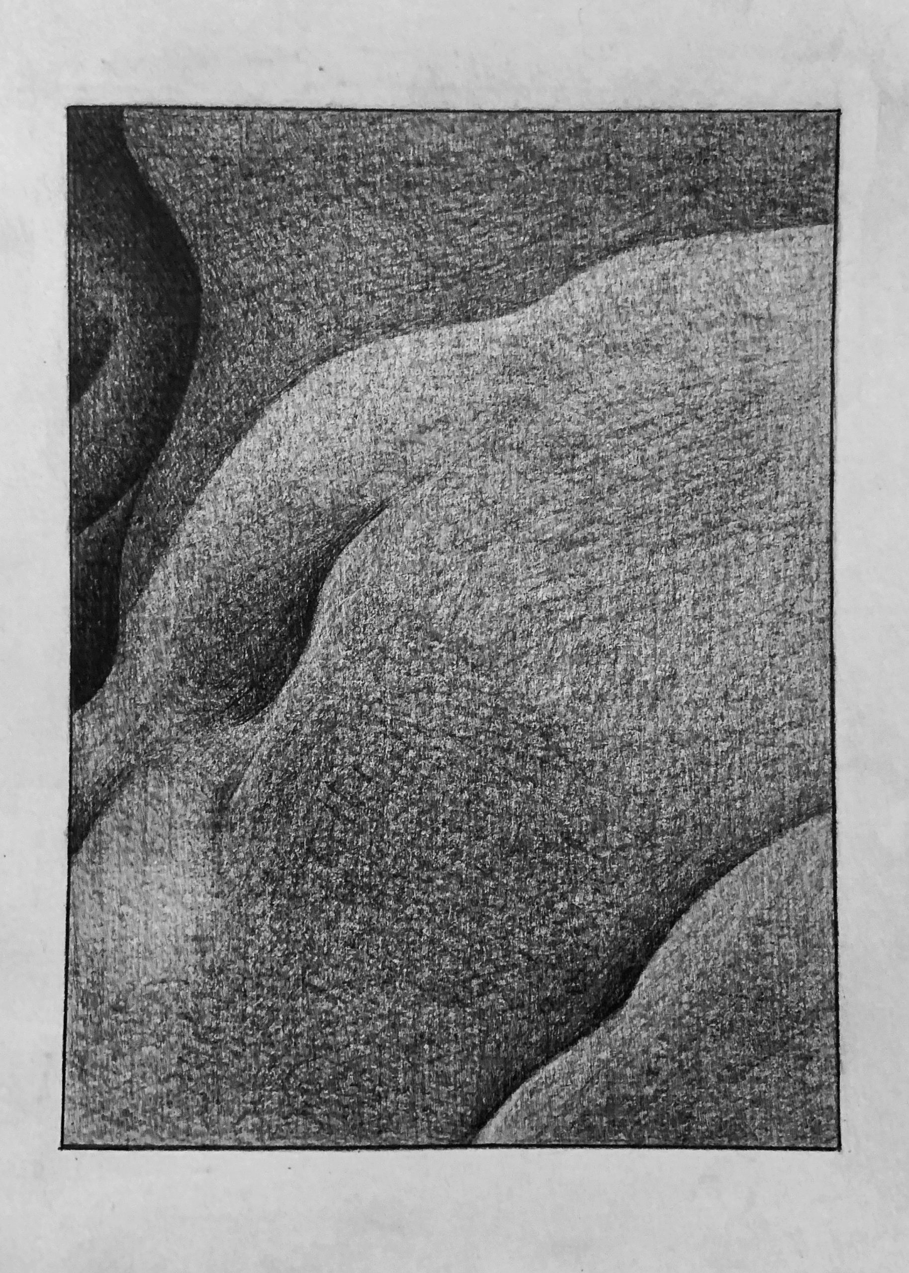
Very good in the lower left but the rest of the values are more similar to that. I suspect you were worried about over-working the hatching but you’re a long way from that.
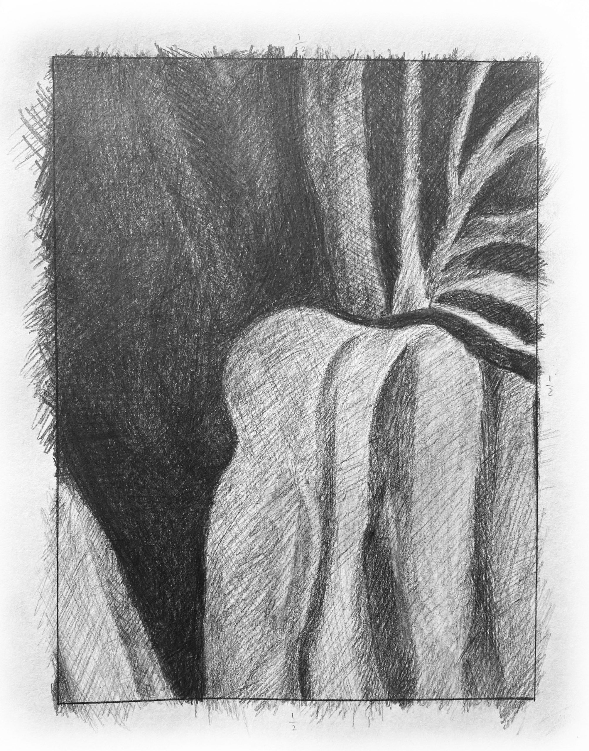
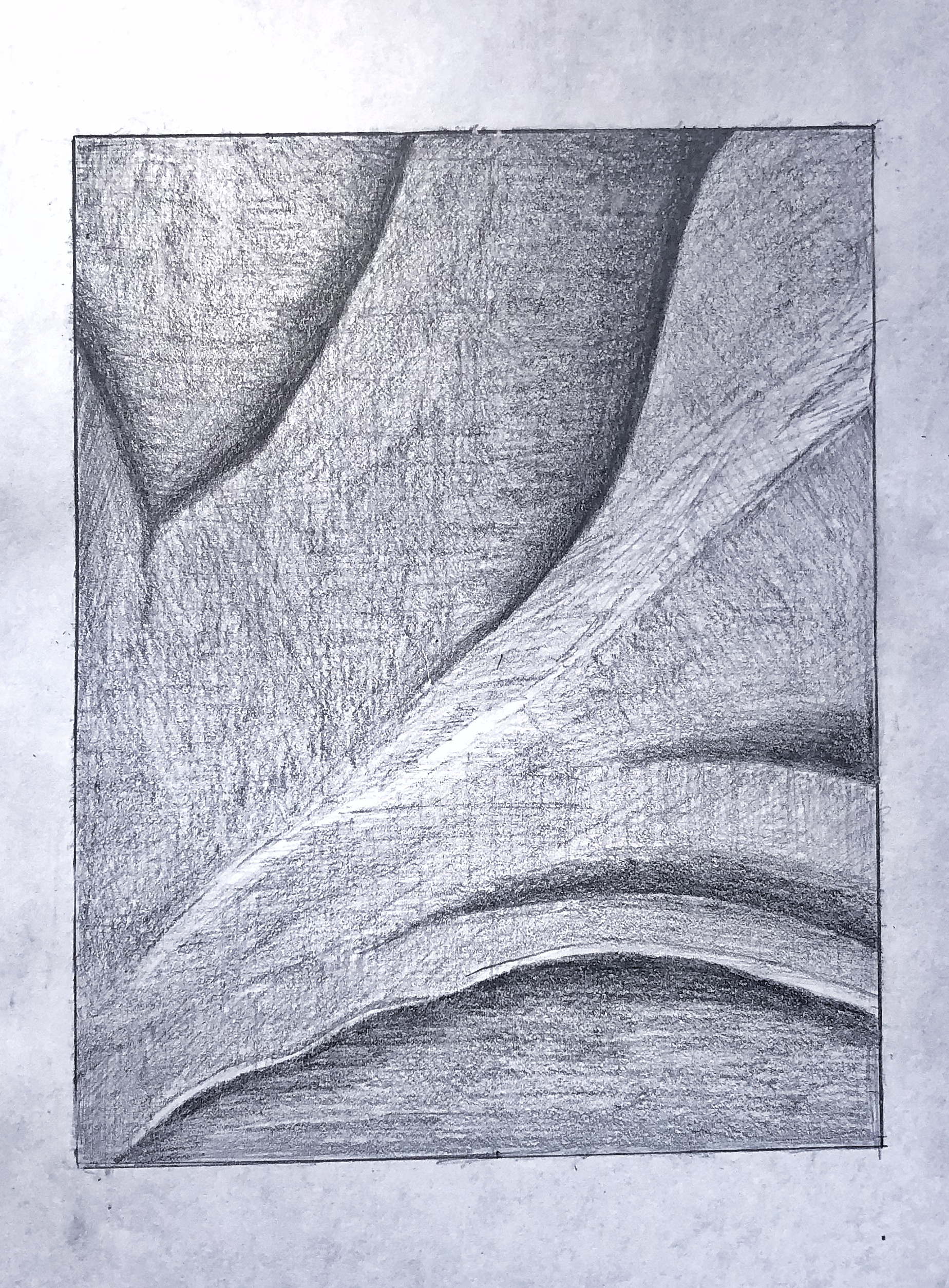
Like the other pencil drawing, your strokes in this one should be much gentler and more tempered. These would be great for the ink drawing but the pencil drawing requires a more refined technique. That can still be accomplished here as described in my notes for the other pencil drawing. The light grey values here are darker still. Once again, compare them to the white of the paper. There’s no value in the reference that approaches the whiteness of the border.
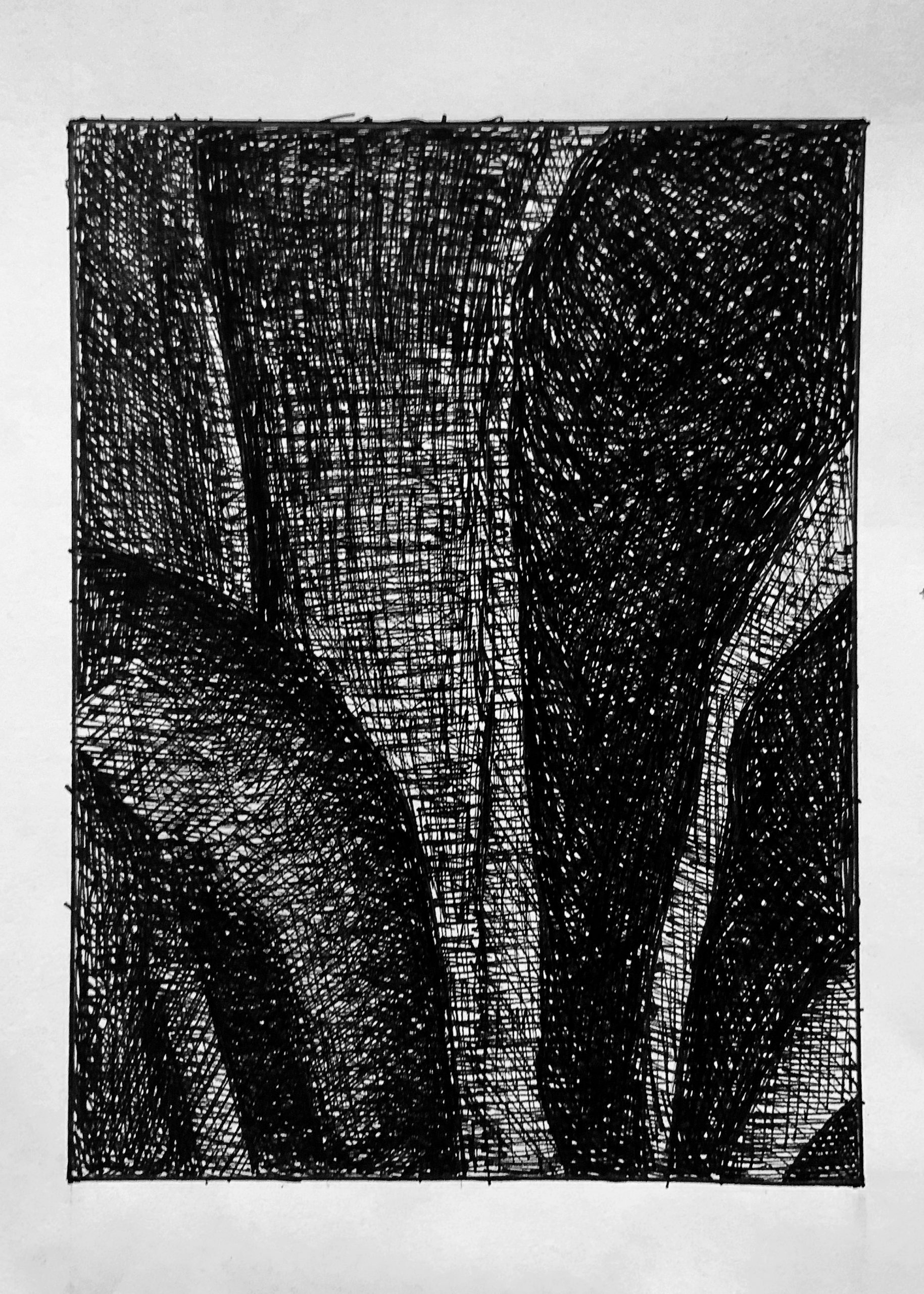
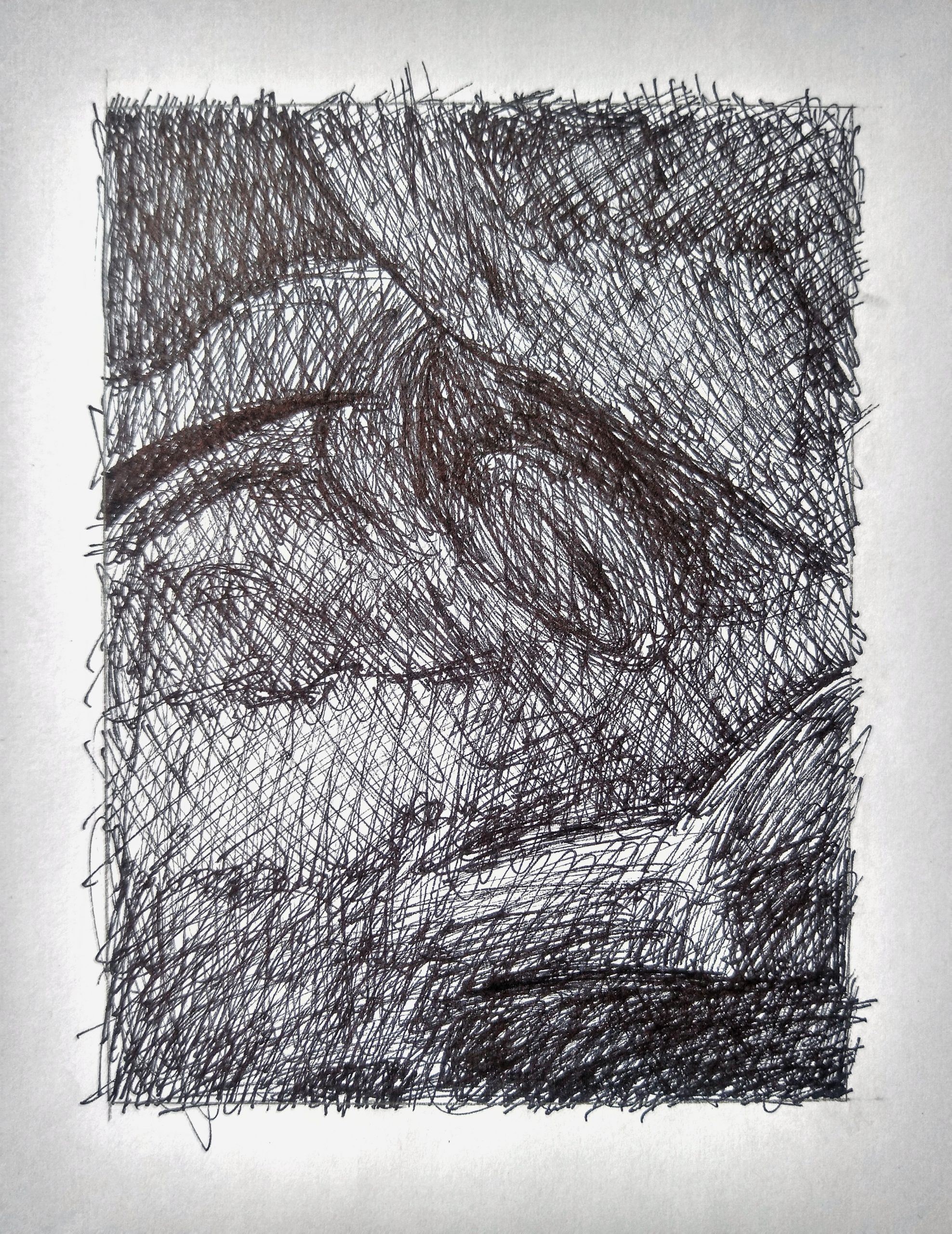
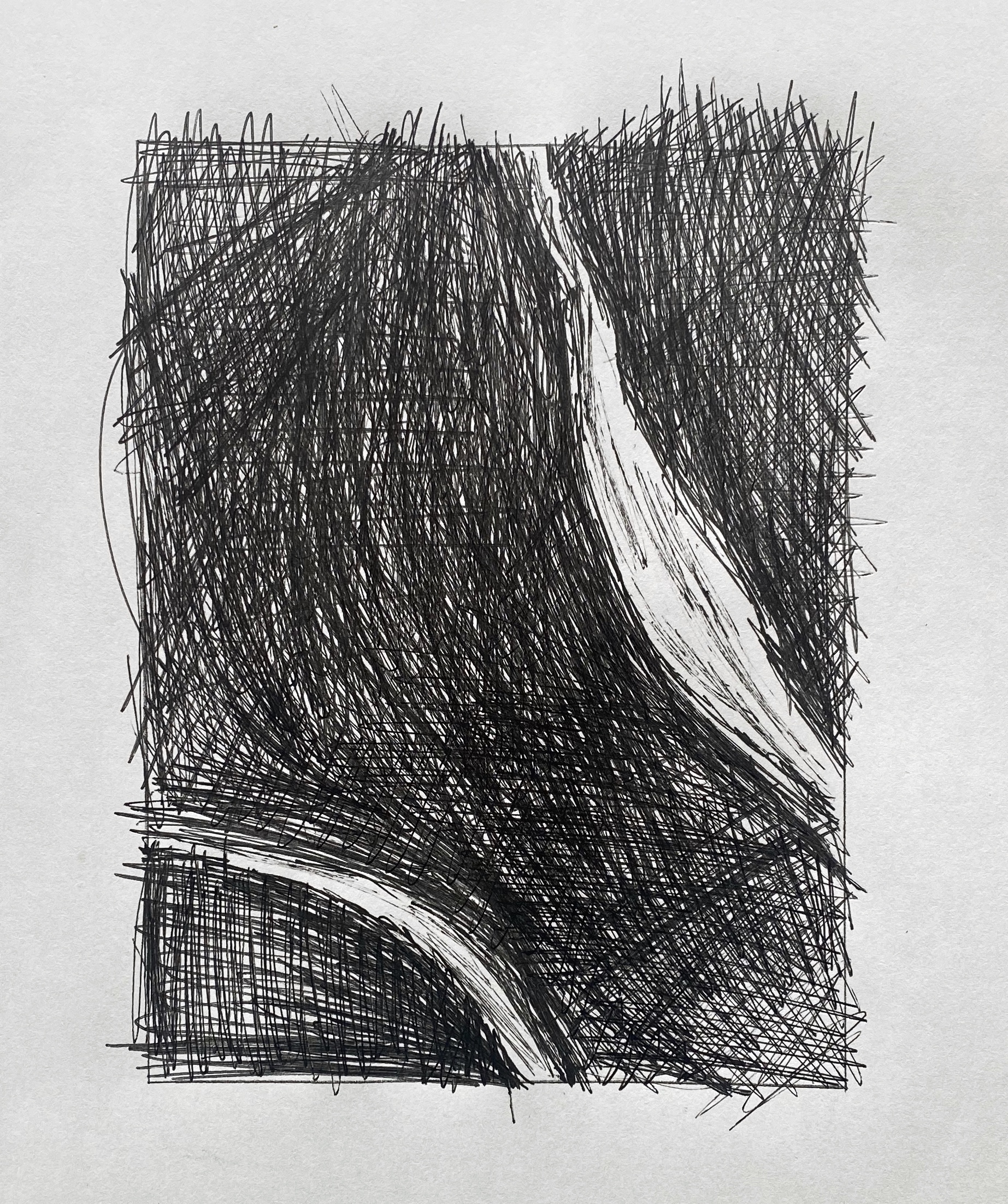
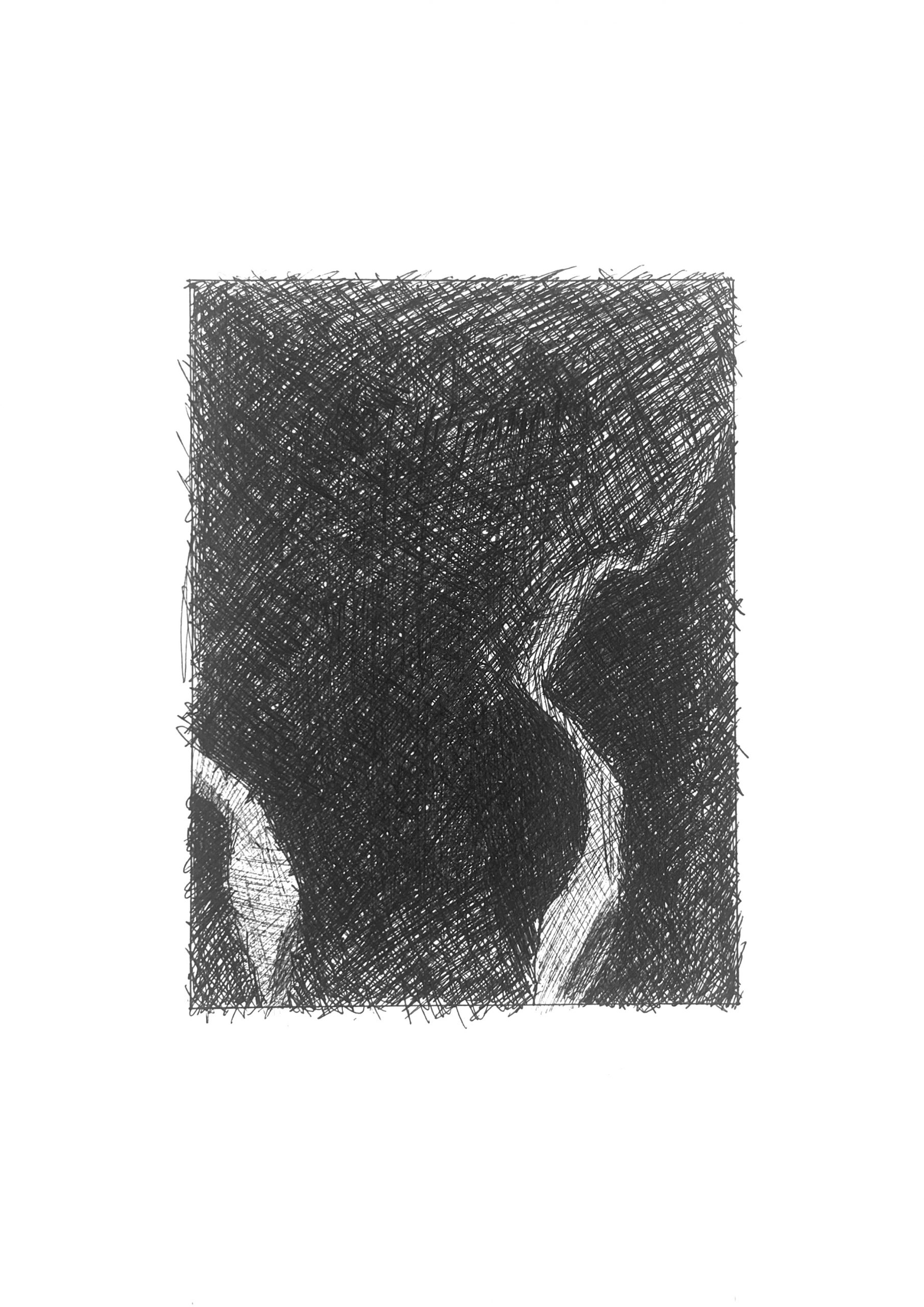
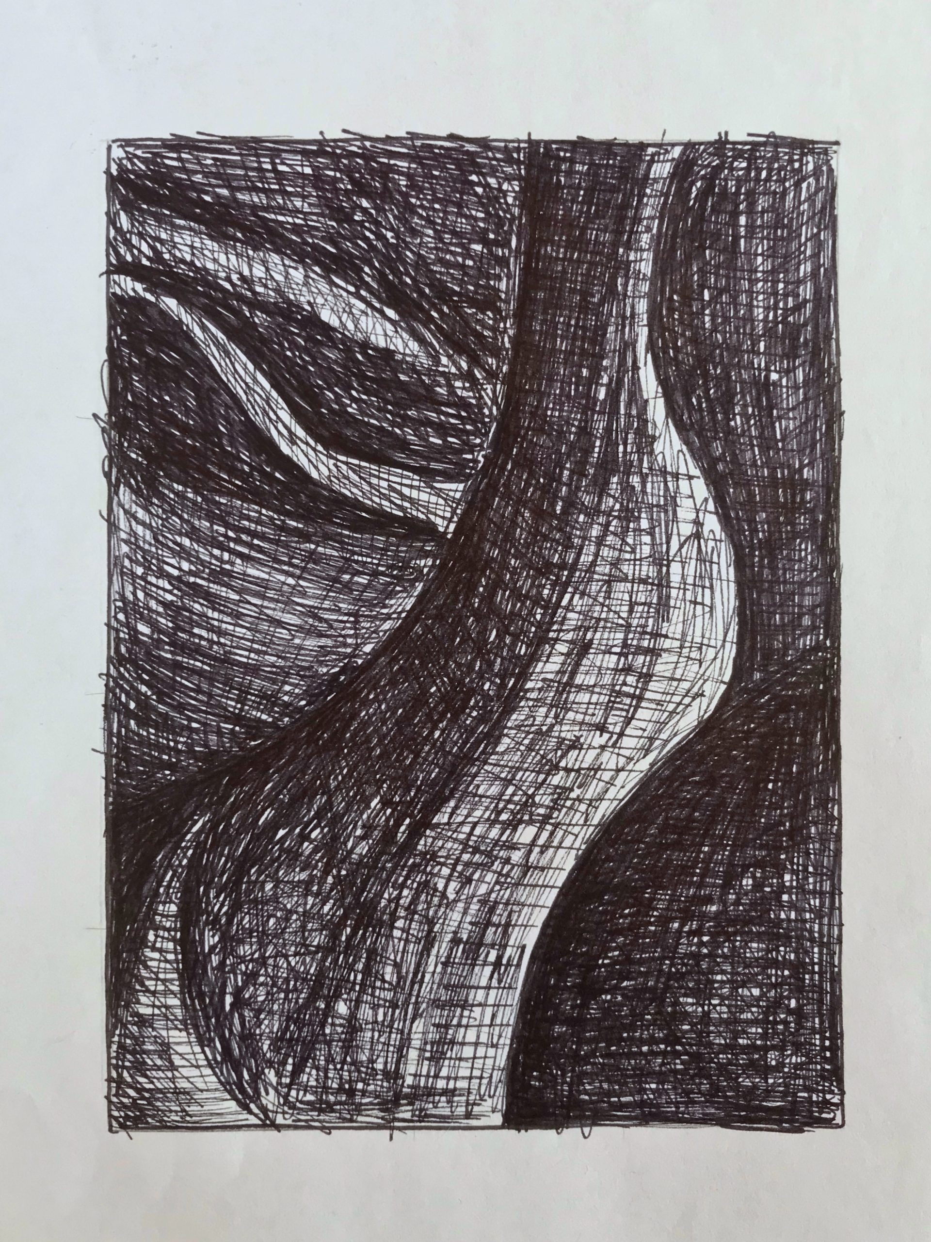
Very good, but the large dark shape to the upper left is much darker. Like your other ink drawing, the freer stroke in the values doesn’t extend to the forms themselves; shapes could be tidied up, even as the hatching strokes remain freer. See the examples I sent a week ago for an example.
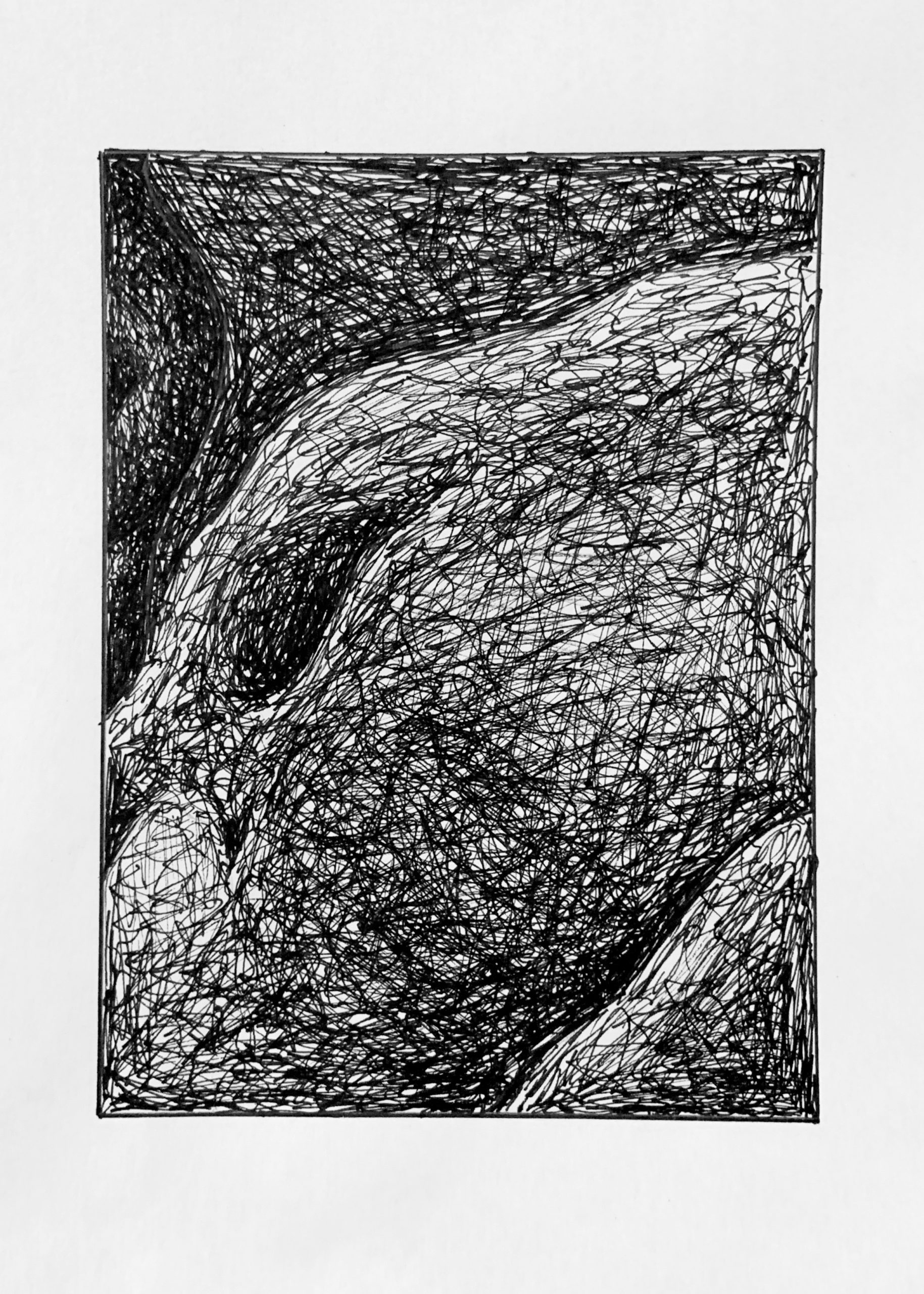
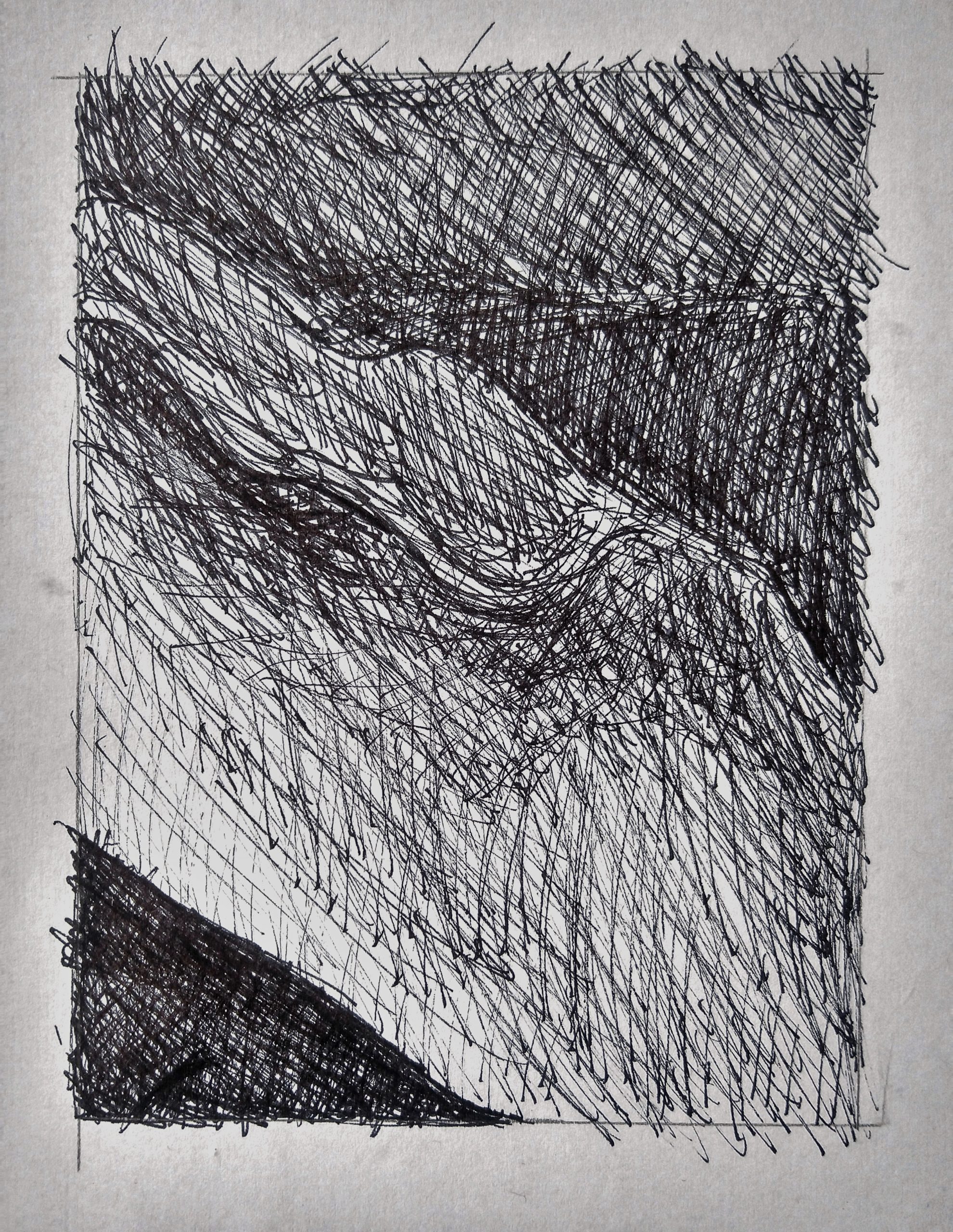
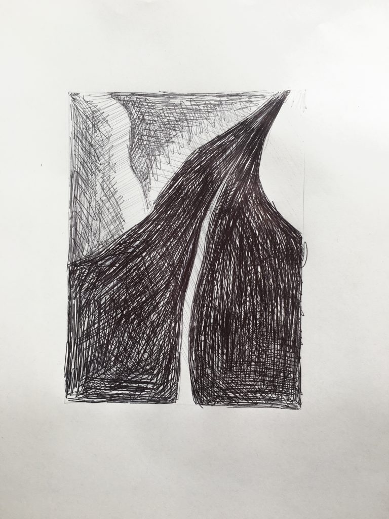
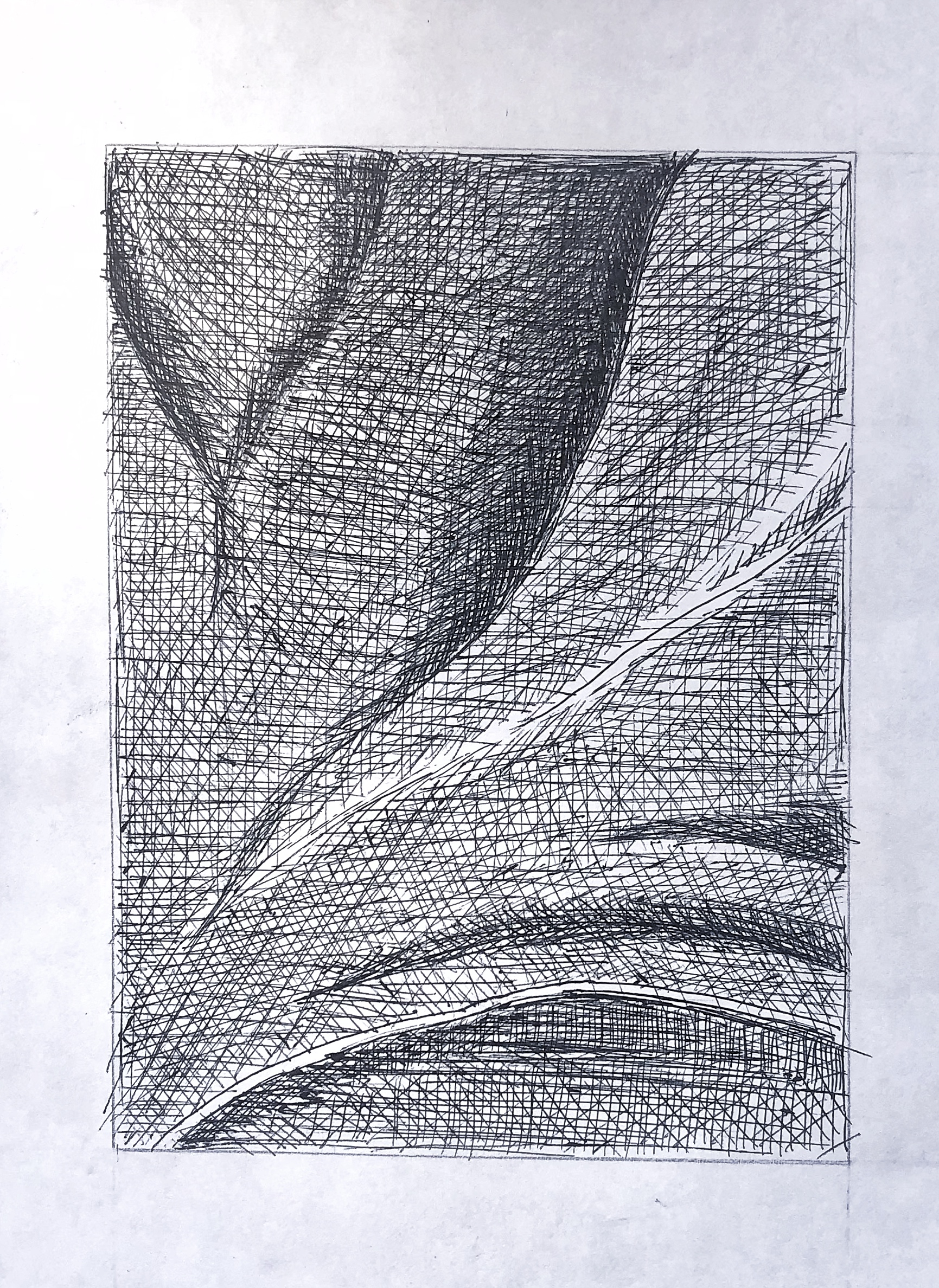
As noted in my email to the class, these strokes are too forceful and untempered. The texture here should be built gradually from many layers of strokes, each lightly applied and “neutralizing” the grain in one another. This can be improved by using a very sharp point to draw into the space and gaps between the darkest strokes, to even the texture.
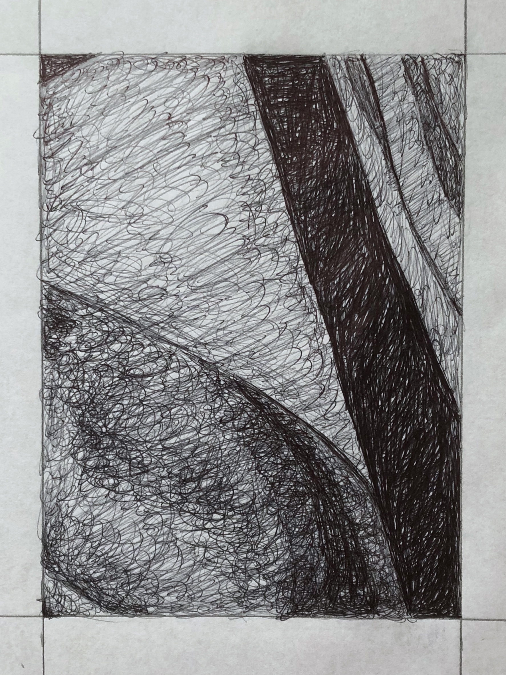
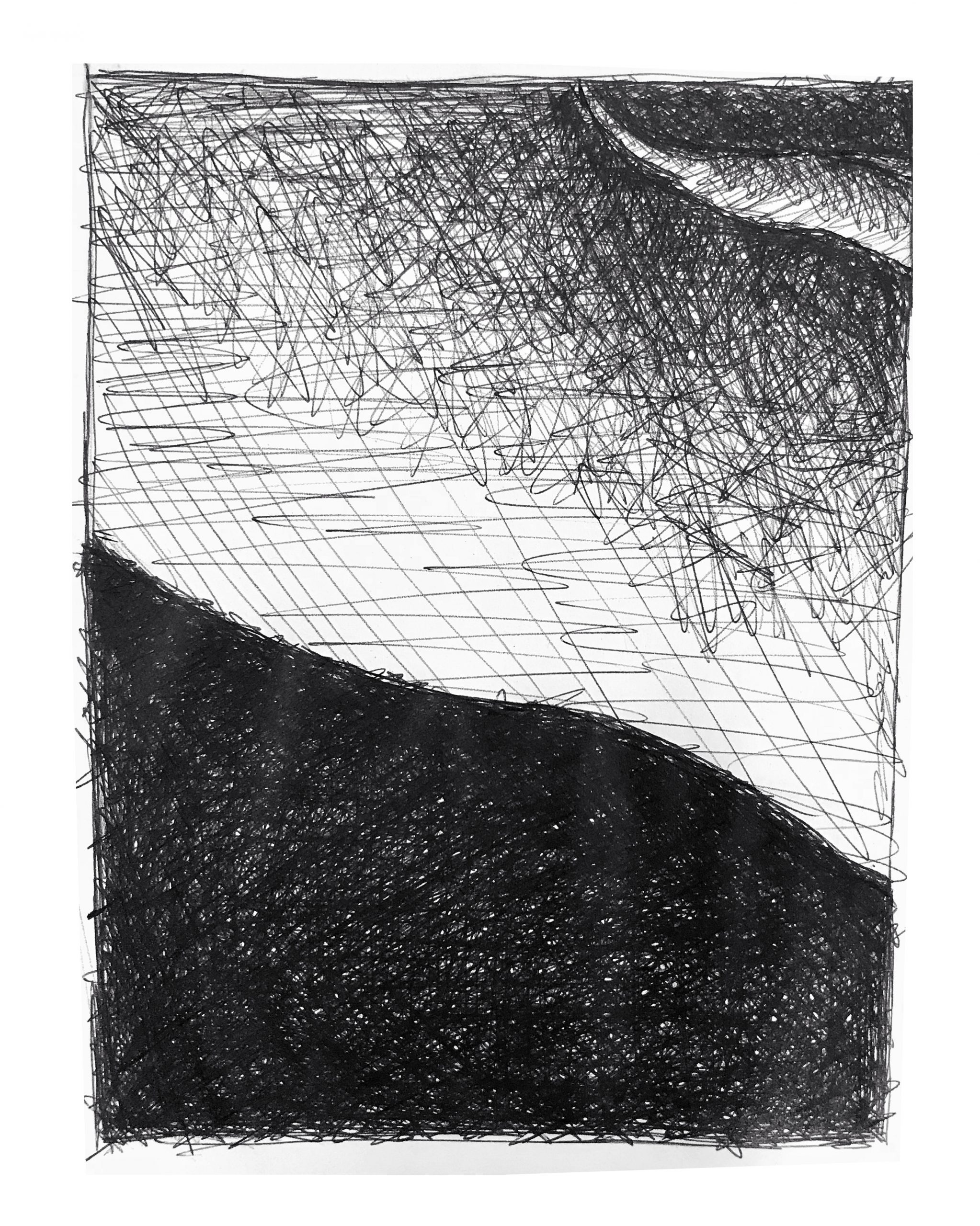
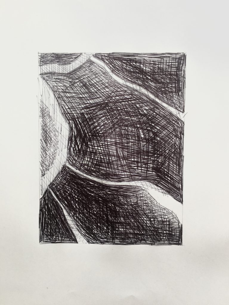
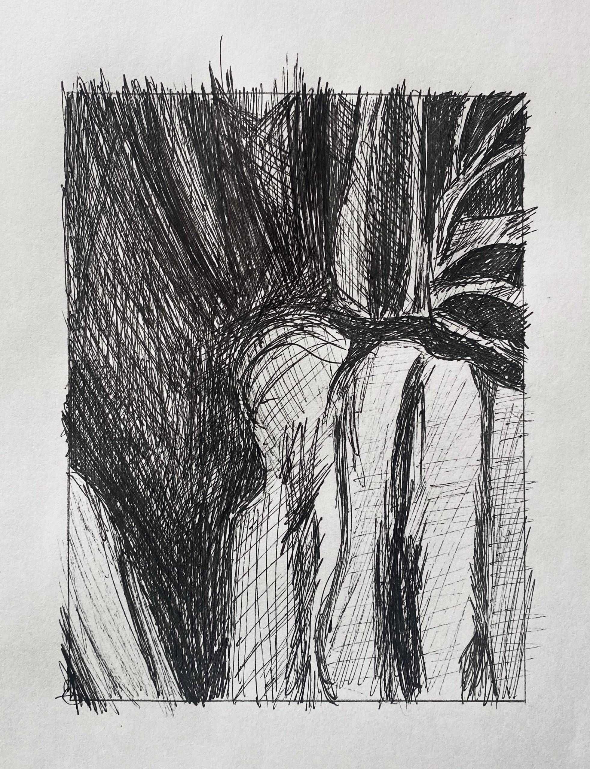
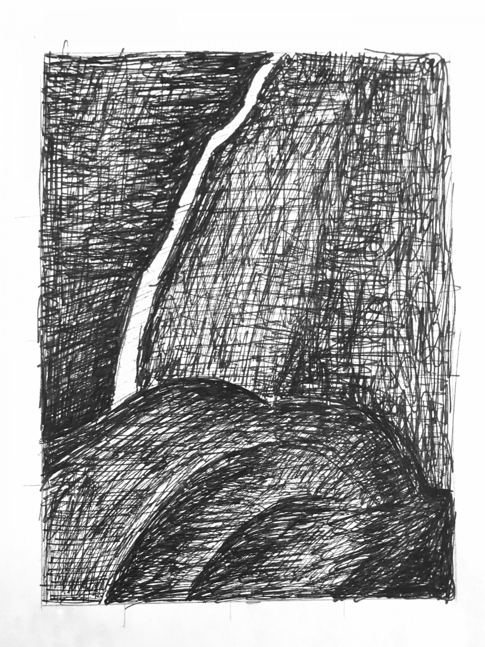
 Very good so far, but the darks need to be much darker–many more layers of scribbling. The white stripe on the lower left is a middle-grey, not white. Even with this expressionist technique you can define the edges of shapes more accurately. The hatching might be free but the forms should have as much definition as they do in the reference image.
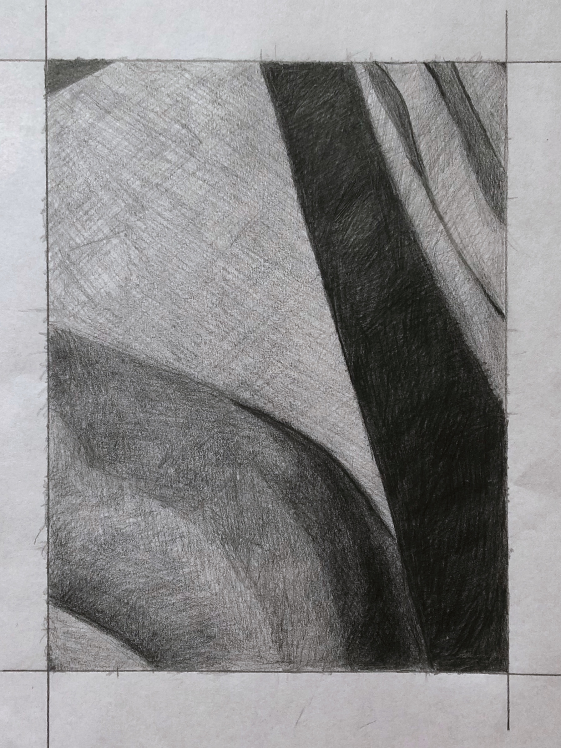
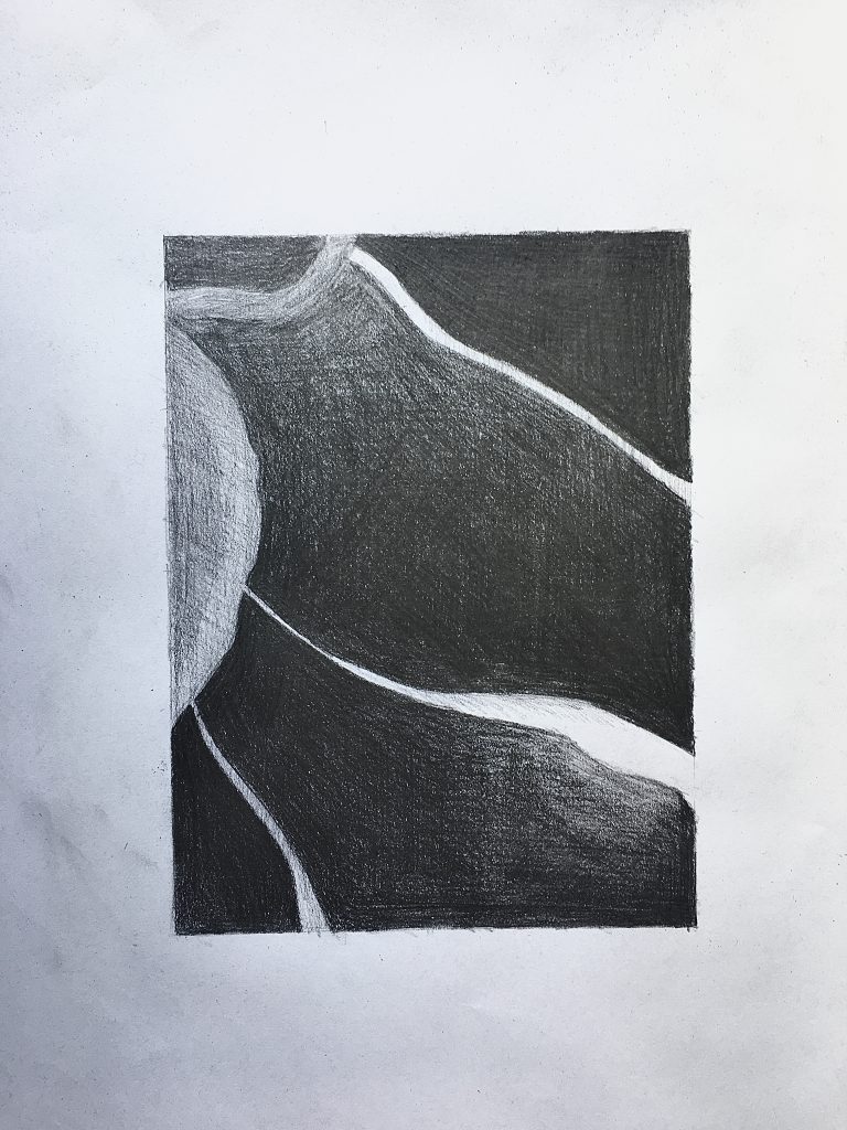
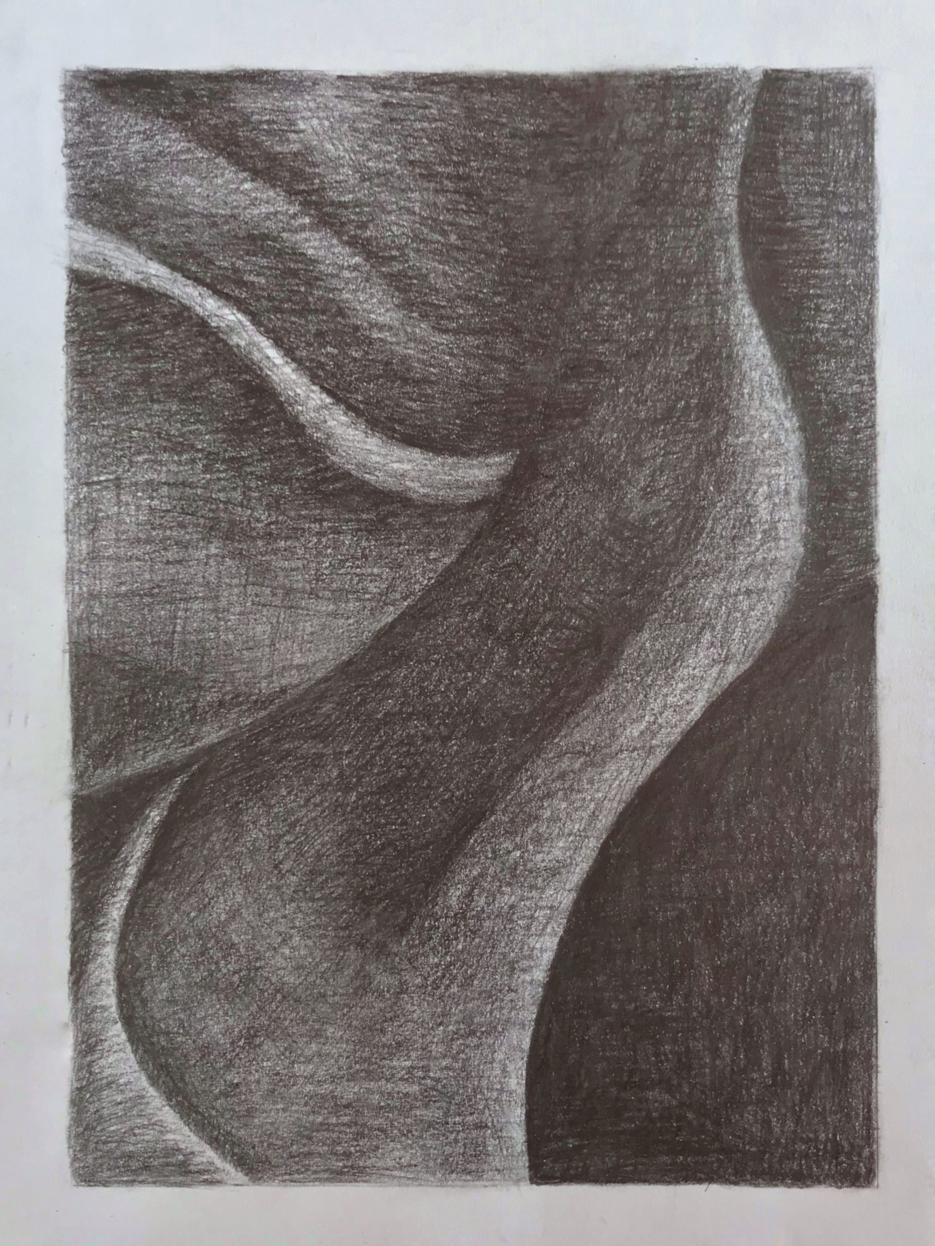
 Very good, but the upper right corner and top edge aren’t nearly that much lighter than the areas below. That slight value change is nearly imperceptible, and much too exaggerated here. Note also that the bottom portion of the lighter shape on the left shades into a darkness almost as dark as the black on either side of it. The top end of this shape is darker as well.
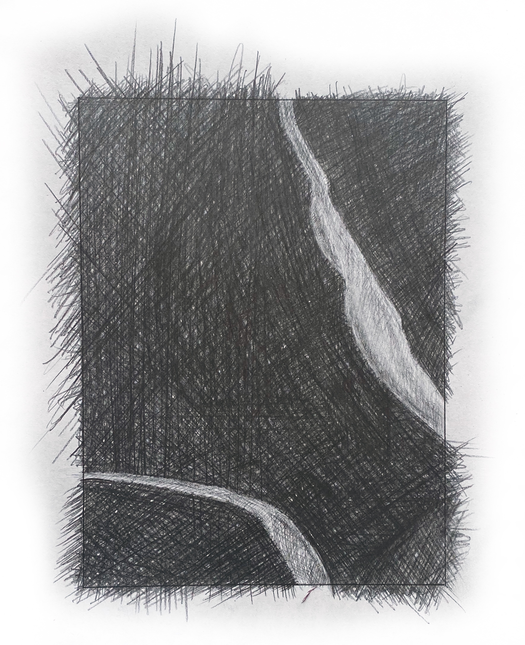
 The better of the two versions of this one, but the upper edge and upper right corner are darker still. Better on the light shape in the lower left as well, but its lower portion is still darker.
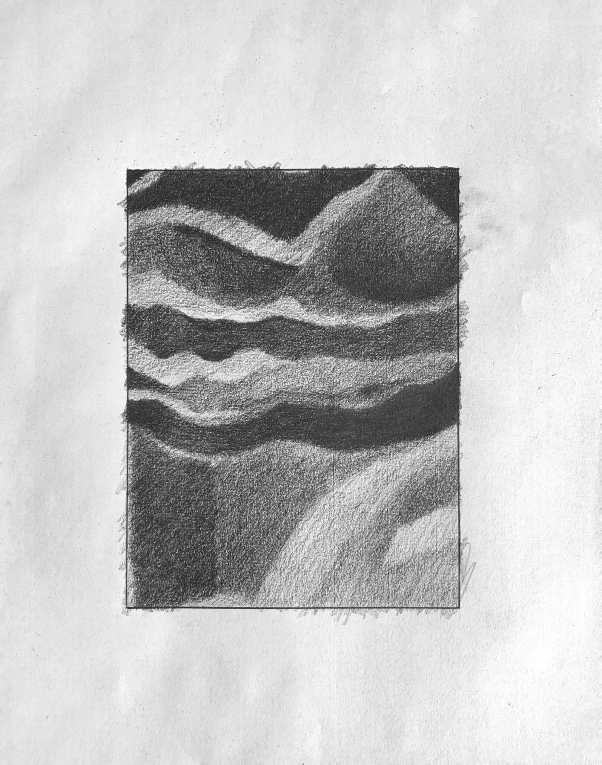 Good, but the mid-values are all darker than this. The darker greys in the upper half are all closer to black than this. The light shape at the lower right is altogether darker as well–not nearly as light as the lightest areas in the upper left. Just to the left of this shape along the bottom edge, is a small shape that you’re making much lighter than it should be.
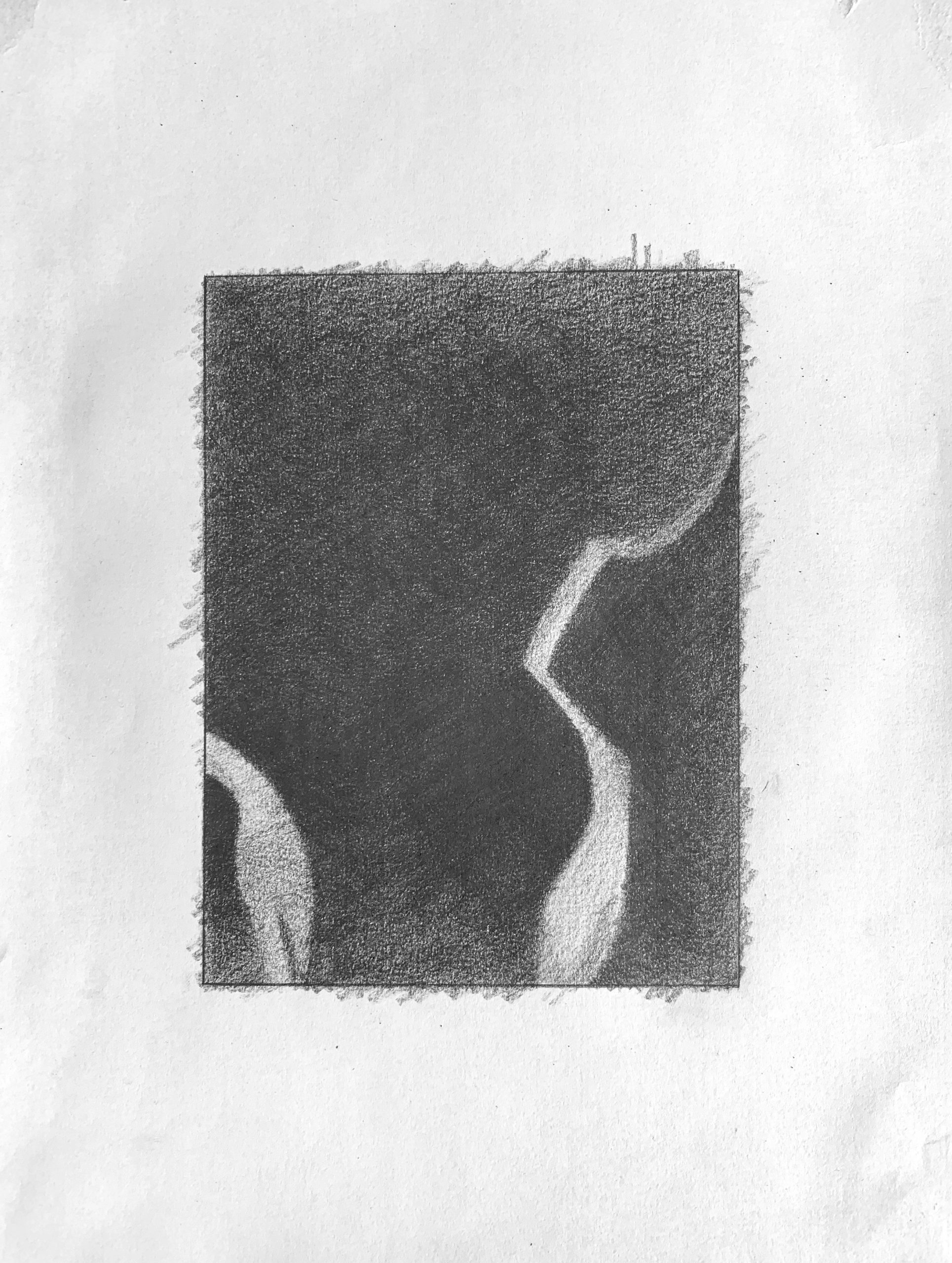
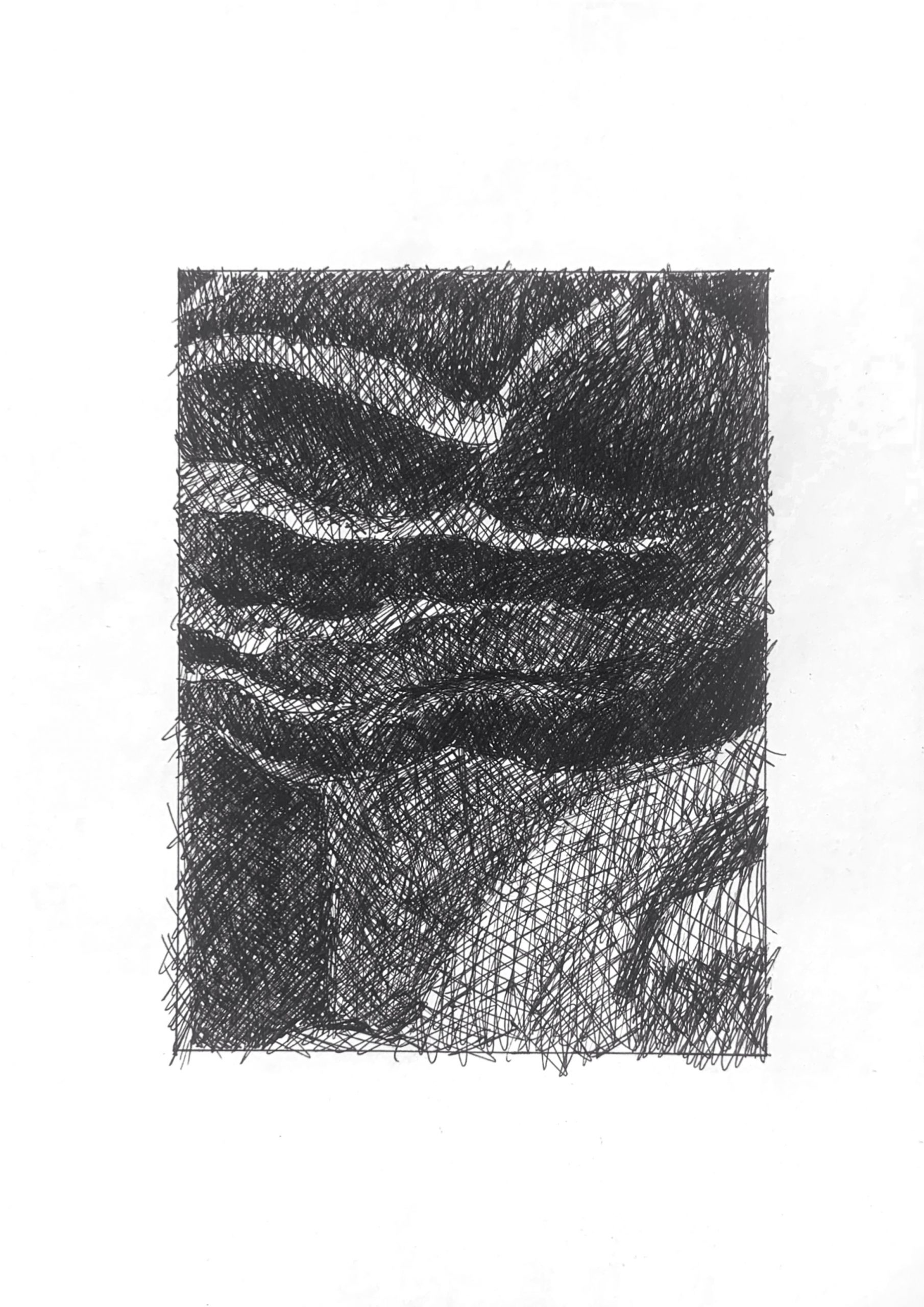 You’ve almost lost the lights in the upper left, but otherwise this is very good–exactly what I was trying to describe above in the pencil version. Don’t worry about those whites–you’re all set.