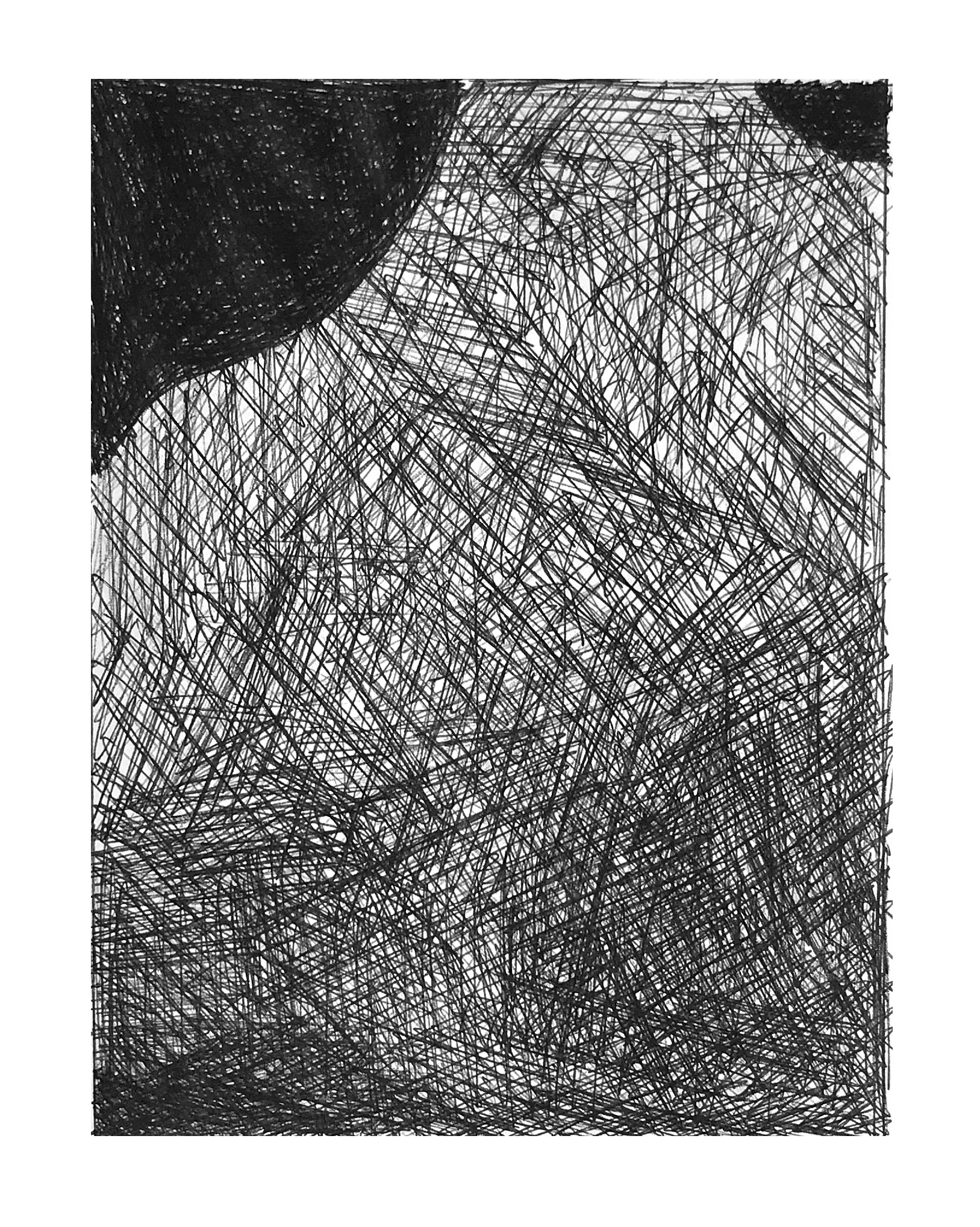
 Fine work.
Category: Drawing
Lily Value Pencil 2
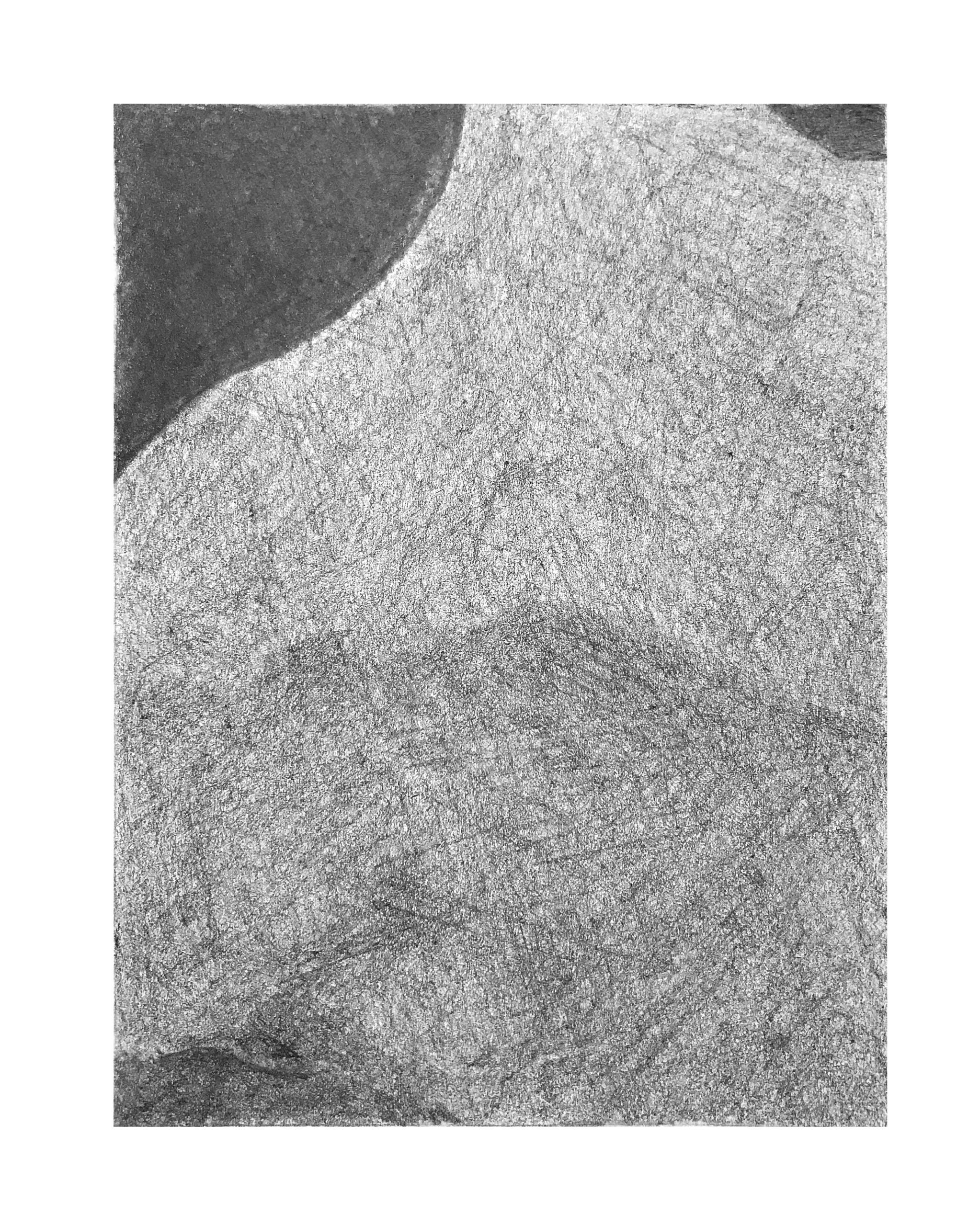 Good values, but you’re over-defining value changes in the large mid-value shape that dominates this composition. There is a shift there (around the mid-line between top and bottom) but it’s subtler and more gradual. Likewise the gradation from that dark area and along the bottom edge–a more seamless transition.
Lily Value Pencil 1
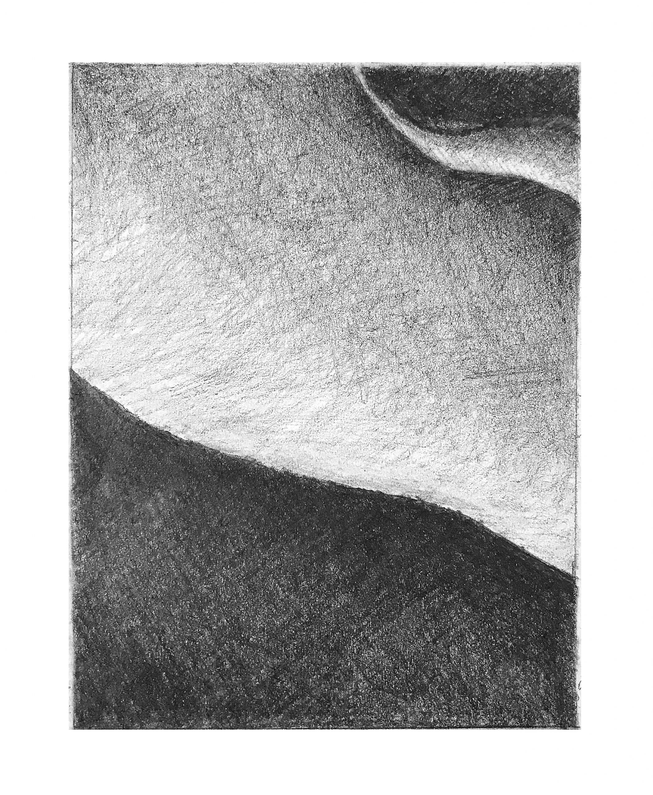 Excellent work.
Anibal – Time Capsule – Toilet
Hannah Schleifer Time Capsule
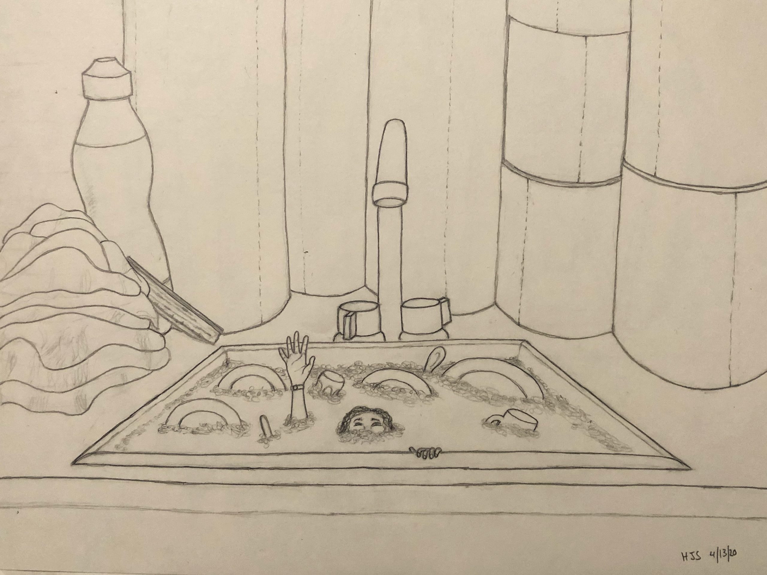
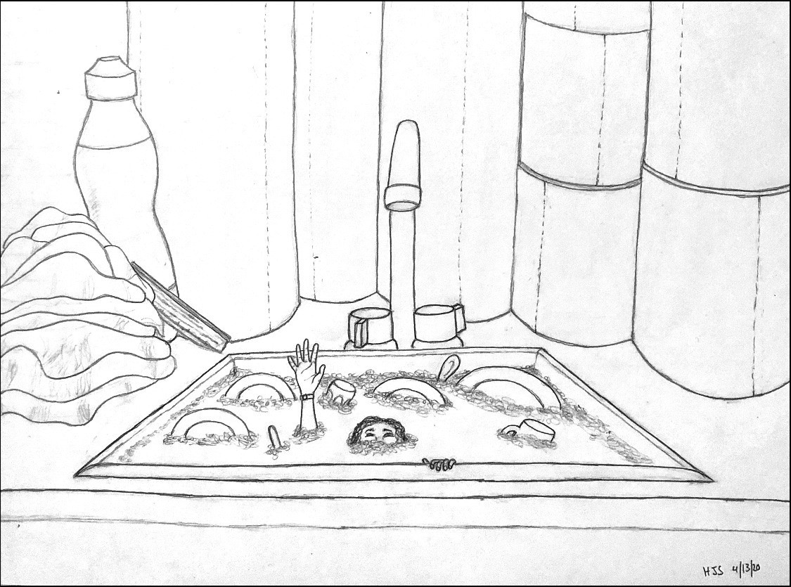
I took the liberty of editing this further, using the tools I’ve shared before, to give us a better look (and to do it justice):
And my suggestion to raise your viewpoint (see comment).
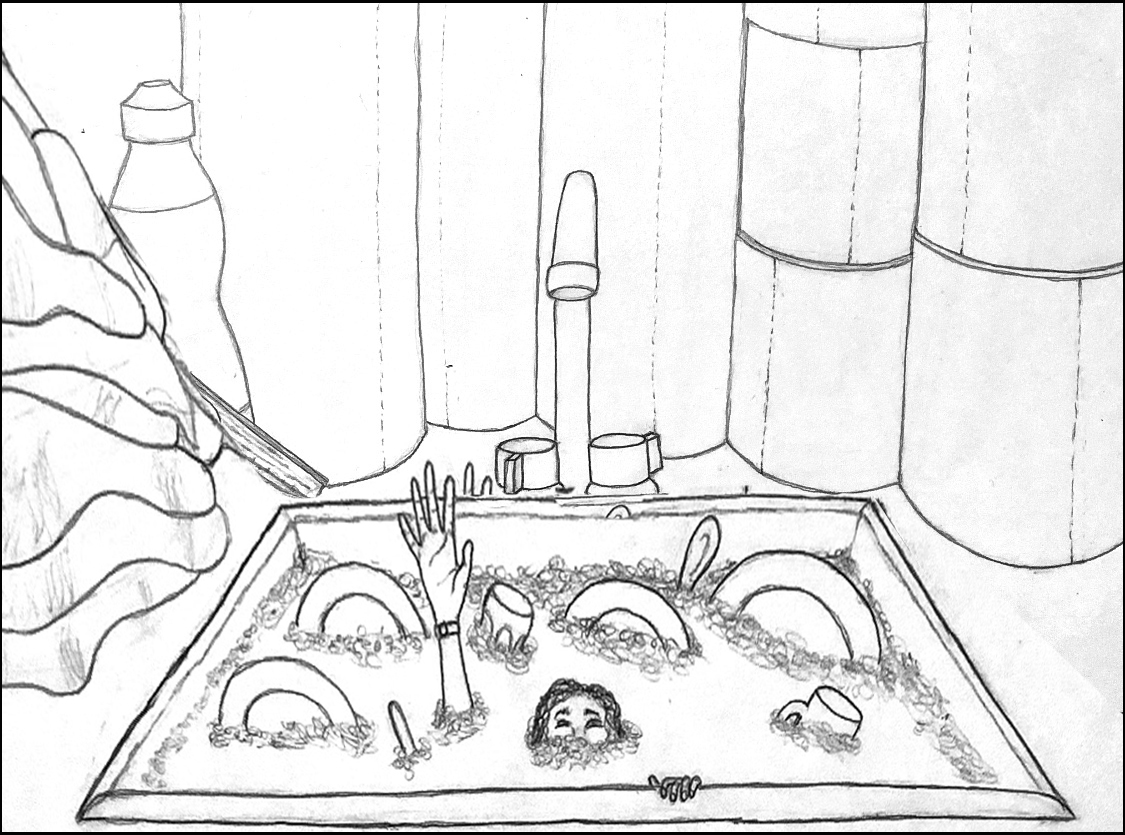
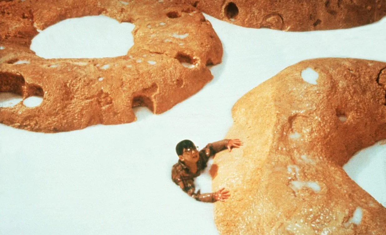
This also brings to mind this scene from “Honey, I Shrunk the Kids” (from when your parents were your age). That’s a kid in a bowl of Cherrios.
Grace BT Time Capsule Drawing
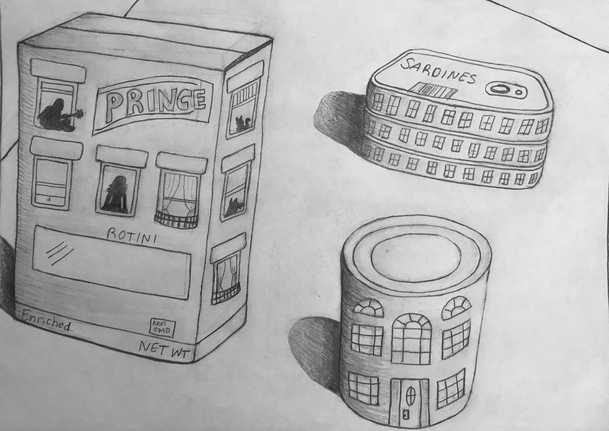
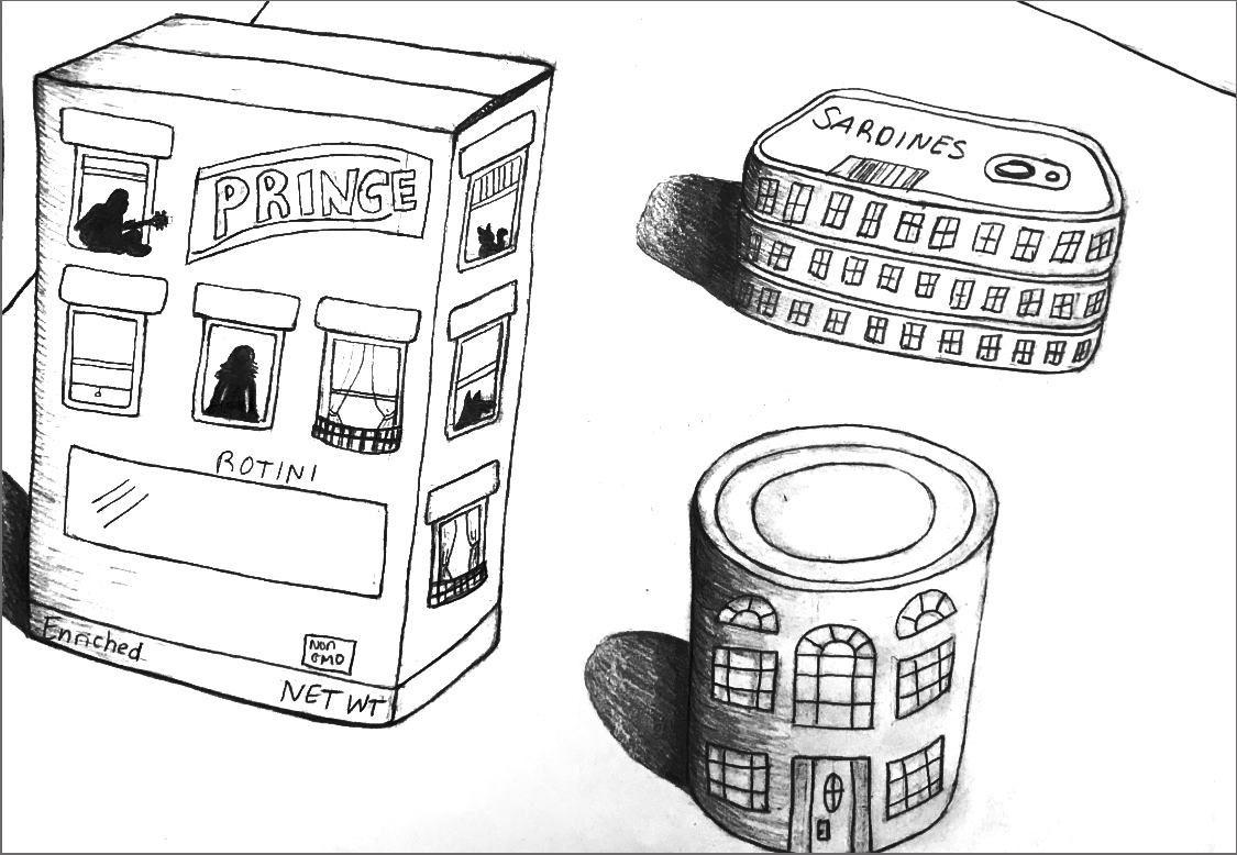
The cast shadows darkened a bit in the process, but here’s a lighter, higher contrast version to make it easier to see (I added the outline):
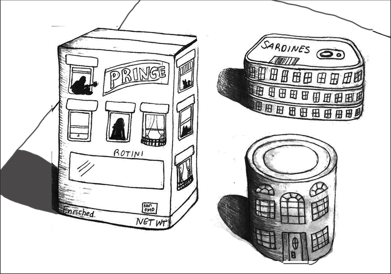
And here’s a version (below) with a little more space around the objects and straightening them up, so they’re not sliding off the table. There’s a certain charm in that, but it does make for an unstable composition. I think the added space around them gives them a stronger sense of what you’re after–objects isolated not only from one another but from the border (space around them) as well.
This reminds me of the famous Saul Steinberg drawing (a New Yorker cover from 1976), of a New Yorker’s view of America. Your objects have a similar child-like charm, and even your style and lettering (as well as the eye level, looking down) are reminiscent of his–great company to be in:
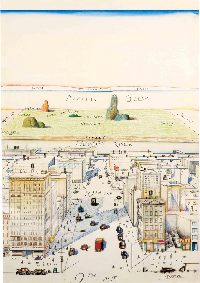 (that empty space at the top is for the name of the magazine).
Yours also reminds me of the work of Roger Brown, especially the silhouettes in the windows, but also that view from above:
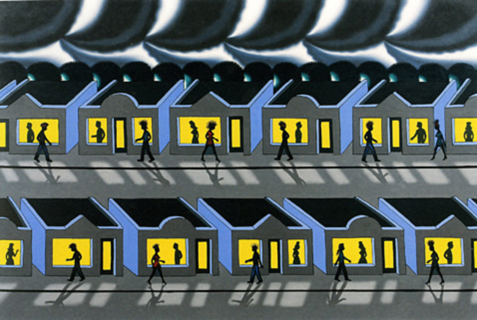
His was done years ago (1991), but has a prescient sense of social isolation.
Finally, yours reminds me of a tableau that our daughter made a couple of weeks ago, using paper-covered cereal boxes and such, suggested by Mo Willems on his Lunch Doodles telecast:
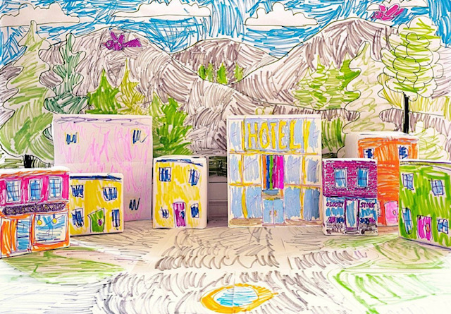
Amanda Trent- Time Capsule
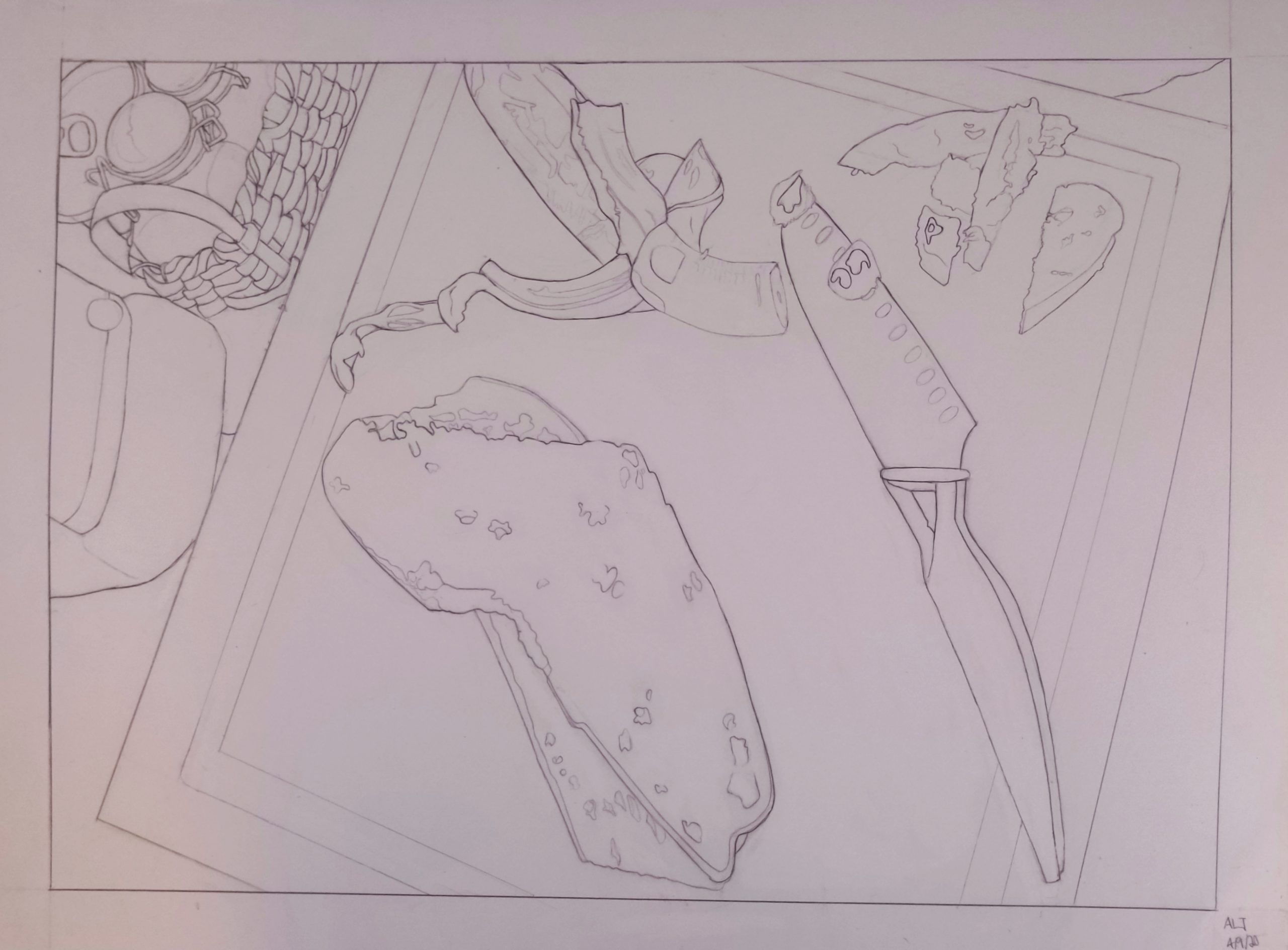
Better editing:
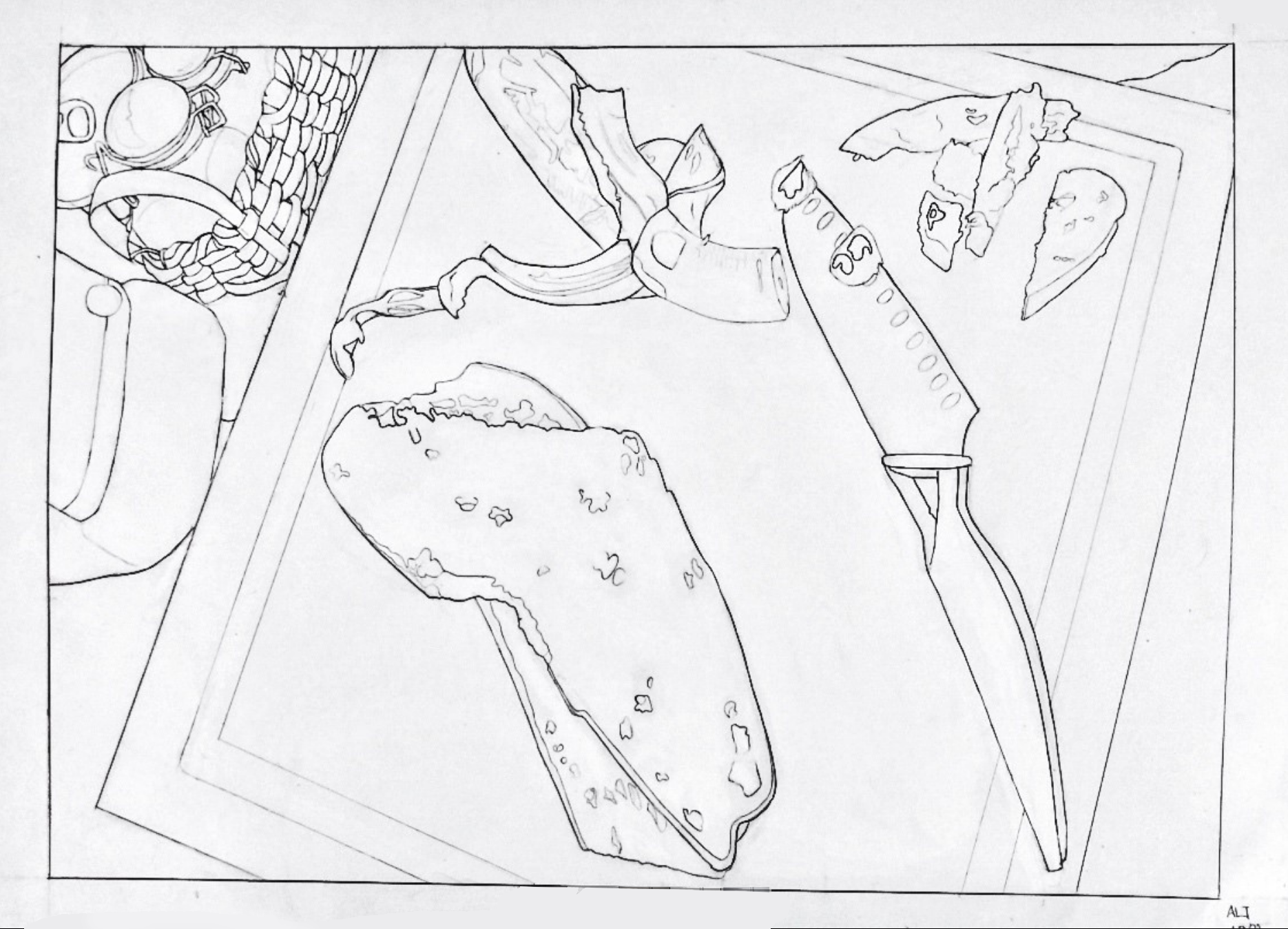
Project 2
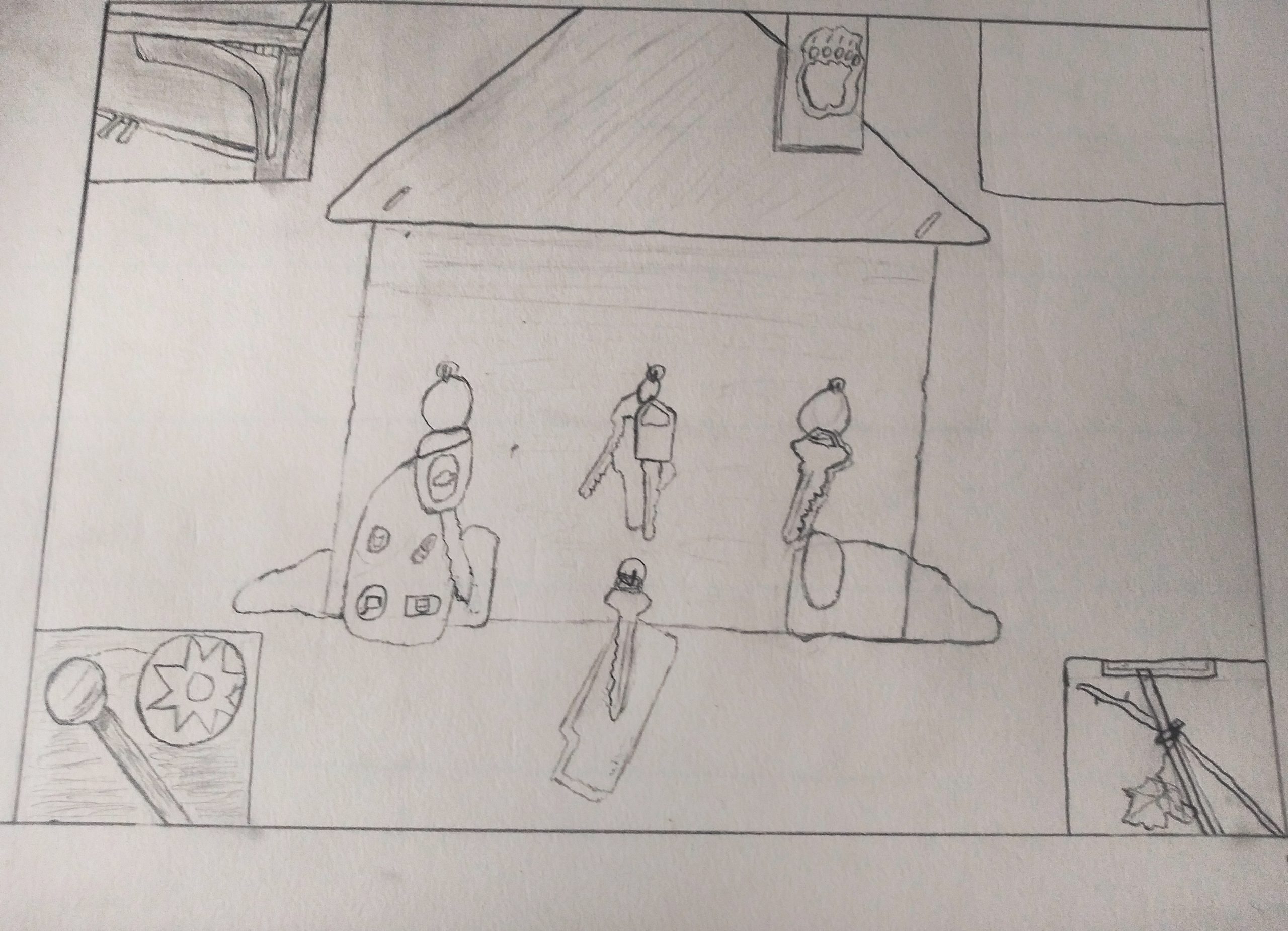
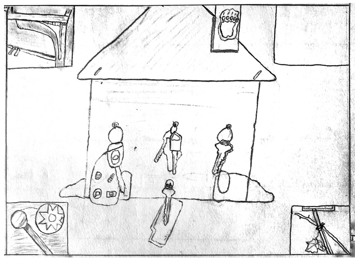
I’m guessing this is closer to the cropping and exposure of the original. We can’t begin to talk about your work until it’s presented more clearly. Please take the time and effort to make a good exposure and edit it more effectively. If you’re having difficulty with this just let me know.
Drawing Project 1
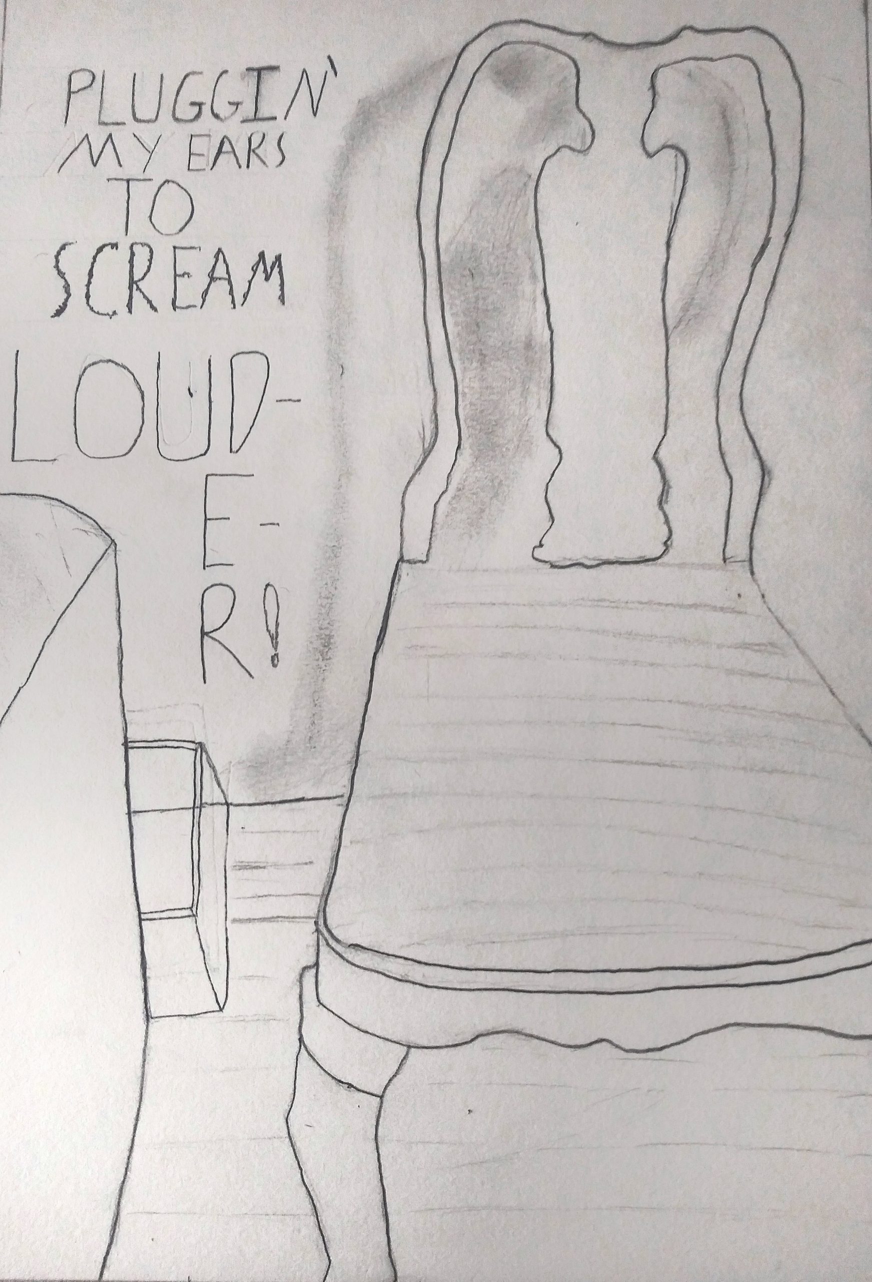
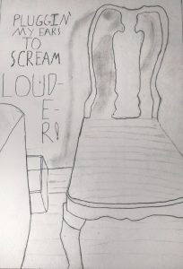
I reloaded this so that it could be opened larger with a click. Love that you included the text, which is like concrete poetry–poems whose graphic design contribute to their meaning, such as the word “louder” too big to fit in its space, spilling over twice to a new line. The contrast between this sentiment and the apparent calm and domesticity of the chair is very powerful. Great drawing.
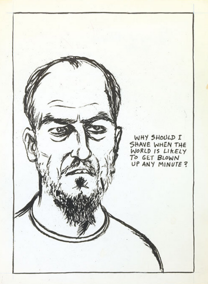
Raymond Pettipon, another artist who uses text and image very effectively:
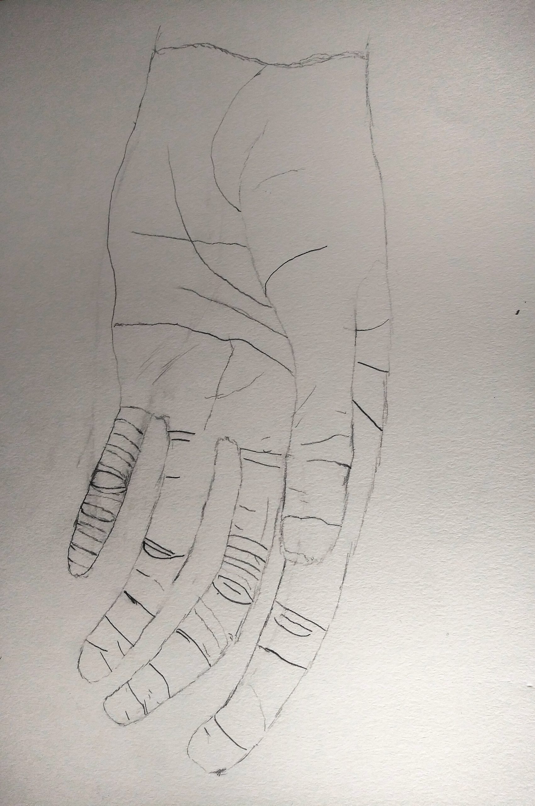
Very good drawing, but could be better still with a more forceful line quality. You’re being too circumspect, and your theory about the small finger doesn’t hold up. Better the thumb, to bring it closer. Some other examples:
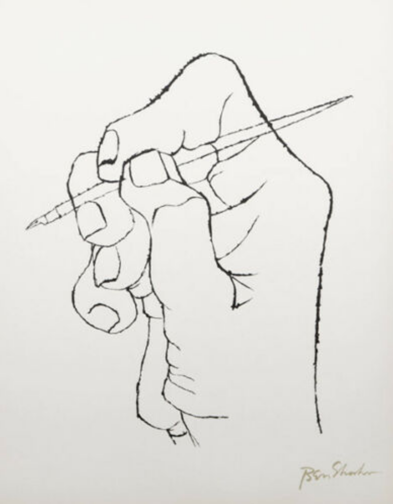 Ben Shahn
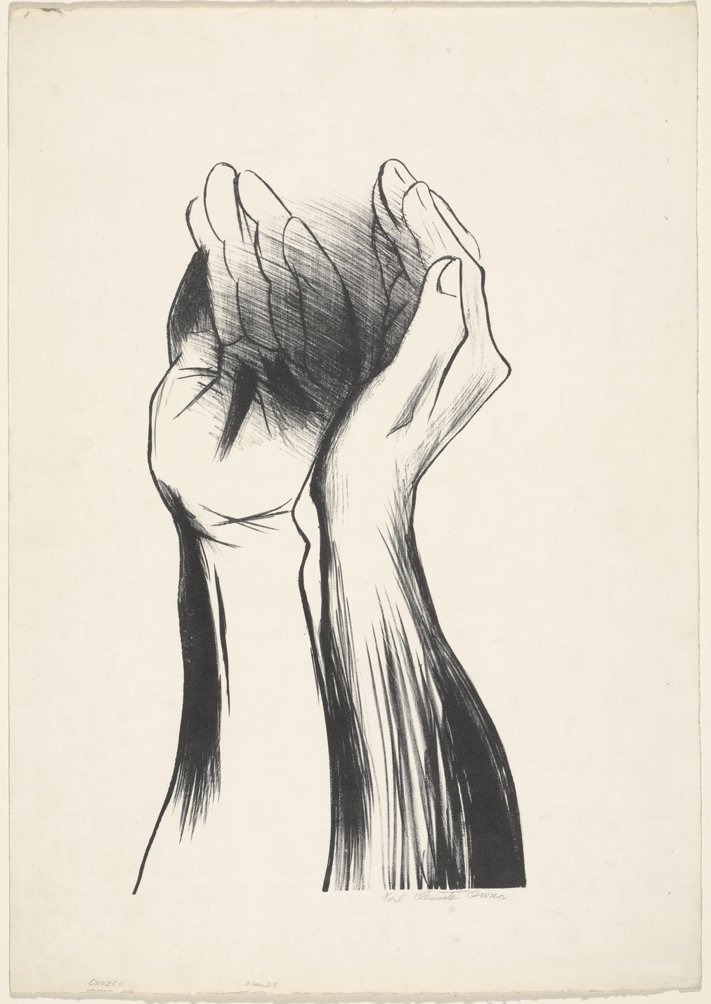
José Clemente Orozco
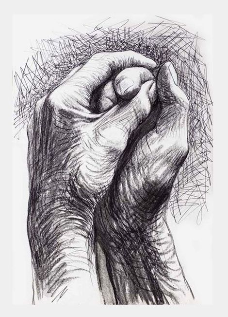
Henry Moore
Aadhya- Time Capsule
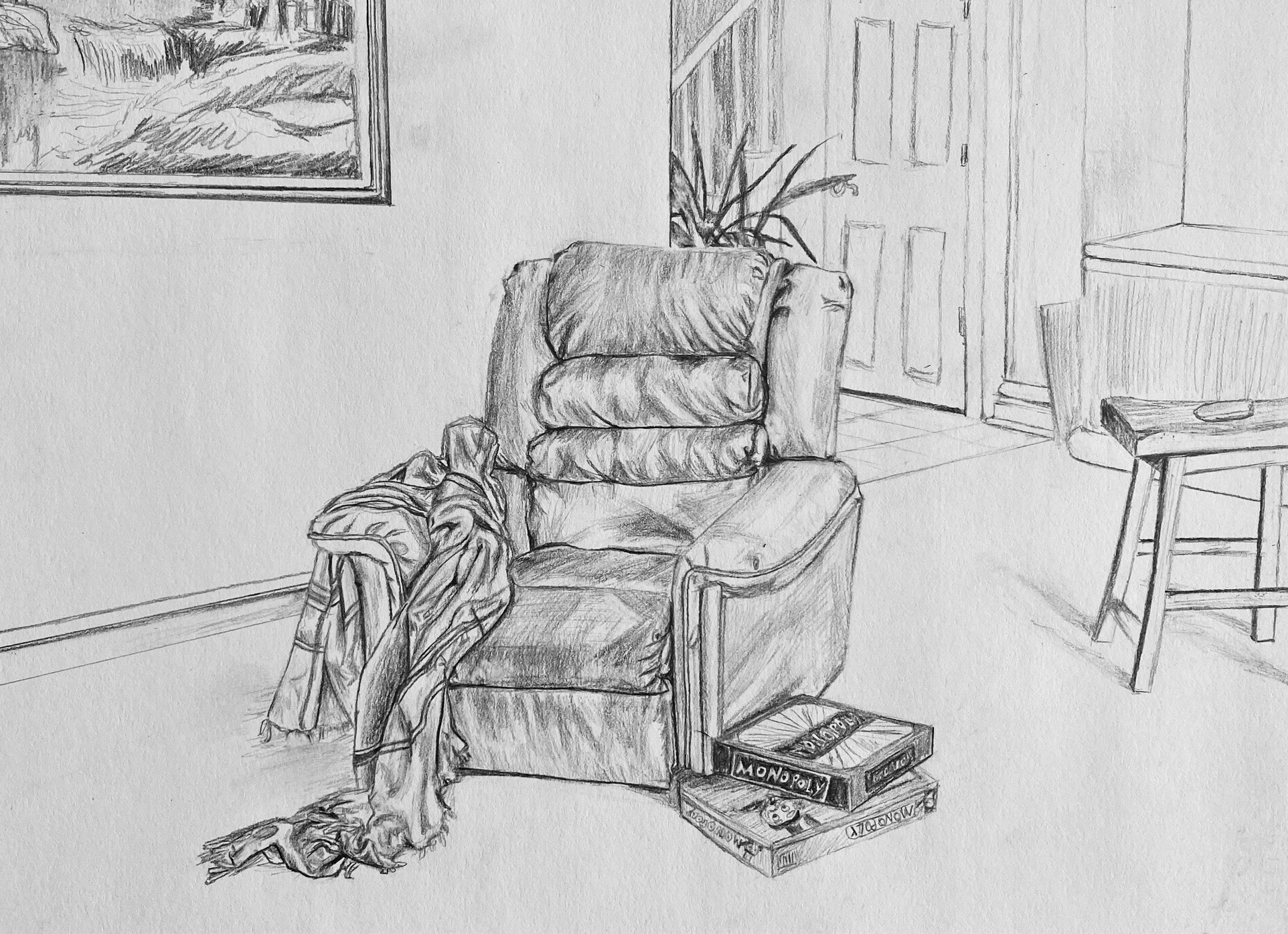
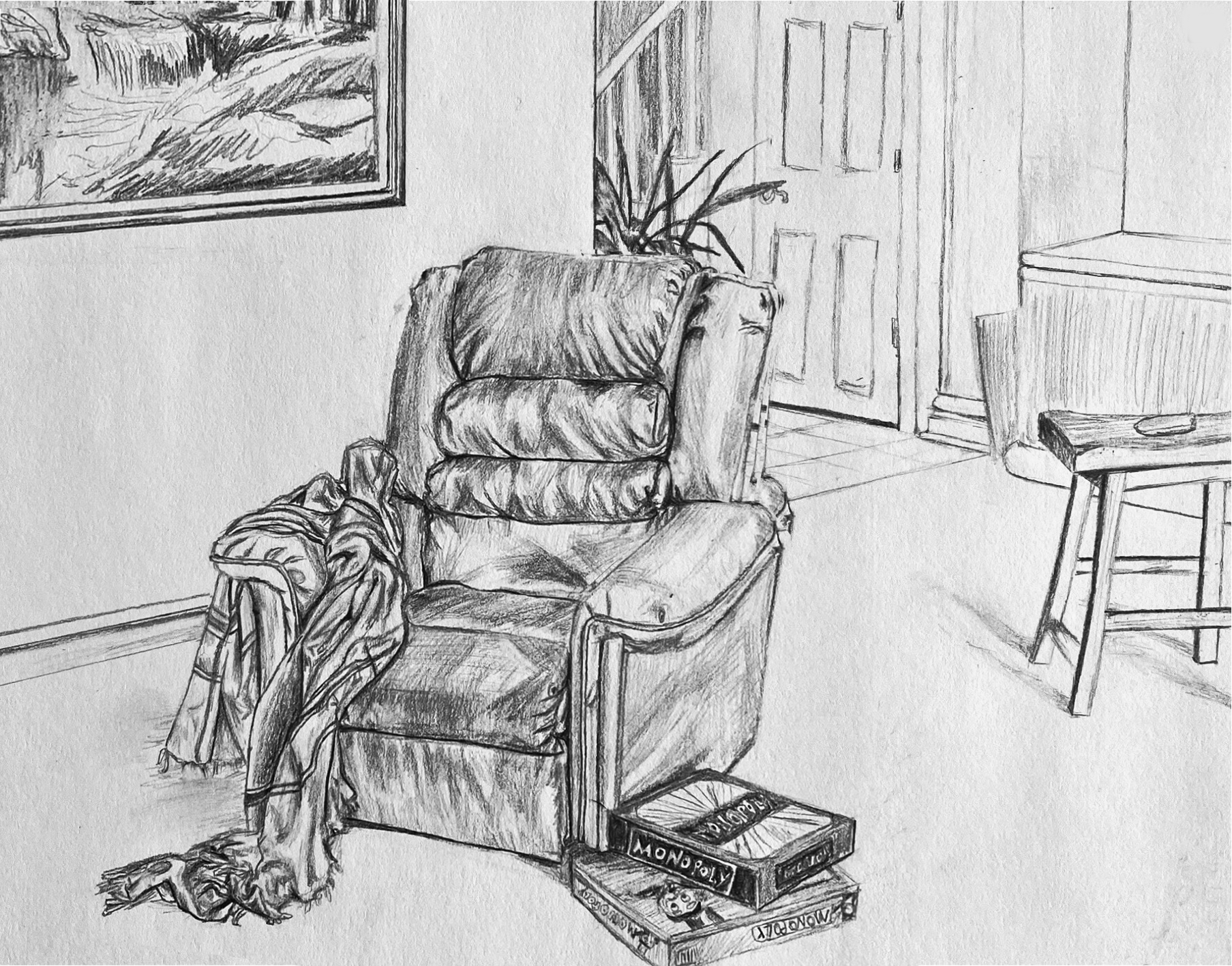
Excellent work (see my comments) but your perspectives are off. Most noticeable is the painting on the wall, the bottom edge of which should be converging on a common vanishing point with the baseboard and the short end of the countertop. But the recliner is also slightly askew. It would look more like this:
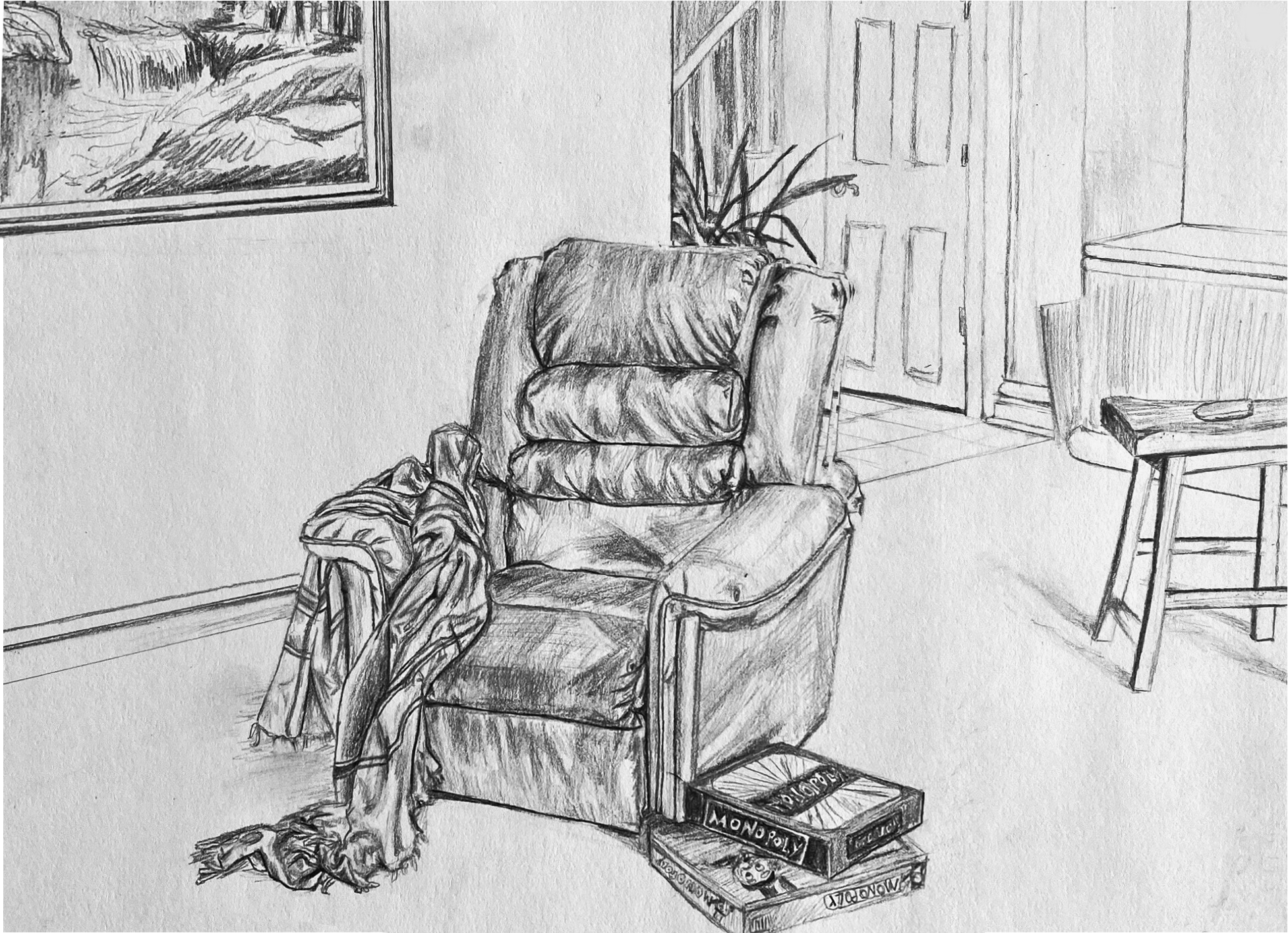
Note how that also has the games touching the edge of the frame, just like the stool, the painting, and all the background material. Not only does this complete the visual “theme” but makes stronger (better defined) negative spaces and ties the image to the rectangle. Your objects float a bit.
Finally, I’d also recommend cropping the left a bit. It goes on a bit without adding anything to the drawing (much like the space between the plant and the bed last week). Your sketch of the painting is just terrific. I didn’t want to lose any of it so I moved it down the wall–and in the process made a tighter connection (and better negative spaces) with the chair. Note how the cropping plus the more correct (and more dramatic) perspective anchors and opens the space to the viewer more.