(MW) Unless this was drawn on grey paper (and let me know if it was), I wanted to give it a better chance to be seen. The exposure above is too dark.
Professor Mark Wethli – Spring 2020
(MW) Unless this was drawn on grey paper (and let me know if it was), I wanted to give it a better chance to be seen. The exposure above is too dark.
I’m only guessing about the original, of course, but it felt like this needed more contrast–
I just threw a border on this in order to assess the composition better.
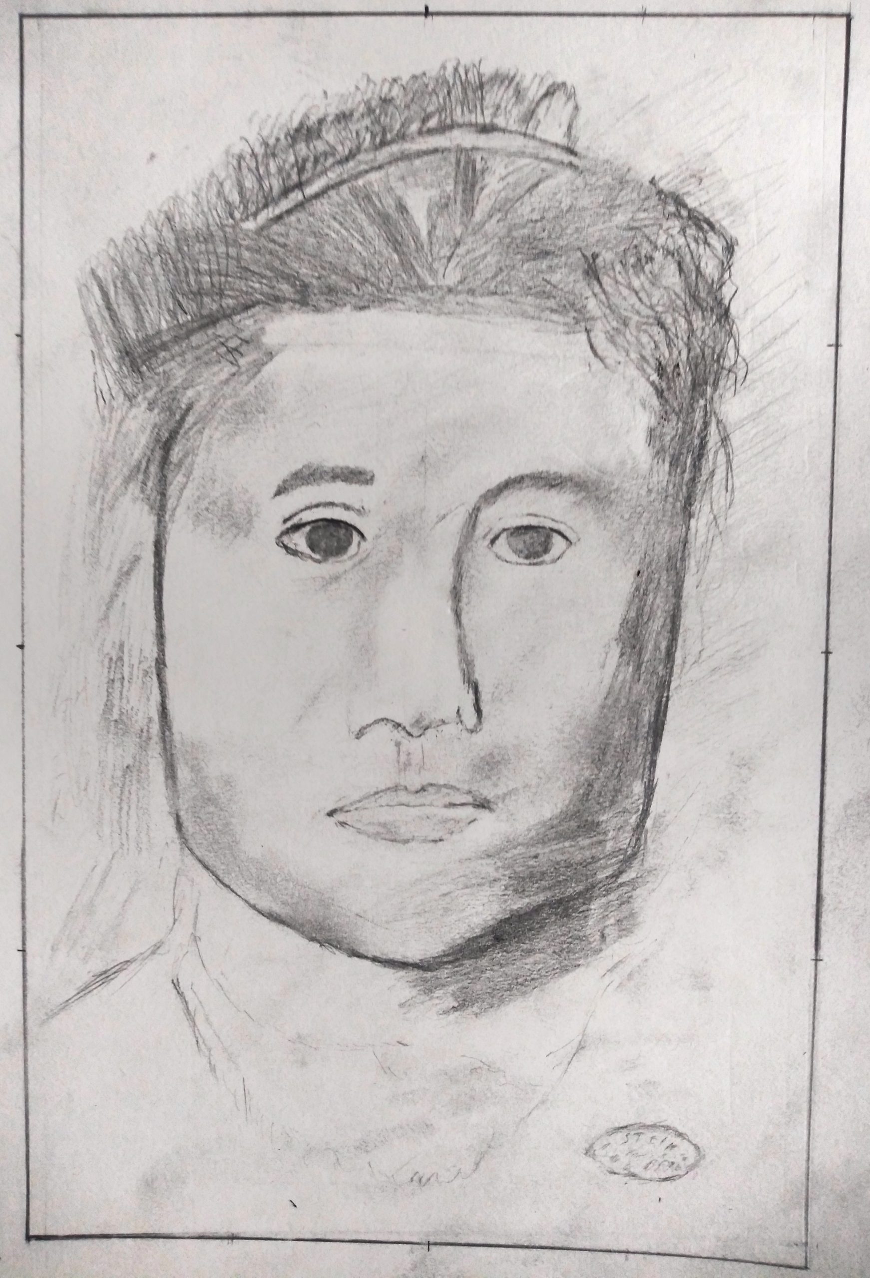
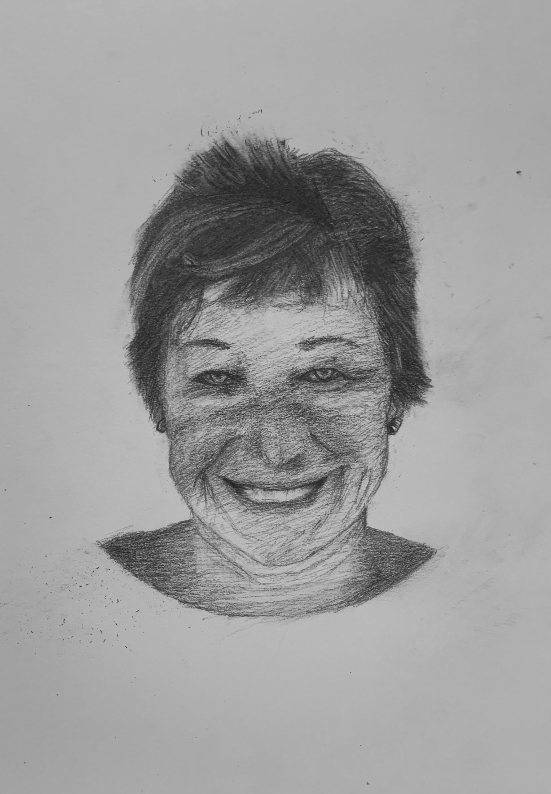
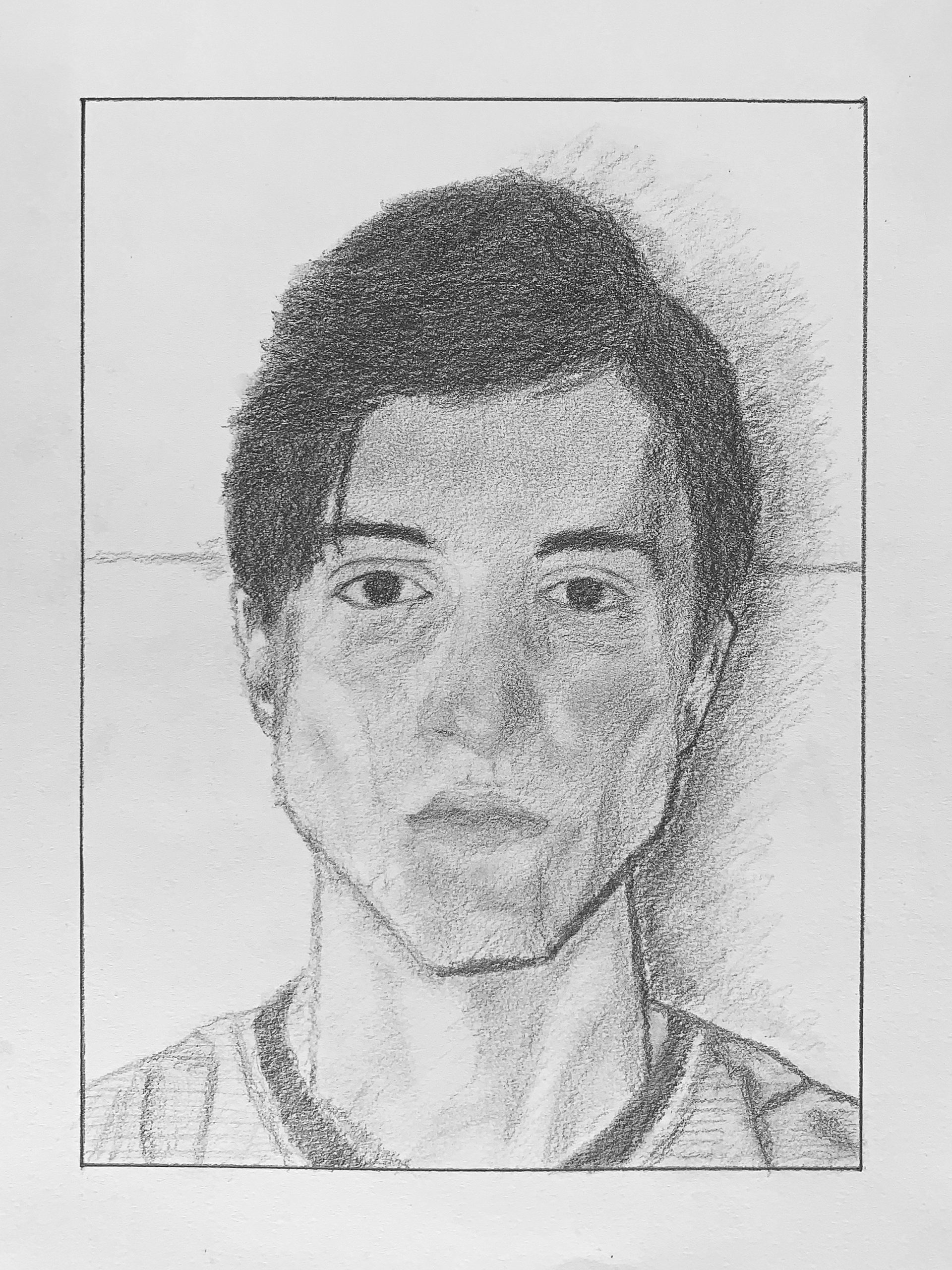
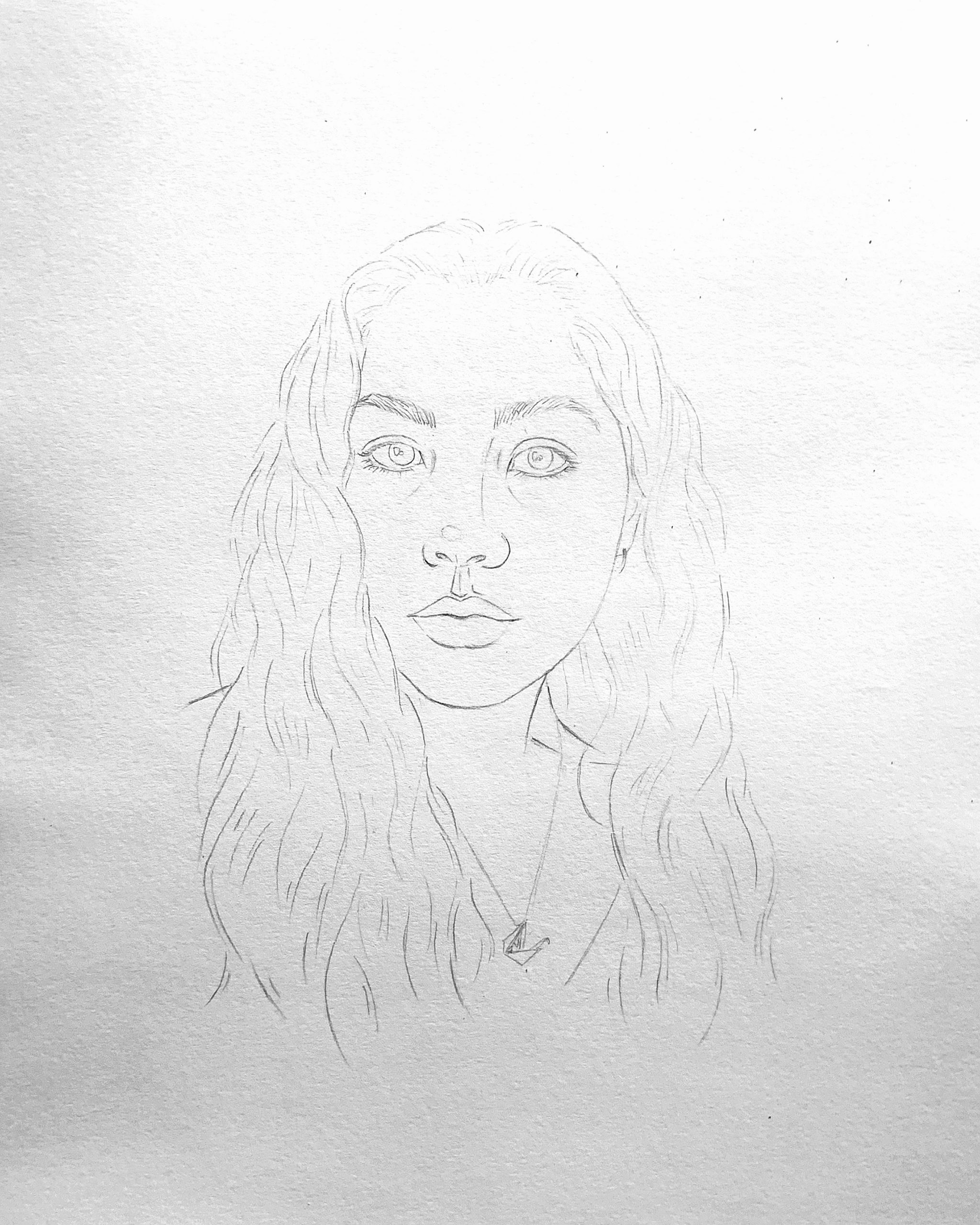
Good effort, Bryant, as far as it goes, but you need to slow down and look still more closely. Happily you have not substituted preconceived symbols for her features (like almond eyes or peanut shaped nostrils)–these are very much coming from the Degas–but you need to examine and push them further, from being more specific and particular about the shapes of the negative spaces around her head, to centering the features on her face, to the shapes of the eyebrows, and more.
Her eyes are also larger and more widely set. The one on the left especially is too close to the bridge of the nose. Notice that on the Degas (and as a rule) that the tear duct is directly above the outside edge of the nostril. You did better at this on our left side.
In the final stage, Degas applies his hatching more softly and deliberately. There are smudged tones here that don’t appear in the original, like the one between and just above her eyes.
You’re applying the fundamental lessons of the semester but not consistently and thoroughly enough, but all the same she’s looking back at us with a tender and tentative expression not so different than the original.
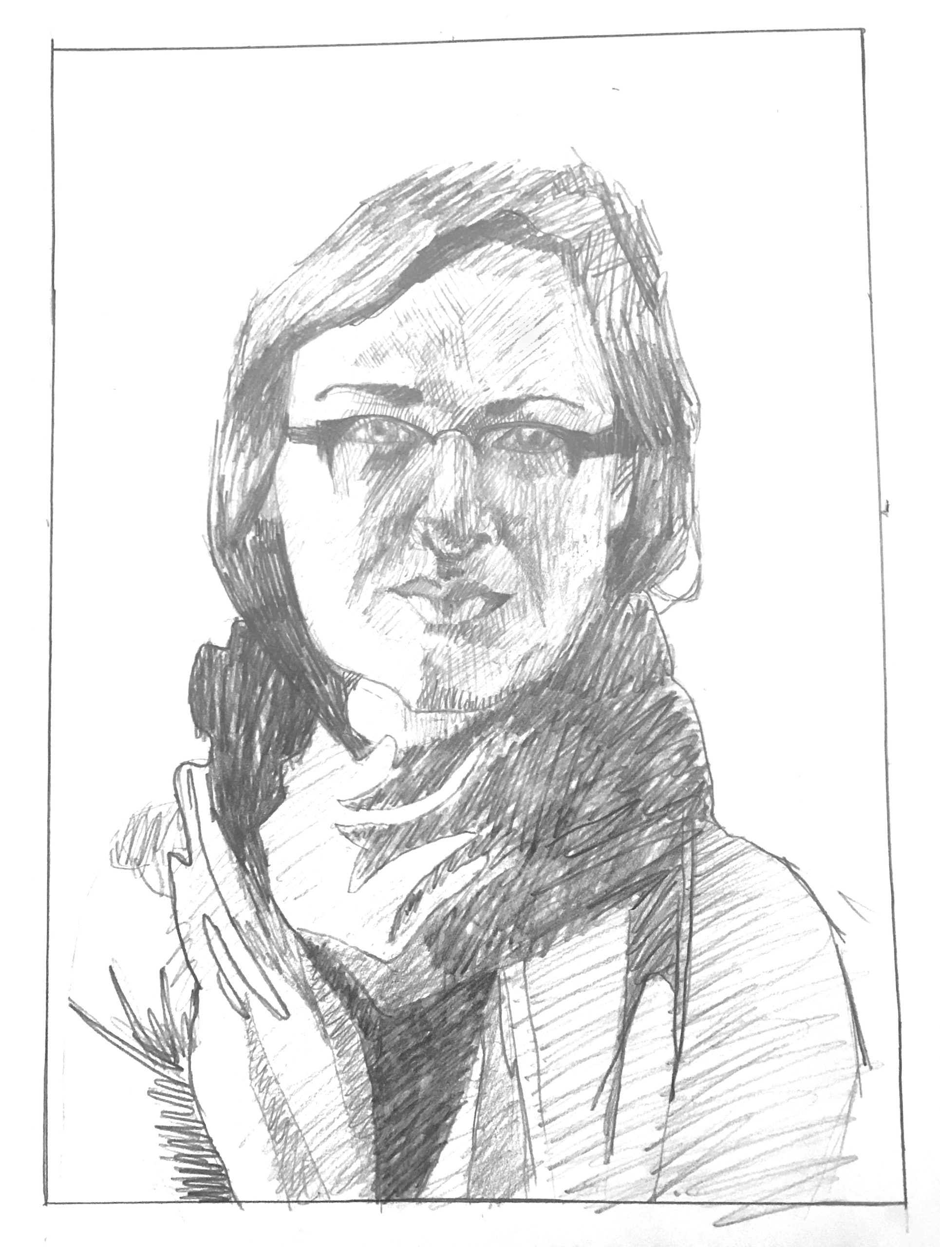
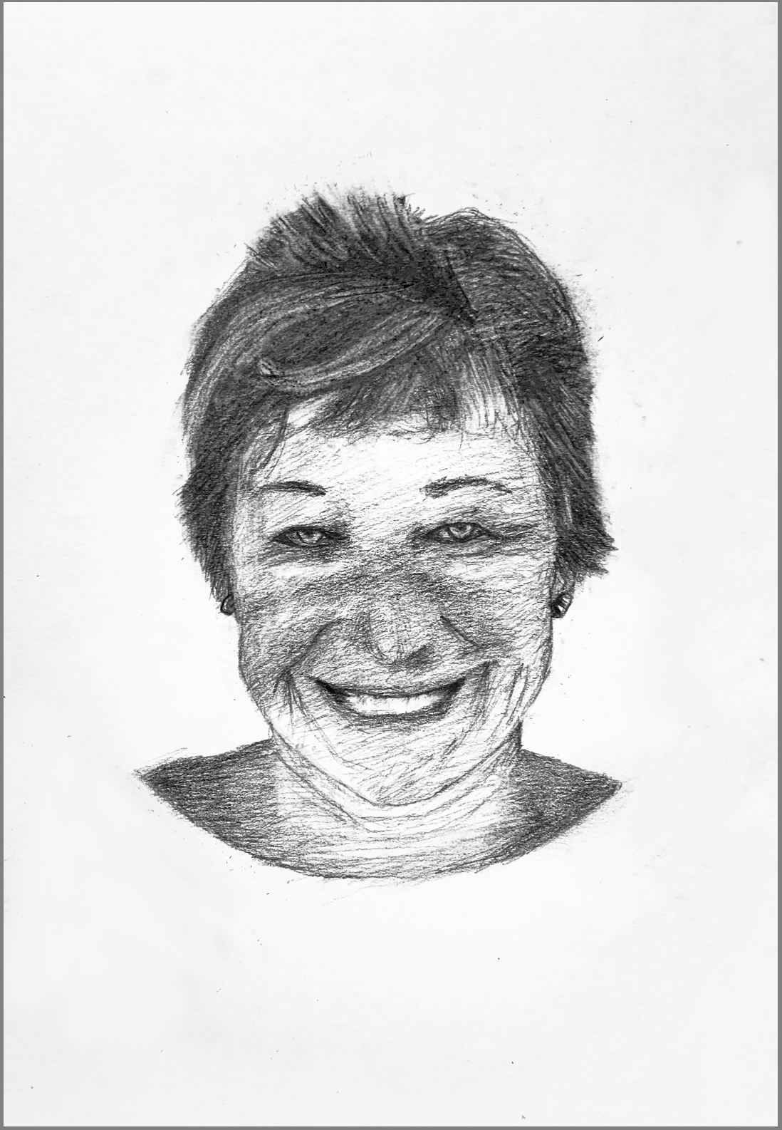
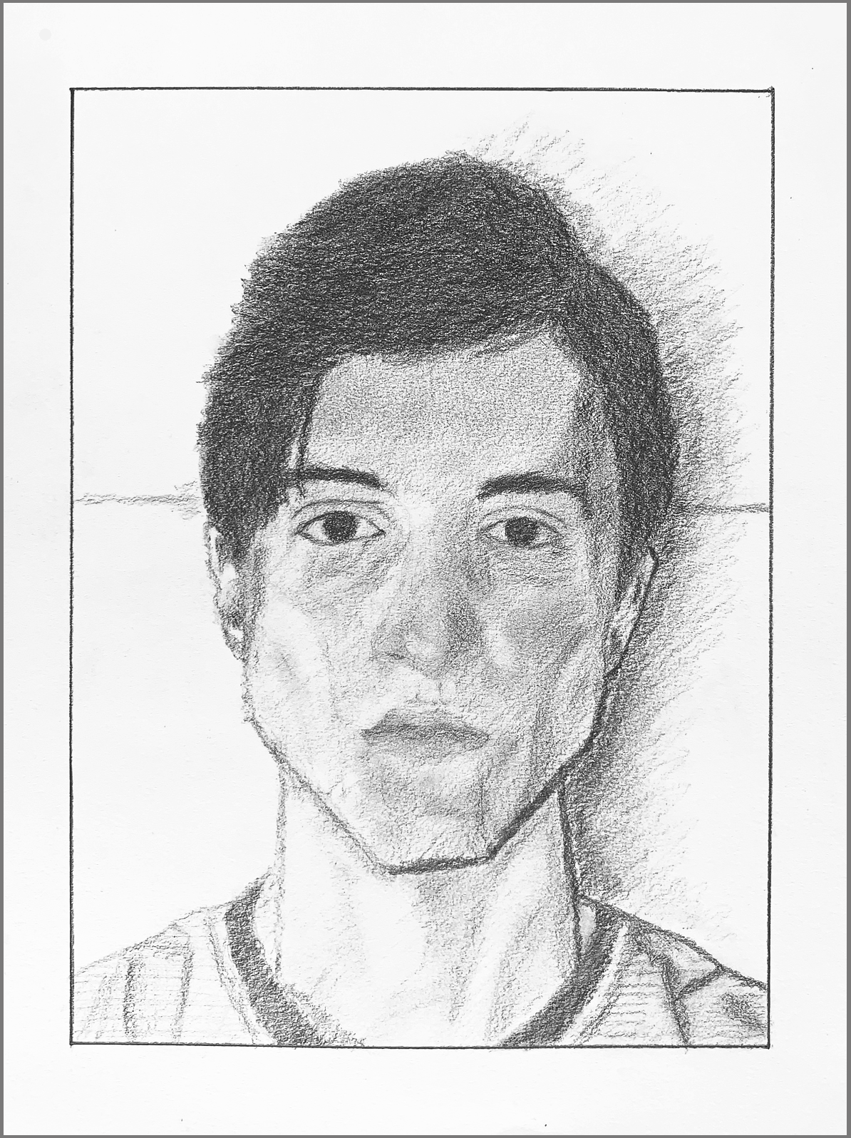
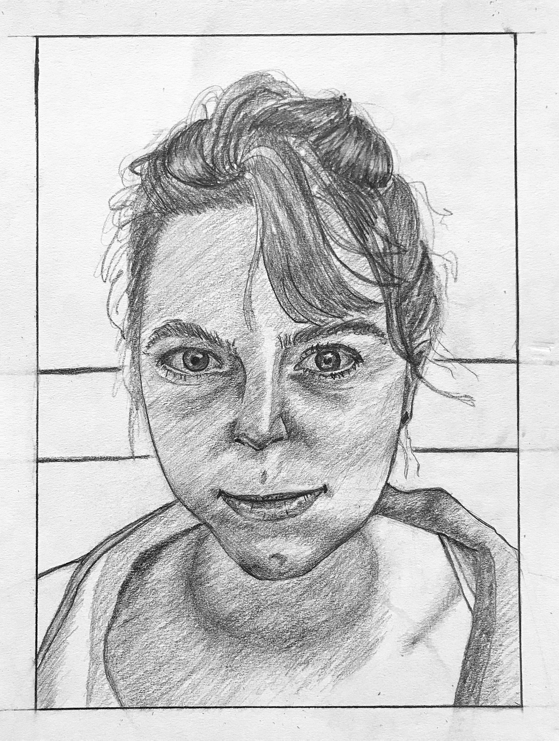
In answer to your very last question, I think the second one is the better exposure (without being able to see the original, of course). In terms of your other questions (and thanks for those),
1. The tilt of the head is indeed off–a sign that you need to slow down and linger at the schematic stage awhile longer.
2. This is also a good observation. Being aware of that (on your own) is half the battle. The value variations on her forehead, for example, are not as significant as the greater overall unity of the shadow relative to that patch of light to its left. Her hairline on the left side is also quite different–another signal that your schematic (which is 60-70% of the drawing) needed to be more observant and scrupulous.
3. You’re also right about gentler, finer strokes in the face; another signal to slow down. She has a distinctively methodical hatching style that you could learn more from. But yours is not at all dissatisfying in its own right.
4. Your version doesn’t look younger so much as slightly fuller. The proportions in your face are good in and of themselves, but the original is narrower. Once again–something to iron out in the schematic.
5. In terms of smiling, maybe ever so much. But even if this artist copied her own drawing there would be differences of this kind. It takes very little to turn a pensive look into an irritated one (and any number of other mood shifts). You did great.
As you did on the whole drawing. I especially like the way you stuck with her attention to planes–our most important goal. Nicely done!