Category: 1) Drawing-in-Place
Hannah Schleifer Drawing In Place
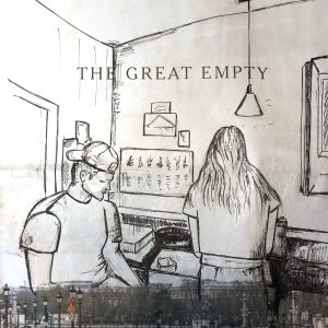
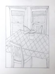
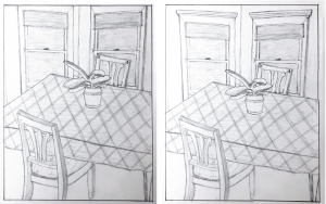
Ryan’s Dining Room
This is an almost great composition, save for the dreaded TANGENCIES along the top edge (i.e. space killers, because they glue the drawing to its frame). In a composition in which everything else but the potted plant is cropped or overlapped, I’d probably opt for cropping the top of the windows (on the left), which also throws more attention to the plant at the center.
But you could also open up the space a little (on the right side as well) for another good solution.
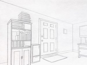
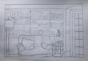
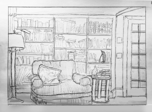
Grace’s Living Room
I’ve made some adjustments in Photoshop to show you how the following suggestions would look.
Notes:
Opening up the foreground just a bit more gives a better foundation for the furniture and bookcase and gives the viewer a visual “foothold” in the space.
Bookshelves aren’t paper thin–showing their dimension helps to divide and articulate the space, strengthen the character of the room, and make it more convincing. Likewise the mullions on the French door.
The base of the side table needs to be lower than the baseboard–otherwise it appears to be floating.
Making the base of the side table tangent to the bottom edge inhibits the perception of space; neither in nor out of the picture.
In yours, the bottom of the French door extends well beyond the bottom of the door opening. By correcting it it moves back in space, more unified with the plane of the bookcase.
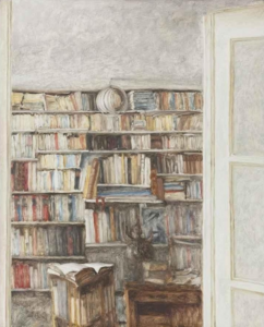 Avigdor Arikha, Books, 1977, Oil on canvas, 39.5 x 31.75 inches
A similar composition by Avigdor Arika (1929-2010). You’ll note he also crops out the floor, but he does it a little higher so that its more decisive and not teetering on a tipping point (i.e., is it in or is it out?). Note too the slight angle of the French door (which happens to be more in the foreground than yours) to urge the eye into the scene. You do this nicely with the top of the door frame in the upper right, but better had it been drawn without a bow in it–oh, unless it’s an arched door opening, in which case that could be more convincing as well.
Lily Weafer Drawing in Place
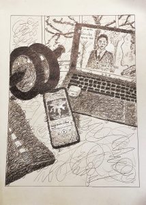
Isaac Gelb– Entertainment in Quarantine (Graphite on 18″x24″ drawing paper)
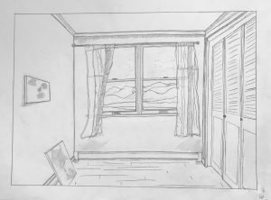
Drawing in place (Devon Garcia)
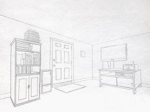
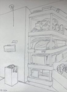
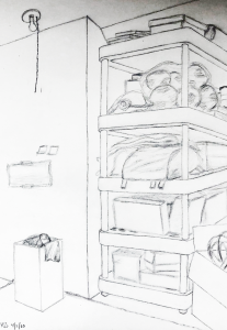
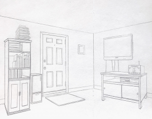
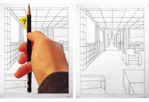
Pretty sure what happened here is that you set your theoretical vanishing points arbitrary to the left and right, and quite close, when in fact they were much farther out. Setting the angles of the ceiling and floor lines (and all other receding lines) by sighting* would have likely produced shallower angles. If I’m correct about that, this is one of the pitfalls of drawing from theory rather than observation.
Using Photoshop, I made the angles of these orthogonals much shallower (my best guess about how it might have looked), which brings the scene in closer. Note also my adjustment to the top of the bookcase on its receding side (on the left), making that angle less severe as well.
I also cropped the left and right sides just slightly to bring us in closer. I think your cropping on the one below is too severe, and throws too much attention on that one wall only.
See my comments about these two paintings:
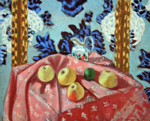
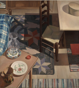
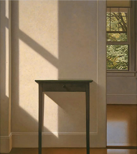 MW, Simple Gifts, 1995, oil on canvas, 54 x 48 inches
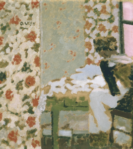 Edouard Vuillard, The Seamstress