Very good, Anika, and well-composed. His drawing has a lighter, softer touch and his edges, even the eyelids, aren’t as hard or defined; a good thing to learn from. It looks like you’ve added lip color-note how his disappear into the surrounding area without such a defining contour

Also, the left side of her face (our left) should be slightly narrower, and the right side (our right) slightly wider.

Nevertheless, good work overall.

Isaac Gelb– Degas

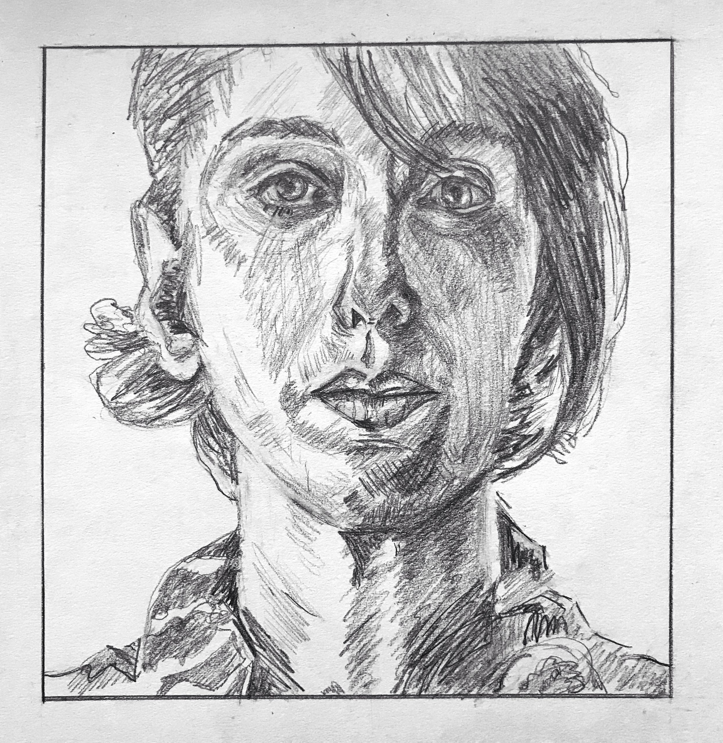
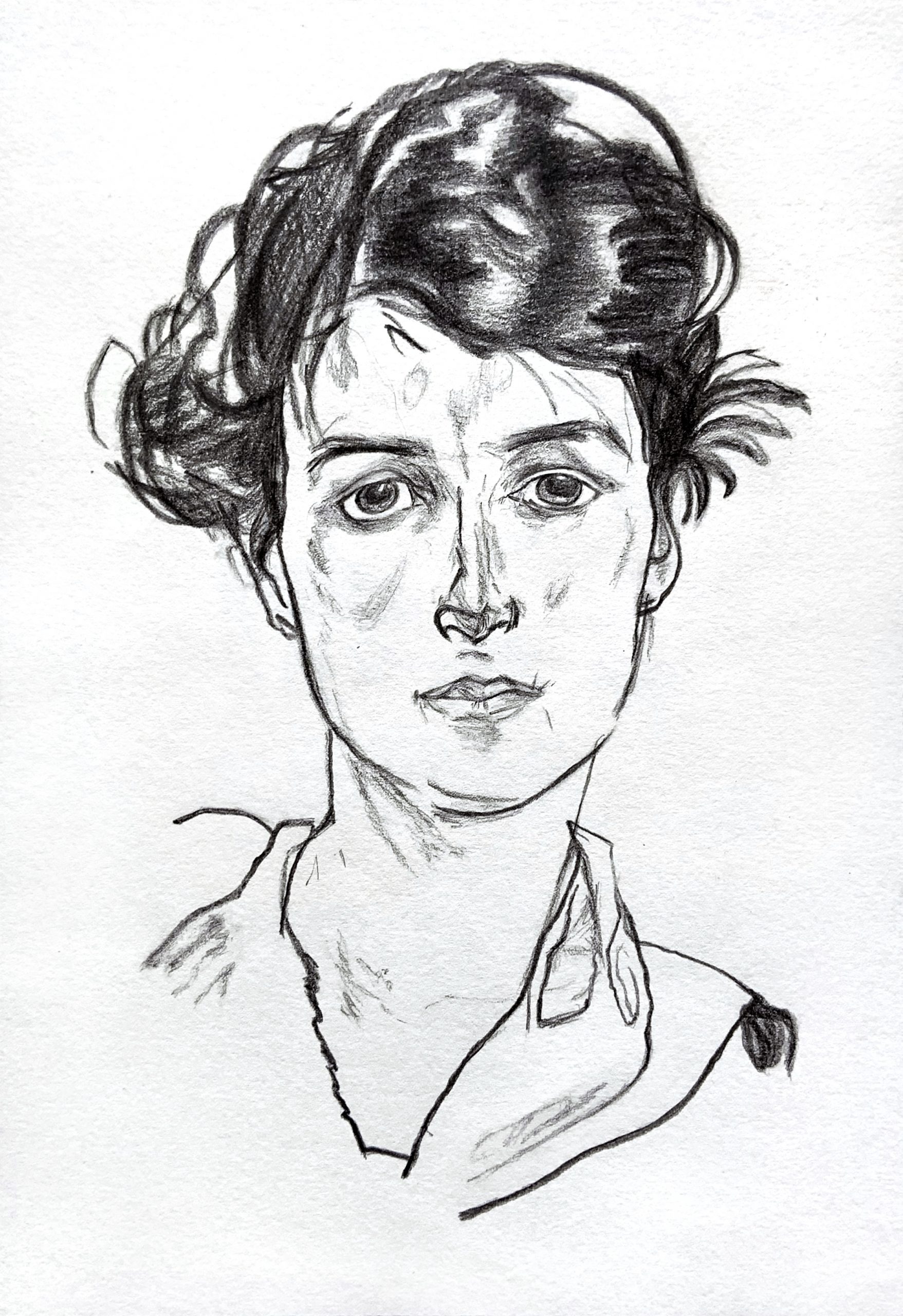
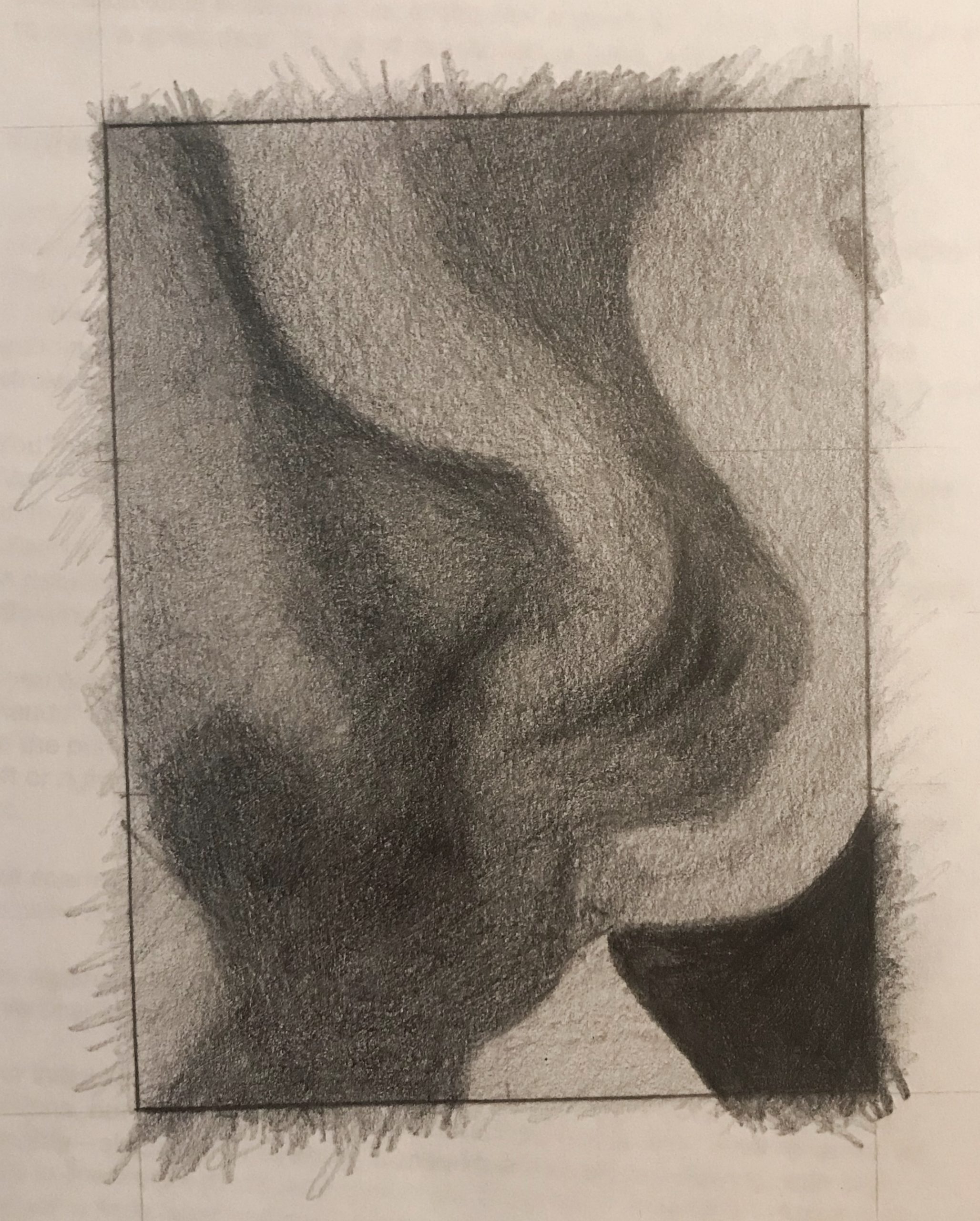
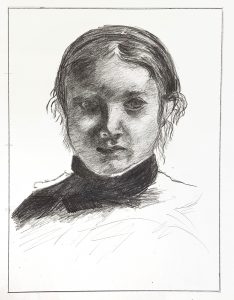
Good work, Isaac, and your scrupulous attention to proportions, values, and details is apparent. So glad this set you up for this week’s drawing, which was my main intention. And so glad you can also see and appreciate Degas’ seemingly infinite subtlety.

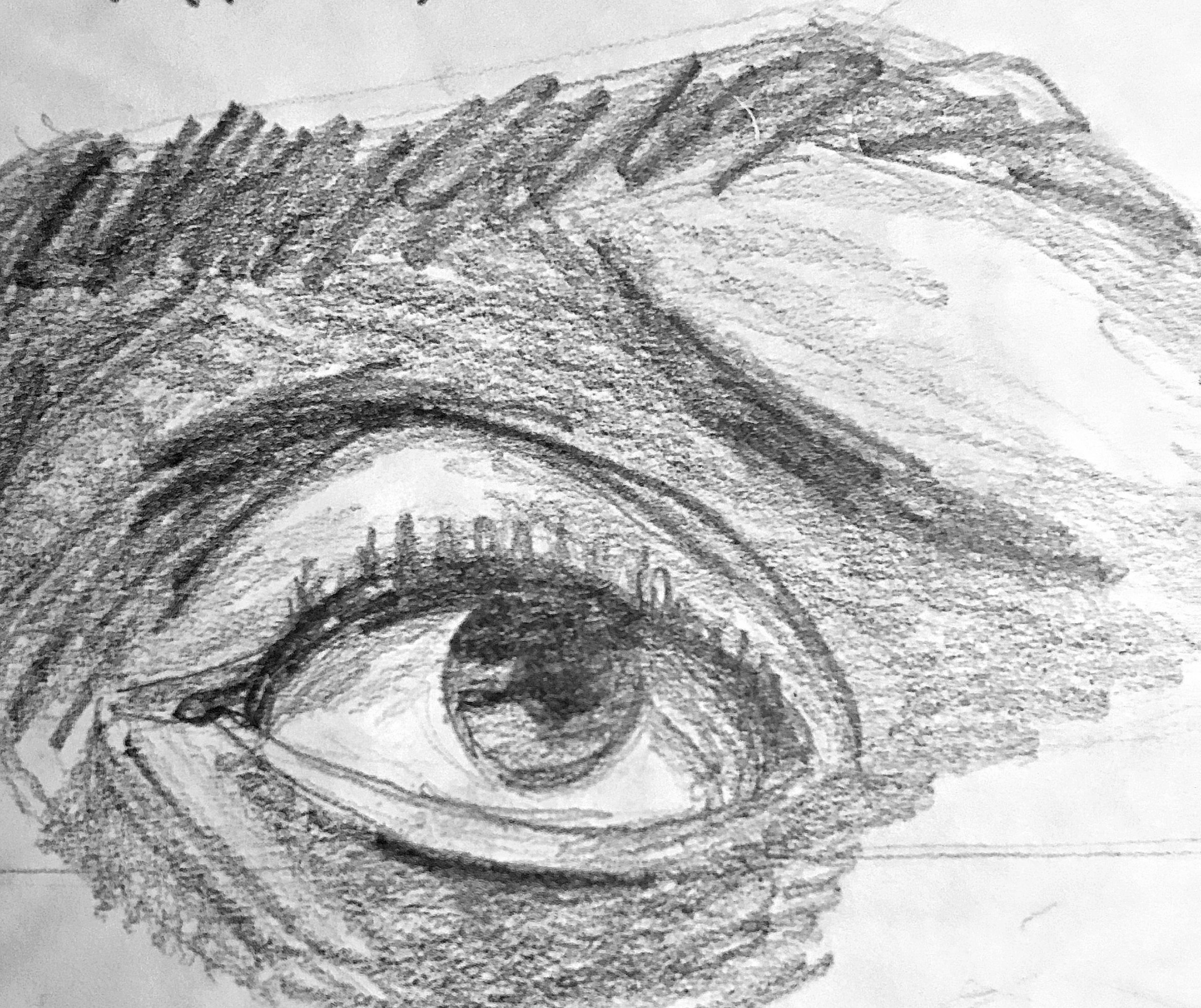
The two things that jump out at me are the texture of your hatching, which is coarser and grainier than the original, and a slight misalignment of the features with the silhouette of the head.

To solve the first issue you need a sharper point on your pencil and a much lighter, softer touch, holding the pencil loosely and far back and allowing the values to build up gradually. This can be followed by even finer marks to fill the white spaces between your strokes. To be clear, there’s nothing wrong with this kind of hatching the way it is—it’s just not as fine grain and high res as the original.

As for the misalignment, the space between the left contour and the features is just a bit too wide (just a bit) and the space between the features and the right profile is just a bit too narrow (again, just a bit, but taken together they pull the features to the right). Also, that contour between the face and the ear on our right is simpler and smoother–not so undulating.

You’ll notice we can see her left ear (on our right) but not her right, which tells us her head is slightly turned to her right. This has the effect of foreshortening that side of her face just a bit and making that side slightly narrower. It looks like you’re trying to center her features a little.

This is exacerbated by the eye on our right being a little too far to the right even in relation to the other features. Her tear duct should be directly above the outside edge of her nostril, but is slightly more to the right.

Great job accepting Degas’ lighting on the eye on our left—it all but disappears and you didn’t try to impose what you know or expect, but followed suit—great work.

Other small notes:

The reflected light on the nostril to our left is much too light, as is the reflected light on the cheek to our left, but to a lesser degree.

The modeling of the edge between shadow and light on the tip of her nose needs to be softer.

The white of her collar is jumping out in yours—it’s more of a light grey.

The values in her collar and shoulder are too dark.

Very good effort and noteworthy achievements here but still room for some refinement as outlined above.
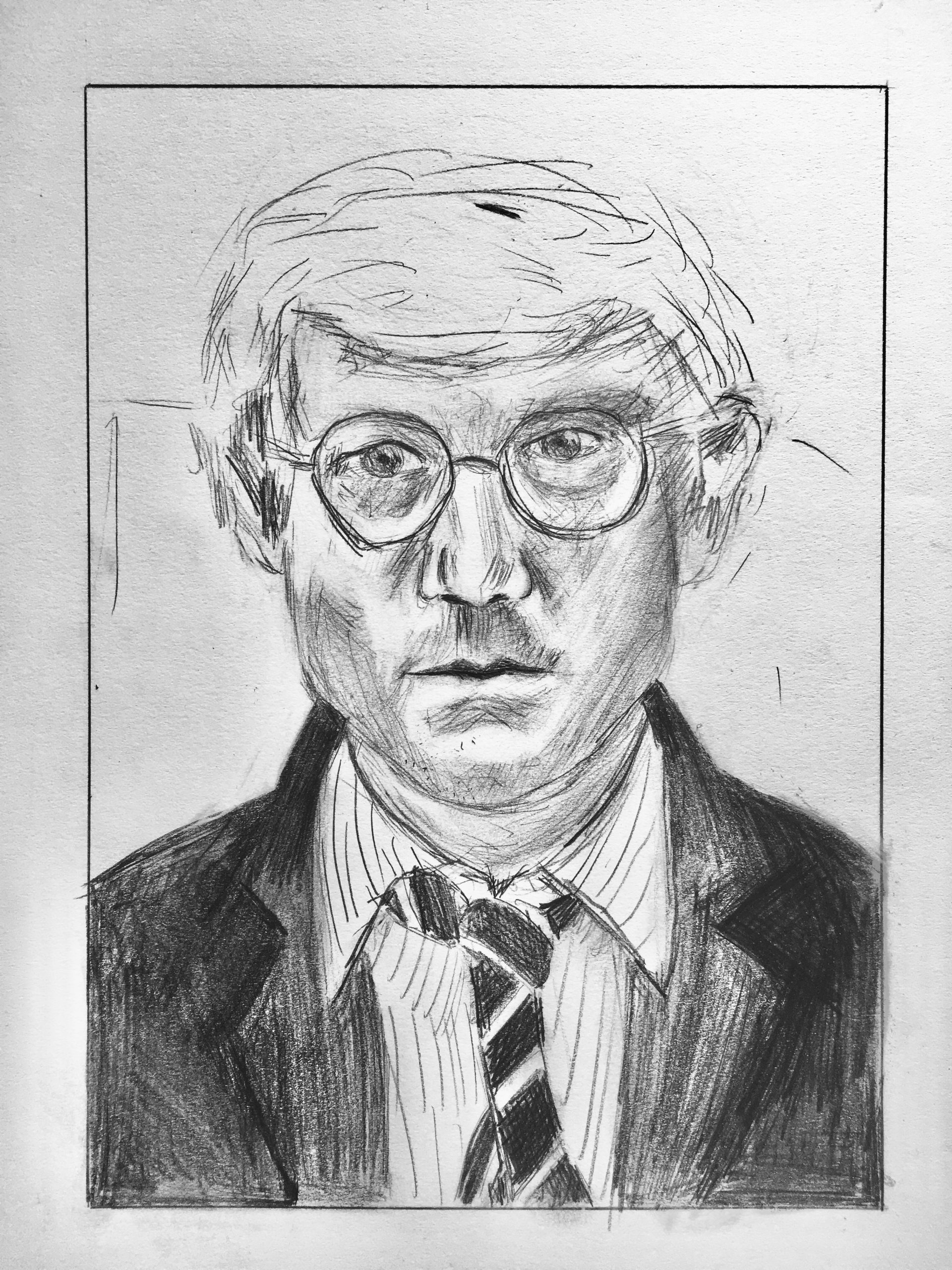
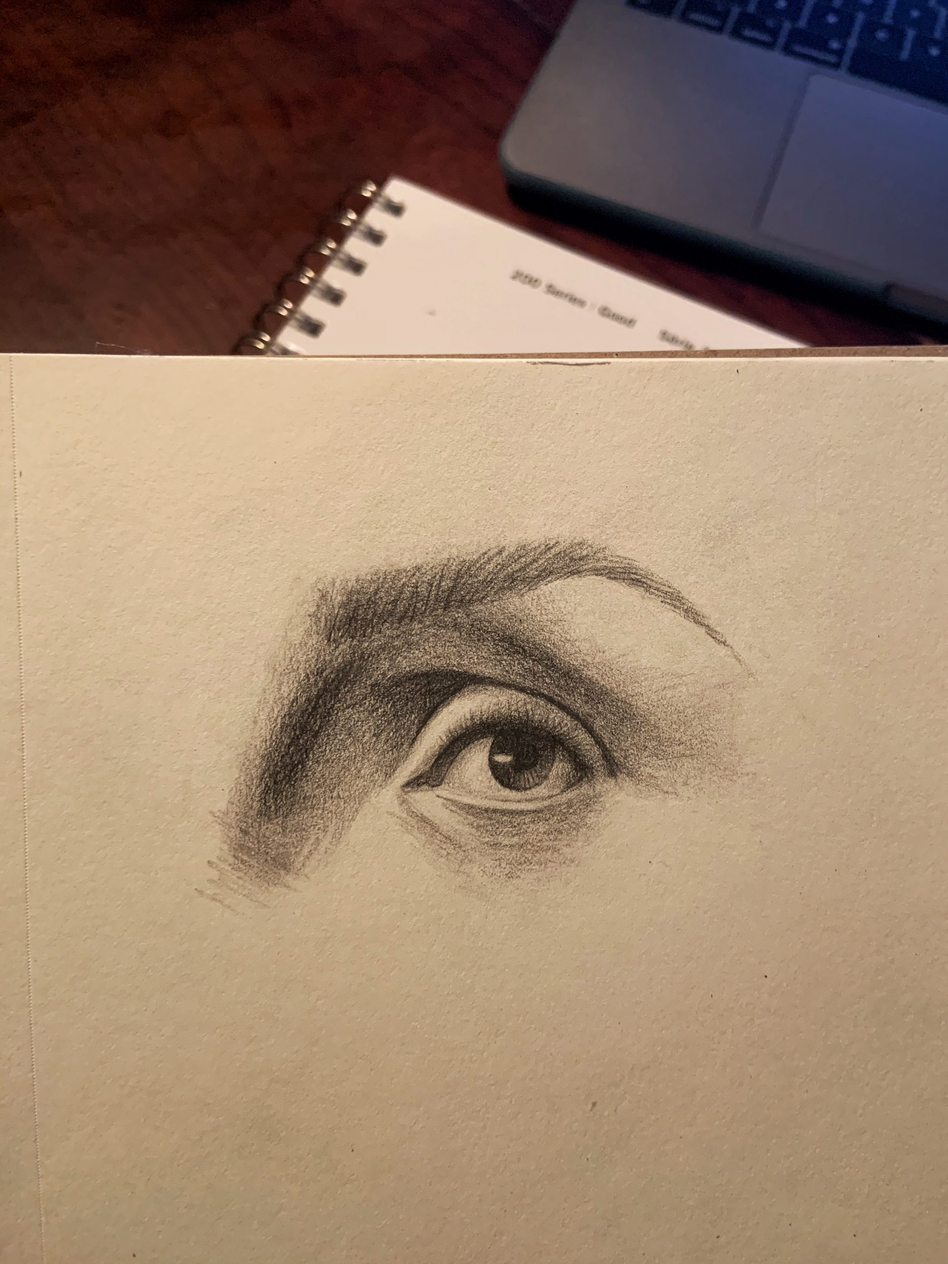
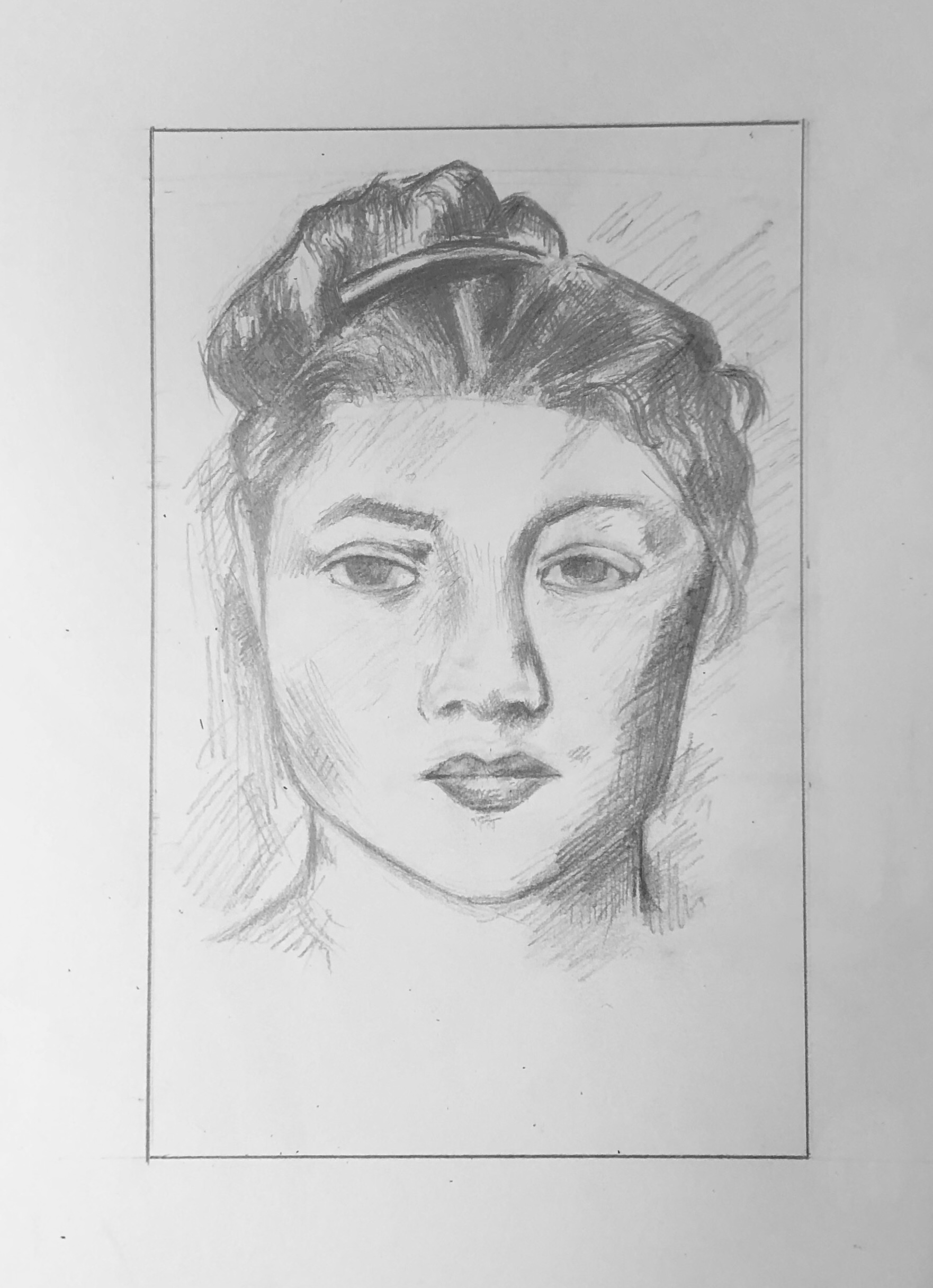
Sara Caplan – Portraiture Prep

Great job, Sara. My only suggestion is to learn from his example about line weight. There are far fewer lines in the hair and more openings between them. The background lines also need to be fainter to allow them to fade back. You did much better with the pinstripes on the shirt, but otherwise this drawing suggests you need to develop more range in your line weight.

Great job channeling his slightly louche and insouciant drawing style; a perfect fit with this pose, disheveled look, loosened tie, etc.


Lily Portraiture Prep

Very fine work, Lily, in every respect. Just a few small notes:

You’ve given her more eye liner than the original but at no expense to planes or anatomy–just as an aside.

Follow O’Neil’s lead when it comes to open contours–there’s one on her left ear lobe (our left) and one along the left side of her neck. The left side of her nose and the center of her upper lip are two more. These not only connect her to the ground (or one plane to another) put add a sense of light bathing the form.

On both cheeks, note how the direction and pattern of the hatching, which is just a bit higher resolution (finer strokes) than yours, expresses the volume of these forms. It’s not just a value (shadow) but changing planes within the value. Yours are flatter as a result.

Great job on the hair but carrying the strokes off the top edge–yours start just a tad below, losing the sense that the head continues outside the frame, as in hers.

Excellent work.


Dev’s Portrait Master Copy (Schiele)

Copy of Egon Schiele’s work
9 x 6.25 in on drawing paper

(MW): What can I say? This is an extraordinary rendition of the Schiele.

The only thing that might be noted, and is neither here nor there, is that the eyelid on our left slopes down a bit more (his is more arched), making her look a bit more tired or sad, and also eclipses the iris a bit lower, making her look less alert than the original. But that’s not a criticism or a suggestion–simply an observation.

Great use of the side of the graphite (in a wooden pencil) to achieve these effects.

Exceptional work–


__________

I admire Schiele’s work and this portrait interested me because of its focus on contours and lines that don’t feel quite smooth and rhythmic, but rather expressive in their weight variance and jagged edges. I had a lot of fun with the face. The eyes have an expressiveness in their semi-geometric imperfect shapes and shadowing – I feel my results were mixed and definitely could have improved upon the shadowing and openness. I used a wooden pencil and feel that it was definitely the better tool for this style. The hair was very difficult, with many interlocking forms that seem to blend into one another but simultaneously stand out. I used the flat side of the graphite for wider strokes, but some forms feel glaring while I also struggled to reach a depth of darkness. I am unsure if I rendered small bits of shadow (?) on the face correctly and would love thoughts on what to try.

Zoomed out version (the border was warped in the photo but I promise it is straight!)
An attempt to follow Proko’s eye walkthrough.
<3 inches wide on drawing paper with the Sharpwriter pencil.
An attempt at capturing the forms and shadows of the Picasso in a miniature version (maybe ~4 inches). I wanted to spend a few minutes on this to experiment with the use of the wooden pencil before trying the larger Schiele. I still feel like it is difficult to capture the dark shades present in both works with this particular pencil, so ultimately I would use a charcoal pencil or charcoal in the future.


Team Value Drawing Result

All 36 drawings together. Above is the high-resolution pencil version, and the one below is the pen rapid hatching version. Click them open and zoom in to see your pieces in context with their neighbors. The value and resolution differences between them is inevitable but makes the image interesting in a different way.

Note also the overall difference between the “complexion” of the pencil version and the ink version.

The image is a painting by Georgia O’Keeffe, called Jack-in-Pulpit, No.2, 1930, Oil on canvas, 40 x 30 inches

Here it is in black and white, which you worked from:

And the original, in color: