Ian Strudwick – Team Value Drawing

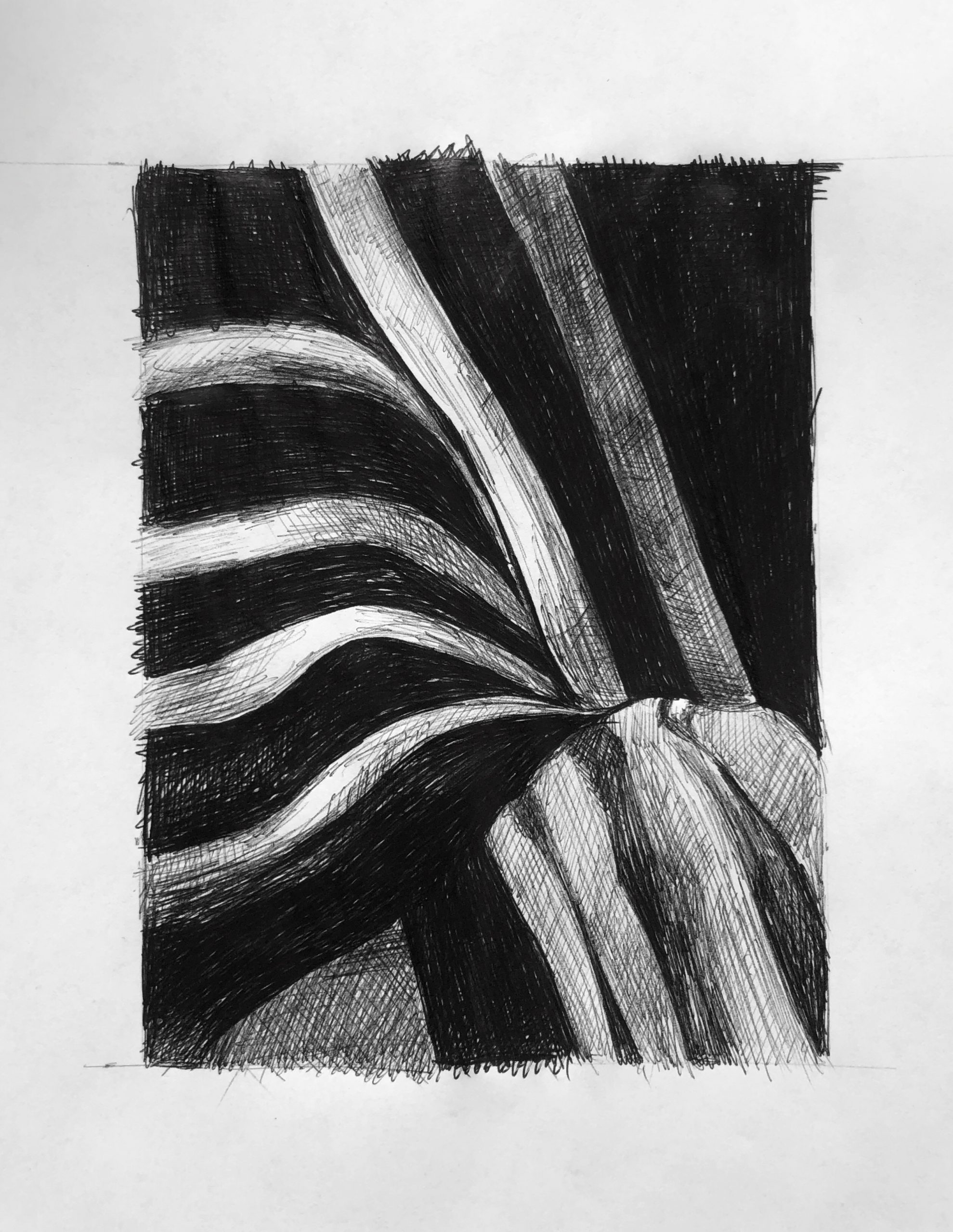
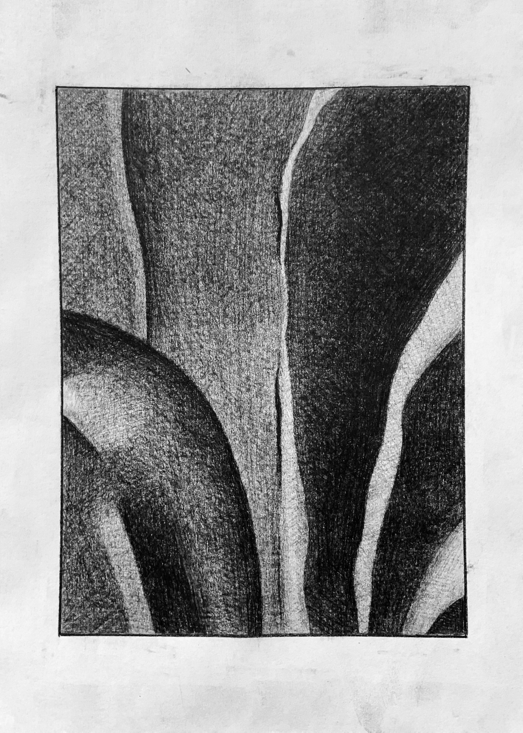
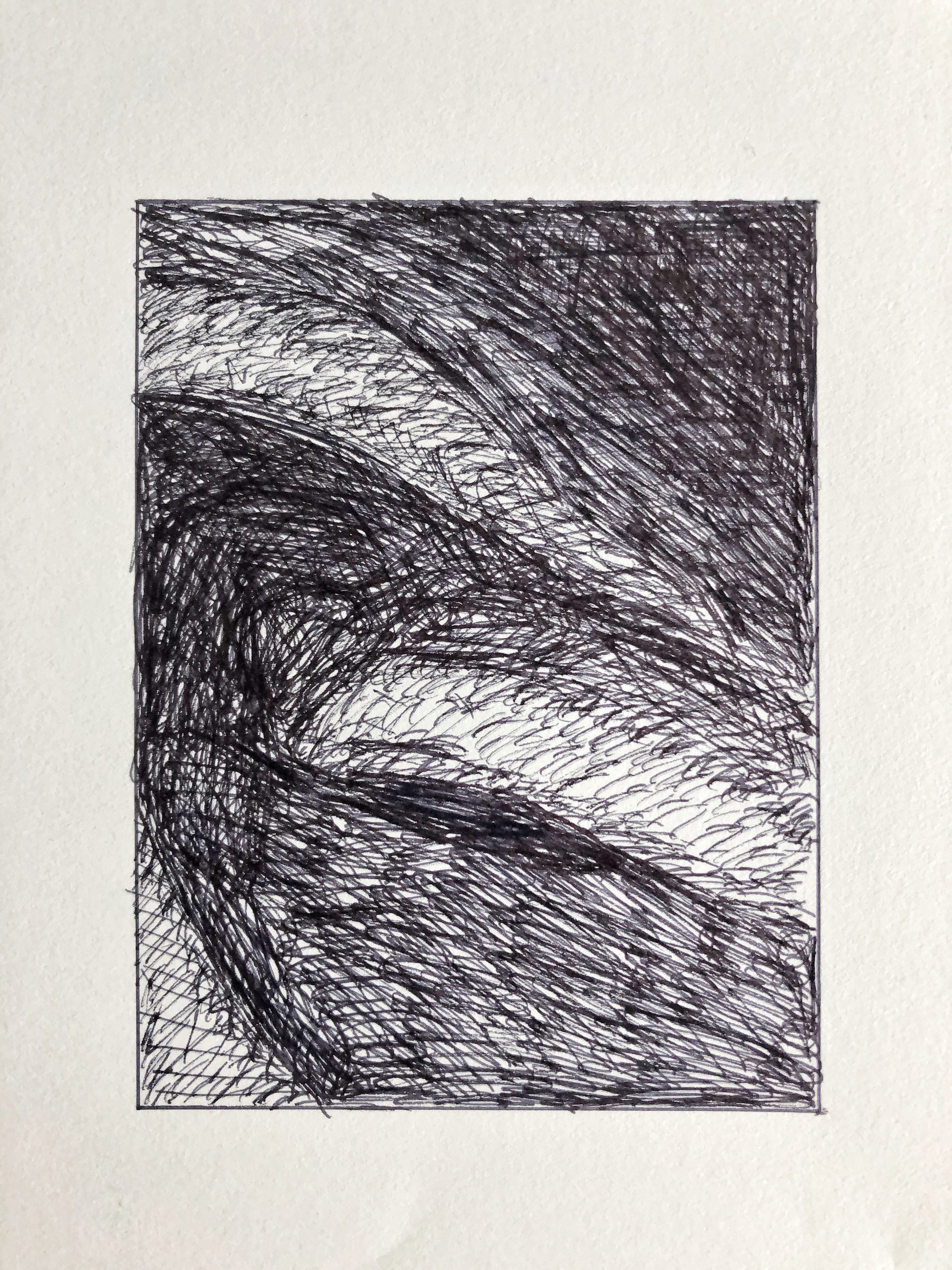
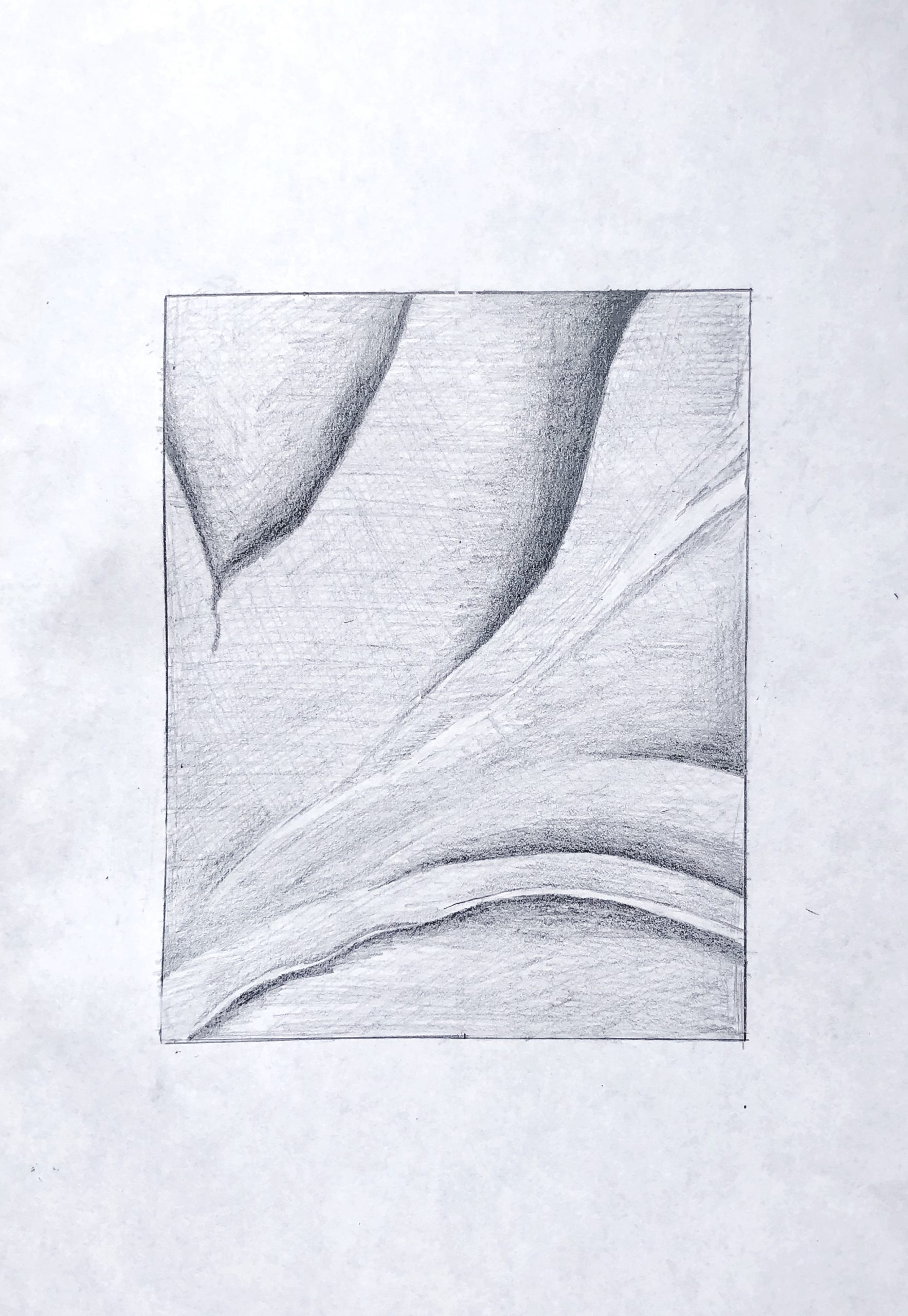
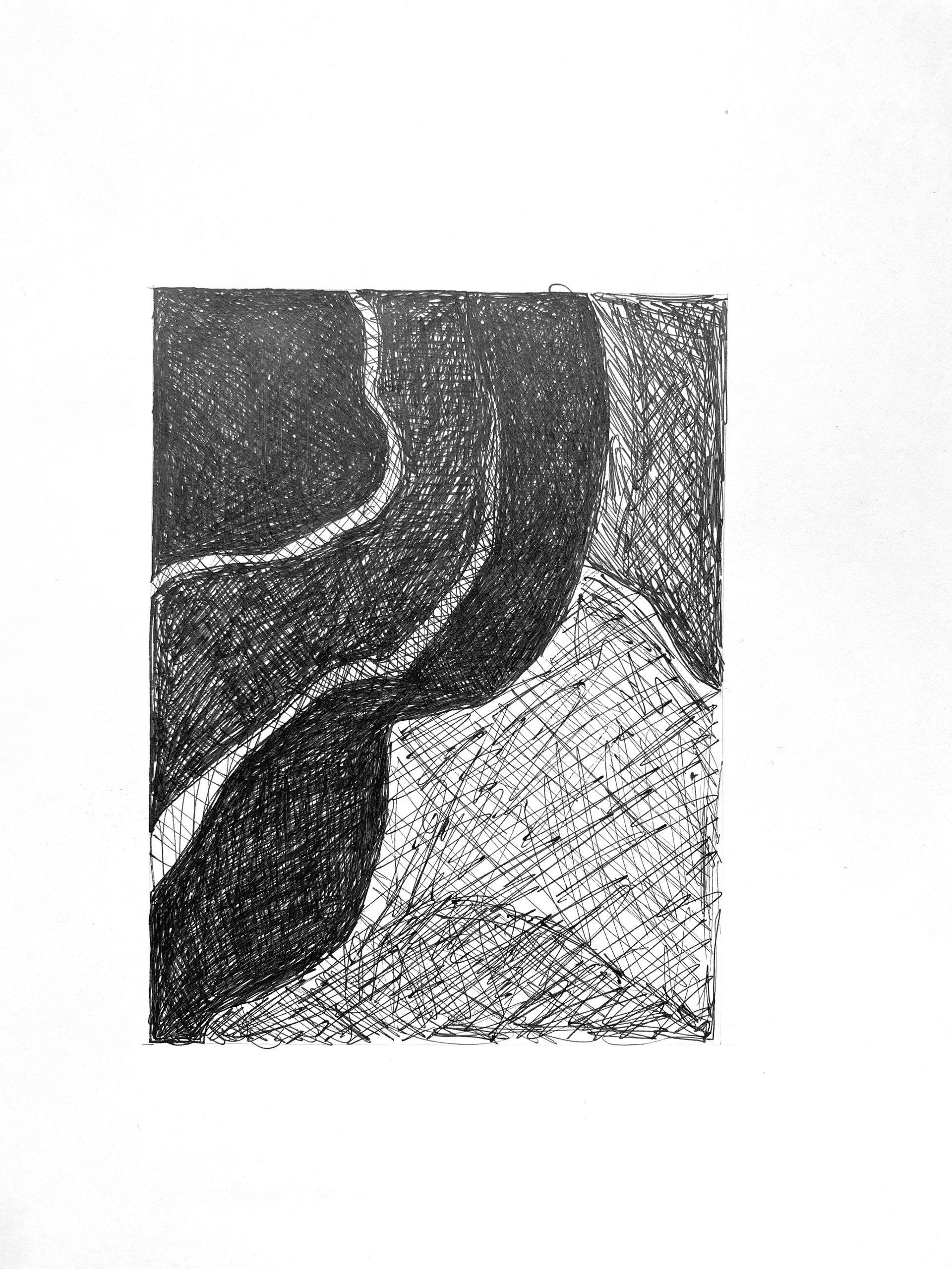
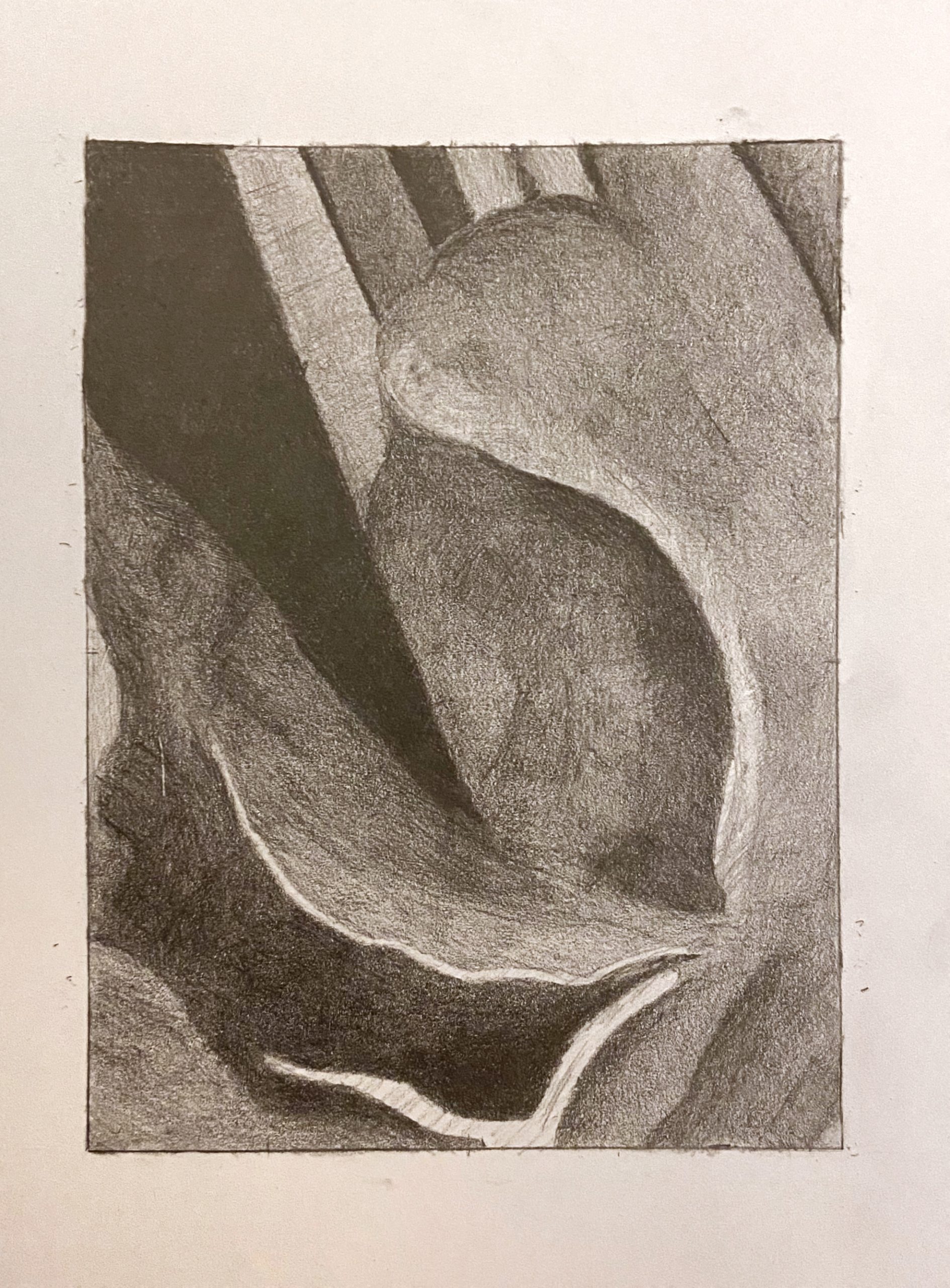
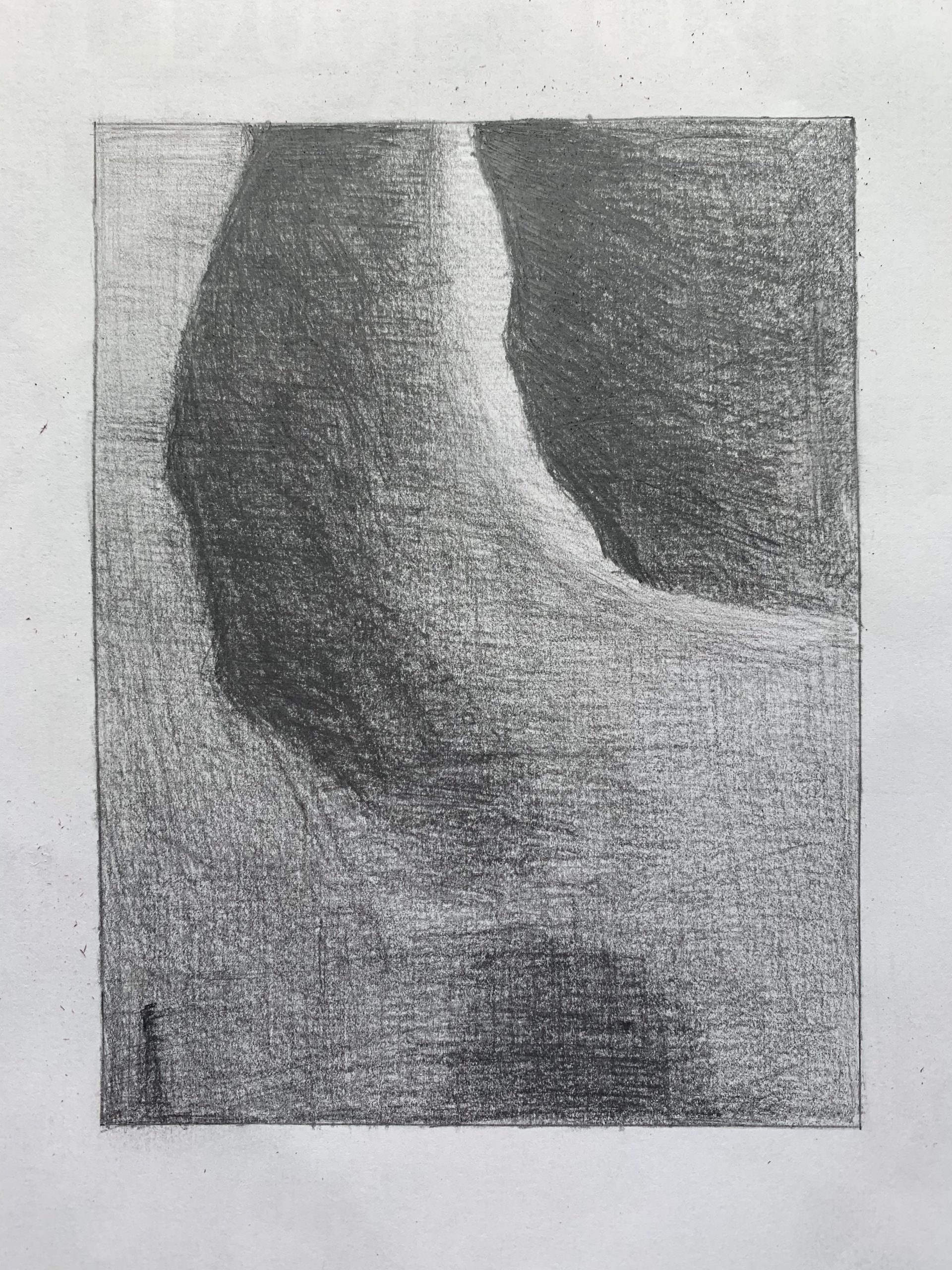
Dark values are fine and the light values are fine (actually, could be a little darker) but the mid-tones (which dominate this section) all need to be darker. That sliver of light in the top center needs to stand out more, as it does in the reference, by having all the other values get darker.

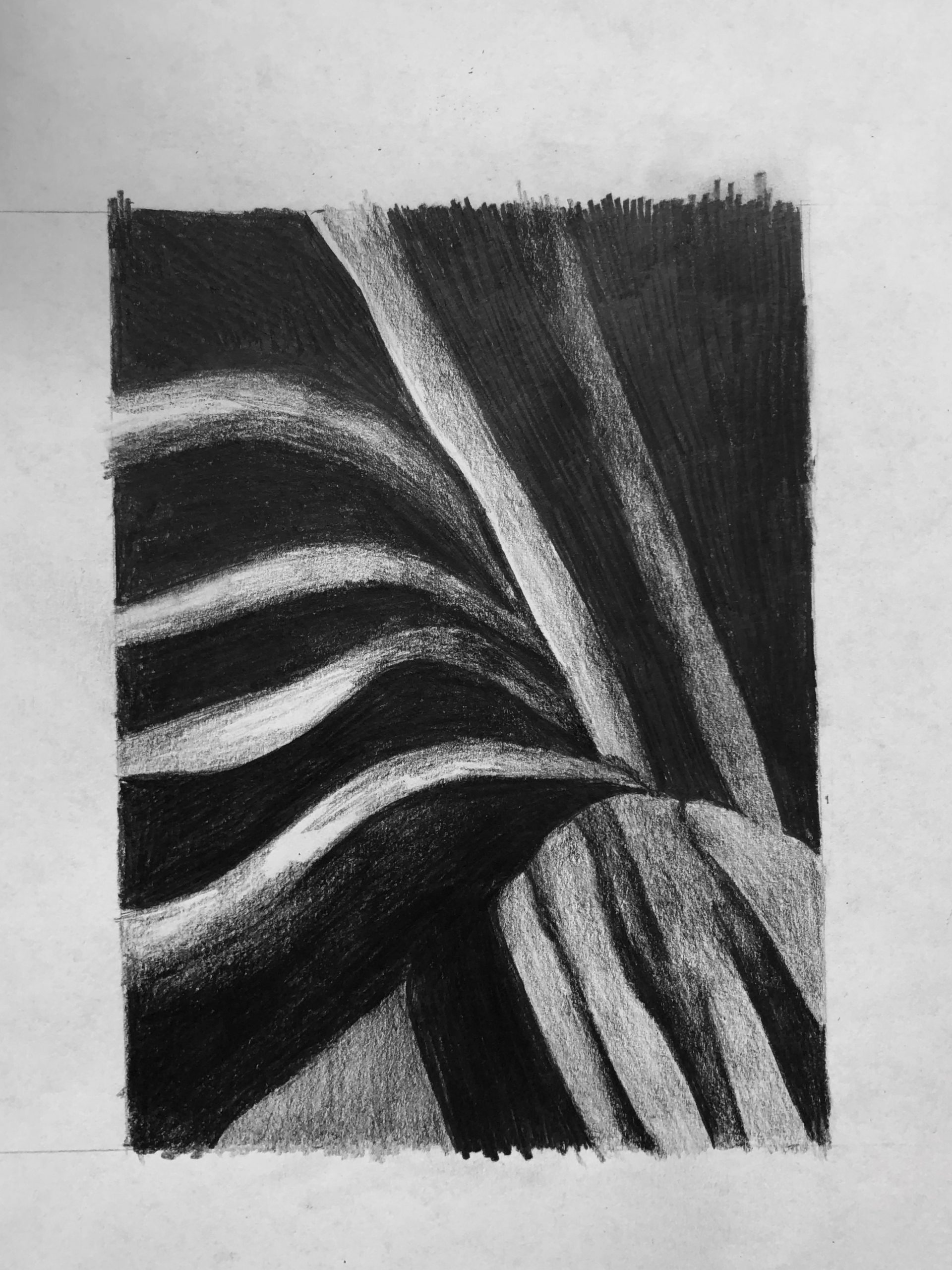
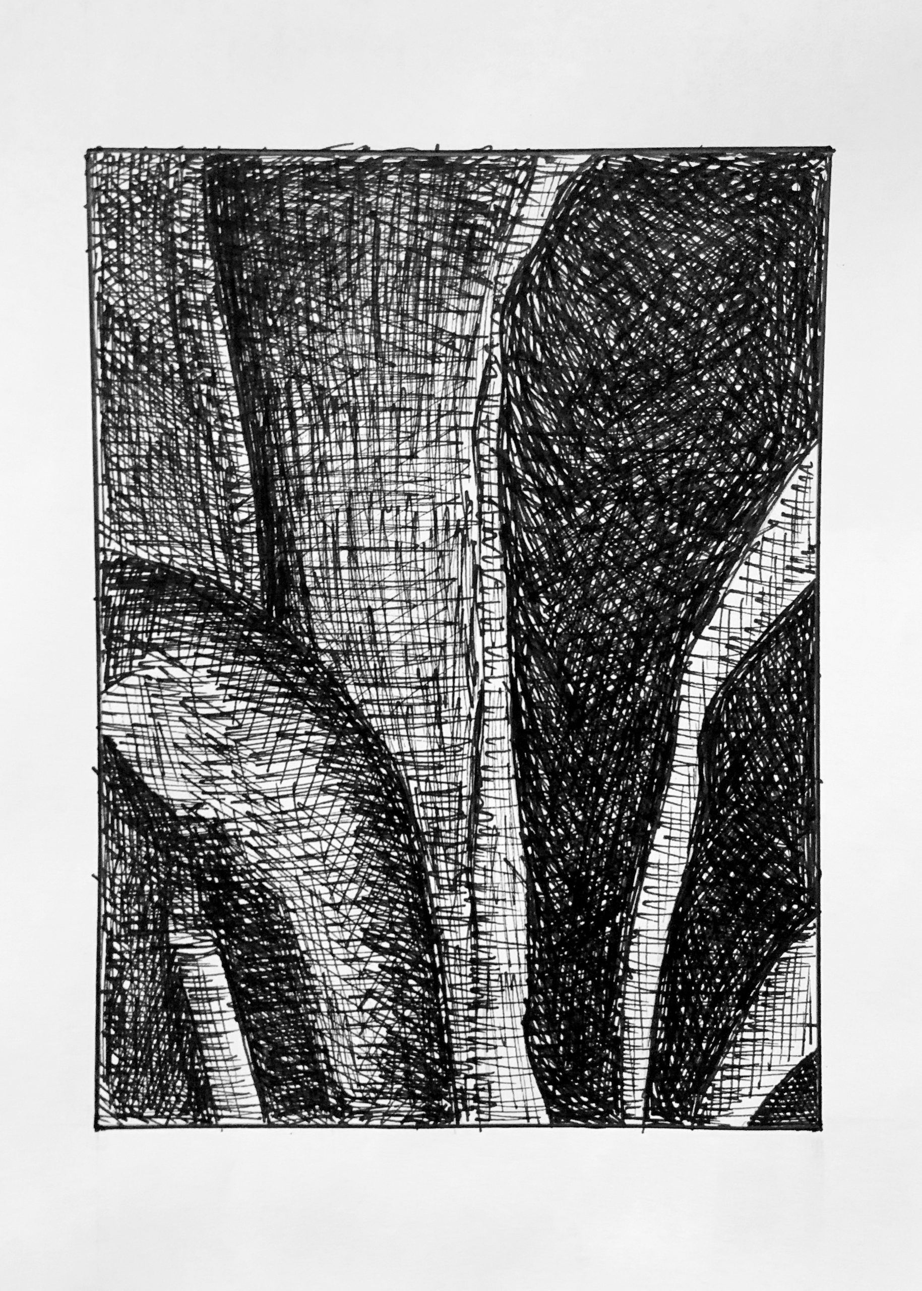
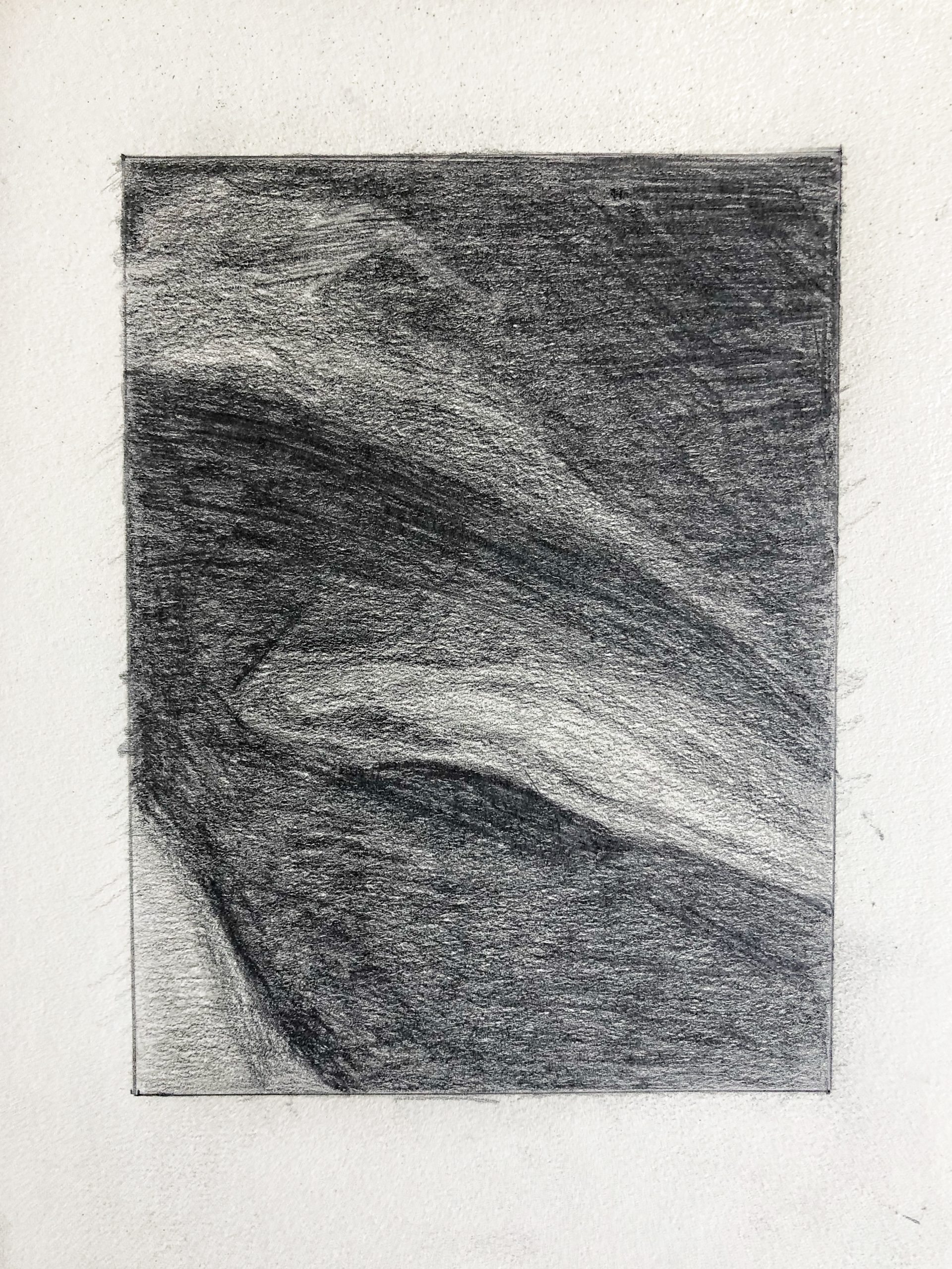
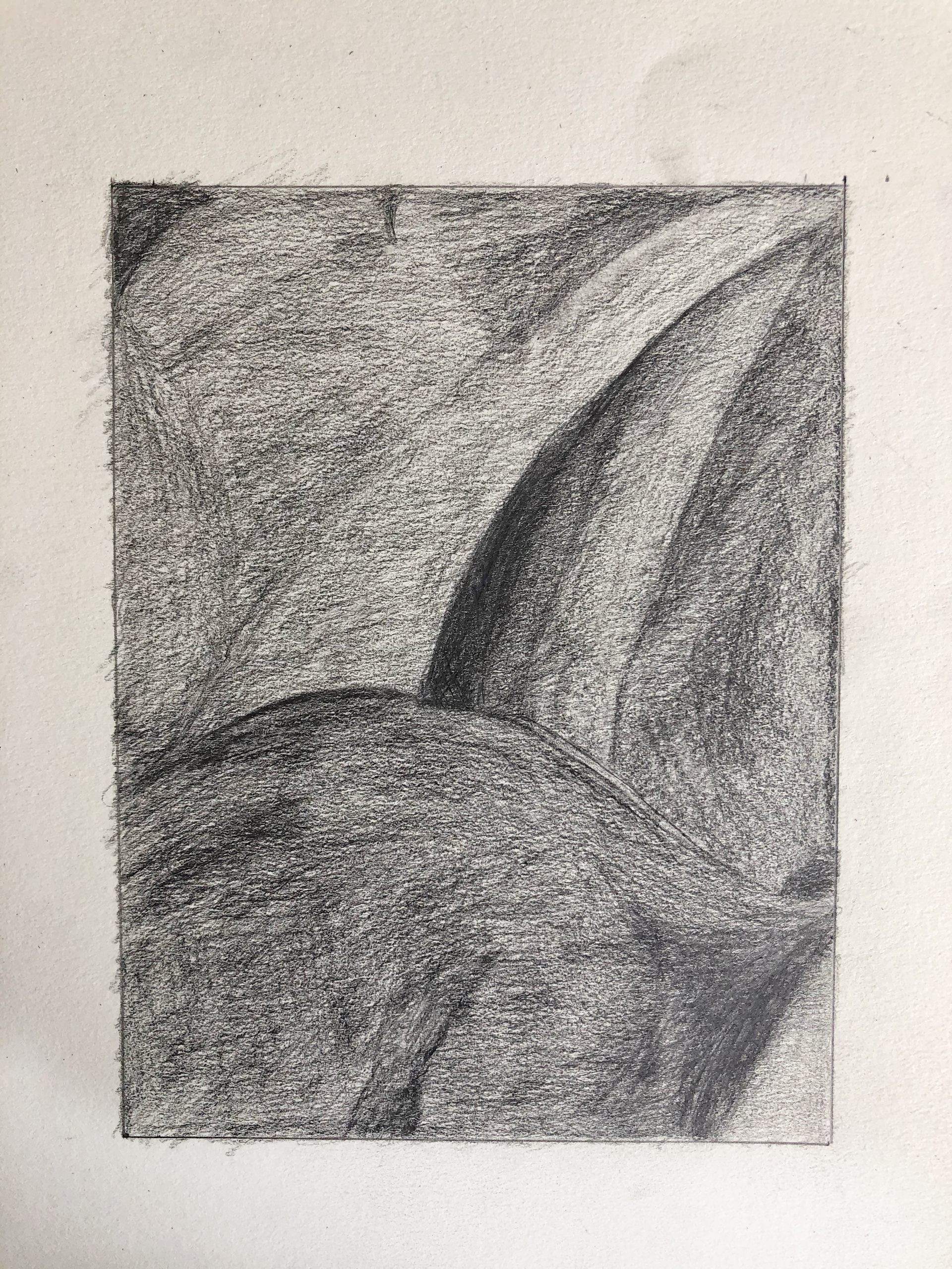
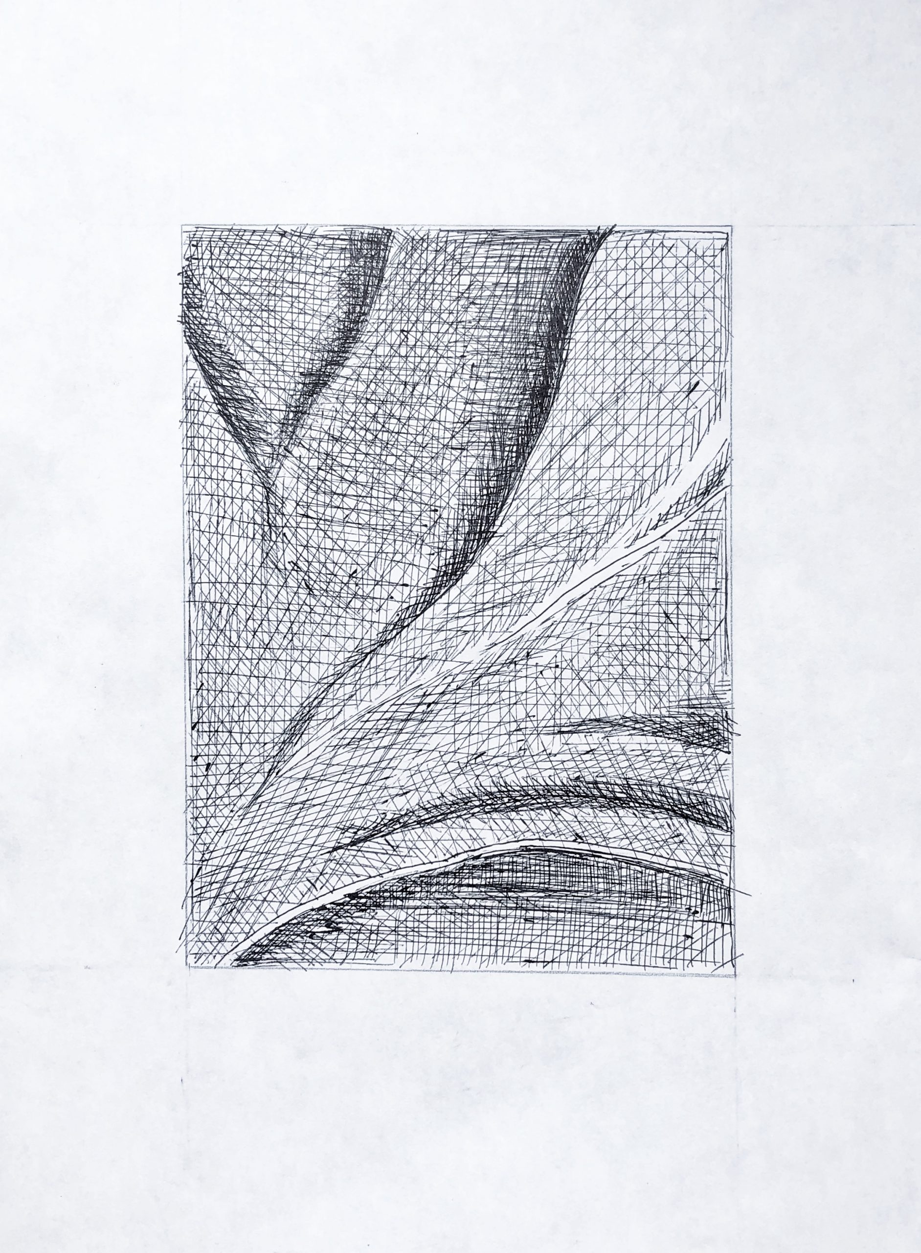
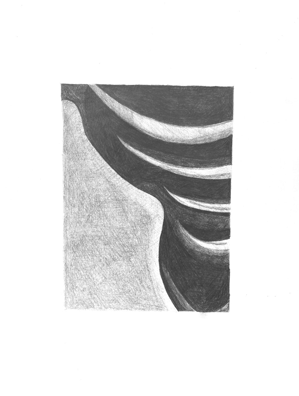
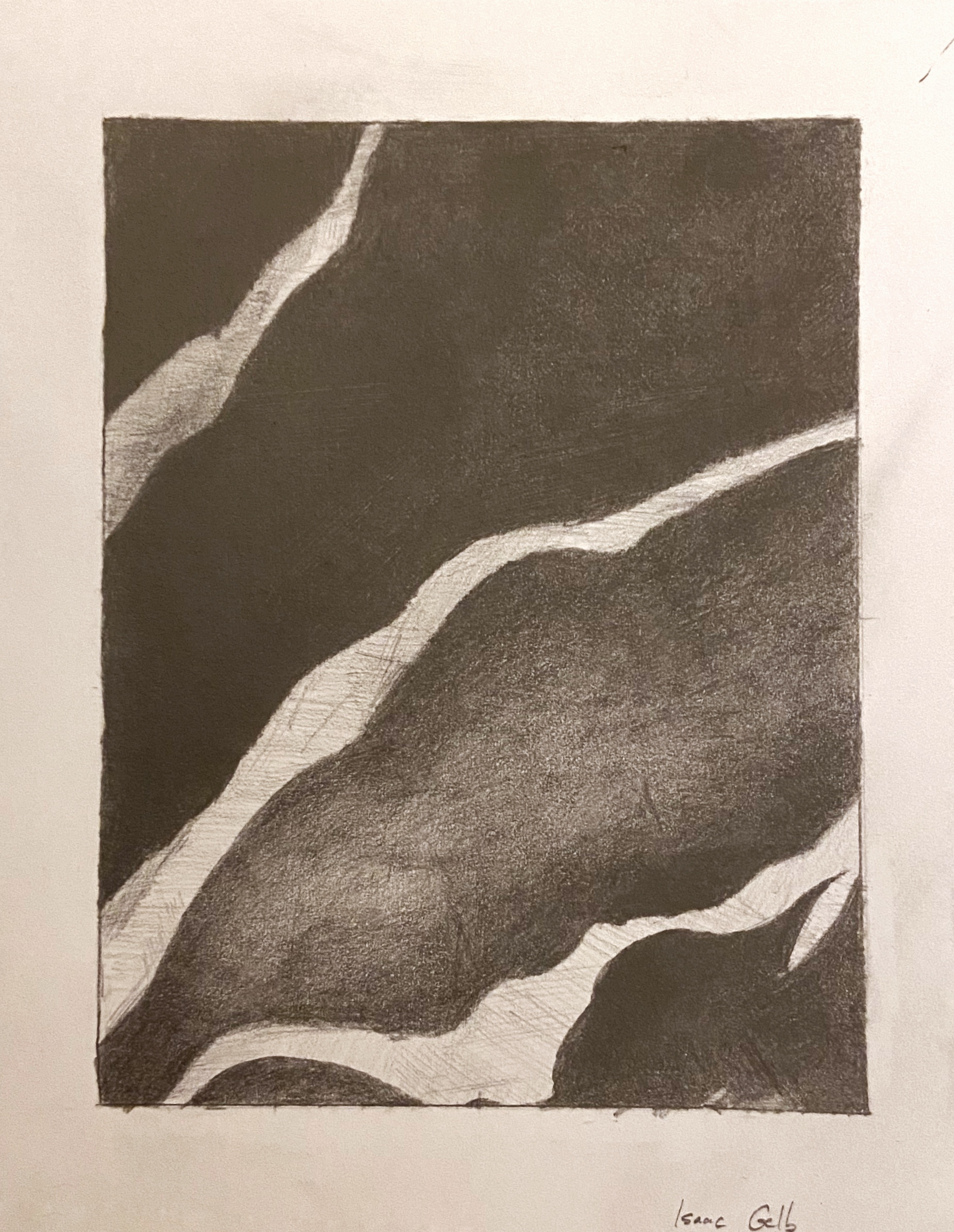
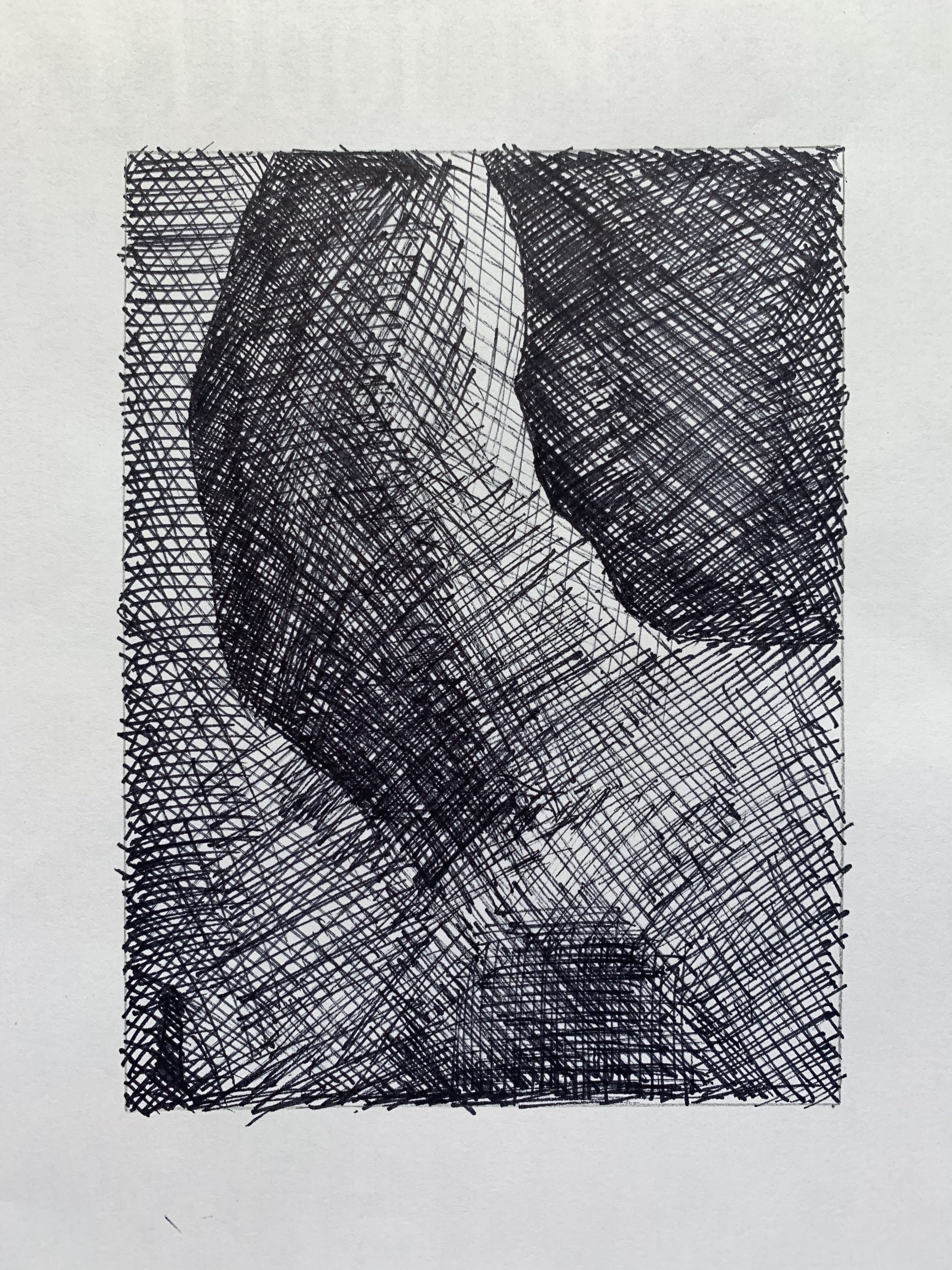
The better of the two of this image, but the midtobe in the lower right quadrant and lower half in general needs to be darker. The tonal shifts in the lower half of this image should be almost imperceptible; you’re bringing them out too much.

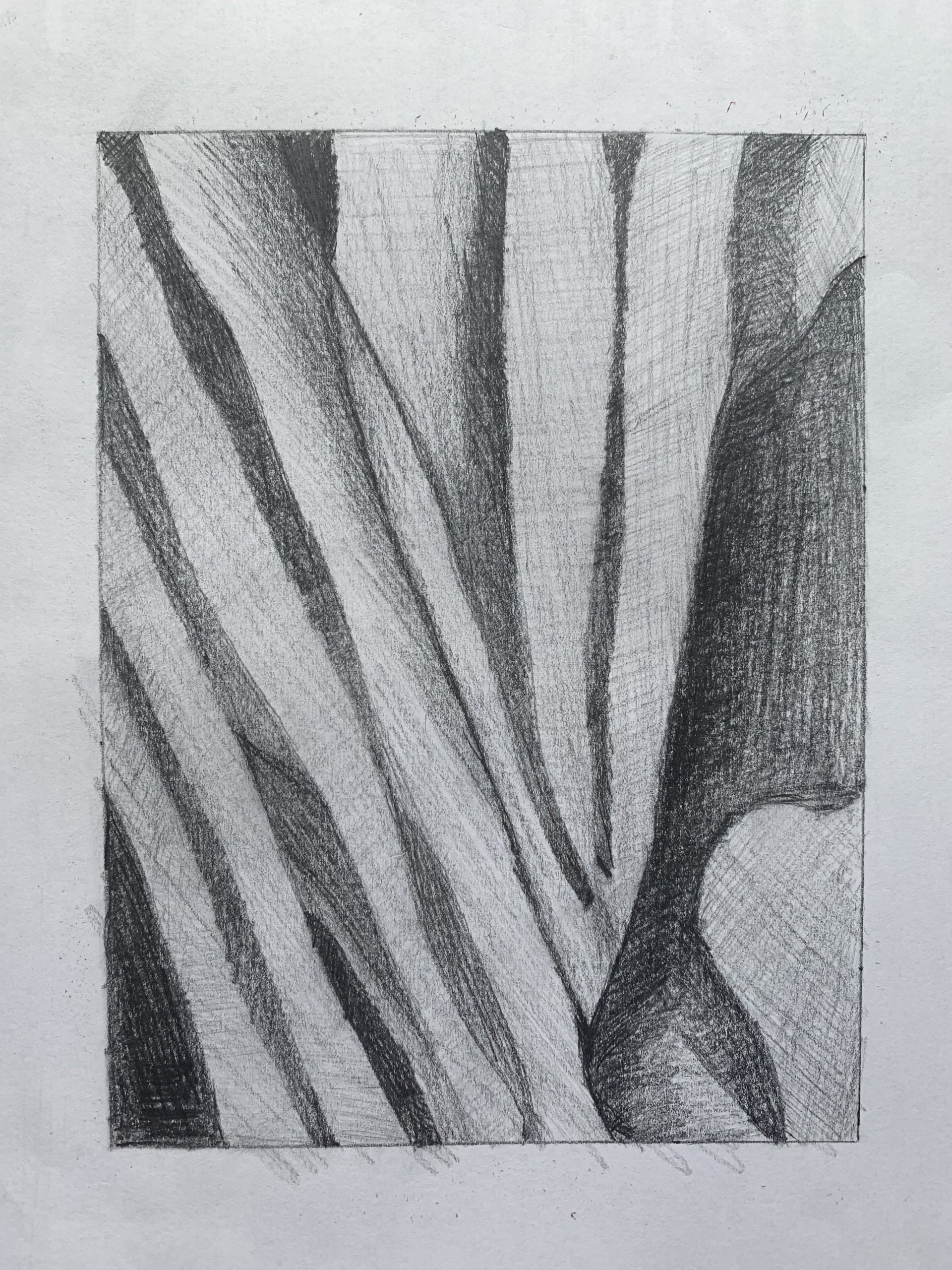
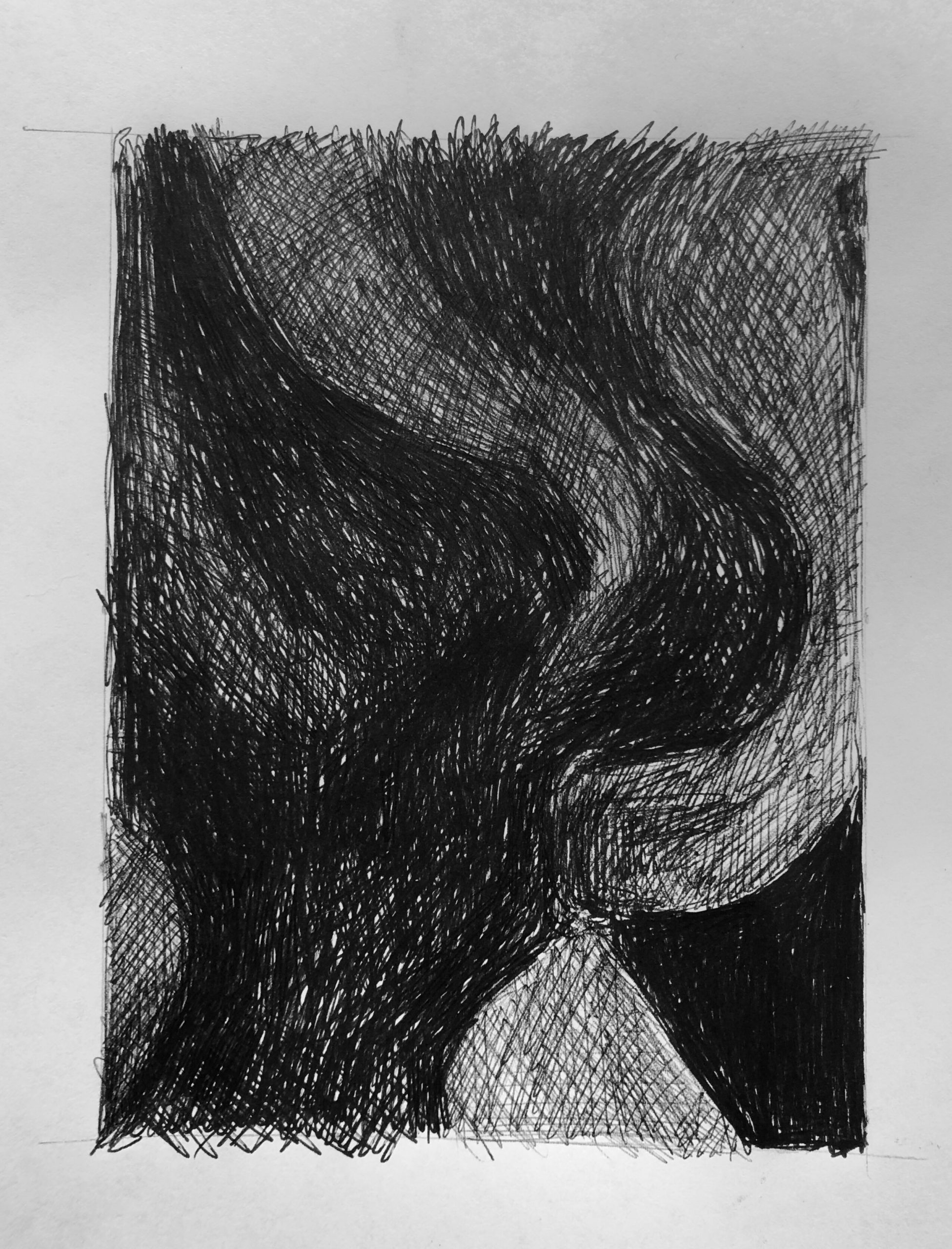
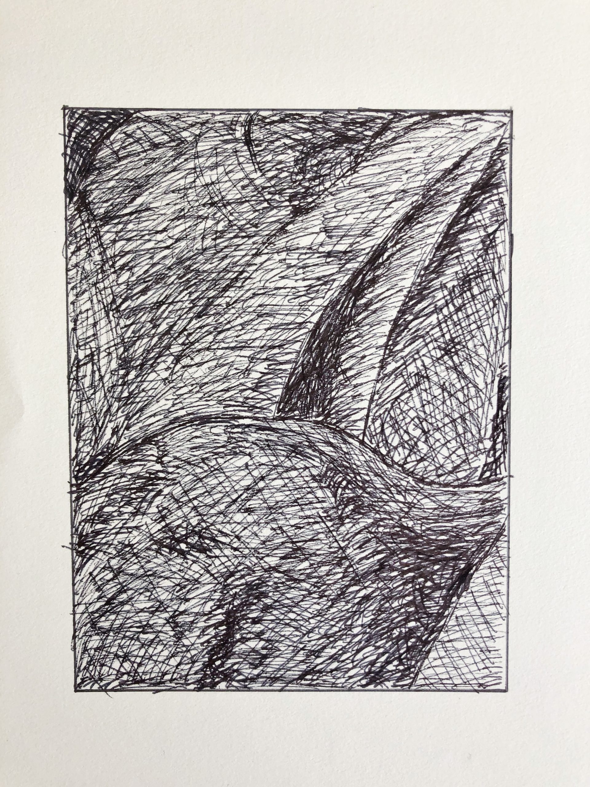
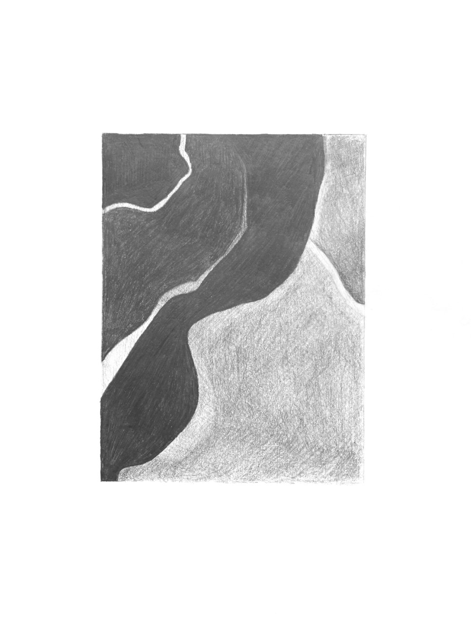
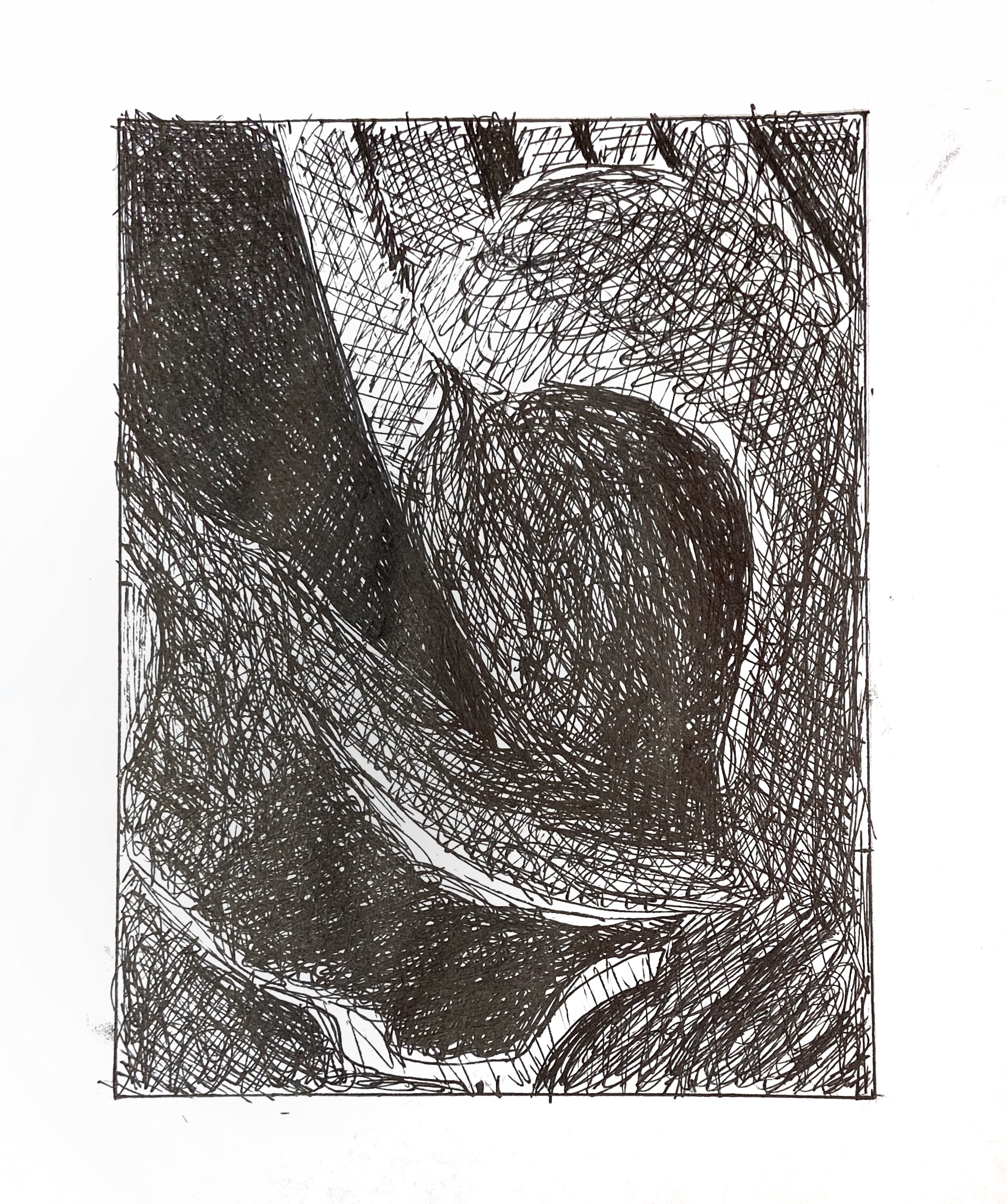
Great configuration but same as above–your mid-tones (which dominate this section) are much too light. Yours are hardly darker than the paper, when almost all of them should be a middle-dark grey. Only a couple of spots that I would describe as a lighter mid-tone. Especially true of those shapes in the lower right, which are much darker.

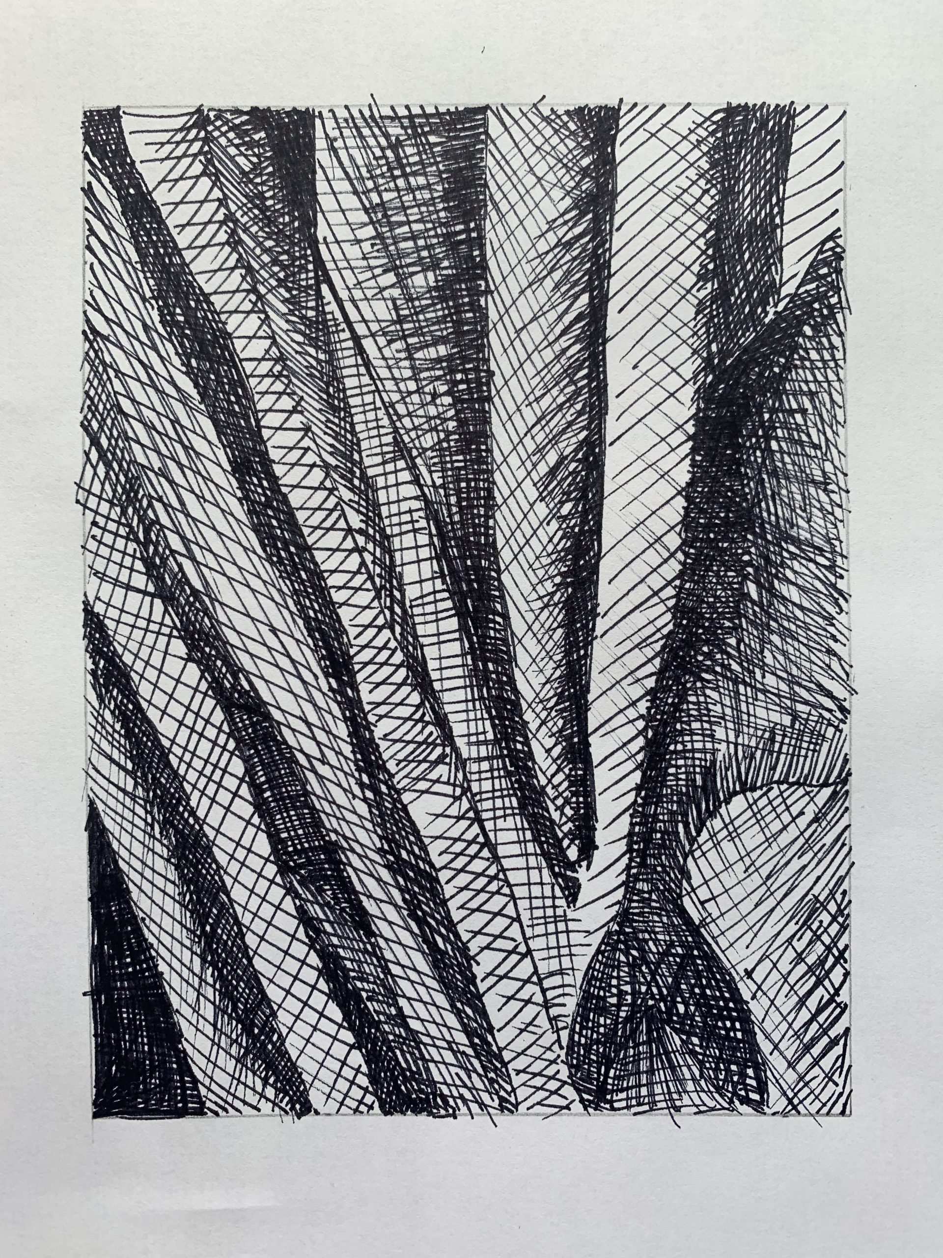
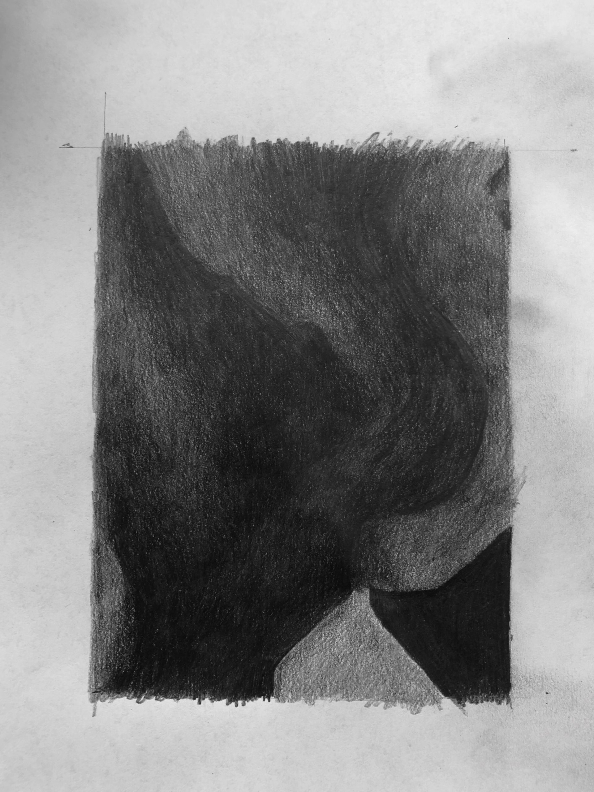
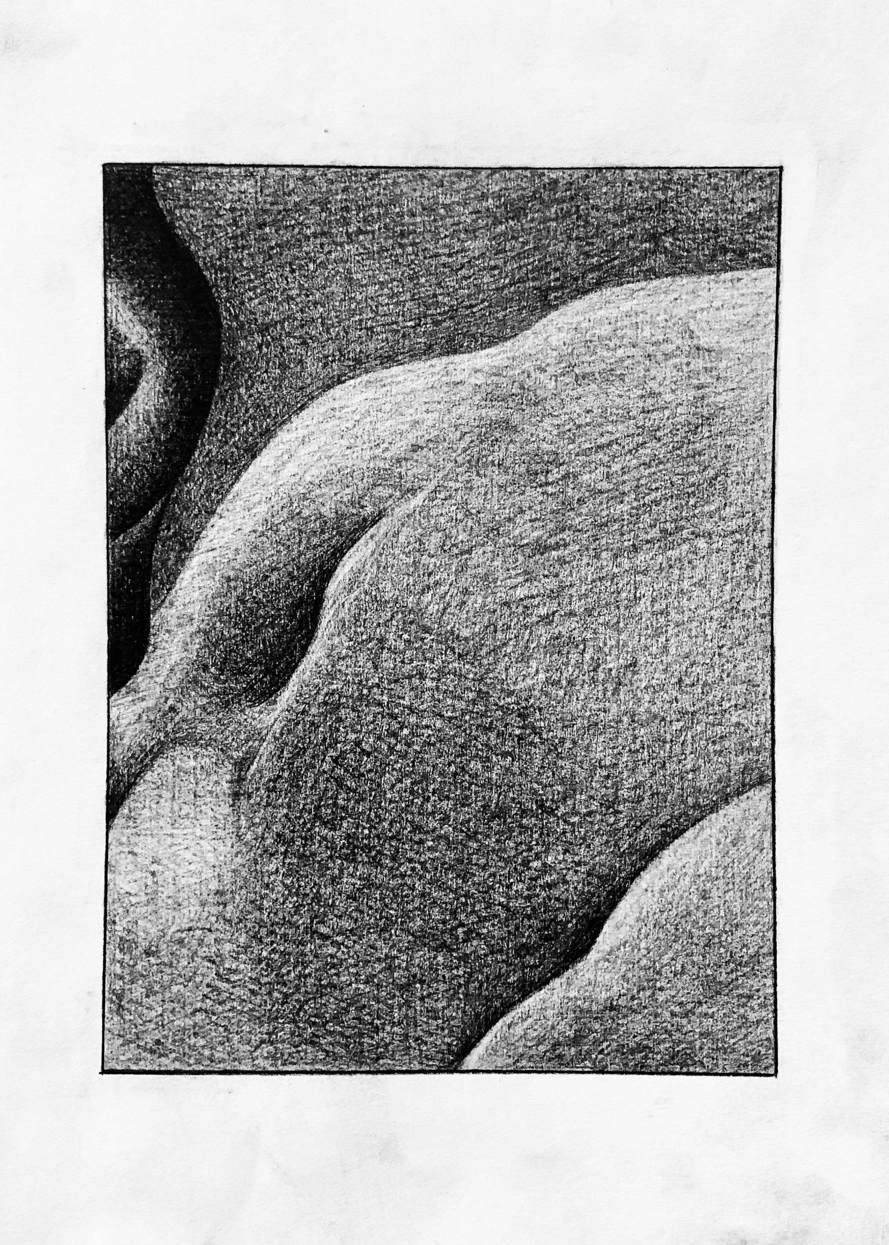
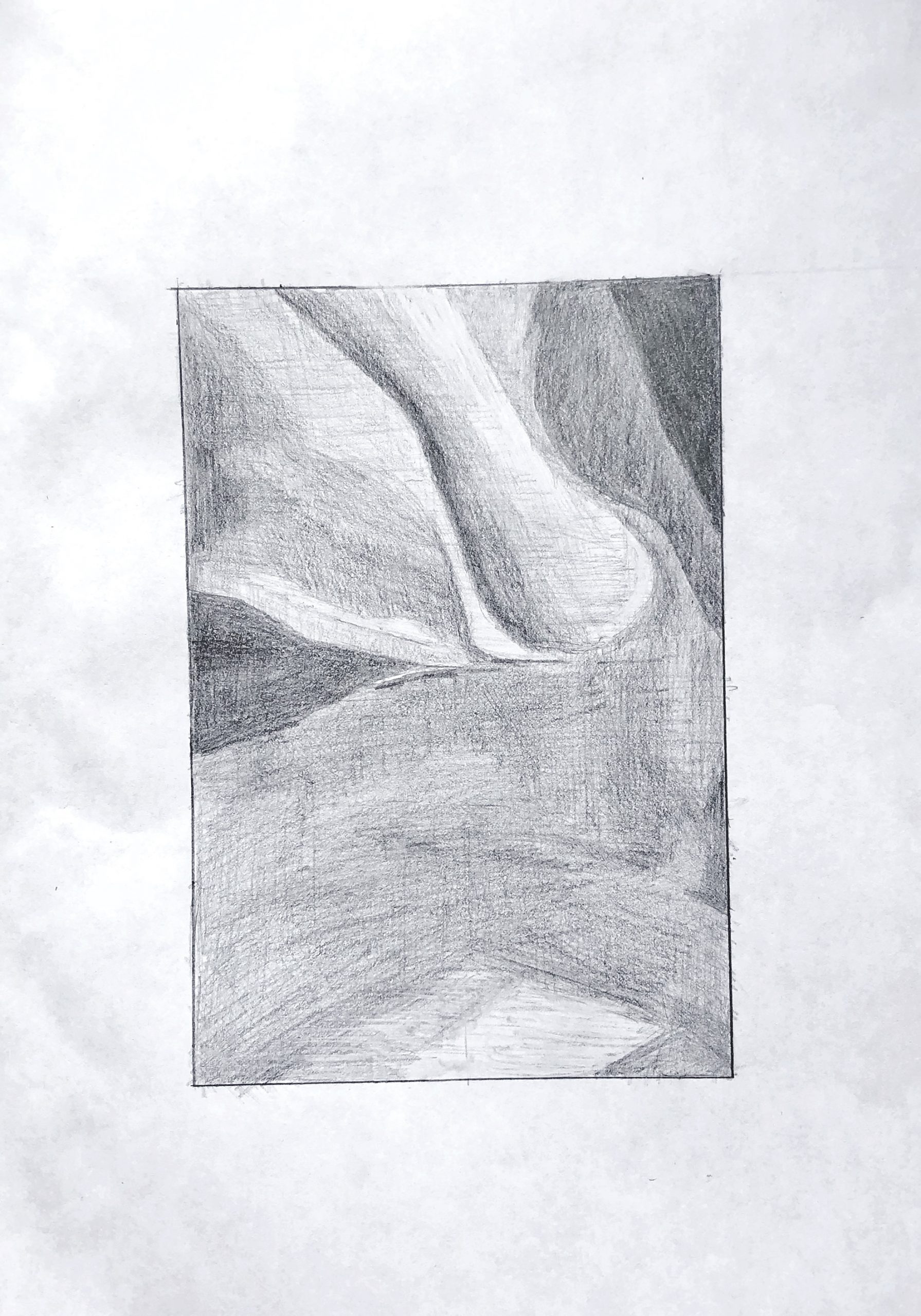
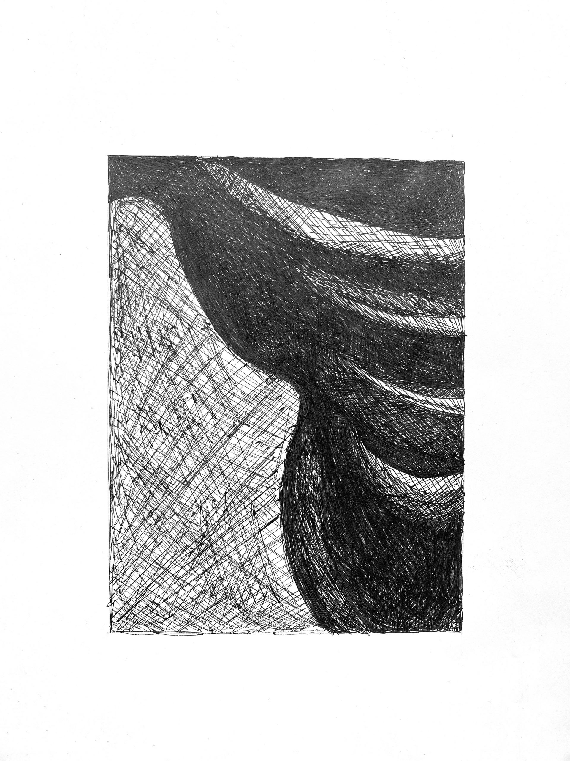
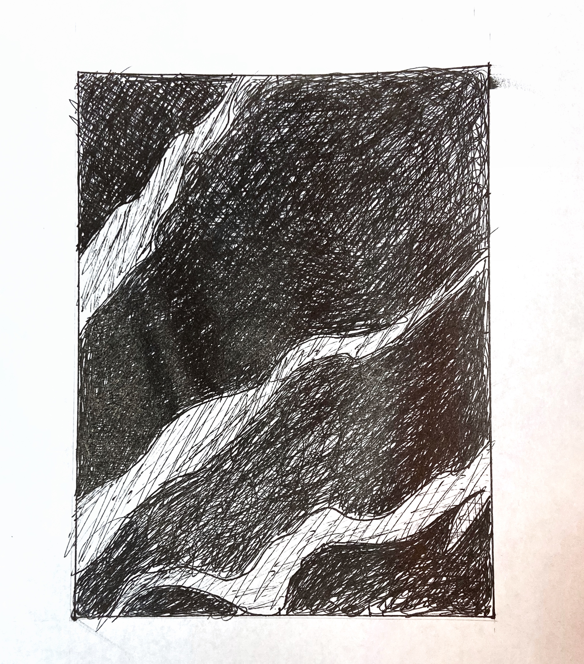
Better value range than the pencil version. Only that lower right shape needs to be darker. The shape at the center right edge also needs to be darker. That section is better in the pencil version.

Anika Helmke Revised Value Drawings

Very good. The nature of that leaf shape poking in from the bottom edge could be more accurate in terms of its curvature, but values are very good.


It might be a glare in the photo, but the upper quarter is too light in value. If it’s the photo could you shoot it again? Also that slightly lighter area at the left center isn’t nearly that much lighter than its surroundings–it should be an almost imperceptible lightening of that dark value, not a sea change. The texture of this drawing is mottled. It would be better by very subtly filling in the lighter splotches with a super sharp pencil.


Very good. The stripe on the upper right is much darker (not nearly as light as the others), and so is that triangular shape along the bottom edge.

Very good as well, but the lighter values in the stripes aren’t this white. Compare them to the value of the paper; none of them and no part of them is that white.

Dev’s Team Value Drawing

Right half is great, but the lighter stripes aren’t nearly that light. Yours approach the lightness of the paper when they should be mid-dark greys, not light greys. Left half is categorically too light; good value relationships but the whole passage is in a darker key. Only a shade lighter than the right half; not to this degree.


Good. Your lightest values could be a shade or two darker, and that sideways V-shaped highlight on the upper left isn’t nearly that light. It’s a barely perceptible difference from the dark shape it’s part of.


Very good drawing, but same notes as the pencil one.

Very good. Terrific abstract drawing.

Ryan’s Designs

Fairly good, and a wonderful abstract drawing in and of itself, but except for your darkest areas (near black) all of your tones need to be darker by a few shades, especially in the upper half and that dark shape at the bottom that goes off the lower right corner. Even the lightest value, about a quarter up from the bottom and toward the right, should be darker.

This is good so far, but there’s more value contrast in play–especially where that large curved shape in the lower half overlaps the shapes in the upper half. It also shades toward dark much more toward the right. Except for the lightest areas, all others could be darker.


Better than the ink version in  terms of value but it too should be categorically darker. Also, the texture of this drawing lacks the refinement we’re after. As shown in my demo, you need to combine strokes from all angles–these are dominantly left to right–as well as a more tempered and gentle stroke, to achieve a high resolution surface.

Better than the ink version but still under-developed. All values except for the darkest ones and the lightest ones should be darker. Note that the triangular shape on the lower right is the same value as most of the lower half, but separated from those similar values by the dark patch; its the dark patch that makes it look lighter due to simultaneous contrast, but you need to see past that by making wider comparisons.

grace bilodeau – Team value drawing

This process was an emotional roller coaster for me. I think the most difficult part for me was definitely the pen drawings. I was finding that that with pencil it was far easier to vary the intensity of the line weight. Additionally the wider expanses of similar toned (light gray) areas I struggled with making a consistent tone. I think my biggest worry was not leaving enough space for the highlights and lighter areas in my pen drawings, as I was afraid that they would darker too quickly. 

My suggestions here are the same as I mentioned in my email. In the process you could tighten up the resolution by hatching lightly from many angles rather than just two, as suggested in the demo.

The hatching in the pen drawings is fine, but as before, these need to be several shades darker overall.

Olivia Pencil 2 (edited)


Good,  but the mid-tones in the right half should be altogether darker. Try hatching at a slightly different angle as well to avoid that mottled look. The upper right corner is significantly darker; although this might be glare–I notice the dark areas on the left also get lighter along the top, when they should be the same as the other darks on that side. The lower white stripe, especially as it approaches the left edge is also darker–not nearly the value of the paper as it is here.

Olivia Pencil 1 (edited)

Like the other pencil drawing, the middle-grey shape to the lower left needs to be much darker–also a chance to hide those horizontal rows of overlapping shading. Just change up the direction of the pencil. As noted in my demo, multiple layers of hatching, each at a slightly different angle to the last, will even our the texture and the pencil strokes. Also, the four very light shapes in the upper right are much darker. Compare them to the white of the paper.

Isaac Gelb– Team Value Drawings

That dark V-shape on the upper left and the vaguely leaf-shape at the bottom left and center (your darks, that is) are great, but all other values should be a shade or two darker than they are here. That light shape at the bottom edge (like a bird in flight) is much darker (and so are the values around it)–not the same value as the paper as it is here.

Very good, but light stripes aren’t this light–especially the one in the upper left. The third dark shape down from the top has a slightly lighter value running through it, but not this much lighter–it’s subtler than that. By the time it reaches the right edge it’s as dark as the other dark parts of the drawing.

Much better than the pencil version, in terms of value, but that white shape near the bottom is still not that light. A light grey, but not that light. Make sure the lighter values at the top edge go all the way to the edge–you’re leaving a gap there on the two to the left. All of the lighter values near at the top could be a shade darker.

Very good, but lower portion of upper left stripe, where it meets the edge, is darker–still lighter than what’s around it, of course, but not as light as this.