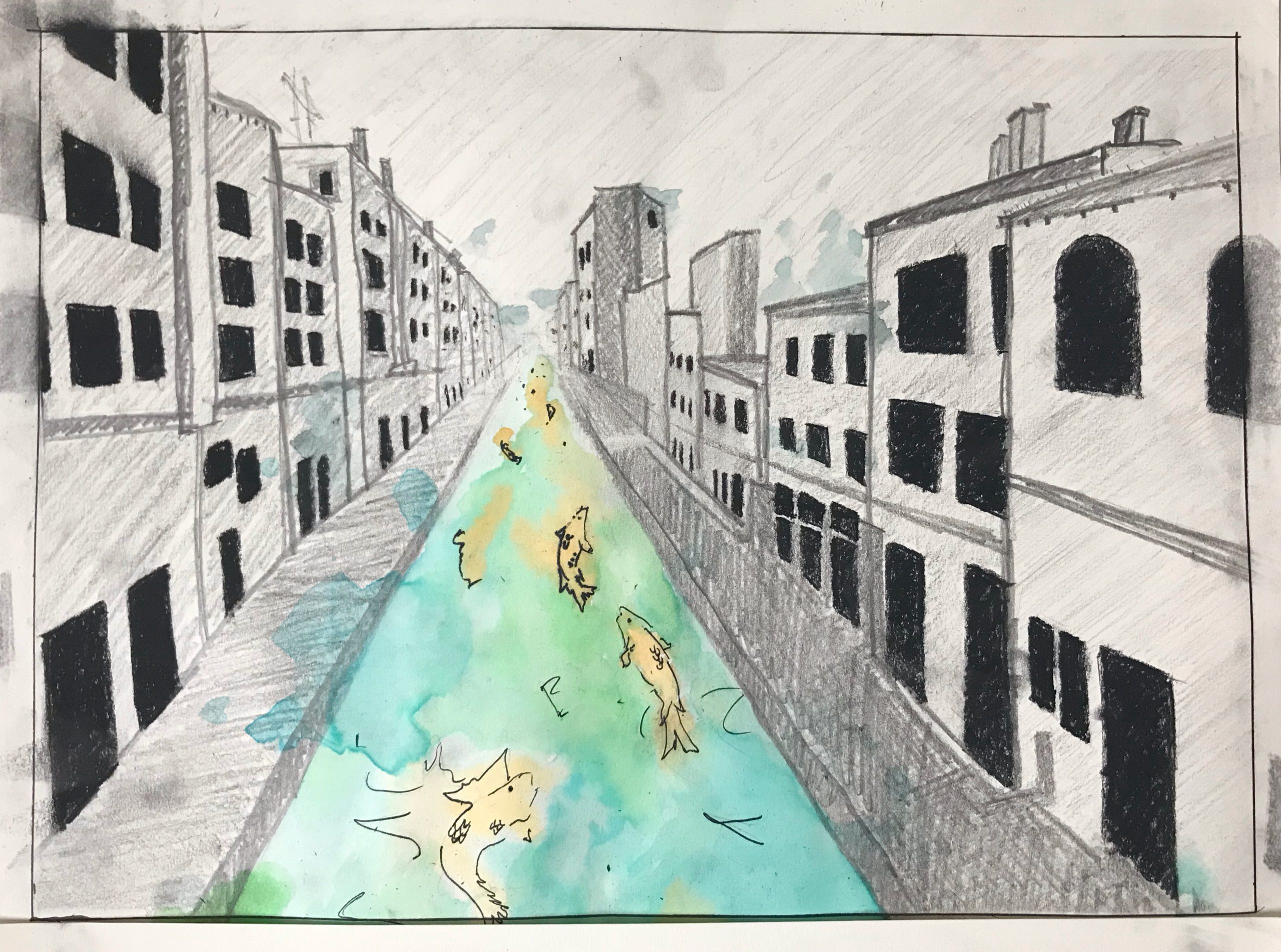
Category: Drawing
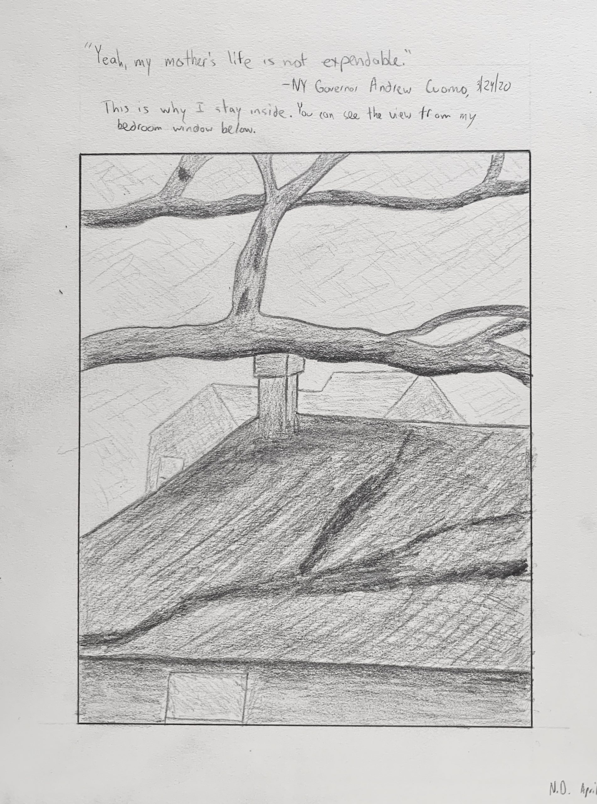
Isaac Gelb– Time Capsule Drawing
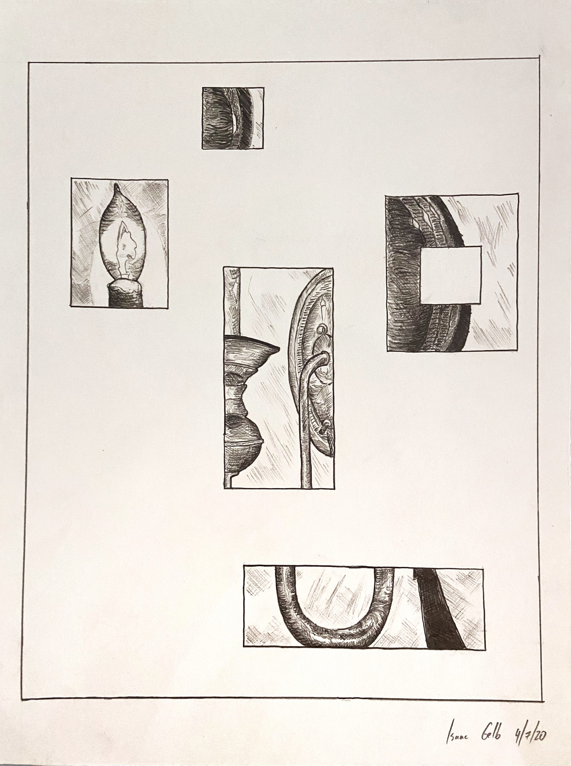
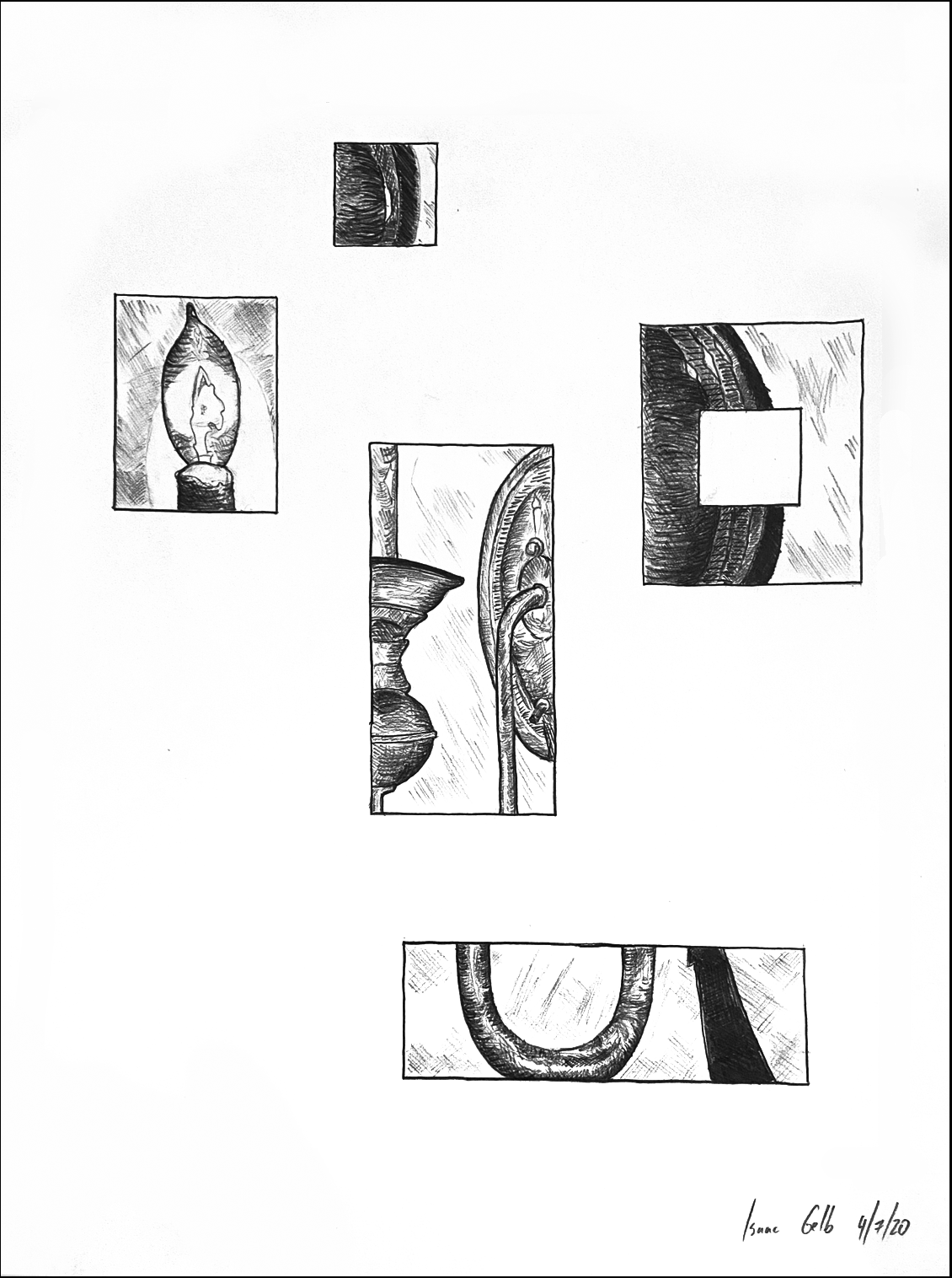
Love the way you broke this into parts. They’re perfectly arranged and aligned to both hold the space and maintain their independence while also converging on the same image–wonderful job. I’d go one step farther and let go of the outer border, which feels redundant and less daring. The black outline on mine is the edge of the paper (I also tweaked the contrast and the white balance to remove that pink haze and make the lines black).
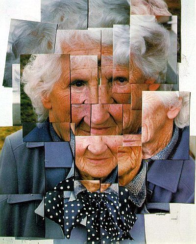
David Hockney
Nate DeMoranville Drawing Place
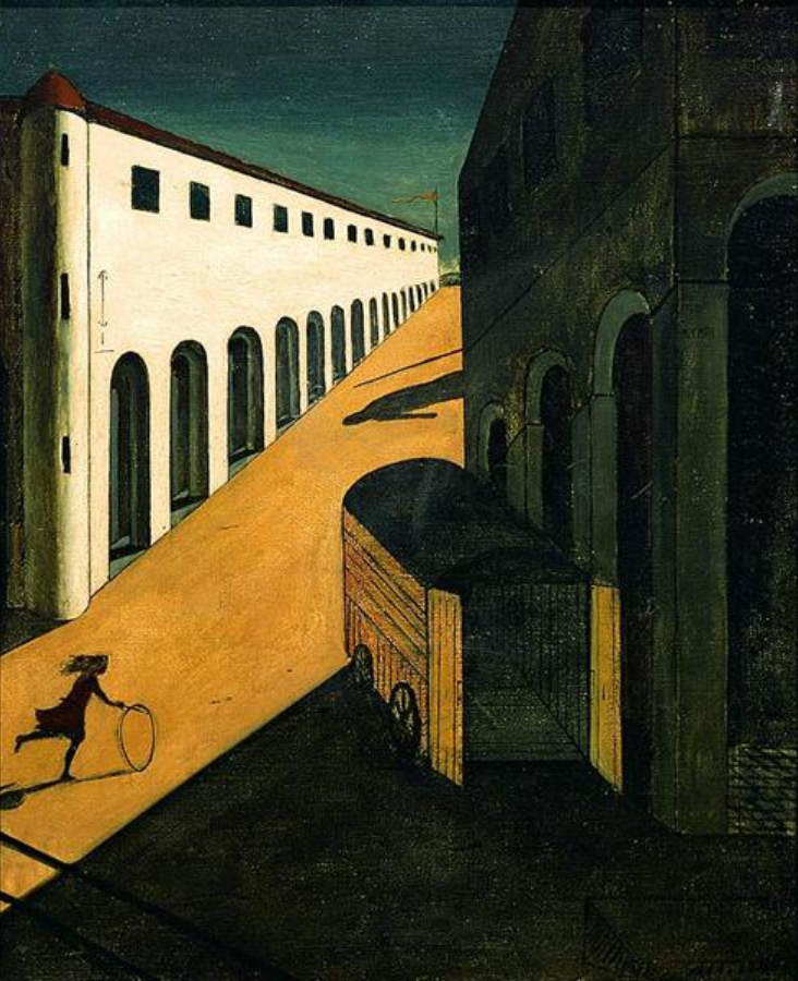 Giorgio de Chirico
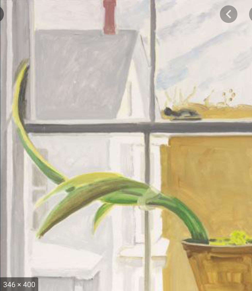 Lois Dodd
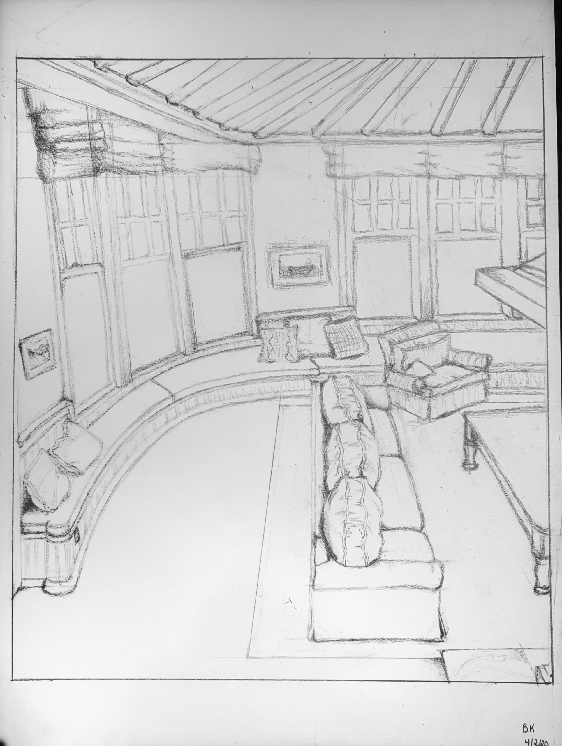
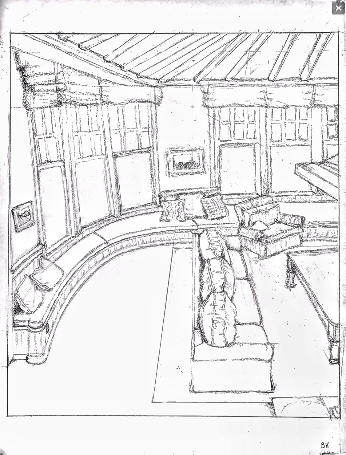
Ben’s Family Room
Aadhya – Drawing in Place
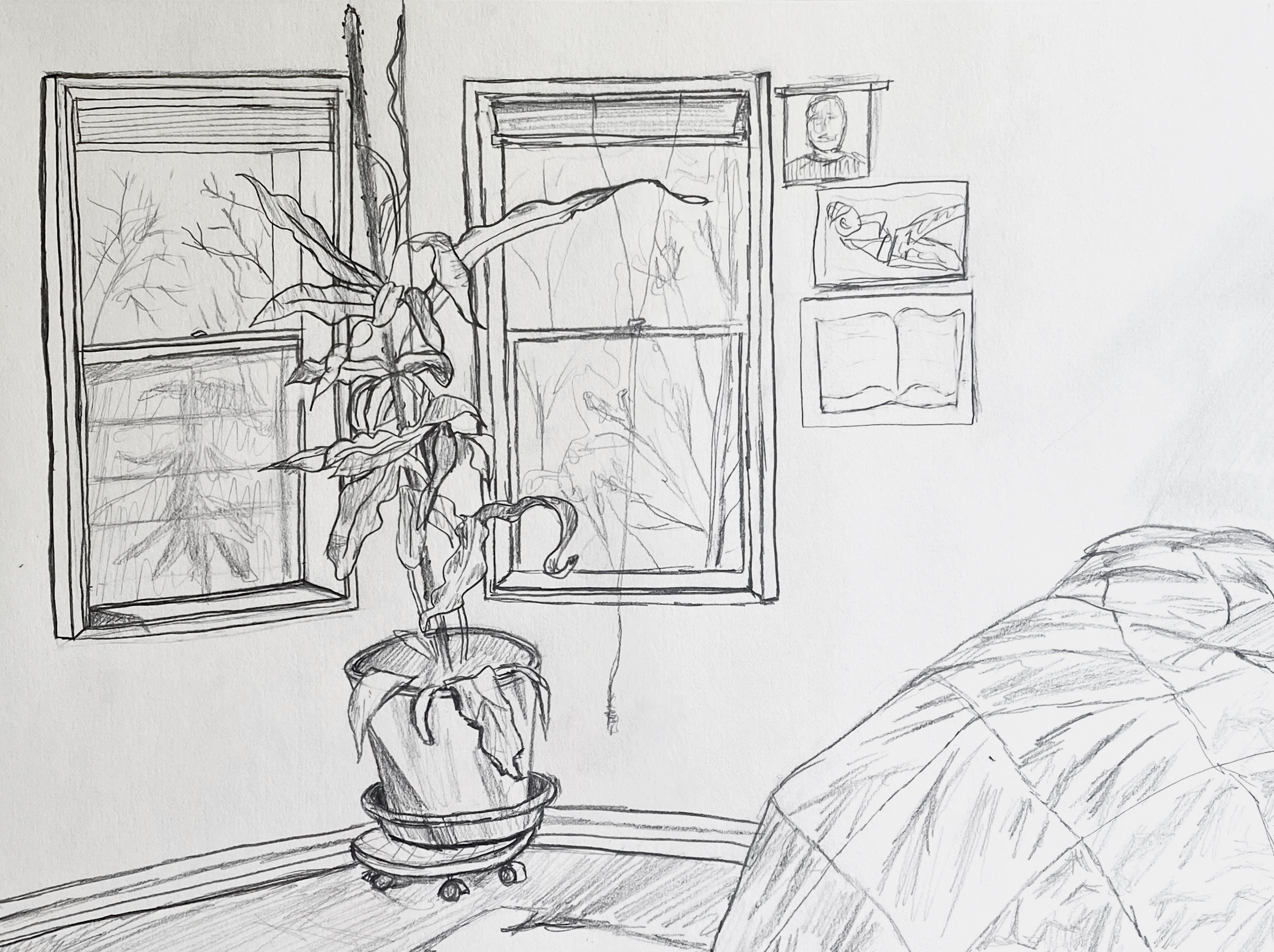
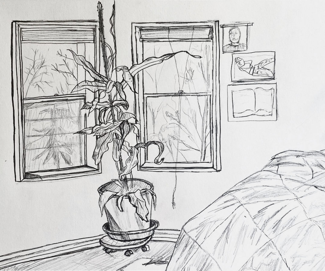 Using Photoshop I moved the bed closer to the plant to fill the rectangle more effectively. Note how this also uses the rule of thirds to strengthen the design:
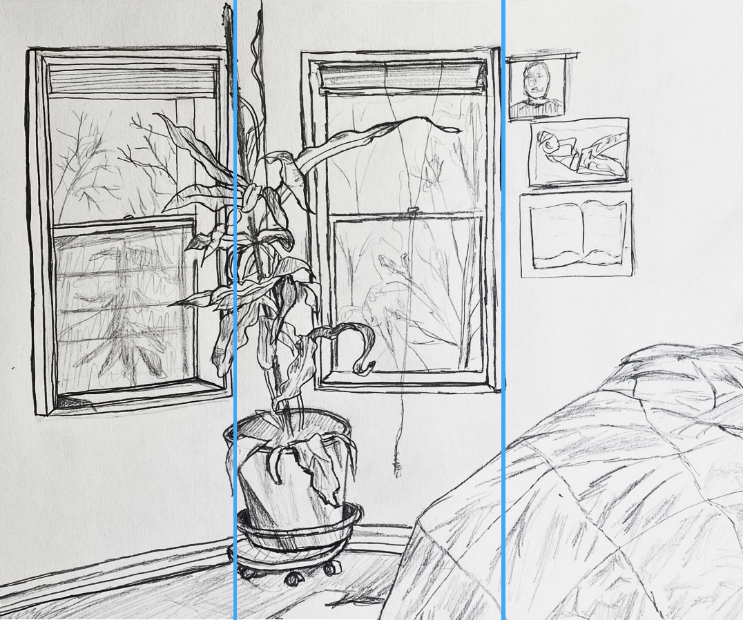 I like the way this places the right edge of each window frame on a third, and how the plant, while mainly in the middle, sticks its nose into the left third, and the bed, while mostly in the right third, dips its toe into the middle third.
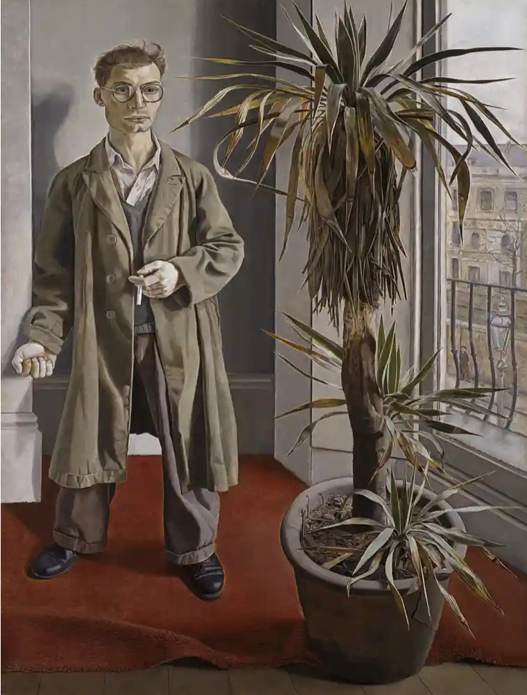
Finally, a painting by English artist Lucian Freud that your drawing brought to mind (good company to be in):
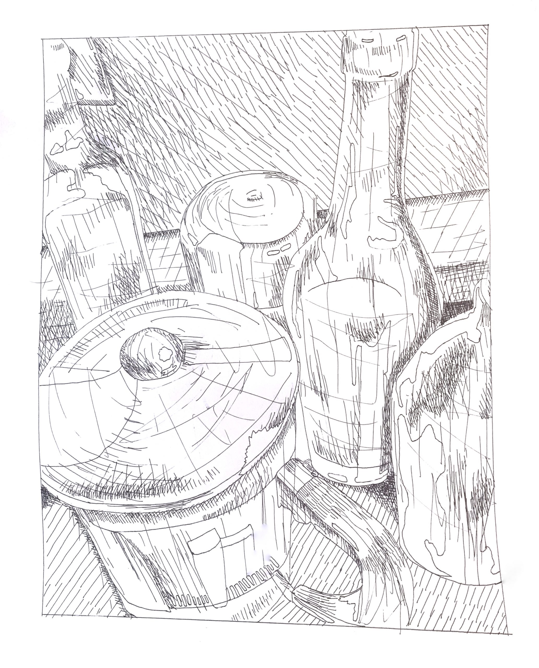
Anibal Husted – French Press?
Ian Strudwick – Drawing in Place
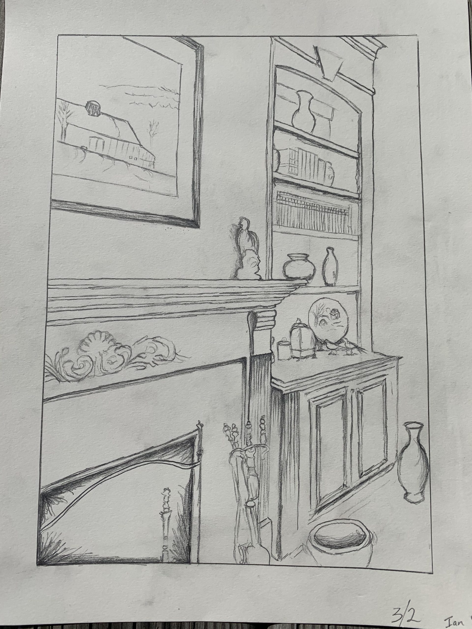
After squaring the image and increasing the contrast:
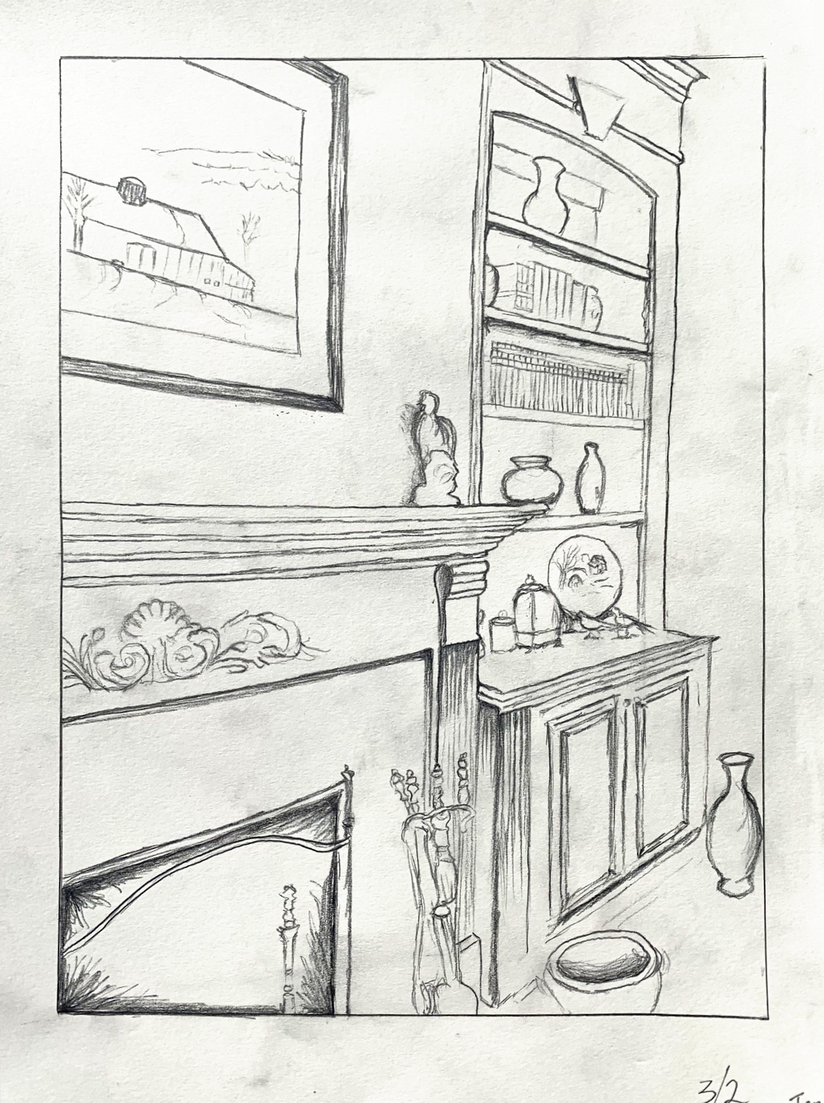
After straightening the verticals, adding perspective lines in the disaplay cabinet, cropping the vase, and adding a baseboard and glimpse of picture frame to the far wall:
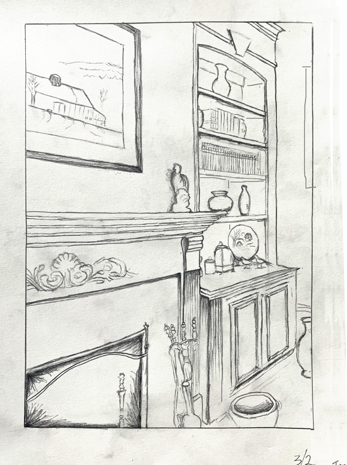
Amanda Trent- Drawing in Place
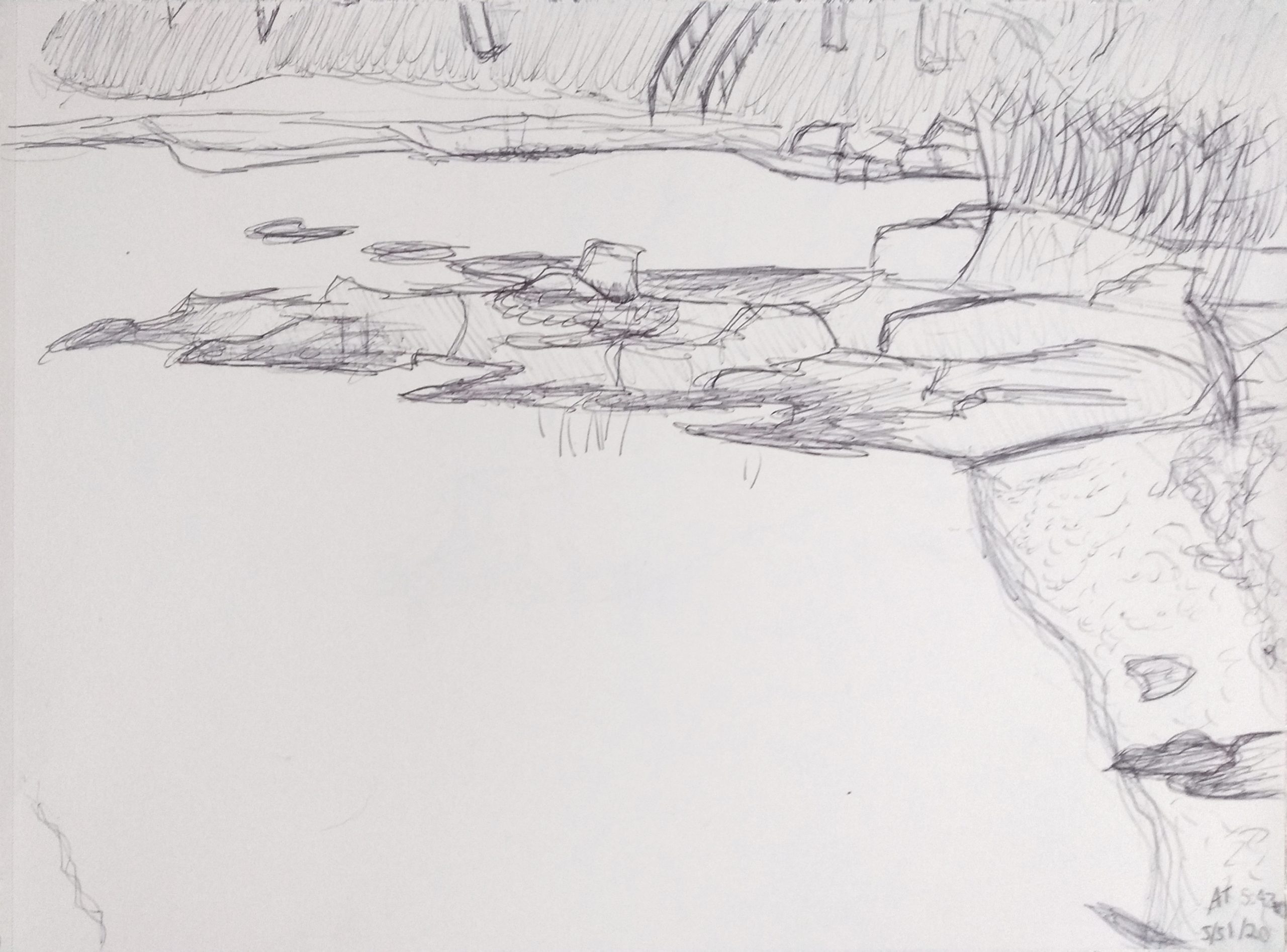
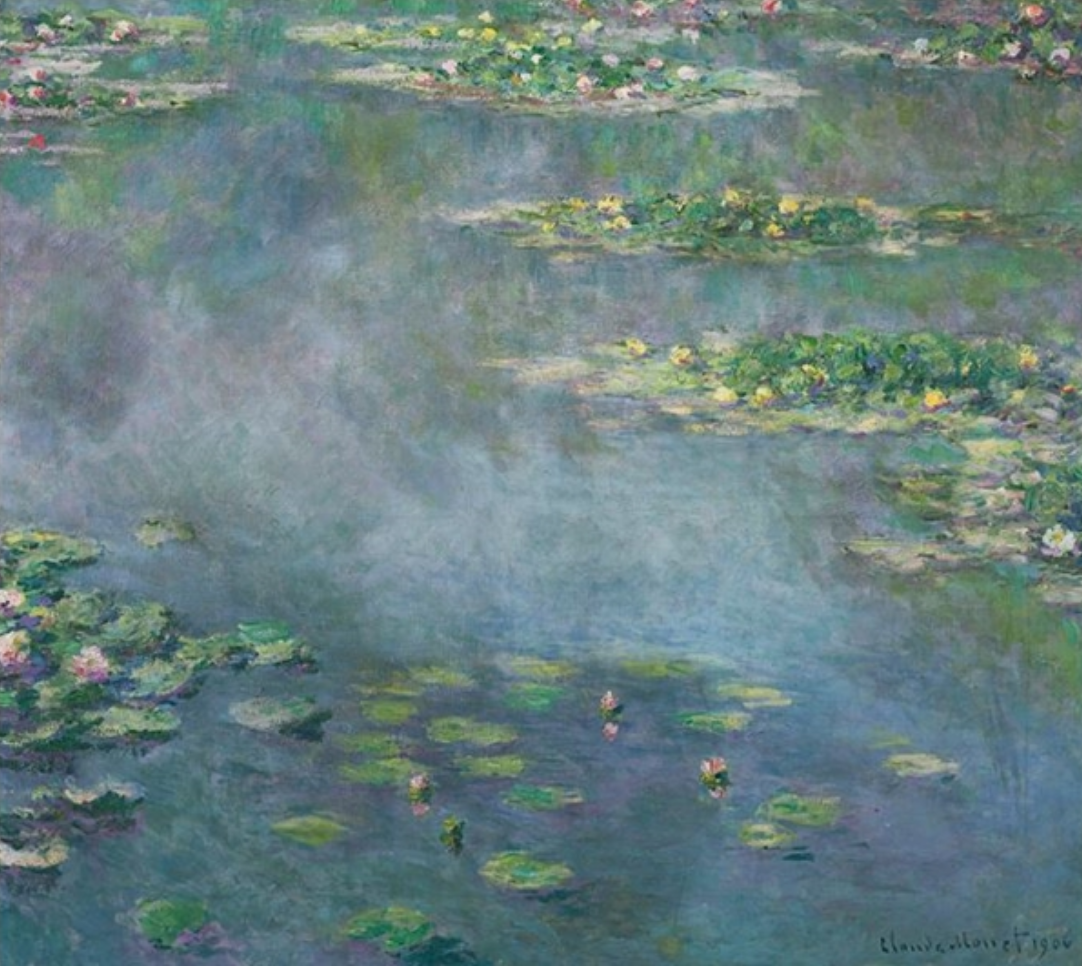 Claude Monet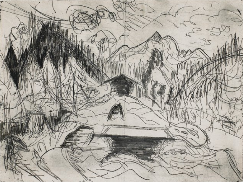
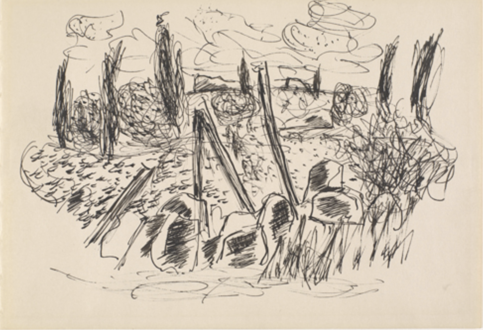
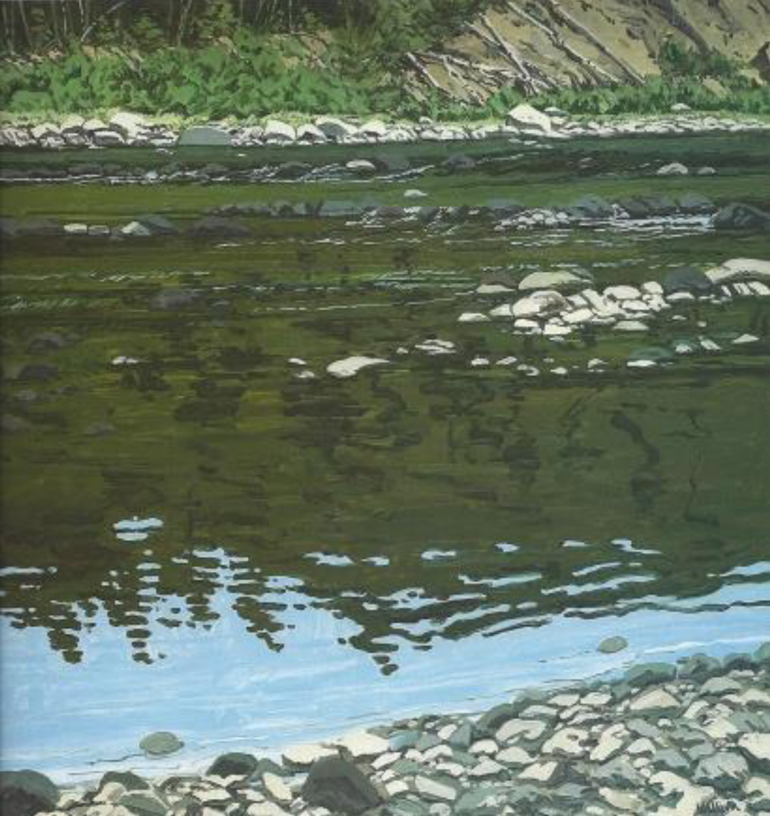
Max Muradian – Drawing in place
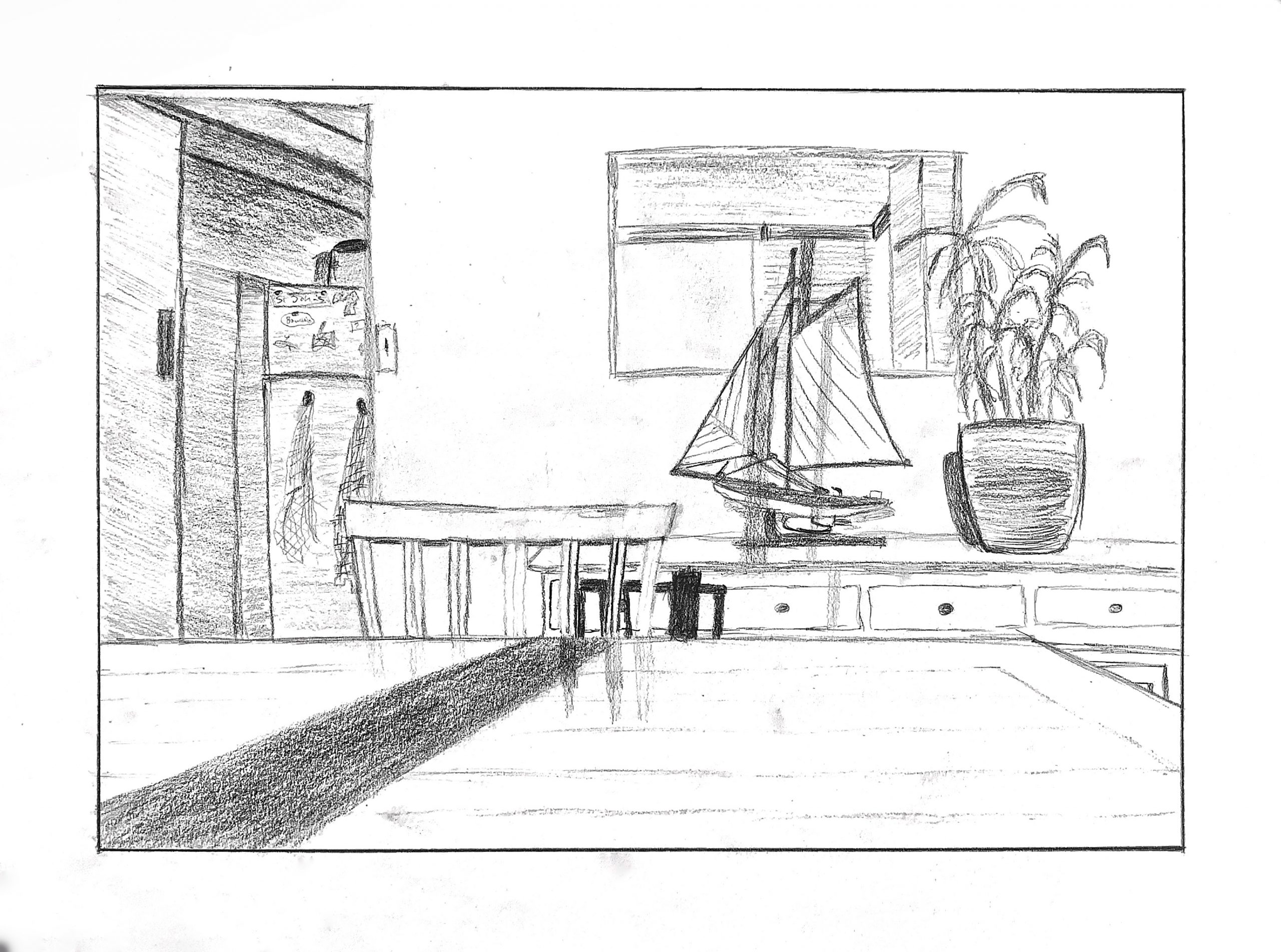
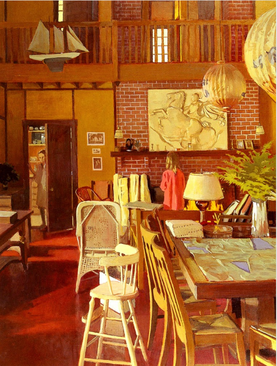 Fairfield Porter
Drawing in Place- Olivia
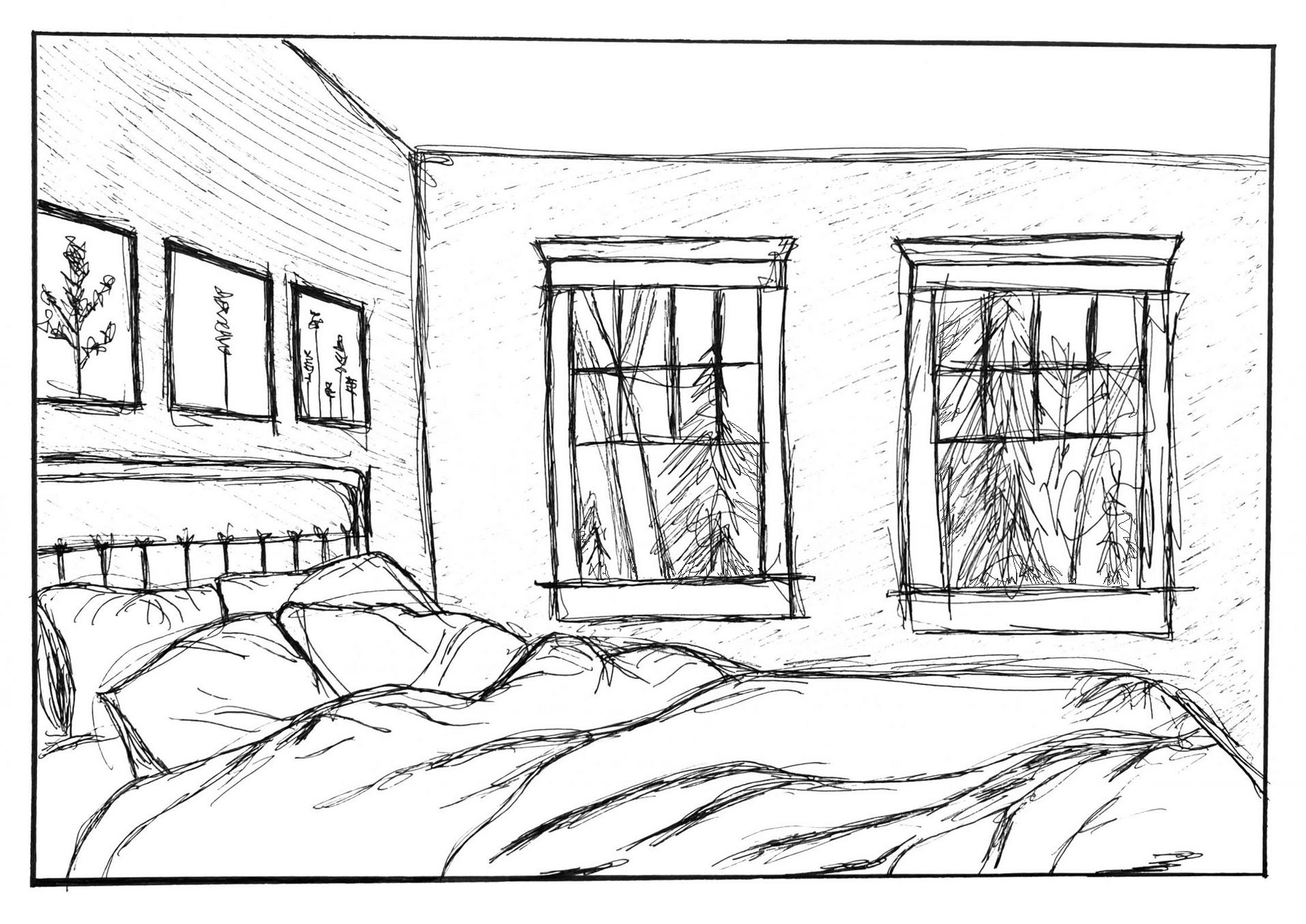
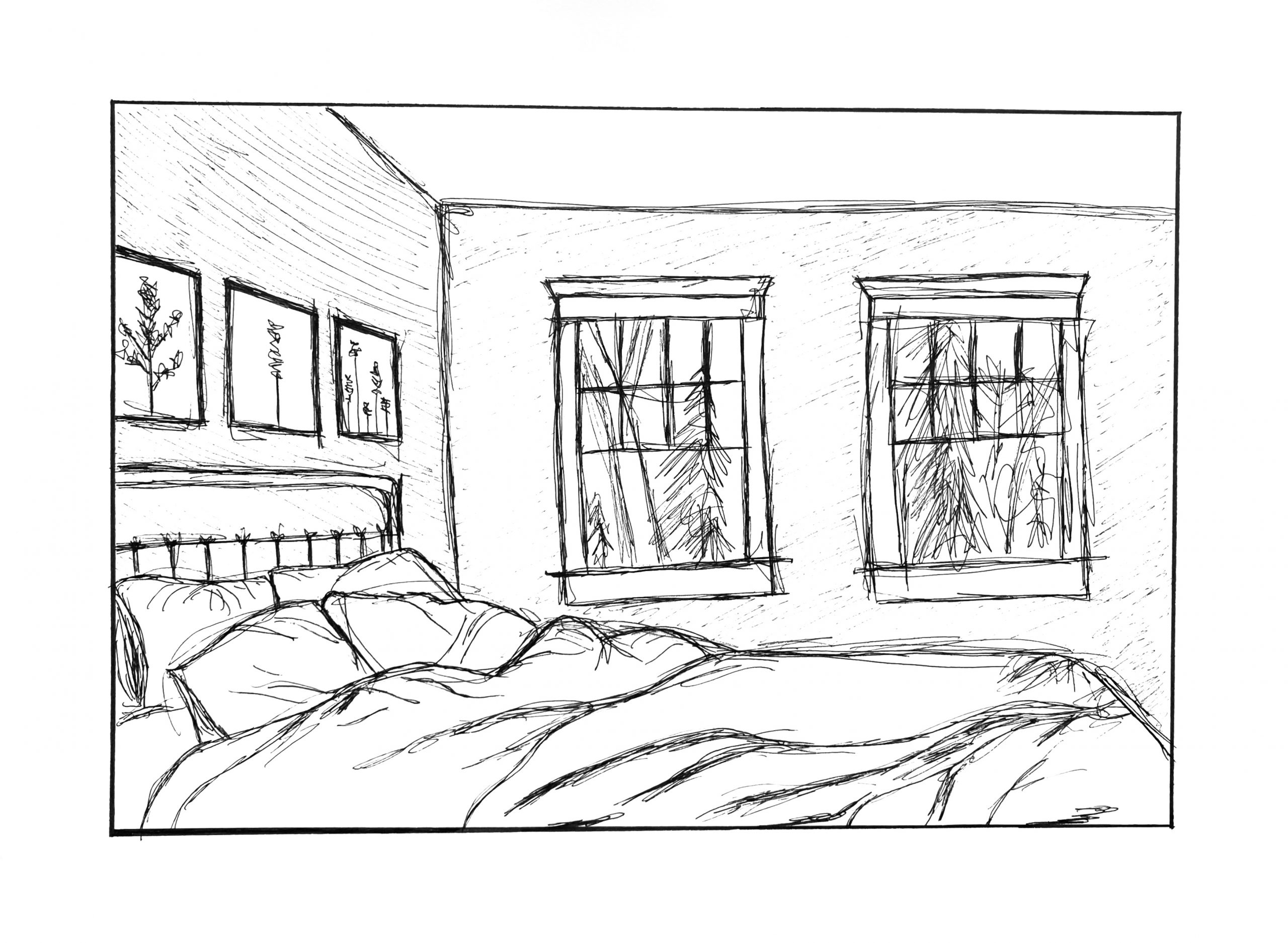 Just a couple of suggestions. I know they can’t be made once the ink is down (well, one of them), but the lower window sills are angling up to the right, pulling our attention away from the cozy bed. By leveling them, or even dropping them on the right just a little, as I have below, they harmonize better with the silhouette of the bed and keep the focus in the room.
The second thing could still be added, which is carrying the trees all the way to window frames, so that the windows eclipse the view out the window, create a stronger, clearer sense of overlap, and create more depth (as I’ve done here in Photoshop). Yours also suggests that nature doesn’t continye beyond what we see in the window.
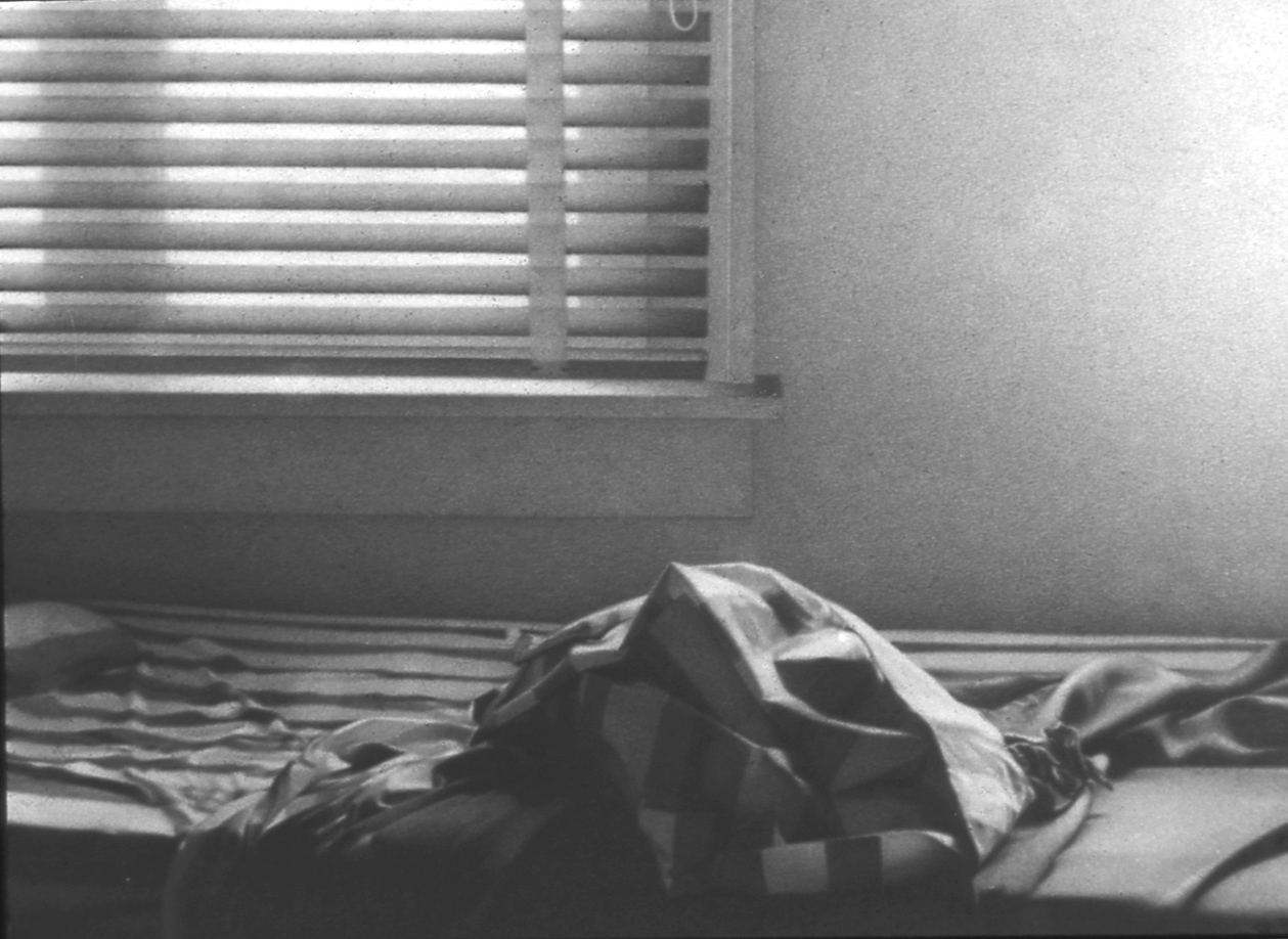
MW, Miami, 1974, Graphite on paper, 9 x 12 inches