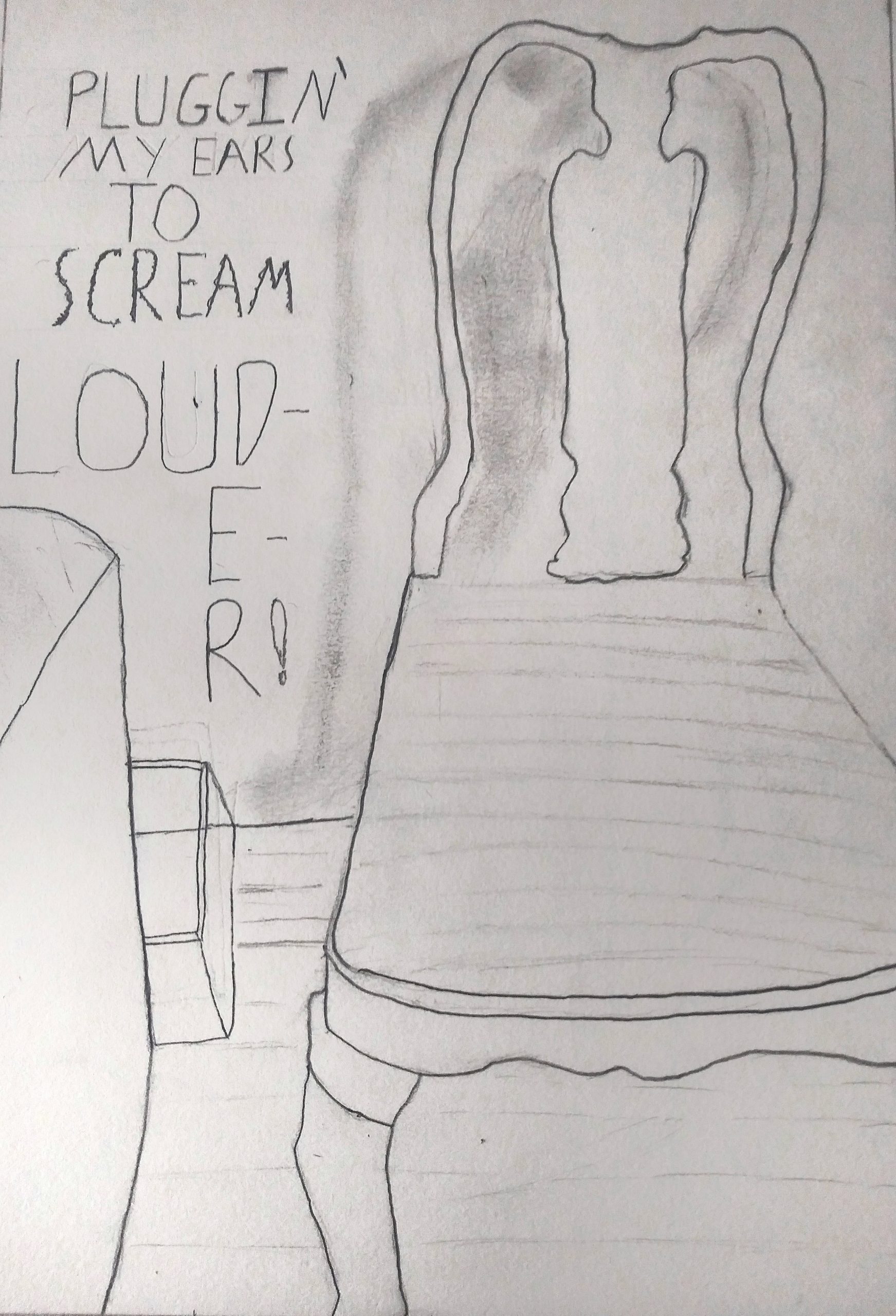
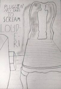
I reloaded this so that it could be opened larger with a click. Love that you included the text, which is like concrete poetry–poems whose graphic design contribute to their meaning, such as the word “louder” too big to fit in its space, spilling over twice to a new line. The contrast between this sentiment and the apparent calm and domesticity of the chair is very powerful. Great drawing.
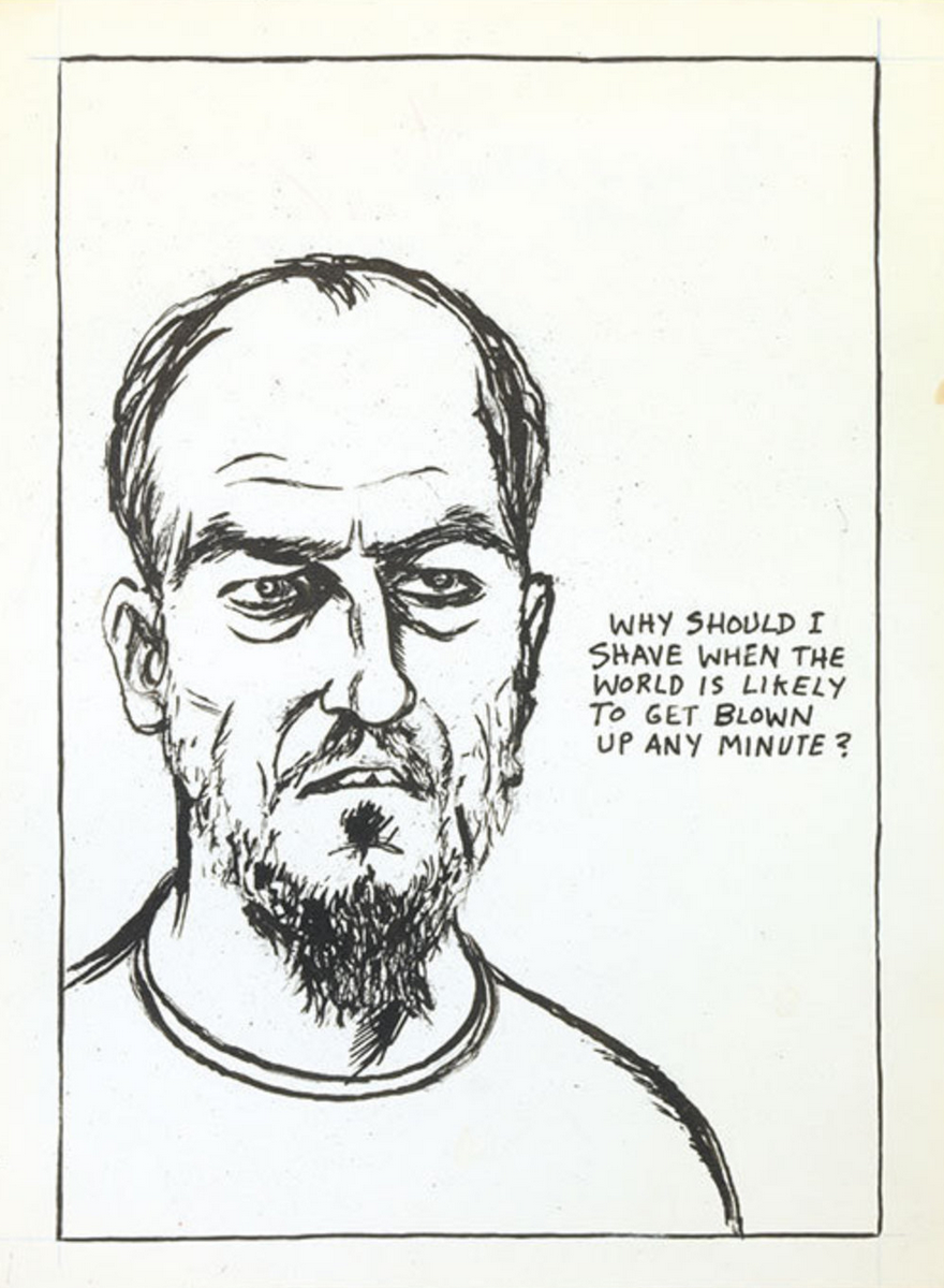
Raymond Pettipon, another artist who uses text and image very effectively:
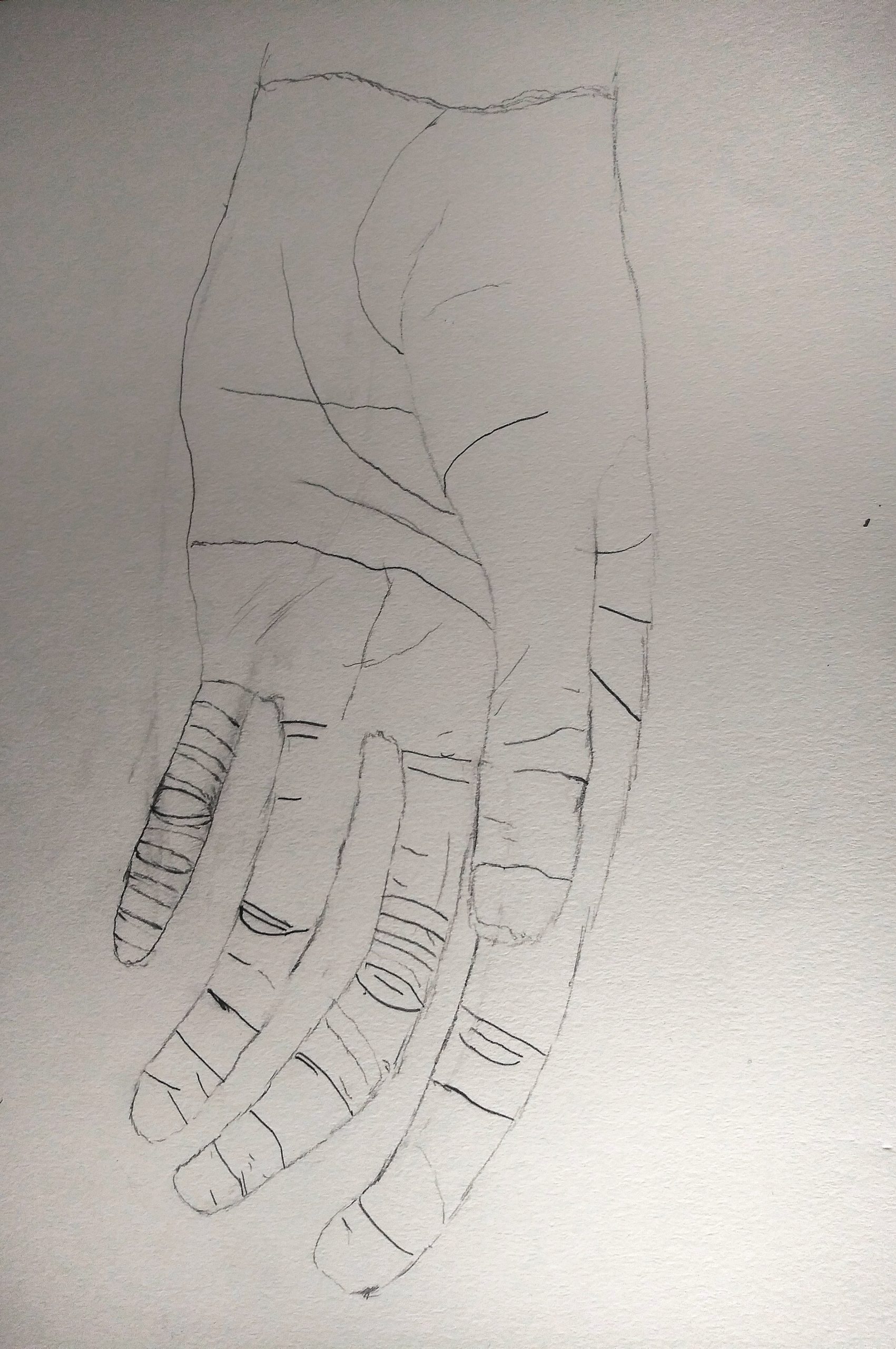
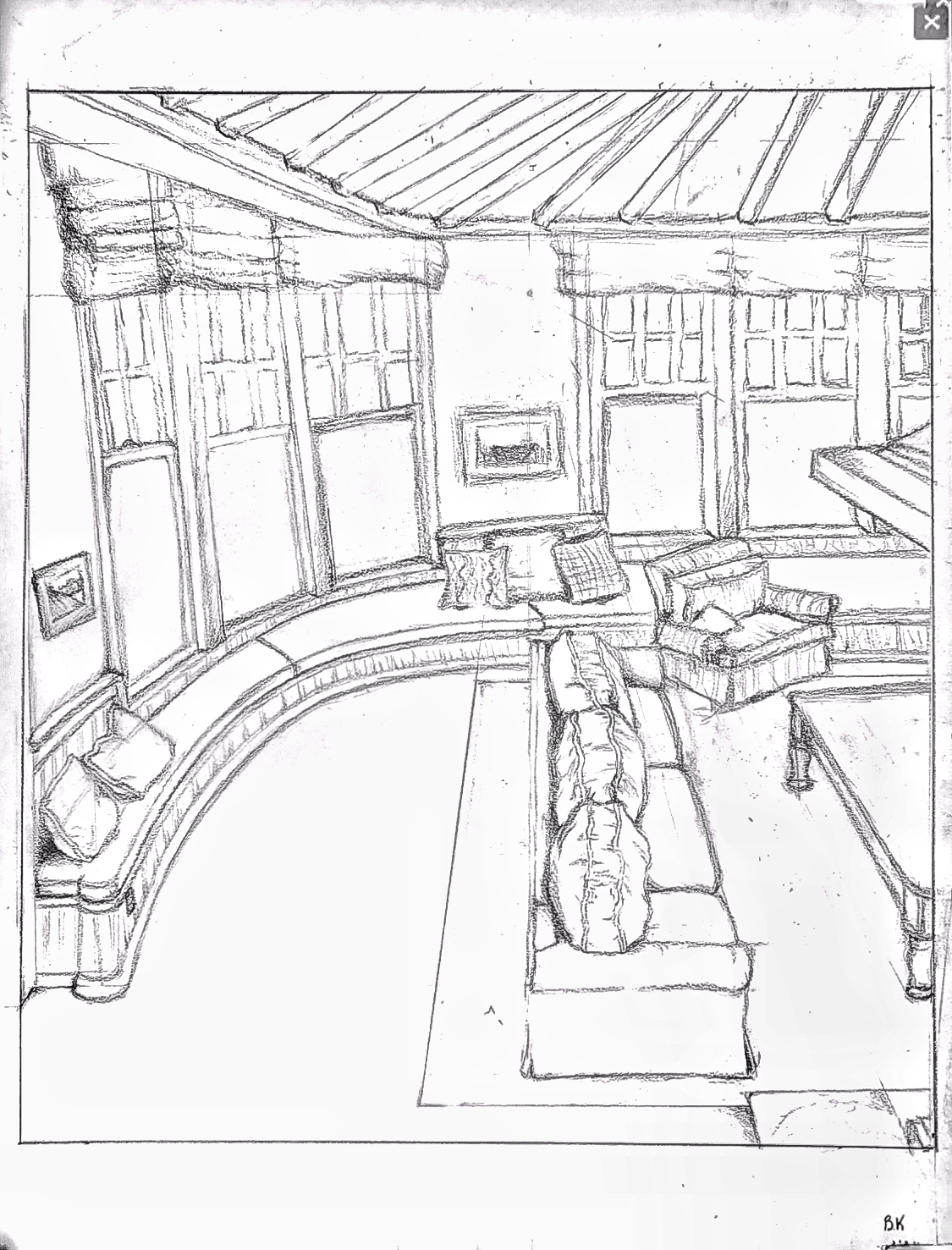
Very good drawing, but could be better still with a more forceful line quality. You’re being too circumspect, and your theory about the small finger doesn’t hold up. Better the thumb, to bring it closer. Some other examples:
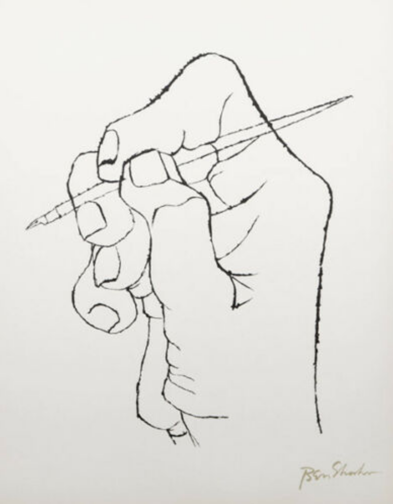 Ben Shahn
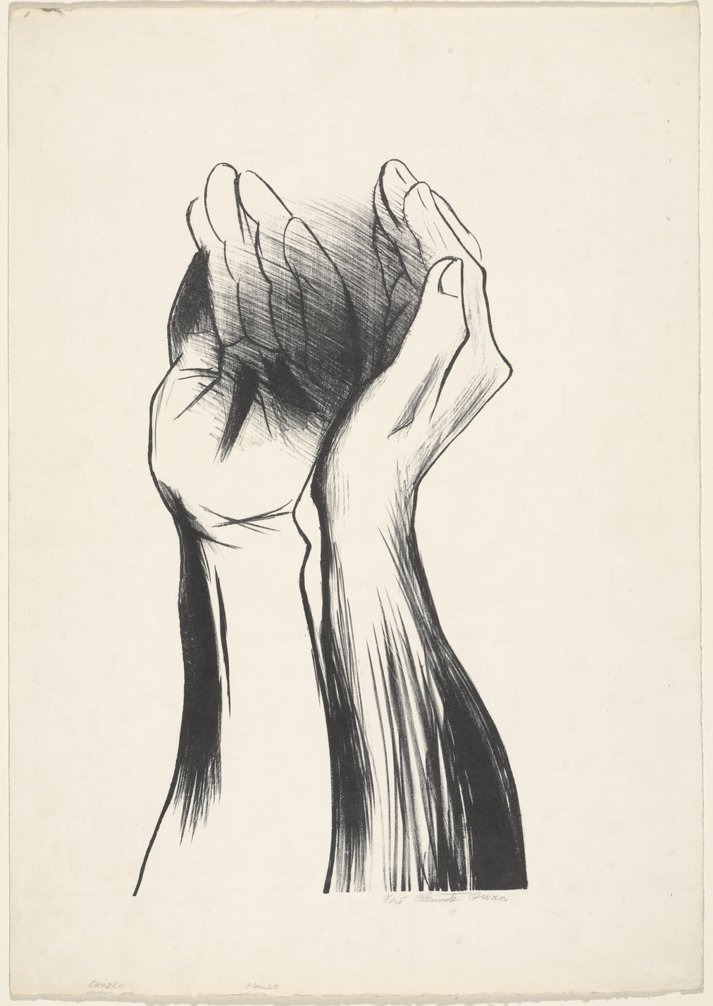
José Clemente Orozco
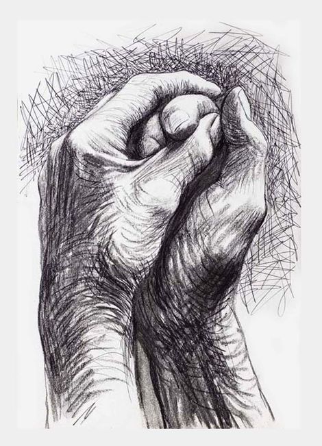
Henry Moore
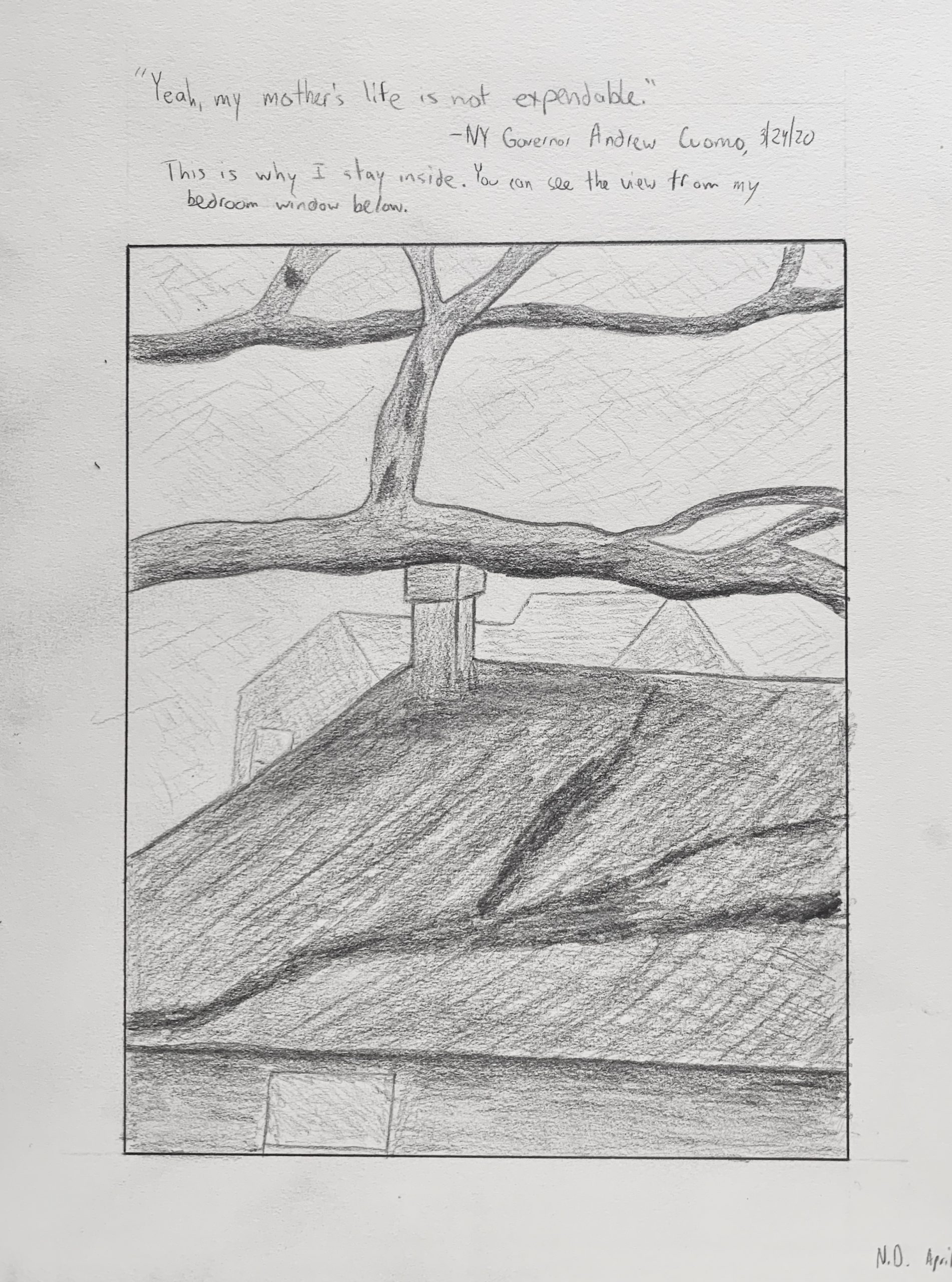
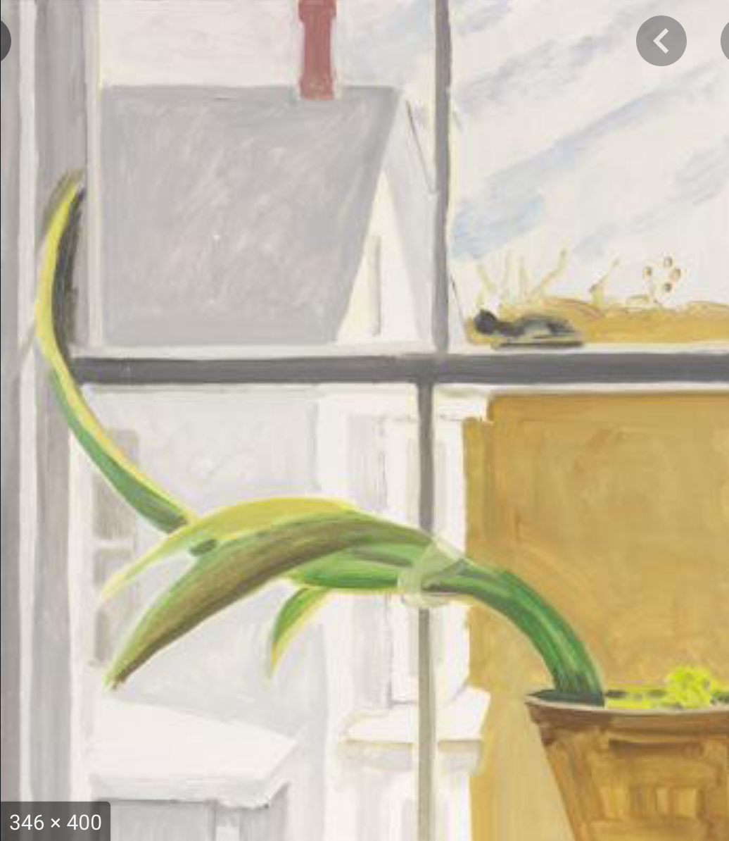
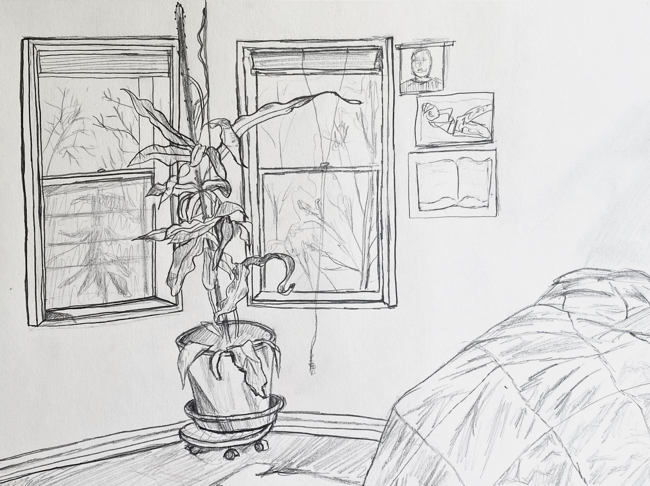
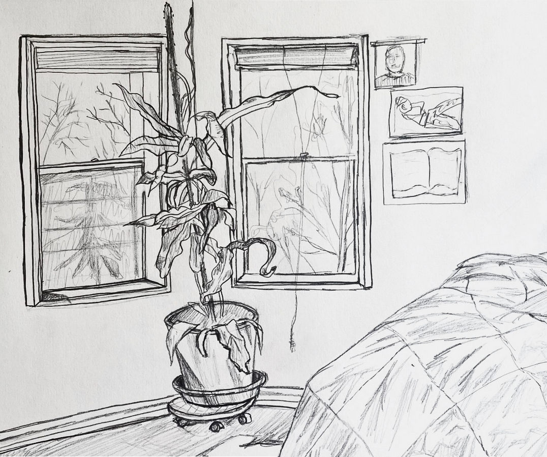
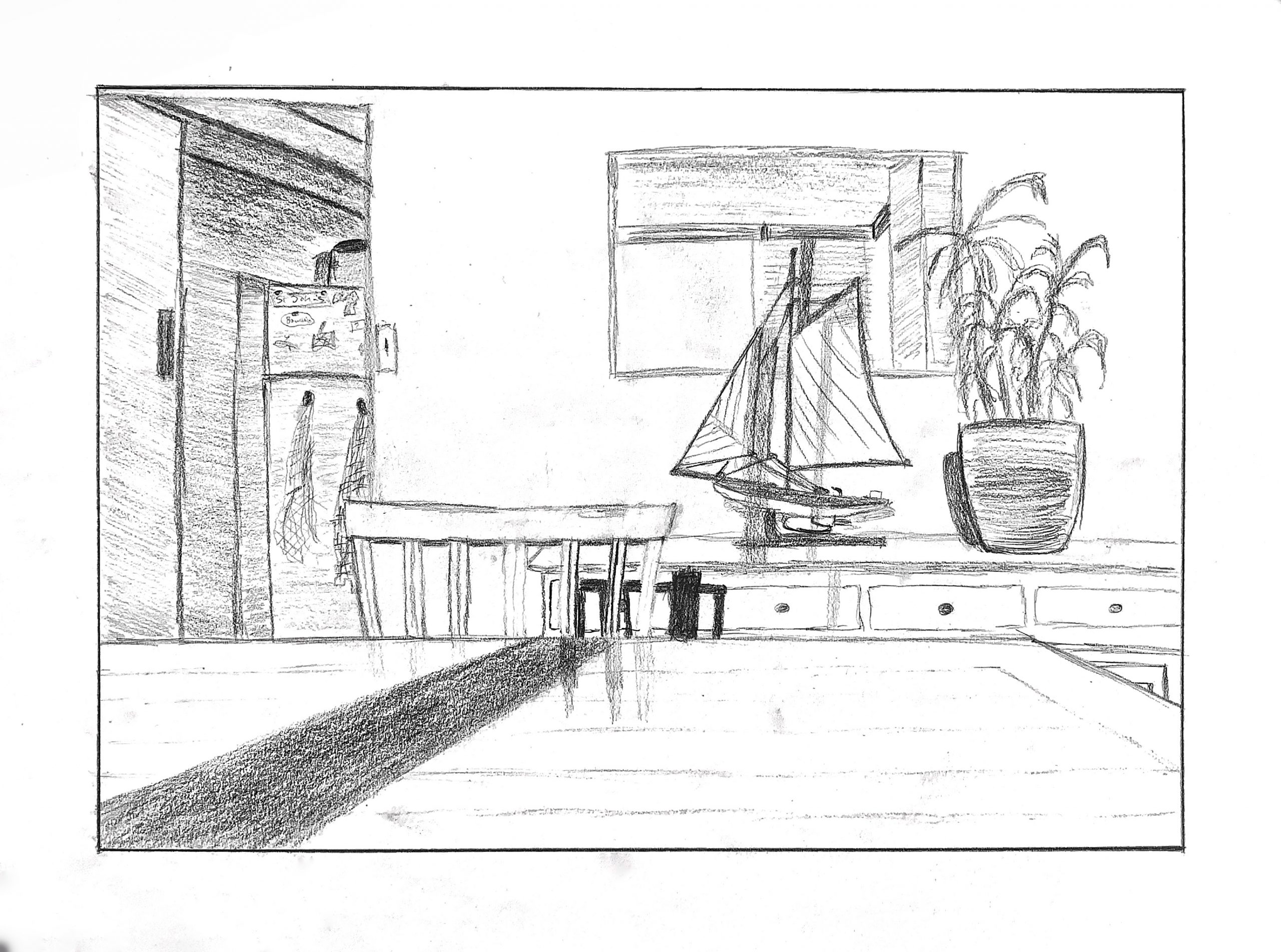
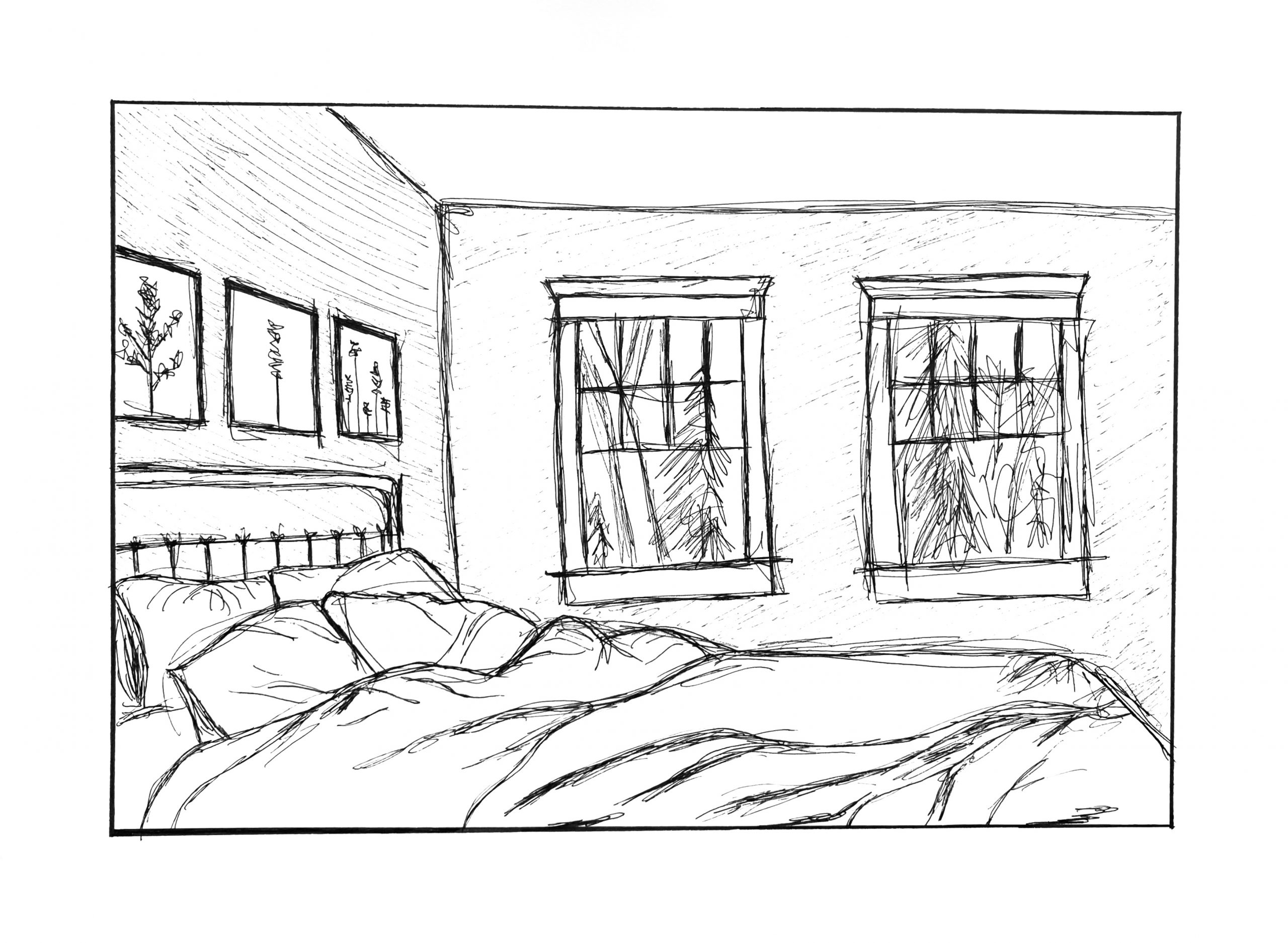
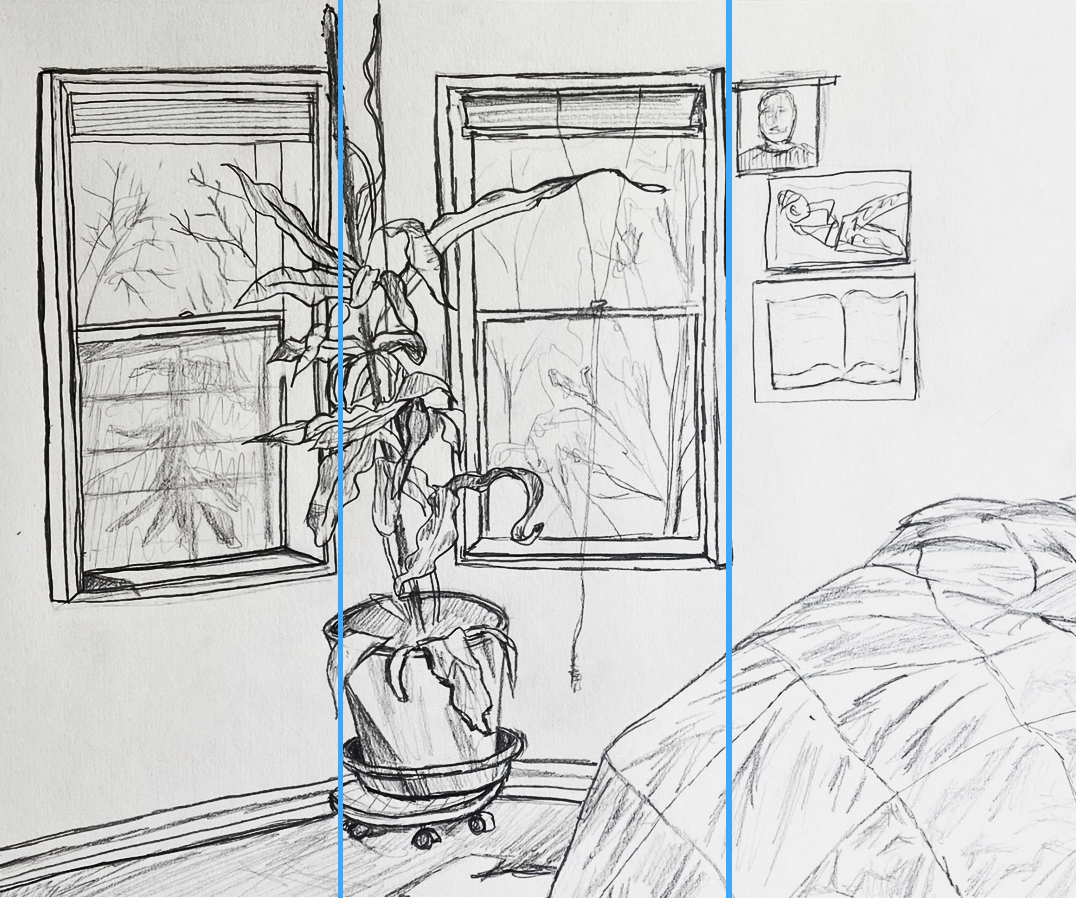 I like the way this places the right edge of each window frame on a third, and how the plant, while mainly in the middle, sticks its nose into the left third, and the bed, while mostly in the right third, dips its toe into the middle third.
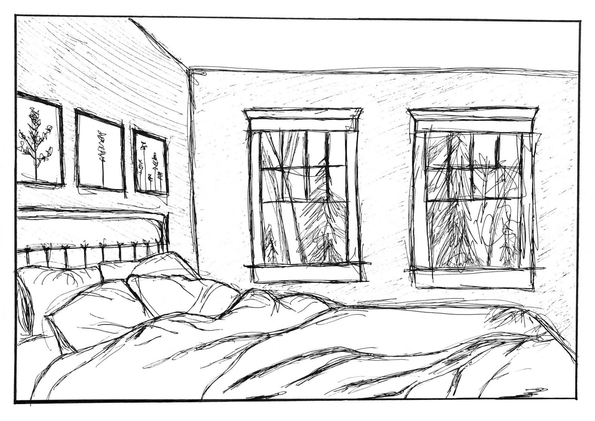
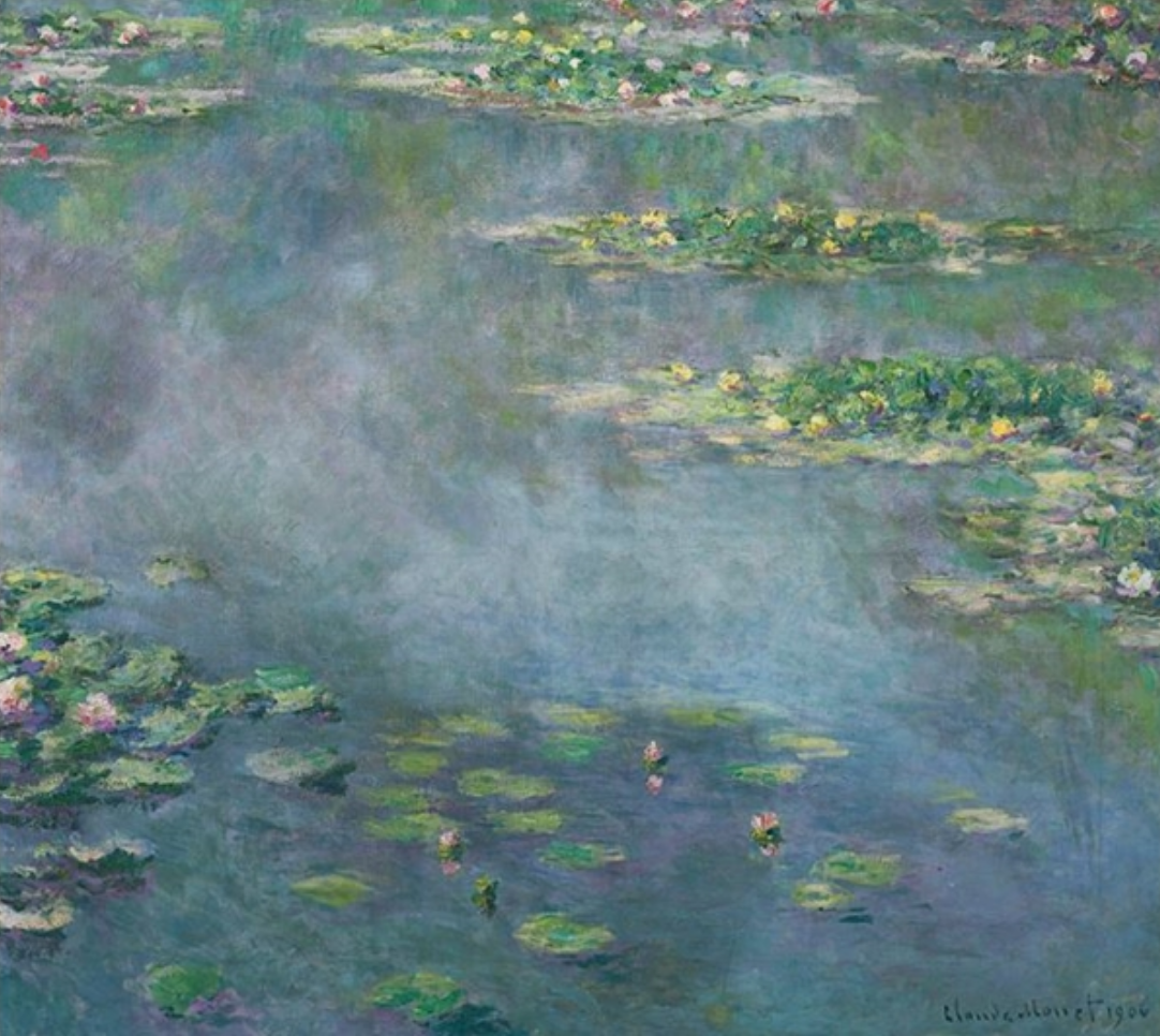 Claude Monet